Trending
Opinion: How will Project 2025 impact game developers?
The Heritage Foundation's manifesto for the possible next administration could do great harm to many, including large portions of the game development community.

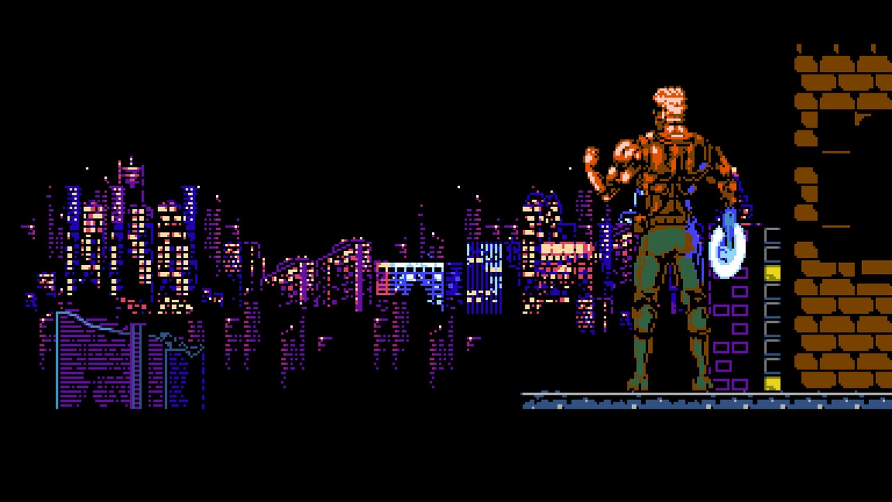
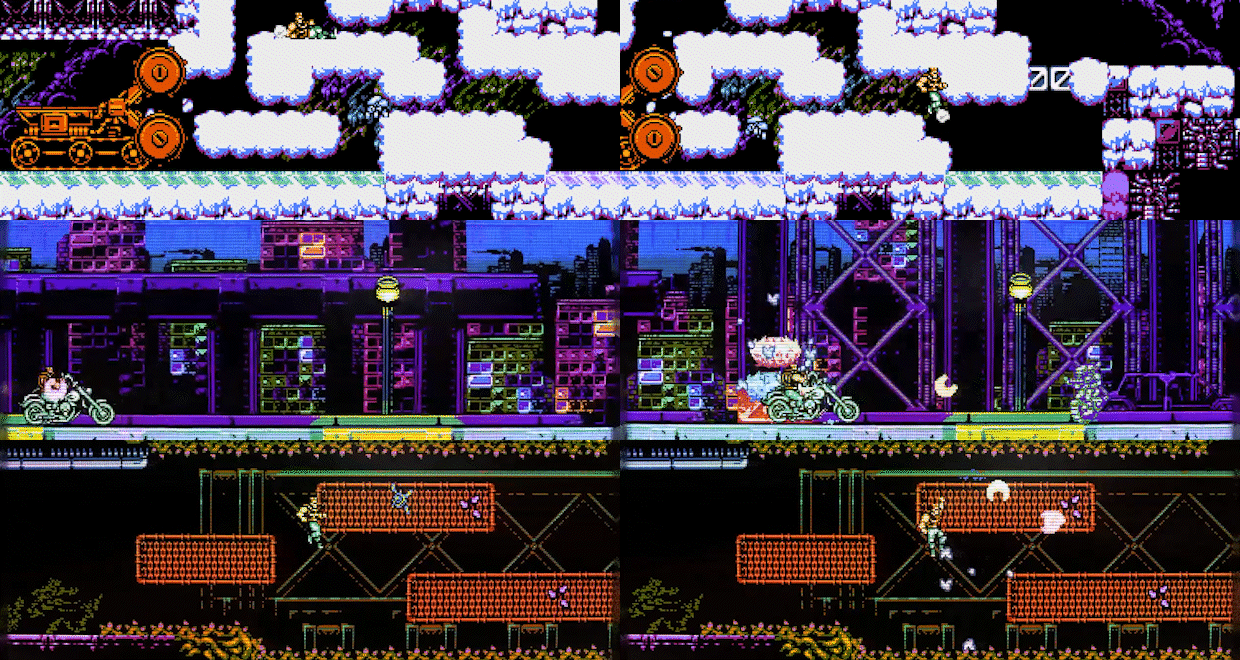
Prison City takes players to a massive prison city they need to fight their way across by flinging chakras at hostile machines. This screen-shaking, Power Blade-inspired NES action title came together in a little over a year thanks to the clever reuse of systems the developer made for their previous games.
Game Developer sat down with Programancer, the game’s creator, to talk about making something that feels like an NES game without entirely sticking to the system’s limitations, how it was important to keep their console porting plans in mind throughout development to cut down on later headaches, and the immediate, liberating feeling they got from being able to make use of old systems to work on their new title.
Prison City is a Power Blade-inspired NES action romp filled with screen-shaking explosions and vibrant pixel locales. What interested you in making a game like this?
These are the kinds of games I grew up with! I have a huge amount of nostalgia for mechanically-simple-but-kinetic action games that kind of throw you in and allow you to make mistakes but also allow you to grow with it until you master it, games that give you the tools and information you need from the start and let you have at it. It's definitely something that feels a bit like a lost art these days.
What challenges did you face in creating a high-speed action game while keeping it within an NES style? How did you create something more complex than an NES game while still crafting something that feels like an NES title?
I think a lot of the difficulty with making something like this is bending the rules enough to be fun and appealing but not enough to lose the feeling of authenticity. I very loosely adhere to some vague NES rules. For example, I mostly try to stick to 3 colors + transparency for a lot of sprites and tiles, but I'll bend it where meaningful, and I try to maintain some very simplistic approaches to design and mechanics to sell the overall vibe of the game. Make no mistake, the things the game does under the hood could not be put on an NES cartridge 1:1 without some extreme redesigning and optimizing, but whenever someone asks if I'm making an NES cartridge of the game, I know I was successful in blurring the lines between old and new.

Image via Steam.
It was also important that everything feels authentic to play, which can be pretty hard. In some cases, it's about adding a bit of nuance to simple mechanics. Jumping, for example: if you jump and land without pressing left/right, or you fall from a great distance, Hal will do a "heavy land," where you have a few frames where he's braced from the landing. It interrupts the flow a bit, but it also adds a bit of weight to the experience, which makes it feel a lot more true to the style of game it's simulating. The concession for that, however, is that you can also jump out of that heavy land, or you can slide, keeping everything kinetic while still having a bit of that NES charm/maybe-annoying-quirk. Very simple things like that can go a long way in making sure the game honors the things it's inspired by.
Your past works, Dumpy & Bumpy and The Transylvania Adventure of Simon Quest, have an NES feel to them as well. What do you feel draws you to this particular look and feel in games?
The beauty of the NES is that, in most cases, you could just pick up a controller and play the game without a lot of instruction. You didn't have to worry about crafting recipes or button combinations, you knew your jump button, you knew your attack button, and you knew how to move. Sensibilities have changed quite a bit, and I think people expect games to have very complex controls, but for me, it's appealing to know I can figure out everything I need to know by just pressing buttons for a little bit.
I think I'm drawn to the simplicity. In the case of Dumpy & Bumpy, I wanted to approach the game from the perspective of someone who doesn't necessarily excel at puzzle games but still wants to have fun! So, I looked at games like Bomber Man and Bubble Bobble and thought about the overall idea of "You don't need two players, but wouldn't it be fun if someone was there to just help you cheese the whole thing?" That was it, the whole premise!
Most of the games I enjoy can be broken down into some very simple key points and mechanics, and it's just kind of luck that a lot of those games are NES games. The more time goes on, and the more buttons you have on a controller, the less simple things are. So, if I can make something that makes me feel nostalgic, or even feels like it could be something I would have played when I was eight years old, sitting in my family room in the middle of the night gaming with my brother, I'm all for it!
The game was developed with a desire to make a solid action game in a short period of time, with development starting in July 2022 and the game releasing in August 2023. What made you want to put this game together so quickly? Why do you feel a quicker development time can be important for developers?
A good chunk of the development of this was rooted in a desire to take systems I had made for Dumpy & Bumpy and The Transylvania Adventure of Simon Quest (TASQ) and refine them even further. I knew the things I had made for those would be modular enough to make something else reasonably quickly, and I was feeling pretty burnt out with how slow-paced TASQ was. As much as I love a brooding adventure game with a Castlevania-style commitment to movement, I needed the inverse of that as a development break/cleanser. I have a tendency to use my own 10-day game jam as an outlet for various ideas I've had that just wouldn't fit in whatever I'm producing at the time, so I used that to prototype Prison City. The original jam version is still up on Itch.io as well for free.
As for quicker development time being important, I think that's kind of a mixed bag. I have a bit of a unique situation where I prefer to work on games almost non-stop. When I start feeling burnt out, I move on to different aspects of the design, like music or art, but I always keep forward momentum in development, and I'm more than alright with working on it for 12 to 16 hours a day if I can. I think for anyone working on something of this scope solo, it would be perfectly alright spacing a project out an extra year if you want to spare some healthy free time! I will say, though, that there's no shame in using systems you've made for other projects to expedite your development for the next one. If anything, everything you make should be iterative and benefit the next thing in some capacity, and oftentimes, that benefit is speed.

Image via Steam.
Part of how you created an impressive game in a brief development period was by reusing and reshaping systems from your other games. However, your previous works (Dumpy & Bumpy and The Transylvania Adventure of Simon Quest) don't play anything like Prison City. What thoughts went into repurposing elements and systems for the explosive action of your new title?
A good chunk of the reused systems are things under the hood, for example, the way the games handle user input, or how the games handle all of the actors and their individual states. Those things were really easy to bring over to this. There's always a bit of adjusting for use cases, but every time I bring a system to a new project, it's iterated on and improved upon. Even in Dumpy & Bumpy's development, the way I approached user input changed quite a bit from assigning actions to buttons to assigning buttons to actions. After allowing myself to become familiar with what I had made, it became an even more robust and easy-to-use system as I moved from that to Prison City.
In terms of iteration, in Dumpy & Bumpy that system allowed you to map out DirectInput gamepads. Now, in Prison City, you're able to use somewhere around 13,000 DirectInput devices without any manual configuration- even Super Famicom gamepads, thanks to upgrading the input system I had made to use the GameController DB. From TASQ, the Mansion handler was used to handle levels/wards in Prison City, and even things like the NES palette clamping, fade-ins, and fade-outs were all from TASQ. All of the console porting is just iterated and greatly improved from Dumpy & Bumpy's Switch port. I know people think of development environments like Game Maker and Unity just as engines (and rightfully they are), but I honestly think of them more as a chassis that facilitates the engine and systems you create and put into place.
What benefits did you see from working with those past systems? How did they help you develop the game faster? Were there any challenges that came from reworking or reusing these systems?
For the most part, they clear up a lot of the busywork. Starting a new project is one of the most terrifying things because you look at this blank canvas and have no clue how you're going to get to the finish line from where you're at. When you can take care of all of the things that you need to really get into a groove, designing the game almost instantly, it's a huge weight lifted off your shoulders. It's nice being able to say, "Okay, I want to make this game, but before I can actually make anything presentable or satisfying to see on screen, I need to make sure all of these systems are in place" and have those systems already at your disposal. It takes so much of the guesswork and trial and error out of the early stages of development, and you can just work on making what you see in your head actually work in a game.
It's surprisingly not very challenging, though. In my case, as long as my approach and philosophy are consistent, I can get everything up and running without a whole lot of fiddling!
Outside of reusing systems, what development decisions did you have to make to ensure a fast development time? What things got sacrificed or pared down? What things did you have to shift your focus to?
Outside of just new systems/features, it was decided at the start (even before partnering with Retroware to make this project a full game) to make this in tandem with the Switch. I tested its performance on the Switch every step of the way, so I had the luxury of pushing the limits of how I approach development and design on a system I desperately wanted to make this run flawlessly on.
It seems like it should be easy—a 2D game running on a handheld that should be able to run it—and you'd be right for the most part, but there is a lot of simple-for-PC hard-for-mobile-devices stuff going on! So, anything that caused slowdown on the Switch needed to be adjusted or rethought. I think, at the end of the day, it saved a lot of headaches later because without doing that, it would add a huge mess of rushed performance fixes.
I think a lot of that informs design early on, and this is definitely a game that had the most room for emergent design from the start, unlike something like TASQ that is meticulously planned out. Surprisingly, I didn't have to sacrifice a whole lot. There were a few ideas here and there that came up, and I'd say maybe 80% of them fit nicely within the scope and context of the game. I never really had to shift focus too much. I think, given the type of game, it's a fairly concise process, even with whatever emergent design crops up. But managing scope is a massively important thing. Thankfully, it all came together smoothly. Console ports did absolutely become 200% of my focus for the last two months of development, though. Daunting stuff!
While creating the game, did your past experience as a developer affect how you wanted the game to play out? How did your strengths as a developer affect the design?
I'm not sure past experience affected how I wanted it to play out, but it definitely informed how I wanted to approach making the game. At the time I had started Prison City, I was fresh off of three years working on TASQ, so I was already pretty familiar with the things holding me back on that project. I just set out to find new ways to assemble everything. For example, TASQ is very tile-heavy, but Prison City uses scalable 9-slice images exclusively for levels. This allows me to freely add elements to the maps and adjust them however I need. I think being able to do that alone gives me so much more freedom to just adjust the experience to something enjoyable much faster.
I also wanted to take some of the things people didn't like about TASQ and do the opposite for Prison City. I wanted to give people who don't care for TASQ something to enjoy, and hopefully people who don't care for Prison City will find something in TASQ they enjoy!
How do you feel this experience will affect how you develop your future games?
It'll just keep making the process smoother, I think. I've been iterating on the same systems I've developed and worked with since 2012, and they just keep getting more refined for the kinds of things I want to make. There is something to be said about post-launch, though; it's nice to see people play your games and see what works and what doesn't for people because, much like code and systems carrying over project to project, that knowledge also carries over. Everything is, and should be, iterative.
You May Also Like