Trending
Opinion: How will Project 2025 impact game developers?
The Heritage Foundation's manifesto for the possible next administration could do great harm to many, including large portions of the game development community.
Generally, the data we get from the database are all true and reliable. However, after grouping, statistics calculation and presentation via graphs and tables, unreliable conclusions may be finally derived.

Generally, the data we get from the database are all true and reliable. However, after grouping, statistics calculation, and presentation via graphs and tables, unreliable conclusions may be finally derived.
1. Simpson’s Paradox
E.H.Simpson, a British statistician, first explained a phenomenon in 1951, that is, a trend appears in several different groups of data but disappears or reverses when these groups are combined. And he named this abnormal phenomenon "Simpson's paradox".
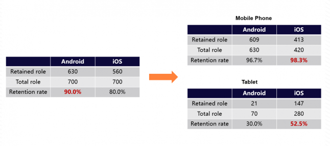
For example, the retention rate of a game is higher in Android devices than in iOS, but when devices are divided into mobile phones and tablets, the retention rate of iOS is higher than that of Android.
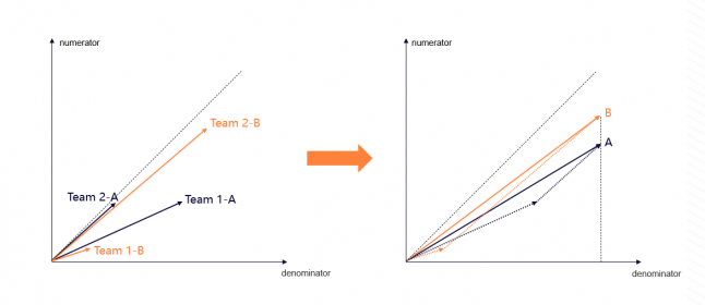
From the point of view of vector diagram, after dividing Team 1 and Team 2, the proportion of internal A component and B component is out of balance. One group obviously has a high proportion of A component, while the other group is just the opposite.
 There are two solutions.
The first is to find out the internal logic. For example, in the previous problem, the deep logic may be that the game retention rate of tablets itself is low. However, the proportion of tablets in Android devices is obviously lower than that in iOS, and the mobile devices are dominated by Android, which finally leads to Simpson's paradox. Therefore, when considering problems, it is necessary to clarify the logic, make clear what the core points are, and avoid randomly carrying out data statistics while splitting or merging statistics according to a certain indicator.
The second is to set weights. When designing experiments (such as A-B test), it is necessary to ensure that the proportion of each component in different groups is generally consistent, so as to reduce or even eliminate the influence of Simpson's paradox to a certain extent. In a word, in the process of game data analysis, if we want to study some games with different audiences or different devices and measure some indicators, we should be alert to the existence of Simpson's paradox.
2. Correlation explanation
When analyzing the correlation of indicators, there are often two indicators that seem completely unrelated, which are likely to show a high correlation.
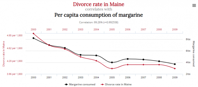
There are a lot of strange high correlation factors on the website of Tylervigen. For example, in the picture above, the divorce rate in Maine is highly correlated with the per capita consumption of margarine, but it is hard to think of causation between them logically.
Generally speaking, there are three relationships between correlation and causality. First, there is a causation between the two variables. This relationship may be a direct A→B or B→A, or there may be a logical chain between the two that needs to prove the causation every step; Second, the two variables themselves have no causation, but there is a third-party factor, which together leads to the change of the two factors; Third, the two variables have no causation, and may be interfered by random factors.
In a word, correlation can only be used as a hint of causality, and a more rigorous method is needed to determine whether there is actual causation between two highly correlated parties. Before the game attribution analysis, it is necessary to have a deep understanding of the game. Once there is a high correlation between the two variables in the study, it is necessary to accurately judge whether there is causation between them.
3. Misleading of graph presentation
In some business reports or product events, in order to highlight or obscure some concepts, the reporter will use some inappropriate diagrams or graphs to mislead, thus leading the viewers to draw incorrect conclusions.
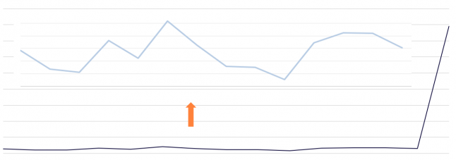
Change the relative shape: When there is a value that is quite different from the average value, the curve effect expressed by other values will be blurred. And sometimes it will be realized by scaling the unit length of the axis.
 3D diagram visual misleading: Misleading by using the plane effect produced by the 3D diagrams, such as the 3D pie chart, the most intuitive feeling of the viewer is that the part closer to himself (yellow color block) will be larger.
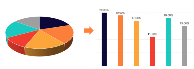
Axis truncation: give an axis that does not take 0 as the starting point, weaken the indicators of other objects, and highlight one specific indicator.
 In short, from the producer's point of view, it is necessary to display the correct data, and also display the data correctly. Besides, try to avoid using 3D graphs that are too easy to lead to misunderstanding; From the viewer's point of view, we should pay attention to the content elements of the graphs, and do not fall into the visual trap.
You May Also Like