Trending
Opinion: How will Project 2025 impact game developers?
The Heritage Foundation's manifesto for the possible next administration could do great harm to many, including large portions of the game development community.

Featured Blog | This community-written post highlights the best of what the game industry has to offer. Read more like it on the Game Developer Blogs or learn how to Submit Your Own Blog Post
For the past 3 years, I worked on a top-down 2D space shooter prototype. These are the lessons I learned about designing such a game.

This article is cross-posted from my blog.
For the past 3 years, I worked on a top-down 2D space shooter prototype. I recently decided to suspend its development to focus on my primary project, a tactical online card game called Zems. In this post I share the major lessons learned while working on that prototype.
 Early build. For some reason I thought this wasn't lively enough and wanted visible ship thrusters.
Early on, I wanted a visual thruster effect for each way a ship could turn and move. For example, if a ship was turning left, thrusters would fire on the right side. In testing, the "flickering" of thrusters actually distracted the player's eyes away from vital graphics like enemy fire. I decided to cut the feature and ask the following question for all visual ideas moving forward: Is it necessary? Another way to phrase it is, What is the minimum amount of visual effects needed to convey this specific information?
Players need a point of comparison to feel like they are moving in the vast expanses of space. Foreground and background elements like dust clouds, stars, and planets are commonly used as points of reference.

Color mask. White indicates the areas we color to depict friendly, hostile, or neutral.
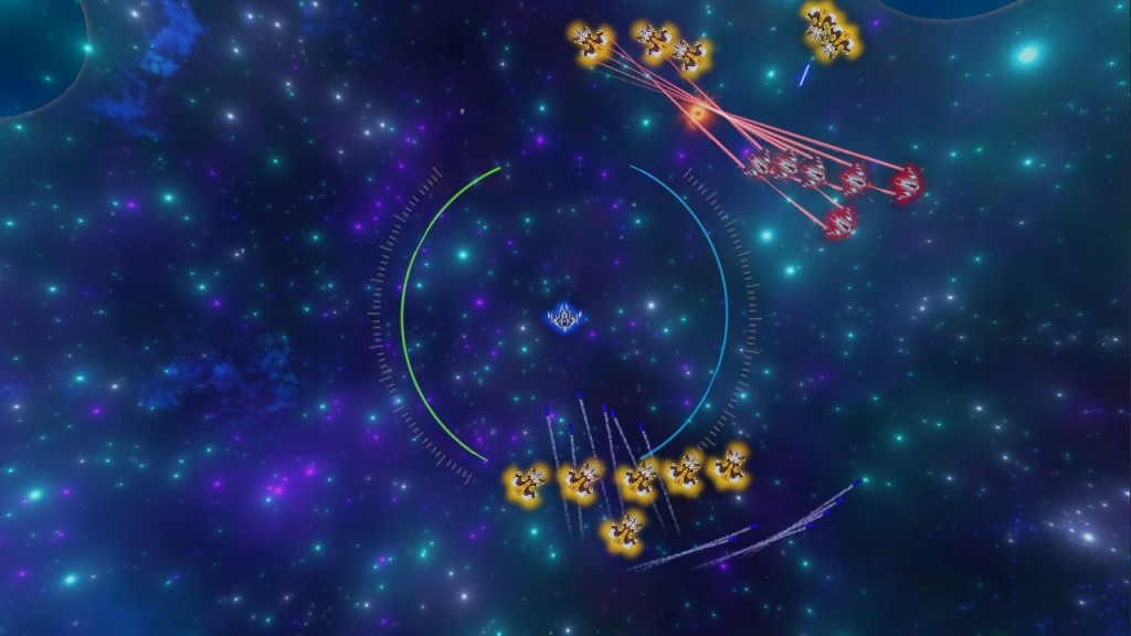
If your game has shields, coloring them is one of the easiest ways to identify a ship's relationship to the player. However, shields eventually deplete under fire, so it's good to have either colored lights on the ship or stripes on the hull to always indicate the relationship.
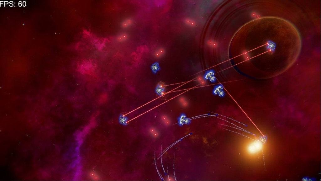
Missiles do more damage than any other weapon in my prototype, but with so many projectiles moving on the screen it can be difficult for the player to know which enemy missiles are locked onto his or her ship. My solution was to draw a line from homing missiles to the player's ship. The animated GIF shows an early implementation of this.
UI for a fast-paced game is tricky. You want the player to easily access vital information like health and shields without being blocked from seeing enemies and bullets.
In my space shooter, I discovered players spend most of their time looking around their ship in the center of the screen. Thus, I opted to put our UI elements in this area, with reduced alpha to minimize obstruction to gameplay. For other examples of space shooter UI, see my Space Shooter UI post.
Shooters are about shooting, which includes the visceral feel of aiming and firing as well as feedback. It's important to have visual effects such as screenshake and impact effects. If you're developing a space shooter and wondering why it doesn't "feel" right, weapon feedback might be the source of the issue. Some say say games should feel fun without fancy VFX, but effects tied to a core game mechanic shouldn't be skipped when evaluating a prototype. Sometimes a small visual addition can drastically change the feel of gameplay. Impact buildup is one such feature - if weapons fire is concentrated on an area, show a buildup of visual impacts around that area. The result is a visually pleasing effect that lets the player know how precise he or she is at hitting the target.
 Homing missiles instantiate at the same angle as their firing mounts when launched.
If you have weapons with 'smart aim' or homing capability (usually missiles), you can make them more interesting by matching their firing orientation to their weapon mount. This adds an element of skill to the game by giving the player a higher chance of dodging guided weapons because they have to turn toward the player.
One difficult aspect of game design is ensuring mechanics engineer the intended gameplay. I wanted players to cycle between intense combat and moments of re-positioning (or retreating). My original design gave all weapons a static cooldown, such as 1.5 seconds per bullet volley. In testing, this clashed with the flow I sought - moments of intense combat seemed artificially restrained by the static cooldown while moments of repositioning seemed to have too much shooting because there wasn't good reason to still aim in the general location of the enemy and fire.
The solution I found was to replace cooldowns with an overheat system: Firing a weapon generates heat, and if a player's ship overheats then it becomes unable to fire for a few seconds.
This is the last problem I solved before refocusing my efforts on my tactical card game, Zems.
As game designers, we often have an idea in our heads of how a mechanic might work, only to later discover that we are struggling with how to convey the minimal amount of information needed to teach it to the player. Most of the lessons here are the result of numerous failed ideas intended to solve that problem. I hope my findings help you in some way as you work on your own projects. Here is one final GIF showing an early version of the game from 2015. It's come a long way!
Read more about:
Featured BlogsYou May Also Like