Trending
Opinion: How will Project 2025 impact game developers?
The Heritage Foundation's manifesto for the possible next administration could do great harm to many, including large portions of the game development community.

Featured Blog | This community-written post highlights the best of what the game industry has to offer. Read more like it on the Game Developer Blogs or learn how to Submit Your Own Blog Post
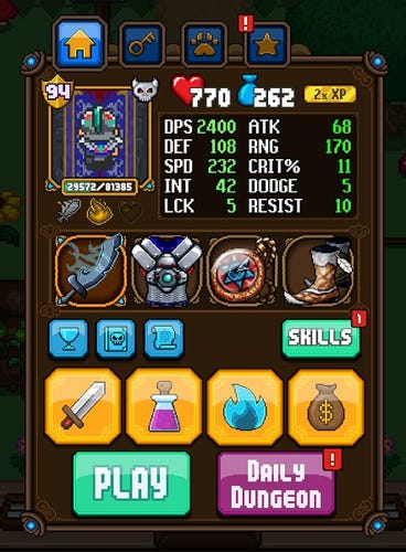
A examination of the UI and menu system of the Tiny Titan Studios game Dash Quest, and how it influenced the design of our new title, Tap Smiths.

I joined the team at Tiny Titan Studios just before the beginning of winter last year, about a month removed from the launch of our title Dash Quest, an endless runner with RPG-style character progression. Our CEO, Jeff Evans, had spent the past year developing DQ pretty much single-handedly, save for the efforts of a couple of art and sound contractors. The game hit iOS in early October; by late November, it was clear that Jeff had a hit on his hands and he’d need a team to help support it.
Make no mistake, we’re no Supercell. Our games aren’t setting the standard for mobile platform success… yet! But we’ve been fortunate enough to find an audience for what we do that allows us to comfortably keep the lights on, eat meals with regularity, and continue honing our craft from one game to the next.
When we began work on our newest title, Tap Smiths, this past spring, we took a long, hard look at the things that we felt Dash Quest had done well, as well as areas we felt it had missed the mark. There’s a lot to that conversation, certainly enough for more posts: gameplay, monetization, social implementation, you name it. Our two priorities, though, were to create a smaller-scale game with depth and simple mechanics, and first and foremost, develop a UI that was fun and efficient to use for the player.
We love Dash Quest and we’re very proud of the game, but as I mentioned earlier, its art is the product of a handful of individuals working independently of one another. This is particularly apparent in our UI, specifically the menu system. Is it functional? Certainly. It’s also clunky, not especially well-integrated into the game experience and it’s inconsistent from an art perspective. Jeff elected to go with a hybrid shop/inventory that’s since proven to be awkward to work around when we’ve discussed adding features.
Something less obvious that became clearer to us as we dug into our feelings was surprisingly simple: using our menus wasn’t fun. It doesn’t aggressively drive users from our game, but there are plenty of opportunities for little “feel good” moments. Dash Quest’s menus are static, and simply appear or switch as needed. Buttons don’t react in a particularly satisfying way. Players aren’t given very graceful direction as new options appear or become unlocked.
Did we mention it’s brown? Because it’s brown.

I hope I’m not sounding like a parent that’s being hyper-critical of one of my children, because the game is incredibly fun and we’ve got a number of very loyal players. Our wish list for Dash Quest includes a revisit of our menus at some point down the line, but I digress: with Tap Smiths, we determined early on that we had an opportunity to learn from our past work.
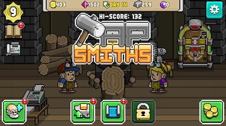
Our goals for our menu system were to create something pleasing to the eye that felt really good to use, and that was fun to interact with. We wanted all of the player’s options located in a central area with a minimum number of taps required to explore the entirety of our available choices. We were after a design that was clean, clear and very visual, highlighting icons and as little text as possible.
Here’s what we came up with:

We’re really happy with how things turned out, and we think it’s a big improvement over our previous efforts. All upgrade paths, currencies, our gold shop and settings are all within easy reach of the player. Elements pop and slide into place, reacting when used. The small exclamation points that you see call out new items, unlocked upgrades and new achievements to collect.
In Dash Quest, unlocked menu features are gradually doled out to players as they progress and begin to get a feel for the core loop. At specific level requirements, players will finish their game, return to the main menu and see a notification pop-up that explains what’s new.
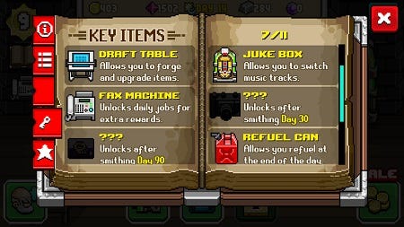
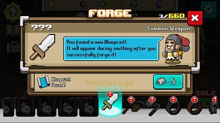
For Tap Smiths, we took this a step further. Key Items are acquired after a specific in-game milestone. This serves two purposes: it lends these milestones a degree of collectability, while providing the player with positive feedback for their accomplishment as the feature becomes available.

We also added a guide character, the Squire, to help bring more character to these moments. The tone of Tap Smiths is goofy and humorous, and this character, inspired by Terry Gilliam’s character Patsy in Monty Python and the Holy Grail, helps sell that theme a bit more. He appears during the intro and when milestones are reached to help celebrate with the player and guide them to the new, unlocked feature. We’ve even made him an unlockable playable character for good measure.

Our commitment with each game we make is to learn something from our previous effort and raise the quality bar with our subsequent project. Soon, we’ll be looking back at Tap Smiths, evaluating the decisions we made, then applying the lessons learned to the next game.
Did we accomplish what we set out to do? Yes, we feel that we did. We think the final UI is smoother and more pleasing to the eye, and it's got substantially more character. It's hard to offer a brutally honest analysis at this point because the game is still so fresh in our minds; we just launched at the beginning of July. It's a little early to guess what direction the next Tiny Titan title will take, but you can bet we'll be looking to build on the foundation we created here.
Glenn Stanway left behind a lengthy sales career in November 2015 to help his friend make video games. He had no industry experience, just a creative fire and a desire to change his life. His blog follows his adventures in the world of game development.
When he's not learning about making games, Glenn fronts a 90's rock cover band, The Spoonmen. He also produces and edits podcasts and is an associate producer for the upcoming documentary project, Box Art: a Video Game Documentary.
Read more about:
Featured BlogsYou May Also Like