Trending
Opinion: How will Project 2025 impact game developers?
The Heritage Foundation's manifesto for the possible next administration could do great harm to many, including large portions of the game development community.

Featured Blog | This community-written post highlights the best of what the game industry has to offer. Read more like it on the Game Developer Blogs or learn how to Submit Your Own Blog Post
How Owlchemy Labs approached accessibility in Cosmonious High without sacrificing aesthetics or gameplay.

Senior Accessibility Engineer Peter Galbraith and Accessibility Product Manager Jazmin Cano deep dive into Owlchemy Labs’ approach to accessibility in Cosmonious High and how it was done without sacrificing aesthetics or gameplay.
Today, around 30% of gamers in the US and UK identify as disabled (Newzoo, 2022). 70% of gamers with a condition or impairment use accessibility features found in games. These numbers tell us that there is a need for accessibility features, so designing your game to be accessible will benefit many players. Players that benefit include:
Players with disabilities
Players with temporary limitations
Anyone who doesn’t feel they need the features but still uses them to create a better experience.
Everyone should design for a variety of needs so more people can experience the joy of gaming. That ties into one of our pillars at Owlchemy Labs: VR for Everyone. We’ve been working on this mission since Job Simulator and Vacation Simulator, where you can find accessibility options such as Small Human Mode and Subtitles.

On the left, a close-up of the accessibility options in Vacation Simulator showing a drawer for Subtitles and an on/off switch for Smaller Human mode. On the right: A close-up of the accessibility options in Job Simulator showing a drawer for Subtitles and a dial set to the language Español.
To help you integrate accessibility features into your projects without sacrificing aesthetics, here is a detailed description of our approach for Cosmonious High.
This format is shared through the following topics: Principles, Processes, and People.
Cosmonious High has three pillars with principles that guide our development decisions:
VR for Everyone
Everyone should be able to play “Their Way”
A great experience for new VR players
Accessibility from the start
Welcome to Cosmic High
Players should feel welcome in this world
Cosmic, but relatable and grounded
Interaction is everything
Everything should be responsive & delightful
Pick up and play
All of this ties into our principle of allowing players to enable play, expression, and our choice to be accessible by default. We encourage interactions that come naturally while knowing every player’s “natural” is different. We also prioritize natural integration of accessibility features rather than having a bunch of menu settings for players to go through and customize. This is important for several reasons. By designing features as part of the game world, players can stay immersed by not having to go through menu settings which can also be overwhelming to navigate if there are too many options. When there are too many customizable options in a settings menu, the settings for players could get lost or be hard to find.
Additionally, by integrating these into the world, players who may not typically look for accessibility settings could find them helpful. Having it readily available in their world allows them to customize the experience to be more comfortable for them. By designing in an inclusive way and removing barriers, our games enable players of all backgrounds to enjoy the game equally and confidently. Having these established principles helps us decide how to design certain things in our game.
To begin, we prioritize the comfort and approachability of players new to VR. We do this by having teleportation as our locomotion method and adding snap-turning for rotation. These forms of movement in VR are known to help players have a comfortable experience, who would otherwise feel nausea and discomfort from movements such as smooth-locomotion and smooth-rotation.
Teleportation is great for players with limited mobility because it allows precise movement, allowing them to get closer to certain areas without moving their whole body.
Snap-turning also helps players who play seated by not forcing them to turn their bodies around and, instead, comfortably rotate their virtual bodies in the desired direction. This is helpful for players who use wheelchairs, have a lower limb in a cast, or experience higher rates of fatigue when standing. This doesn’t only benefit players with disabilities or temporary limitations. It’s an option for players who want to play comfortably while sitting down. This also accommodates small play spaces where players may need help moving around.
.png/?width=700&auto=webp&quality=80&disable=upscale)
Lockers in the school hallway with a teleportation indicator placed in front of a locker. The indicator has two shoe icons in a circle pointing in the direction the player will face.
Designing with accessibility in mind also means conveying information in multiple ways, whether it’s visuals, audio, or haptics. Doing this work early makes your design choices part of the world and are not part of a setting a player needs to turn on and adjust.
An example of conveying information differently is using patterns for colors. Gamers who are colorblind may not find color to be reliable on its own, and by adding patterns to colors where association affects gameplay, the design is accessible and part of the world.
In Cosmonious High, players can find puzzles where they need to connect one wire to another. The wires have bases with their own colors, patterns, and uniquely shaped bases.
.png/?width=700&auto=webp&quality=80&disable=upscale)
Part of a puzzle where three wires are sticking out of a broken wall. Each wire has a base with a unique color, pattern, and shape. One is pink with a ring pattern on a round base. Another is green with dots on a cross-shaped base. The third is orange with a hexagon pattern on a hexagon-shaped base.
Another way icons and symbols can be helpful is to label parts of the game that also use color. In one of our classrooms, we have a fluid dispenser. Though the sections match the color of the liquid dispensed, we also use icons to indicate which fluid is which.
.png/?width=700&auto=webp&quality=80&disable=upscale)
A fluid dispenser with 11 fluids, each in a different color, and marked with a symbol associated with the name or property.
These methods of designing how information is presented benefit players and developers too. Our artists don’t have to spend extra time creating additional versions of assets, which saves us development time and resources.
Related to all of this is understanding that good design can be accessible design. For example, we highlight objects to signal important things to players. In our classroom terminals, when a player has an assignment puck, the terminal gets a bright yellow highlight in the place where the puck should go, indicating to the player where to move the puck to next.
.png/?width=700&auto=webp&quality=80&disable=upscale)
A purple terminal with the word “Assignment” on it. There is a yellow highlight around the words “Insert to Start” and closer to the player is an assignment puck that says “Foundational Fluids”
We also have objects highlighting when a hand is near, signaling that it is interactable.
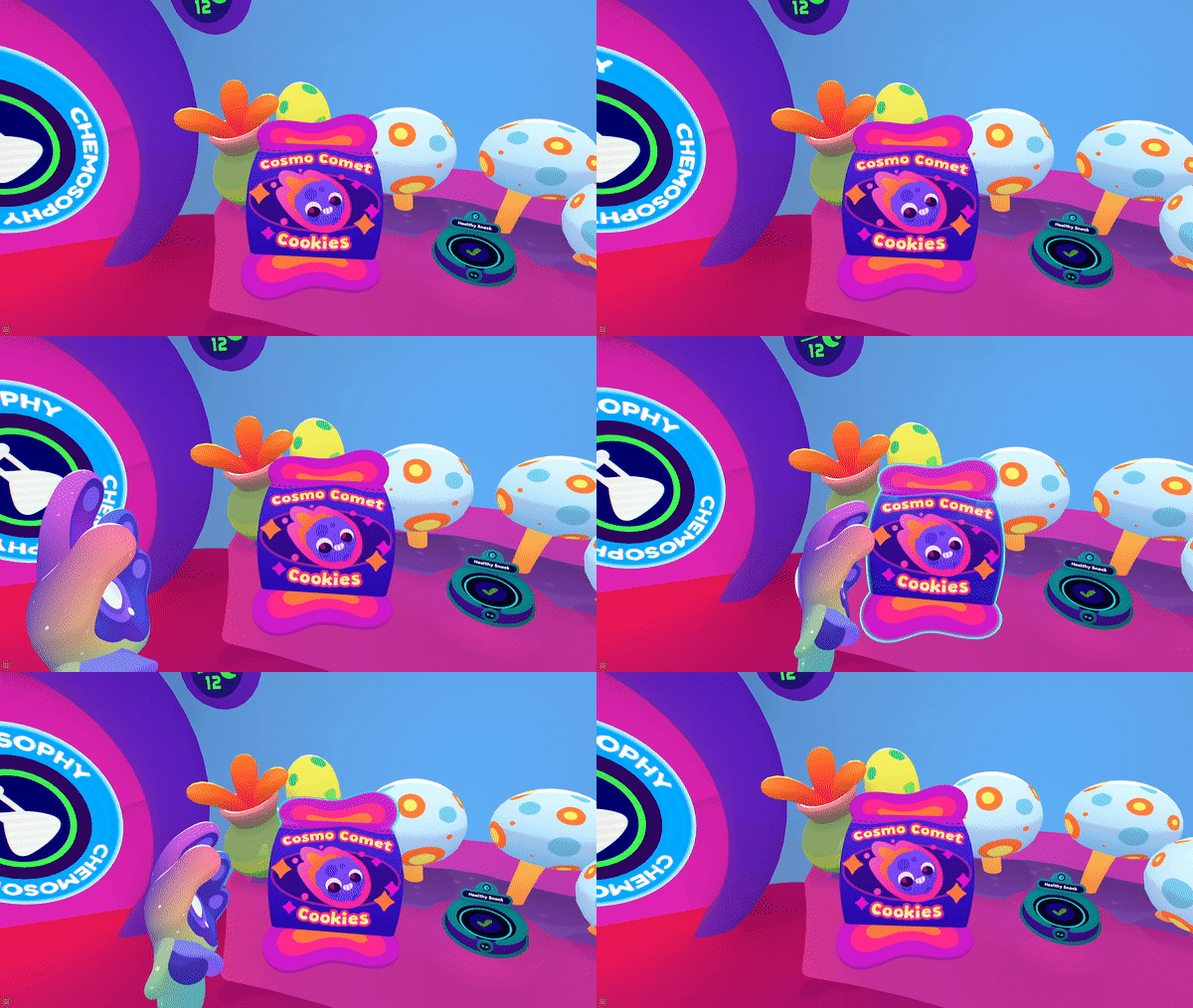
A cookie bag that gets a bright blue highlight around the edges as a hand approaches it.
Consider automatically customizing the experiences in the game to match a player’s situation. For players who play with one hand, one-handed mode should be available to them. With One-handed mode, players don’t have to go into menus to turn this on. If a player has one controller on because that’s how they prefer to play, or if the battery dies in one of the controllers, the game will automatically switch to one-handed mode. It’s helpful for someone with a limb difference or a motor impairment and a player who forgot to charge their batteries and has their controller die mid-game. These designs make the game more inclusive for everyone.
.png/?width=700&auto=webp&quality=80&disable=upscale)
A Prismi hand held up accompanied by selectable powers spaced around the hand.
Another approach for making these designs be a seamless part of the experience is by hiding accessibility in plain sight. This is done by adding toggles, switches, and handles on game objects, which is more intuitive than seeking specific options in a settings menu. Too many menu settings can make it hard for players to find the setting or features they need. For example, players can adjust the height of many surfaces in the game by moving a height-adjustment handle up and down. This itself is not a new idea - we all have probably heard of sit/stand desks by now, where you adjust it to your height.
This type of flexibility allows players to customize the experience for themselves. As mentioned before, everyone’s “natural” is different. This makes gameplay accessible to people who otherwise would have a mismatched interaction because their heights don’t match the default heights, whether it’s due to disability or not.
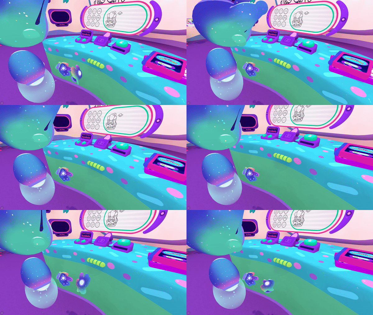
A Prismi in a classroom standing in front of a desk. They grab the handle and move it up and down a few times before settling on a raised position.
Building on the freedom for players to customize the experience for their comfort, we found other ways that allow them to change the game world to suit their needs. In Cosmonious High, we brought our previous successes with us.
Let’s take a look at Small Human Mode, a feature we’ve had in our games since Job Simulator and is great for allowing people to reach items that are high up. The problem some players faced, even with small human mode, is that other objects could still be out of reach horizontally. We’ve innovated on this by adding distance grab.
Distance grab is another feature that allows players who are seated or can’t crouch down due to physical limitations, to pick things up off the ground or grab objects that may be too far away. Other players who would benefit from this include people of shorter stature whose arms may not reach objects that are close by. This is also an important consideration for players with a limited amount of play space, such as players in regions where home sizes are smaller.
A hand pointing at an object in a locker, and between the two is a bright, sparkling beam.
Another way to build on previous successes is to plan for the future. When Peter Galbraith created subtitles for Vacation Simulator, he developed a flexible subtitle system allowing for modifications. In Cosmonious High, the subtitle system was brought into the game and modified to create the tutorial system players see today.
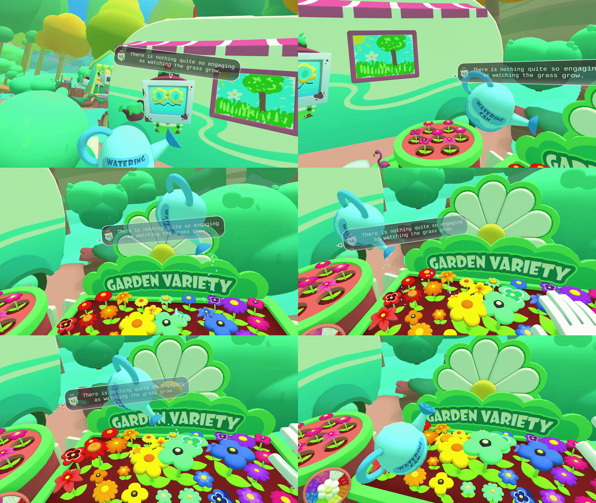
The in-game actions show a watering can watering flowers that grow, the subtitles following the player's field of vision as it moves.
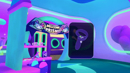
A gif in the game’s Registration lobby where a tutorial graphic follows a player’s view similar to the subtitles pictured in this blog.
While we emphasize the importance of making these choices early in development,
It’s also important to realize that post-launch updates and experimentation can be a part of your process. One way to incorporate this is to understand where you may have fallen short so you can make improvements later.
We released an Accessibility Update for Cosmonious High last year that added the one-handed mode mentioned earlier, welcoming more players who faced barriers when selecting their powers because it required both hands. We also added additional reminder tutorials for players who need a little extra help for cognitive accessibility. Like previous examples shared before, designing with accessibility in mind helps everyone. This feature allows players who haven’t played in a while and would find a reminder to be helpful.
Just because a game is shipped doesn’t mean the accessibility journey is over. If something doesn’t feel good enough, or you get feedback from players that some things are missing, you can make updates. Seek barriers that are still present. Update with improvements. Most importantly, keep going!
A Prismi hand with a tutorial over it highlighting which button on the controller needs to be pressed.
Don’t be afraid to try new things. We recently launched a Vision Accessibility Update that added the ability to hear object descriptions, area descriptions, tutorial narration, and provided high-contrast highlighting in other areas where players needed help finding key objects. While this was designed for players with low vision, we can even see players who can see the game with full vision using the feature to be reminded of what particular objects are called in this cosmic high school.
.png/?width=700&auto=webp&quality=80&disable=upscale)
Backpack from Cosmonious High on the vision accessibility page showing the toggle for Vision Assistance and buttons for Feature Instructions.
This is about the people that make all of this happen. At this point, you’re likely thinking, “All right. You’ve told us the processes, but how do we make it happen?” You make it happen with people! While Peter Galbraith and Jazmin Cano are the only two at Owlchemy Labs with the word “Accessibility” in their titles, everyone at Owlchemy Labs works on accessibility.
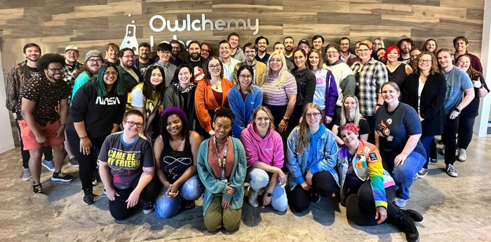
A group photo of the Owlchemy Labs employees gathered in front of the company sign.
Make accessibility part of the culture. When everyone is thinking about accessibility from the start, it’s easier for everyone to work together to make VR for Everyone. A way to make it part of the culture is to include accessibility design in internal developer documentation. Developers must be open to feedback throughout development. Also, provide the team with tools to help them test accessibility features.
Our team has developer tools that have color blindness simulators as well as vision simulators that affect how the game is displayed on the screen with varying degrees of blur. While this doesn’t replace a person with lived experiences around this, it helps our developers catch glaring issues much quicker and immediately.
In addition to making accessible design a part of the culture, your team must also prioritize testing! A diverse team will provide feedback for improvements you may not have considered. Going back to the statistics presented to you earlier, 15% of people worldwide currently experience disability, so there are probably people on your team with accessibility needs.
Be sure to test externally as well. Include players with disabilities. Finding local playtesters may be challenging, but that shouldn’t be a blocker. It's great when you can test in person but open up playtest opportunities remotely for a wide range of experiences.
Our last round of playtesting was primarily remote, and everyone helped show us where we can improve and how to design things in ways players expect. We are grateful for the consultants and playtesters who worked with us on this. Voicing their thoughts and describing their lived experiences provides perspectives that help improve our games because accessibility benefits everyone!
On that note, if you need help finding playtesters, check out VR Oxygen. We teamed up with them to find testers with blindness and low vision to provide feedback on our iterations for the vision accessibility update.
Also, pay attention to community feedback. You'll learn about barriers players may face or features they need to participate in the game. It’s essential to understand players' needs so you can address them.
Be sure to take these learnings with you into development. Whether it’s just you or a larger team, approaching accessibility as part of the design process early on will integrate it as part of the world, making it seamless for players. If you can’t do it early on, there are still possibilities after a launch with experiments and updates. Getting the whole team and external voices involved with playtesting is essential.
If this is your first design approach with accessibility in mind for your game, please remember that you don’t have to “reinvent the wheel.” We encourage you to learn from our previous successes and implement these approaches in your games. Our goal at Owlchemy Labs is to make VR for Everyone. By making your games accessible, too, we can work on reaching that goal together.
Read more about:
Featured BlogsYou May Also Like