Trending
Opinion: How will Project 2025 impact game developers?
The Heritage Foundation's manifesto for the possible next administration could do great harm to many, including large portions of the game development community.
How did the developers of the new indie strategy game strive to break the bounds of the strategy genre? In this article, 17-Bit's Jake Kazdal and Borut Pfeifer break down the decisions that lead to the design choices they made.
February 1, 2013

Author: by Borut Pfeifer
Skulls of the Shogun is 17-Bit's first game as an independent developer, just launched on Xbox Live Arcade, Windows Phone, and Windows 8 (including the Surface tablet). When we left our jobs working at EA over three and a half years ago, we set out to revitalize one of our favorite genres, the turn-based strategy game (and specifically squad-based strategy games).
Skulls of the Shogun is set in the samurai afterlife -- dead samurai fight it out for all eternity in quirky, goofy, and eerie lands, with a nod to Japanese mythology mixed with a bit of modern humor. Players control only a handful of unit types, from the basic infantry, cavalry, and archer, to three different magical animal monks with upgradeable spells. The most important unit is your general, who is both the most powerful unit and the weakest, as the only requirement to win the game is to kill the enemy general.
Our goal was to take the gameplay we love, which is often thought of as being niche or only appealing to hardcore strategy fans, to more players. The challenge, of course, would be to not water down any of that strategy, but instead try to streamline it, teach to the player over time, get rid of a lot of off-putting genre conventions, and make it easier to jump into.
Given our experience working for large triple-A developers, we set out with a basic goal to build a vertical slice of the game, featuring a couple levels to test the ideal map size.
Over the course of the game's development -- and eventual broadening to include both Windows Phone and Windows 8 (desktop & tablet) versions -- we rigorously playtested and refined our design goals.
Round 1! Fight!
Our first real design goal was to just take the genre and remove the cruft of menus that had accumulated in it over time. Selecting a character, then an action, then attack, then a weapon, then a target, etc., is fairly common user interface flow for this genre of squad tactics games. All of it feels cumbersome, and very little of it seems necessary.
As we playtested initially, though, this goal became crisper; we wanted to fuse the spirit of an arcade game into Skulls without sacrificing any strategy. After we had built our vertical slice of two levels (a small one and a large one, to gauge ideal map sizes), we imposed on ourselves a clear rule for any new mechanics -- no new mechanic could slow down gameplay. Defense was important, but even a defensive mechanic couldn't result in the bogging matches down by allowing players to "turtle."
We kept each round to only five moves per side, and limited resources to force a clear start, mid, and endgame. This kept the pace at a healthy clip and really allowed each player to stay informed of every change in the battlefield. Games tend to be more evenly matched, because even if one side has 15 players and the other has five, with five really well planned moves, you can still deal a ton of damage, particularly with mechanics like knockback and instant ledge death.
In the name of speed, we ditched the grid-based system used throughout the genre. Direct control of units is just naturally so much more intuitive than the indirect control most strategy games offer you (selecting a unit, selecting another square to move to, then committing the action).
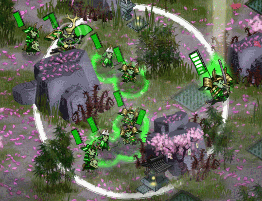
An infantry at the edge of his movement radius.
Immediately the analog nature of the space opened up the possibilities of strategy. The gameplay was no longer about picking the perfect grid square, but about how you flank your enemy or fake them out, as it should be.
When people complain about too much complexity in strategy games, they usually point to these systems with many layers of rules. But that's not inherently something the human brain can't deal with -- if you go outside and play catch with your dog, both you and your dog are acting out complex physics equations in order to play. So the key in making strategy more accessible is to make it something the human brain has a lot easier time parsing.
By removing the grid, we made the strategy of army positioning more nuanced, and something players could more easily learn to intuit. There's a lot more room for finesse, and depth to how you maneuver your units, which people can pick up over time. As opposed to being presented with a ton of options or grid squares, each with their own set of data (advantages/disadvantages), these distinctions become easier to parse.
We spent a lot of time trying to bring the details of the battle to the player's attention without the need for a long, complicated list of details.
By really focusing on the subtleties of how an enemy whips out his sword and jumps into an aggressive stance when you come in range, or winces when he becomes a target of an attack he can't counterattack, we set up a system of immediate feedback that was built into the gameplay as opposed to stopping, checking distances, and doing unnecessary calculations.
The health flag took many iterations, but in the end it became a great, simple mechanism where anytime you target any enemy, both of the samurai flags on the units' backs would show their total hit points and how many HP both units would lose in the altercation at the next touch of the attack button. Almost all the information the player needs is immediately where their eyes are already looking.
Augmenting all the visual design was a strong, iconic sound effect for each action. As you pass by potential targets, they whip out their swords, with the unmistakable grind of a sword being pulled out of its sheath.
Targeting an enemy at a range, you might miss, and you hear a whiff sound. By simply walking around your allotted movement radius each turn, you can see and hear how many units you could potentially attack without needing to do any calculations at all. From-the-hip strategy gaming!
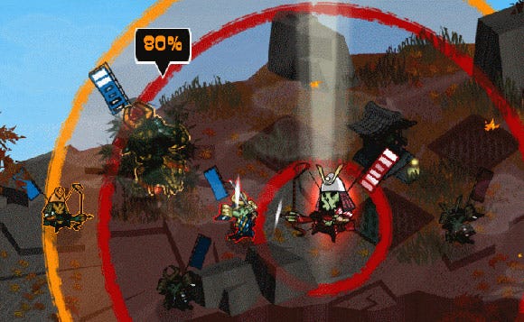
An archer targeting some enemies. Orange-tinted units are missable, whether they are on the outside of the attack range or hiding in bamboo. Units that will counterattack have their weapon raised. Health is shown on the current targeted unit on its flag. Potential damage is shown on the current target in the form of black health bars. While not targeting, enemies within range will gleam white or orange (if they are attackable and/or missable).
Multiplayer was always a big focus for us. By speeding up the gameplay, we wanted to allow for multiplayer, which often isn't an option in these kinds of games because it simply takes too long. As we age as gamers, fun multiplayer experiences revolve less and less around twitchy action experiences -- we just can't keep up. At the same time, we want a chance to socialize with our friends while we play, instead of just screaming for covering fire.
Tied to speeding up the gameplay, we wanted to capture the dramatic nature of a really good basketball game (or say, a drunken flag football game). In early playtests we would have tense, dramatic matches that boiled down to two demon shoguns finally clashing after a tough battle. But we also had matches where one player would be beating the other player down slowly, taking far too many rounds to do it.
We immediately cut out some standard conventions that just slowed things down -- like not being able to use a unit in the turn it was created. We set up the game resources to play to a strong endgame.
Rice, which you gain from captured rice paddies every turn, was limited so you could only gain rice from them for six turns. This prevents players from ever reaching a stalemate where each side has the resources to maintain their position, but not advance. At some point, rice will run out, and players will have to make a final stand.
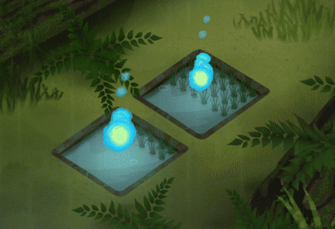
Two rice paddies, in the middle of being depleted.
At the same time, the other resource in the game is the unit's skulls. As you kill your enemies, you can eat their skulls to gain more health. After you eat three skulls, your unit turns into a demon, which means that unit can attack twice per turn if you assign it one of your five orders, as well as having twice the hit points of a standard unit.
If a unit dies, any skulls they've eaten drop to the ground -- free for anyone to eat. As units die during a game, that naturally means there are more powerups. So the last fighting units will typically be heavily powered up, given a sense of increased stakes for the player.
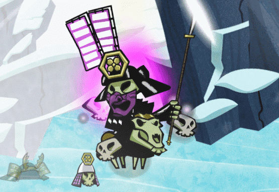
A cavalry unit that's been powered up to a demon by eating three skulls.
Typically units take two to three attacks to kill, depending on the unit and the attacker. As demons have twice the health of a normal unit, it can take as little as three or four attacks to kill a demon (again, based on the units involved). So while a demon is a huge advantage because of its extra action and the value placed on the limited actions per turn, another player can still kill a demon in one turn, probably with an action or two left to eat some of the dropped skulls.
On top of this, melee units can knock back their targets while attacking. Getting knocked back over a ledge of any sort (cliffs or water) will cause the unit to die immediately (and not counterattack).
You can protect your units from most knockback by grouping them together to form spirit walls. These also act as collision barriers to block enemies and defend your own. One mistake in positioning and an observant opponent means any unit is always one short step from possible death.
Also, given that your general's life is the only thing keeping you from the losing the game, one small mistake in using him can cost you a match that you were otherwise winning.
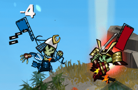
An infantry unit knocking an archer off a ledge.
In this way, we provide mechanics and advantages that are high reward, but high risk (or which can easily lead to a loss). That can give players a sense of power and accomplishment during the match, but they must stay on their toes in order to maintain any advantage. So the player that is ahead in the match can fluctuate wildly, but players feel like that change is due their own skill or mistakes.
Most turn-based and real-time strategy games boil down to some sort of rock-scissors-paper mechanic. We thought it would be interesting to purposely step away from this model and try something different. The high concept of the main three battle units was to give each one distinct strengths and weaknesses, where the strategy was to make the most of their given strengths while avoiding allowing the enemy to exploit their weaknesses. The real strengths are allowed to shine when intelligently used together, as well as minimizing their weaker attributes.
For example, the infantry units have great defense, and can take a lot of hits. They are the equivalent of a linebacker, holding your defensive line. They don't move far per turn or have particularly great attacks, but they are great at advancing a strong line of defense, and they are the cheapest unit to buy. They're usually too slow to go on any major offensive push but an excellent support and defensive unit.
The archer, on the other hand, has very weak defense but an amazingly powerful ranged attack. By keeping him protected by infantry, you can soften up enemies safely from afar, while having an infantry bodyguard rush in to finish off the damaged enemy before he can counterattack. One isn't particularly better than the other, but used in conjunction well, they become much stronger.
Most games in this genre can boil down to puzzle games, where a certain unit is always the right antidote for a certain enemy. Anti-air vs. aircraft, for example, is not a lot of fun when you have a great fleet of aircraft and the enemy just quickly builds up an anti-aircraft front line. This gives players a range of expression for the strategies they want to follow. Even more importantly, though, it helps prevent multiplayer matches from turning into slugfests where one player has rock and that player is just beating the player with scissors for over 10 minutes.
Forcing ourselves to convey all needed information to players as quickly as possible forced us to streamline our mechanics and only keep what we could explain. Making sure the mechanics and the resulting dynamics stayed open and didn't force players into one best approach -- with opportunities for dramatic power shifts -- gave us a whole range of strategy so we didn't water down anything while we were trying to present that information as clearly as possible. Having a clear mandate to apply to any new possible mechanics that came up let us stay true to the spirit of the genre we loved, while giving it a needed kick in the rear armor.
Read more about:
FeaturesYou May Also Like