Trending
Opinion: How will Project 2025 impact game developers?
The Heritage Foundation's manifesto for the possible next administration could do great harm to many, including large portions of the game development community.

Featured Blog | This community-written post highlights the best of what the game industry has to offer. Read more like it on the Game Developer Blogs or learn how to Submit Your Own Blog Post
Getting the correct balance of any game is critical and extremely challenging. Here's how we went about doing it for 1993 Space Machine, while also touching on design. #indiegames #retrogames #amigagames #gamebalancing #gamedev #shmup #gamedesign

1993 Space Machine is a classic shmup ala RType, IO and XenonII and was originally made for the Amiga 500 in 1992-93, but finished in 2016!
First, why make a game in a genre that is as good as dead? Well, because we love the genre and always have. Simple as that.
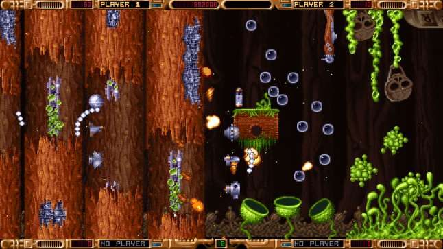
Going into this project I expected a more straight forward approach than what it came to be and I learned a lot. Level and boss design plus balancing was really challenging. But also very rewarding. Here's a brief summary of that process.
Euroshmups
When we restarted this project I came to realize what the term 'Euroshmup' means and that our game definitely was one such game. Since our game is heavily inspired of games we loved and played on the Amiga in the 90's there was no way around it. But taking a good look at what people really don't like about Euroshmups we tried to shave off the worst offenders like small and fast enemy bullets, weak weapons and turning the health bar to a unique game mechanic etc.
Balance is key here - Euroshmups aren't famous for having a good balance at all, which is why I spent so much time focusing on that.
We did want to keep the in-game shop though, since we felt it added a bit of depth to the game as well as giving the player an opportunity to take a breather.
Level design
Before going into the level design I did some thorough research of games I liked in this genre. I would study and take notes of game play videos of such things as speed of bullets, number of enemy types per level, scroll speed, boss fight length, amount of points given and so on. Primarily I looked at games like: Hydorah, XenonII, IO, Raiden, Battle Squadron, Swiv, Project X, Life Force, RType, and Banshee. In other words - retro shmups.
The levels were built in the Unity editor with some custom tools our developers made in order to speed things up a bit (snap and clone functions etc).
The design process involved both environment structure and enemy placement as well as enemy behavior consideration to make these two major elements complement each other. For instance; an open space can harbor more powerful enemies since the player has more movement options. Narrow spaces is better suited for smaller but trickier enemies.
I would approach the levels in sections that had a bit of its own character. These sections would harbor certain types of enemies. Then the sections could be repeated later on in the level with slight variation. Gradually introducing new enemies throughout the level makes the player feel that there's always something new on the horizon and keeps the interest going.
Often one type of enemy alone didn't make for an interesting encounter. If we instead combined two or more different enemy types there would be a much more challenging and rewarding experience that would require more skill and effort by the player.
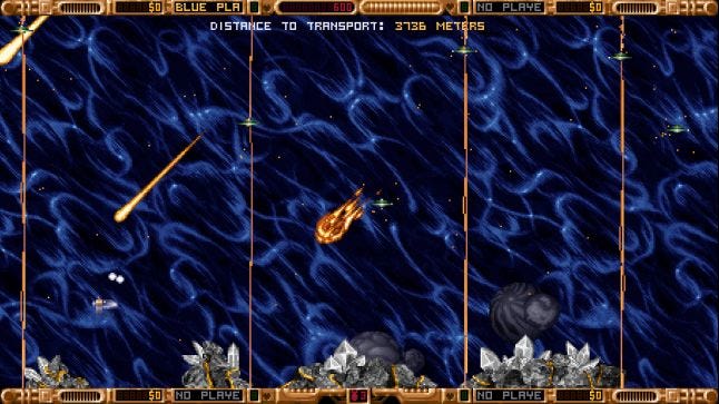
This patch of space was at first only occupied by a comet storm. However, I never managed to get it feeling interesting enough - until I added the small laser probes. All of a sudden this is one of the most challenging parts of the game.
When I felt I had achieved a good variety and sufficient challenge in the level it was the developers' turn to take a stab at the level in terms of implementing all the behaviors. What I would get back after a few weeks was a VERY rough level with variables exposed on each enemy that I could change in order to balance it all. This rough state of the level would feel hopelessly bad, almost to the point that I would freak out and give up. But after a good number of days, and many play sessions later; balancing numbers here and there, it would result in something completely different - an actually playable and enjoyable level.
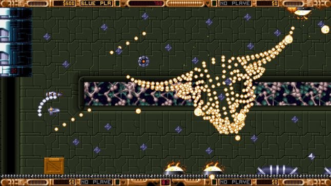
A hidden bonus level - Nestors lab.
Bonus levels
When I found some lost graphics and all the levels were more or less done, I figured I could make a bonus level from those assets, and mix it up with some of the other content. This allowed for some experimentation when it came to how to best use these assets in a setting like this. Some palettes needed to be adjusted for this to be cohesive though.
While making this I got the idea of a bullet pattern that would actually look like something that is not just a geometric pattern. So I used an old bullhead that've made in 3d earlier and one of the developers parsed the null objects in that file; to use them as locators for each bullet in the game. I have to say that it looks really cool and fits the theme splendidly.
Enemy design
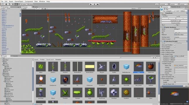
Designing the enemy behaviors was one of the high points in development. It was this part that gave life to the flat pixels that had been created more than two decades earlier.
The goal was to achieve as much variety as possible. With almost 100 different enemy types this was a challenge, but a fun challenge. The secret to make each enemy interesting often lied in tweaking the variables for its behavior to strike that vital balance. What that balance is though; is very subjective. In rare instances we just wouldn't get it right and those enemies were dropped altogether.
The bosses were obviously the most elaborate foes. Finding attacks that would complement one another was quite difficult and we collaborated more and tighter inside the team when developing the boss fights. The worm in the forest was by far the hardest to get right. It was incredibly hard for a long time before we got the movement of the worm right.
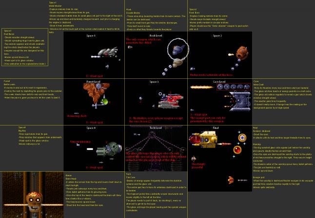
These notes reflect some ideas that were dropped in the end. For instance all the red texts shows an idea that the player would need a specific weapon for each boss. We never came to an agreement how this would work so we scrapped it.
Balancing and in game economics
Balancing was by far the hardest part of development. I spent a year balancing and tweaking the levels, enemies, economy and weapons. Despite that; I've seen reviewers write that the game is notoriously hard while others find it to be a walk in the park. It's not really a unified verdict to say the least.
There are so many aspects that affects the difficulty level of the game and that's one of the reasons why it's so hard to get right. The other major factor is of course the player's skill.
During the year of balancing we made the game easier all the time by different means. At first we had collision with the environment that would harm the player, we had a faster scroll speed, more narrow spaces, quicker enemy bullets, limited amount of lives etc.
The toughest two main things to get right was:
How much currency to hand out in the form of crystals in relation to the weapon pricing?
How much damage would each of your weapon deal and what would the upgrade boost be?
To address these I made more or less qualified assumptions and went from there and started testing to see what felt right. Then, after tweaking, we would test it on other people.
For instance, we assumed that at the end of the game the player should be able to have a maxed out ship with truly bad-ass guns. We split that cost, for the weapons, between the levels and then we decided that only certain enemies would drop crystals. The bosses would naturally drop most of those crystals to create a climax at the end of each level. This was a fair starting point that proved to give the player too much crystals, so we backed down a bit. We also had to decrease the amount the player got, when selling a gun, by half.
As for the player's gun power; I would've loved a tool that could tell me the amount of damage dealt in X amount of time and how much enemy health are on screen at any given time. Now I had to estimate an appropriate attack time for each encounter before they're blasted to dust. This was more of a feeling than a proper method. But hey, that's how art is done.
The crucial step to get closer to an even ramping difficulty level is to test on others as much as possible. Off course as an indie this presents a bit of a problem and we went with the most convenient way of inviting friends to nightly sessions. For these we implemented heat map generation which was truly helpful in spotting the worst death traps.
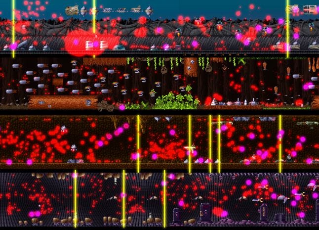
Red dots show hits, purple show deaths and yellow show game over. This is before we added endless lives to the mix. Big fat red blobs showed us areas that needed some more attention.
Hardness and content
In retrospect we now know that most players on Steam feel the game is too easy and that comes mostly from the fact that we gave the players unlimited amounts of lives. This was a deviation from the original design, but I started to question why I loved and played those old games as much as I did. The answer had a lot to do with so called 'trainers'. Trainers were modes were you could start the game with different cheats. So in essence this gave the game more value since it increased playtime a lot (where I had given up much earlier otherwise). It just felt dumb to put so much effort into a game that most people would only see the start of. This is also why we expanded on the teleporter system; to allow the player to go to any planet they want right from the start.
This meant however that the game becomes easier and thus is finished quicker considering that we didn't ramp up content production because of this design change. On the other hand, we could have reused our assets to a much greater degree. There's a lot of variation in the game. Now I think making four levels of each world would've been no problem. It's an art in itself to reuse assets in a smart way, but it's easy to be wise in hindsight.
Read more about:
Featured BlogsYou May Also Like