Trending
Opinion: How will Project 2025 impact game developers?
The Heritage Foundation's manifesto for the possible next administration could do great harm to many, including large portions of the game development community.

Featured Blog | This community-written post highlights the best of what the game industry has to offer. Read more like it on the Game Developer Blogs or learn how to Submit Your Own Blog Post
"How do you re-teach players a genre they take for granted?"

When I first got the idea for Brain Putty, I thought it would be pretty easy to teach players the game. At its core, it's basically a match-three game and it has similarities to different popular board/card brain teaser games that have existed for a while. I figured that once I explained the basic rules and how to match objects, players would catch on pretty quickly.
I was wrong.

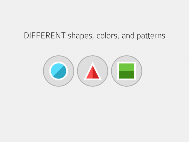
A screenshot of the final game's tutorial.
SAME OR DIFFERENT
If there's one thing people take for granted in a match-three--it's that you match objects that share a common attribute. Brain Putty is a bit different--in order for three objects to be a match, each attribute (Shape, Color, Pattern) has to be ALL the SAME or ALL DIFFERENT. This turns the game into more of a fast-paced brain teaser than a traditional match-three.
The difficulty in explaining this to players is that they default to what they know. Most of my playtesters were able to deal with more than one attribute being required to match when they were the same. But when they were presented with having to match attributes that were ALL different, they drew a blank.
This was something that I knew I couldn't totally solve in a tutorial. While the game's tutorials do address this by guiding players through pre-set ALL DIFFERENT combinations, players need to do it for themselves to reinforce it. In the "mini" rounds that follow each tutorial I purposely turned off hinting to force players to figure out what constitutes a match before proceeding to the next tutorial.
Additionally, I added contextual hinting when players get stuck in an actual game. If the player doesn't touch the board or hasn't found a match in a while, the game animates a match to the player. A lot of times, these end up being ALL DIFFERENT or hybrid different/same combinations. Once the player has seen and processed a couple of hints, the game starts to make sense and they begin to match objects on their own.
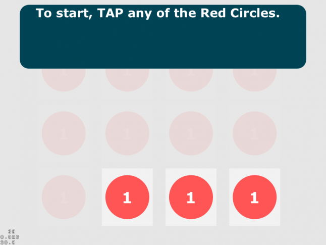
 A screenshot of an early build's tutorial in the game.
ADJACENCY
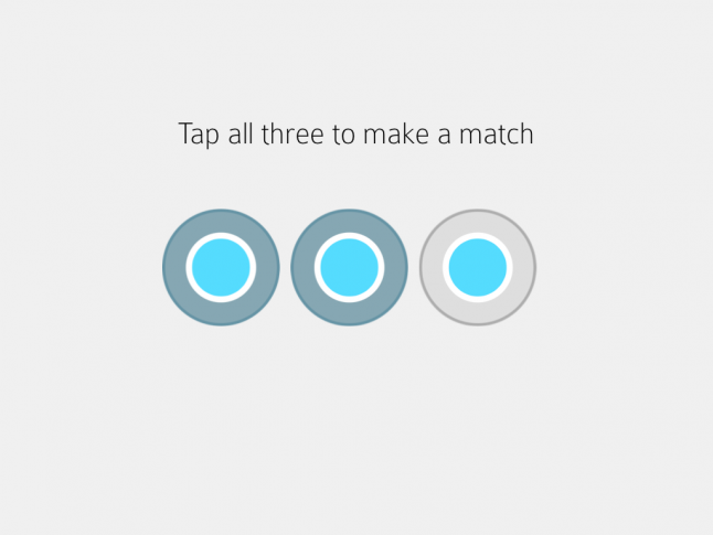
For most players, they expect certain familiar rules when they play a match-three game. The input mechanism is usually swiping to swap tiles or dragging to select a chain of objects. There's an implied sense of adjacency being important--that objects are connected together by a common attribute (usually color). In Brain Putty, objects don't have to be connected to be a match.
This was something that players were confused about until the final iterations of the tutorial. The screenshot above highlights this--it looks like the three circles have to be in a row to be a match. Ultimately, I added another tutorial screen that explains that objects don't have to be adjacent and lets players play a "mini" version of the game after each tutorial to reinforce this.

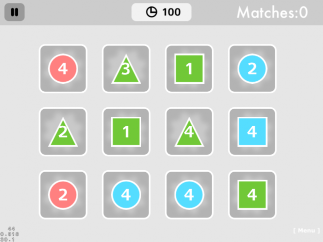
A screenshot of a later version of the game.
THIRD ATTRIBUTE
Initially, each object in Brain putty had three attributes: Color, Shape, and Number. The Number attribute could range from 1-4 (depending on the difficulty of the game). While it basically served to add difficulty in matching objects (3 attributes vs. 2), the visual representation was clunky and it was confusing to players.
As a result, the number attribute got changed to a "visual pattern." The pattern was embedded as a gradient in the shape and could be either Horizontal, Vertical, or Diagonal. I thought the shift from an abstract concept (number) to something purely visual would help players grasp it better.
Once players got the pattern concept, they liked it. Until then, they were frustrated beyond belief. The challenging issue was that players weren't seeing that pattern existed at all. Most thought it was part of the Color attribute or the visual design of the shape itself.
This wasn't an easy issue to fix--I went through many iterations of the tutorial before having a 90-95% success rate for players totally comprehending how to play the game. The biggest stumbling block for players was that the initial tutorial was one part. Players were inundated with a lot of information and expected to retain it when heading into an actual game.
To remedy this, I broke the tutorial up into three segments. Each segment went over one attribute (Shape, Color, and finally Pattern) and guided the player through an interactive tutorial. After the tutorial, the player would play a "mini" round which would reinforce what they had been taught.

A screenshot of the final game's tutorial.
IMPLICIT KNOWLEDGE
Given that I was relying on teaching players concepts that were unfamiliar, it became very important to rely on mechanisms that they did know to bridge the gap. One of the first areas I focused on playtesting was the "feel" of selecting a shape. My goal was to have shape selection/deselection and feedback on a match be very intuitive.
I tried to keep the interaction model as simple as possible. Tap to select a bubble (and see its color change) and tap to de-select (and animate a bounce effect). Tap three bubbles that aren't a match and it results in all three bouncing and playing a squish sound effect. If you tap three bubbles that are a match, they disappear and the user's current score fades in/out over the first selected shape.
To help reinforce this, the first action a user does in the tutorial is to select a shape. The second action is to make a match. To reduce complications, users can't de-select shapes during that phase of the tutorial. This way users will immediately get the interaction model and it will be reinforced as they are presented with the rest of the game rules.
This ended up working well from an early state--users had no difficulty understanding how to select/deselect shapes to form matches.
CONCLUSION
Brain Putty was a challenging game to build and test but ultimately early user feedback helped to greatly improve the new user learning experience.
Check it out on iTunes: https://itunes.apple.com/us/app/brain-putty/id888067880?mt=8&uo=4
Read more about:
Featured BlogsYou May Also Like