Trending
Opinion: How will Project 2025 impact game developers?
The Heritage Foundation's manifesto for the possible next administration could do great harm to many, including large portions of the game development community.

Featured Blog | This community-written post highlights the best of what the game industry has to offer. Read more like it on the Game Developer Blogs or learn how to Submit Your Own Blog Post
The goal of Brass Tactics started simply: Make an RTS that embraced the medium of VR... Luckily, we were blessed with a lot of freedom to explore what that meant. As we iterated towards the final product, we made a lot of interesting stops along the way.

In the fall of 2015, Hidden Path made a pitch to Oculus for a game with a clear and understandable premise: To create a real-time strategy game with a miniature clockwork aesthetic. It was clear and inspiring... The company had a long history of exploring games in the RTS vein, and were eager to make a full-blown strategy game in VR. We had all seen the introduction to Game of Thrones and found it an excellent visual inspiration. But, what the game truly would be was still a fairly blank slate... 'Real-time Strategy' could mean a lot of things after all, and VR had very few precedents in the strategy genre.
In the project's first months, we were eager to get going, but we only had a team of 1 or 2 at our disposal... We knew we had to get a grasp of the scale, pace and strategic level of gameplay that would be used in Brass Tactics. Luckily, Oculus had generously given us a few months to really investigate and explore what RTS would be like in VR. It was a perfect opportunity... we didn't have to make any assumptions, and we were encouraged to build a game that felt natural to play in VR that just happened to be a strategy game, rather than take the standard 2D RTS mold and shoehorn it into a set of goggles.
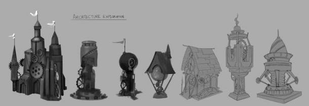
We quickly formed some pillars (primary design goals) that helped us prioritize our feature set as we proceeded:
Accessible RTS Gameplay: Create a game that would be immediately recognizable as classic real-time strategy, even as the trappings of VR transform the experience. Our audience should feel comfortable and not intimidated by the mechanics or interface.
Innovation in Interaction: While the gameplay would be familiar, this RTS experience would evolve to take advantage of VR and the Touch controllers, replacing cursors and menus with a tactile experience where players physically manipulated their environment and units to achieve victory.
A Tangible Play Space: Brass Tactics would be presented as an elaborate game made possible by wondrous clockwork creations. To keep the player immersed in this environment, we would not move or teleport the player, but rather present functionality via intricate machinery.
Knowing that we didn't want to just assume anything about the world we would interact with, I launched into exploring the type of world the player might interact with. A wide array of possibilities came about...
Regardless of how our game played, we knew that we wanted to be as immersive as possible, and not have it feel like a fiddly strategy game. We wanted the experience in the game to be as physical and tactile as we could get away with... and to obey physical laws whenever possible during interaction with the environment.
One of our earliest concerns was research that suggested that players may not be comfortable with virtual objects interpenetrating their body when in VR... that people may have instinctual reactions to virtual objects punching through their midsection. This put us into an interesting situation... We knew we wanted to use the Touch controllers and physically interact with things, but wanted to explore ways to avoid moving through the board to do so.
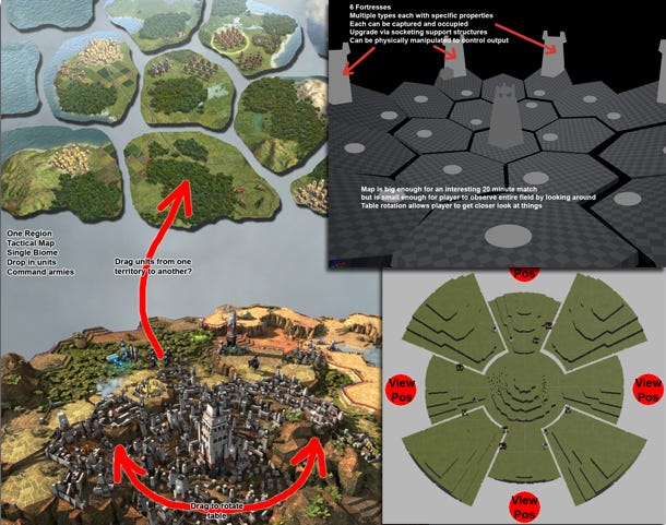
That early in the project we found ourselves lacking any kind of engineering team, so I tried a lot of different configurations in simple (i.e. poorly-coded) Unity prototypes to explore this issue... Since we only had DK2 devkits and no Touch controllers, this was done with a mouse cursor simulating how a Touch would manipulate a surface by grabbing it. This included:
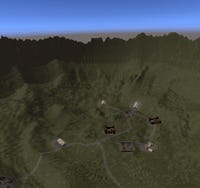
Taking height-mapped terrain, but wrapping it around the player, who then plays within it. The idea is that nothing is incredibly far away from the player, and they can get a good view of the situation by simply turning their head. This could have been interesting but it led to a strange disc-shaped world that we quickly discerned would have been hard to understand... It was like being stuck between the inside of a half-globe and a regular terrain valley.
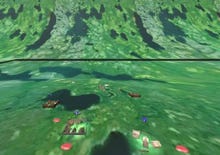
We put the player inside a rotating cylinder, like a fat halo... This put a lot of stuff within reach, and allowed the player to be near things and rotate by dragging the world in front of them. Unfortunately, even with a few spots on the map to focus on, it was incredibly nauseating to be inside of... probably the most unpleasant feelings we experienced in these tests.
One way to put forth a world that the player can interact with is to put it all on a globe, and let the player rotate the globe at will. This gave a 'god game' feel to interacting, which certainly would have impacted the gameplay. Nonetheless, the globe (like the bowl and barrel) somehow took away some of the tangibility since we would be changing gravity around its surface. However, rotating the globe in front of you would have been a great feel for a non-mechanical game for certain.
Like the barrel, we once asked 'what if the player was on the inside of a globe, with all gameplay happening around them (like a Brass Dyson Sphere?) It certainly would be even more gameplay within relative reach, but it proved even more nauseating than the cylinder before we even got the whole thing running.
Still wanting to explore ways for the player to belly-up to the gameplay but still not interpenetrate the map, we explored ways to 'cut out' portions of the map, so that a large amount of interactive arena surrounded the player on three sides, where the player could also teleport between four different 'cutouts' on the map. This would have required teleportation, as well as the possibility that the opponent would also want to occupy the same area (which was actually extremely likely, since they would probably be controlling combat in the same area as you would). It also involved teleportation, which still removed player's sense of place and (along with rotation during the teleport) created disorientation.
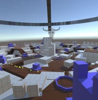
A variant of the 'cloverleaf' method was to put the player in a fixed location, and have them make all the relevant map decisions from that location from their location. There certainly are examples of strategy games where the player simply spawns units and sends them forth (our comparative example was Nexus Wars for Starcraft 2). This sort of play can be compelling but there are a few issues there. First is that since the player isn't directly controlling the units, it can take a bit of time to understand how the matchups work. More importantly, the player doesn't get to be near the enemy base when killing it... that felt significant since at a triumphant moment, you're peering at something going down ten feet away... and feeling left out.
This was one of our favorites when we were focusing on keeping the player outside of the world geometry. We continued to speculate that a turntable would manage to keep things interesting and yet allow players to get close. One thing that helped this was to start thinking of Brass Tactics as similar to a miniatures game like Warhammer or games that take place in a single city. The urban layout might have theoretically given us a way to compress the space within the turntable and use tiers, roads and obstructions to squeeze the most possible gameplay into a limited space.
You'll note in the prototypes in the video that in many of these maps had holes punched through them... It was important for us from the very beginning to make sure the player felt 'anchored' in the room, and that the table itself was being moved. We thought that if we could see the floor through gaps in the map that the player could avoid some discomfort. It could have added some neat flourish to our 'play table' aesthetic, but it was a lot easier to make maps that didn't have this particular limitation.
We came out of this process with a better understanding of world sizes, object size and scope, and the distance at which you might have been able to interact. Taking some inspiration from tabletop did give us a target for the sort of elegance and intricacy we could represent. Miniature gaming tables had created some amazing worlds and objects in that scale, and with the proper physicality and materials we could make the table seem 'luxe'... and this gave us a good target for the art explorations in the months to come.
You'll note, of course, that we still hadn't settled on the 'table dragging' method we have in our final product... we still were still serious about a turntable. The idea of a round board was compelling enough that the art team did a paintover of one of our rough city boards, and some concepts visualizing this round map set in a grand War Room. We stayed with this idea until the project got more of a team.
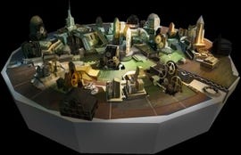
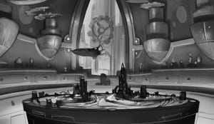
Coming out of the early experiments, we had a better sense of the world scale we'd be dealing with... Rather than playing at a nation level with major cities and a heavy economic component (as the Game of Thrones intro might have implied), we would have ramps, stairs, and buildings, and units that were a couple of inches high. However, our earliest prototypes still were created with a mouse acting as a proxy for a Touch controller... a right-click drag would move the world and a left-click would direct units. Once our project was officially approved, we could finally bring some real engineers (yay!) to really dig into world interaction.
We also had another issue that our initial turntable world presented... limited map size. We still wanted players to interact with units and towers very directly, by touching them if possible. However, if we stuck with the turntable layout and didn't want the player to be able to 'step into' the table, we'd be limited to a play space with only a few feet in diameter. Worse yet, the larger the table got, the further away the player might be from the action. As you can see from some very early table experiments in the video, we experiment with flat maps with grab-pull mechanics at times, but we had to gain a greater certainty that players would not feel uncomfortable. (Remember, this was two years ago and at the time comfort was priority number 1, 2 and 3 in VR).
Luckily, we were finally able to acquire some Oculus Touch controllers so the engineers could set up some real hands-on interaction... and the results were really great. We implemented the turntable movement successfully with the Touch controllers, but table movement by dragging a flat map was even more promising. The connection to the world that the player gained by physically dragging the map with their hands reduced discomfort immediately, eliminating the 'weird' feeling of the table penetrating the body. Also, nausea was greatly reduced over the experiences we had moving the table with the mouse or via the stick. We were glad to know that we could deliver an experience with a map that was as large as we wanted, and more importantly we were happy that we could create units and interactions with intricate features that players could get up very close and appreciate.
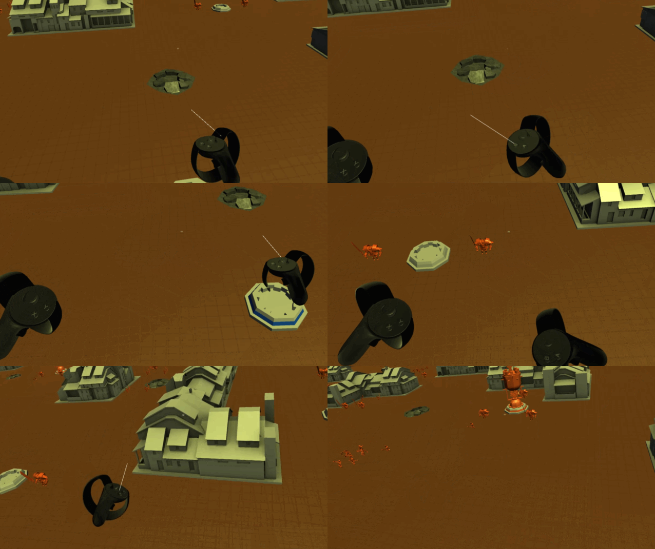
The last piece of the puzzle came as early testers were still seen struggling to move around the table. It was important to us to avoid 2D game crutches such as minimaps if possible, but it was critical for players to be able to move from conflict to conflict quickly. However, a segment of players still tended to 'crawl' along the map as opposed to 'throwing' it as intended. People's arms were getting tired because of how much motion was demanded... There was still doubt. Luckily, we observed that some of the more adept players tended to use their wrists as a fulcrum to get extra speed when releasing the map. This led to the addition of an 'extension' to the player's hand (what we often called a 'hook' that 'grabbed' the map), which allowed players to amplify motion with a flick of the wrist. Finally most players were able to cruise from one end of the map to the other after only a minute or two of practice. This was the last piece in the puzzle that cemented the control system of Brass to be as intuitive and precise as we could manage.
Starting during this time and continuing into later months, there were new gameplay questions to be answered. We were happy with our table movement but the tension between creating controls that were both physical and responsive was just beginning. More on this next time.
Read more about:
Featured BlogsYou May Also Like