Trending
Opinion: How will Project 2025 impact game developers?
The Heritage Foundation's manifesto for the possible next administration could do great harm to many, including large portions of the game development community.

Featured Blog | This community-written post highlights the best of what the game industry has to offer. Read more like it on the Game Developer Blogs or learn how to Submit Your Own Blog Post
In Part 2 of this Postmortem of Brass Tactics, we explore the evolution of unit manipulation and learn some of the things that worked surprisingly well in VR.

It was now early 2016... and we were starting to get a feel for our map size and player table control in Brass Tactics. Our movement wasn't yet at 100%, but we had to move on to the next major issue: how the player would interact with their units. Delivering a great strategy combat experience was critical, but we agreed that the work was meaningless if it did not feel comfortable in VR... We needed a hands-on feel and precision that allowed the player to feel in control rather than vaguely flailing at units.
The path we followed towards our final control scheme had a lot of interesting turns along the way.
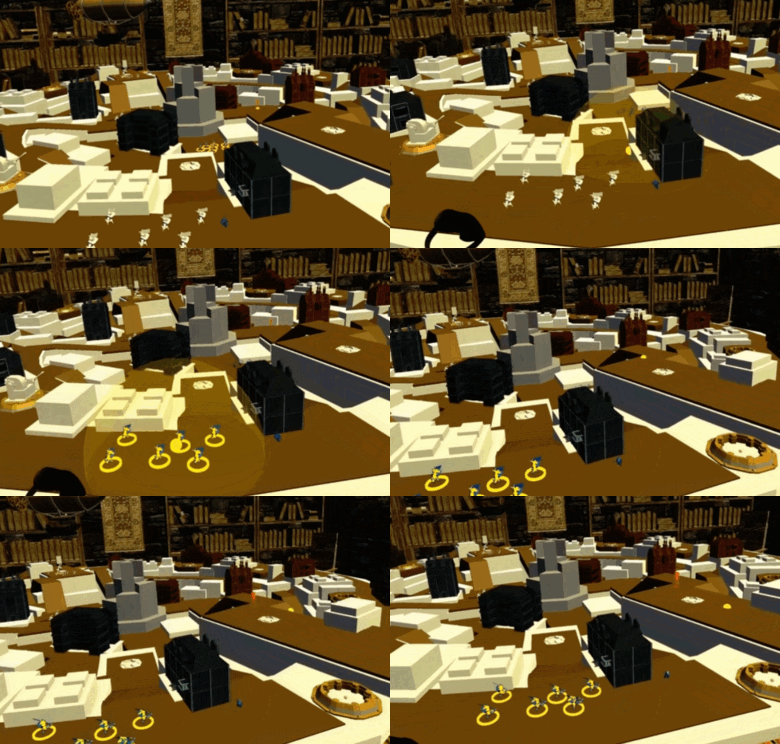 We knew we wanted a classic-scale RTS units moving around the board, similar to playing with plastic army men. However, the sky was the limit for how they would be controlled. The only thing we had tried by then was the rough prototype hacked at the very start: The player could select units individually with a sphere "brush" using the mouse (we did not yet have Oculus Touch at the time). Left-click selected a group, and right-click sent them to a destination. This was pretty standard RTS fare, and at the time we didn't even know if the player would have to select at a distance... our table-dragging solution was a ways off.

During those earliest days we hadn't decided whether the player would control full rigid army formations, or attack lanes, or even pick up and drop units directly. We discussed ways of grouping and controlling units, and how to make it as tactile and hands-on as possible. This blue-sky period gave us all sorts of bizarro possibilities on paper, from digging squads out of commander "boxes", to "vacuuming up" units from one part of the map and "blowing" them elsewhere on the field, to sending squads out and nudging their path via foosball handle-controlled blockers:
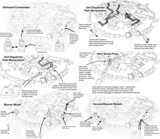
However even with that earliest mouse control mockup, we noticed some issues... units got lost fairly easily on the table, even with our fairly small rotating table map. UI would certainly be needed to help the player keep track of things, but a classic ring or health bar over every single unit threatened to take away some of the physical toy feel. Moreover, we wanted the player to field fairly large armies, but wanted to avoid too much fiddly work managing them. This encouraged us to lean towards controlling units under some sort of grouping mechanism to keep the controls more manageable.
Luckily the early concept of "painting" multiple units felt good even with the mouse. Its success influenced the development of many of the ensuing experiments.
The addition of Oculus Touch in March allowed us to shed the 2D-wannabe feel of using a mouse, and really freed us to explore and embrace everything that felt good in VR. We immediately went to work on some possibilities:
The very first technique we explored was the most obvious: The classic laser pointer. It is a common solution, and is immediately understandable to players, which were both advantages. However, it had some accuracy problems, particularly when the player targeted something distance: The player's wrist could get inaccurate and shaky, especially over time... and even the smallest tremors are amplified when the pointing at a distant location. In addition, the player's wrist could get tired because the user relied on it a great deal, even for large gestures.
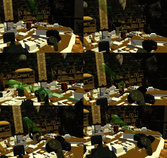 Since the player was already inaccurate at a distance, we wanted to try a scheme that "accepted" this inaccuracy. A "flashlight" cone allowed players to act with precision up close, but expect more "sloppy" selection when dealing with targets at a distance. Removing the expectation of distant accuracy and essentially embracing it did improve upon the laser pointer, but it also created some unexpected quirks in how different players used the feature. How do you hold this flashlight? Some players tilted their hand forward and held it like a real flashlight. Some acted as though it had a pistol grip. Some people even suggested holding it "cop-style", with the beam coming downward from the controller.
The programmer who implemented the flashlight prototype had a fun solution to help us explore the angle. He made it so the player could adjust the beam to any angle he/she wished by "grabbing" the beam and pulling it into the desired position. This was fun and let us try many angles quickly.
The flashlight was good, but a cone like that had no specific collision point to stop the beam (unlike a laser pointer), so it had a tendency to select things behind the desired unit and in the foreground halfway down the beam. We could have implemented something to stop the beam, but it felt like a rabbit hole that would end up with some concessions. In the end we wanted something with the precision of a laser but the extra "slop" at the point of impact... something that felt like the spherical paintbrush from the mouse-controlled days.
And so we tried out the "lollipop"... A laser pointer with a consistent-sized sphere at the point the laser intersects with the ground. This helped a fair amount because the player had the precision to point directly at the area they wanted but still could "paint" over additional units nearby the target. 
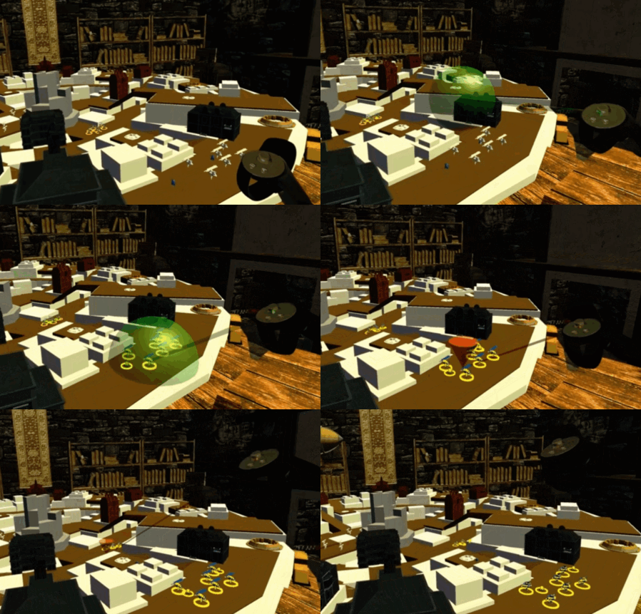
The Lollipop was working okay, but it was missing something... We had always fantasized that when a unit was close the player might reach down and put their hands directly on a unit, harkening back to "playing with toys in a sandbox". It was a magic of using Touch controllers that we wanted to give a fair shot. However, the Lollipop wasn't ideal for this. For this reason we tried adding a sphere to the hand on top of the lollipop (sort of like a dumbell?), trusting that the player could use one or the other without them getting in each other's way. Despite it looking like a franken-interface, it felt okay and seemed like progress.
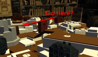 As we mulled over the best way to select units, we knew that it was only half the control equation: We still had to have a method for players to direct units after they were selected... in RTS parlance, the "right click" to follow the "left click". Our logical first step was to look back to the classic laser pointer again: It indicated a single destination point, and players understood it. Seems like a no-brainer, right?
Once again, accuracy reared its ugly head. The player still had trouble directing units to somewhat distant spots... This was largely because unlike selecting units, the player frequently had to target the ground when directing units. A patch of ground on the other side of the map might be large, but from the player's perspective might only be a sliver of visual real estate.
In the Lollipop example above, you can catch a glimpse of how players tended to direct their units when using a laser pointer... they held their hand high in the air and twisted their wrist downwards to get the most precision on that horizontal surface.

Luckily, Hidden Path at that time wasn't a babe in the woods anymore with VR games: The company had recently completed Defense Grid 2: Enhanced VR Edition, and we had a good amount of learning about VR input control was in our back pocket. In particular, it had a control scheme we wanted to try out in Brass.
Being an Oculus Rift release title, DG2:VRE (whew!) did not have the advantage of Touch control (which had yet to release), so the team had instead opted to use gaze to select its towers. That is, they placed a targeting reticule in the center point of the view so that the player used their head to make its selections.
So, we gave it a shot. "Gaze" was a solution that could be used for both selection (by projecting a sphere or brush at the target point under the reticule) and direction (by guiding the units to the exact spot indicated by the reticule). It ended up feeling quite precise as compared to a hand-controlled method... The human head does a pretty darn good job of being accurate when pointing at things, although you did have to train yourself to point your head rather than your eyes at your target.
In the wake of this success, the issue still came down to feel. It felt... functional. It worked great for Defense Grid, but it didn't take enough advantage of the Touch controllers that Oculus wanted us to feature... It didn't immerse the player in the fight. Aiming with your head is definitely good for hanging out in your armchair, but didn't quite hit the fantasy.
We still liked the physical action of "painting" over units and then directing them, so we swapped out the controls so that the player could have the physical feel of selecting units with their hands, while still having the precision at a distance via gaze selection. It proved physical and tactile (reaching down and "grabbing" stuff! Yeahhh!), but it was still difficult to reach all the units you wanted. A bit more exercise than a typical player might want. It wasn't quite ideal.
Then we hit a breakthrough. We liked pointing, but we wanted to change "pointing" meant. As mentioned above, a classic laser pointer gets inaccurate because it relies on the player's wrist to hit the correct angle... Small movements of the wrist, whether due to body jostling or whatever, had a significant impact on the pointing location at a distance. It was also also fatiguing, relying on wrist movements for a great deal of the control nuance throughout a match.
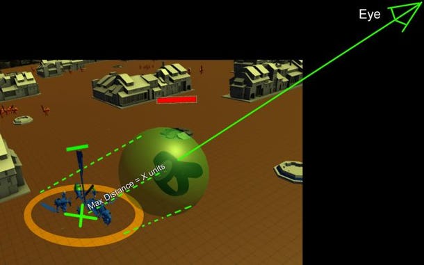
So, instead of using the wrist to determine the angle of the pointer, we used the shoulder to do so. We projected a ray from the eye to the hand position and directed past it to determine a point on the ground. Suddenly we required larger movements to make the same angular changes: Accuracy-wise this was far superior, allowing players to point at distant targets with much less fiddling. It also shifted the physical activity from the wrists to the arms, which could deal with the fatigue quite a bit better.
More importantly though, the player was no longer fiddling with an interface... they were making wider hand gestures to get the job done. They were truly pointing at their targets. It was immediately wonderful, and advanced the experience from a 2D mouse wannabe to a real VR activity The fantasy was becoming real.
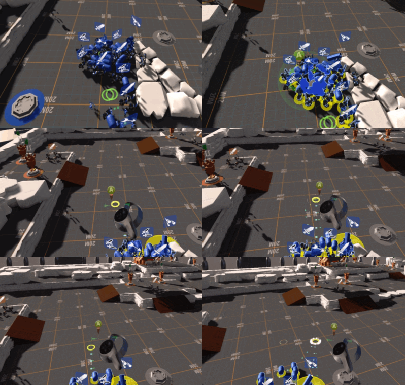 The final major change we made was more subtle, but extremely significant to the feel of the game. Up until this final phase, we had broken up the controller input into multiple steps, in the same way as a 2D RTS controls units: The A-button selected units, then a second button press directed them where to go. This felt like classic mouse controls, and had that familiar feel. With it came some feedback we had to address... How to make it clear to the player that they were select versus direction mode, how to cancel a move, or add to a selection... It was solvable, but it was enough that we didn't feel we were at our final control scheme.
On a whim we tried changing from pressing the A button (on top of the controller) to using the trigger. The player selected their units when the trigger was held, and sent on their way when the trigger was released. This basically changed our two-action process for commanding units to a single, continuous action... grab-drag-release It was unorthodox. But you know what?
It felt great.
Selecting and directing felt physical. You felt like a commander directing your troops more than ever. You felt a little cool, in a Minority Report kinda way. Believe it or not, you even kinda looked cool playing our game. (This is not a common thing for VR.) We knew it was a bit strange, but we had a feeling in our gut that this was the right choice.
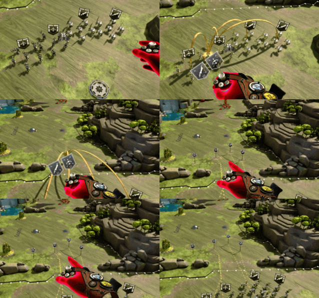 Having chosen this input method, we knew it felt superior, but we knew it would be a battle to train. We also knew it would also be a battle to deal with quirks caused by it. We had to deal with the fact that players might select things accidentally while directing units. This was handled by command extensions like half-pull for single-select, and squad-type select with the stick, as well as tweaking sensitivity over the player's gesture. These quirks were new to players, but we knew by now it was worth it.
We also wanted to embrace the near "dance" type motions the control method resulted in. We embraced ambidextrous controls, allowing players to use right and left hands equally... and even control two different groups of squads at once. A great player can become a maestro when standing and playing.
Nonetheless, we took on these challenges because the feel was so inspiring. No regrets... it became a core element of Brass Tactics that we are incredibly proud of.
In the final installment of the Road to Brass Tactics, we will discuss the wide variety of interaction experiments we took on to fill out our building and economy mechanics.
Read more about:
Featured BlogsYou May Also Like