Trending
Opinion: How will Project 2025 impact game developers?
The Heritage Foundation's manifesto for the possible next administration could do great harm to many, including large portions of the game development community.

Featured Blog | This community-written post highlights the best of what the game industry has to offer. Read more like it on the Game Developer Blogs or learn how to Submit Your Own Blog Post
The final part of this Postmortem of Brass Tactics examines the design of the economy of this RTS game in VR. This involved a fair amount of experimentation with interactions over the early phases of development.

Over the winter and spring of 2016, we had established two of the core interactions of Brass Tactics: Player Table Movement and Commanding Combat Units. However, while our second-to-second tactical play was pretty well defined, there was the whole aspect of long-term strategy and economic development that needed further definition. As usual we started with a very loose set of objectives and speculated as to how we might fulfill them, and then had some fun as we reached our target experience.
We knew that we wanted more hands-on activities, and pushed for more tactile interactions. However, from early tech demos and our personal experiences with VR we realized that it was important to have physical analogies that made sense. There couldn't be "movement for movement's sake". Pulling a lever to directly manipulate a machine that translated that motion into a result (for example to stamp some metal) is fine. Pulling a lever to accomplish the same thing as pushing a button was not good: it immediately felt fake and tedious.
We cast a pretty wide net during this period, and learned what interactions fit the RTS game model and what did not.
Towers are a core element of the game, the buildings placed on the map to claim territory, as well as being a source for various military units. The player needed easy access to towers during play, and interacting with towers needed to feel natural when built with the Touch controllers.
Our first speculation on tower construction was to have a "toy chest" of towers, a growing group of tactile objects that the player could pick up and place into sockets, and then remove them and socket them elsewhere on the map. "Resocketable" towers in this sense would have had a profound impact on how the game would play as an RTS, but the idea of picking up and placing tactile elements directly on the battlefield fed into our overall fantasy for VR.
There are a number of reasons we didn't keep the feature, but one of the most prominent was how it clashed with movement. The player used the same input buttons to slide the table as they did to pick up a tower, which immediately caused frustration when you grab a tower instead of moving the table. This sort of context-sensitive input works fine when the player has to make a deliberate action or the game's pace is not too high, but table movement is key to success in Brass Tactics... We couldn't sacrifice that.
We could have moved tower pickup to another button (such as the trigger, as we did with upgrades), but then it would have clashed with unit direction instead, simply moving this issue to another button.
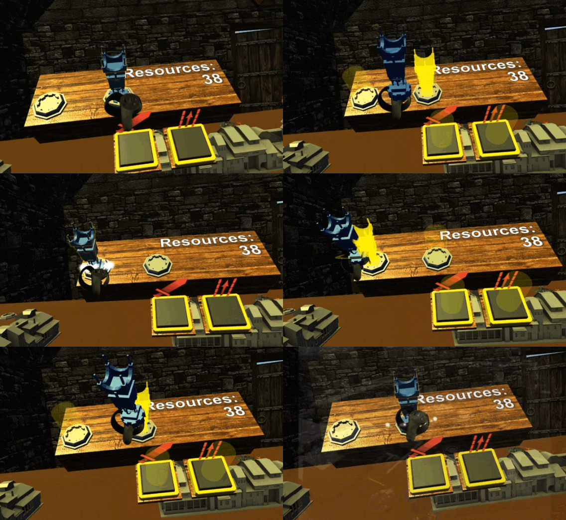
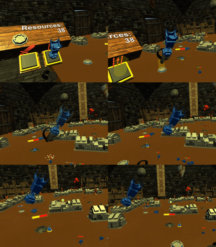 One oddball quirk of moving towers around the map during play is that once you pick one up, you are forced to hold it in one hand while moving with the other. This felt awkward. As an experiment we allowed players to place them in the air in front of them, "floating" as though in zero gravity. The player could just place them out in front of them wherever it was convenient. We even gave them a bit of a visual bob because a rock-solid frozen object in the air feels like a bug and causes players to unintentionally tune them out. The end result worked but was strange, and violated the "physical" world with real gravity that we'd created.
We still knew we enjoyed the physical placement of towers, so we still needed a way for players to purchase them. Since we didn't want to rely on menus, a "vending machine" where the player spent some currency to acquire an object required a physical space to live.
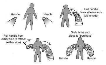 The first thing we used for a while were "shelves" that hovered at the player's elbows on the left and right. This gave the player a surface that followed them around the map, where we could put a variety of controls. However, they were well outside the player's normal view, and were problematic if the player walked around the VR space. We considered variants of this such as a "belt" the player could grab from either side and pull into view, but that would result in the player having to look down rather severely. (An apt rule coined by one of our designers was "If the player gets a double chin, you're making them look down too far".)
Regardless of the shape they took, these shelves just felt weak and temporary.
We still needed a place to purchase towers, and the castle was a natural option we had to try. The tower "vending machines" were placed back at the player's home base, which we knew would be inconvenient but we wanted to see if it fit with the pacing of a strategy game. In the end this was quite unpleasant, as the player would not only have to move back to their castle to make a purchase, but they had to hold the tower in one hand and move to the build location with the other. It was not comfortable for a majority of players, and required returning to the castle far too often. It amplified player requests for the ability to teleport back to the castle with a button press, which we were trying to avoid for the sake of space and presence.
We had seen a number of wrist-mounted menus in other games, so we wanted to explore that avenue next. We wanted to make sure that the player interacted with physical objects as always, so it had to unfold somehow, but we wanted to avoid using a button to open it. We opted for rotating the hand palm-up as the signal for the palette to unfold, which was a clear gesture that was different than a typical resting position for the player's hand... When we tried palm-down variants (where the palette would unfold from a wristwatch), there were far too many false positives where the palette opened, due to how the player held their hand naturally.
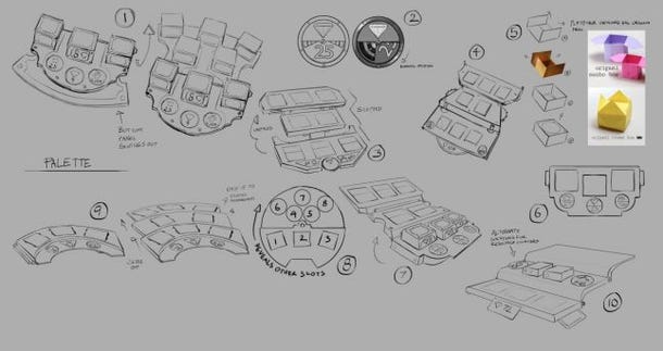
The palette could have been any shape, so we started with round ones, and experimented with "tiered" versions that helped the player see all the towers mounted... In the end a flat and simple shape worked fine, and we adjusted the palette's angle on the hand for maximum readability. Staggered rows and careful spacing helped the player see each tower label and price. This was definitely the right choice.
After tower purchasing, we had to design how our tech tree would manifest... and we knew that the interaction and function would be strongly tied together. In many RTS games, a tech tree is accessed via menus or distributed across the map. Our main goal was to avoid any solution that required parsing a lot of text to use... reading has yet to be a pleasant activity in VR.
Placing upgrade buildings was our primary focus because it was tangible in the way towers were. We quickly decided that these upgrades would be built around the player's castle. This did require returning to the home base (which was inconvenient for tower placement) but since it happened less often, it was less of a hassle. A side effect was that upgrades automatically made your castle seem more elaborate, and when your purchase triggered a castle upgrade, you were generally there to see the (elaborate mechanical) castle upgrade process. Finally, an opposing player could be in awe of your progress by sliding over to your castle and checking it out.
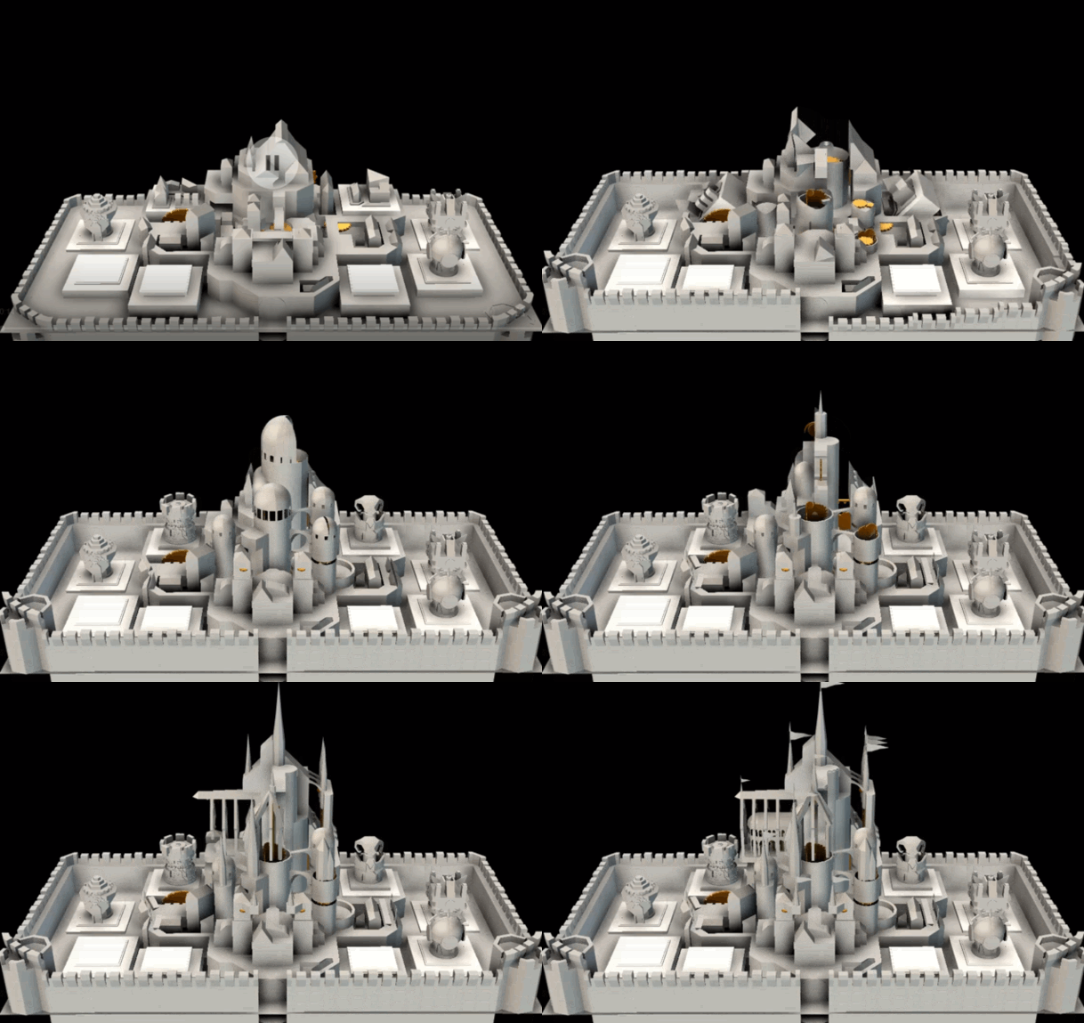
The upgrades were purchased using resources and then socketed into the castle. We had a limited number of sockets, which was further attached to the castle upgrade level. This worked best in VR because the player could clearly see how many sockets they could fill, as well as what happened to the castle when those sockets were filled. By creating a physical analogy we cut down on the menu fiddling and reading in the game significantly.
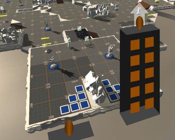 One side note on the disadvantages managing a lot of information with limited UI is that hardcore players still want to hone their skills with some sort of guide (such as a tree view of the upgrade progressions) and deeper dive that they can refer to during play. Not only did Brass Tactics not provide that extra-deep information in-game (although it was made available on our website), the nature of VR meant referencing outside information during play is nearly impossible... A player cannot (easily) have a web page up on another screen, or glance at a poster-sized printout on their wall... they see the game and only the game.
Our last decision was where the upgrade building "shop" would be positioned... We could have made a second palette to hold them, but we opted to put these buildings behind the castle, outside the normal playspace. We briefly considered a model where the player had to pull a drawer open and pull one of the buildings out, so that the upgrades wouldn't accidentally be picked up... We believed this two-handed operation would not be too tedious for players since it is done eight times a match at the most. However, in the end it was discarded. Two-handed actions felt burdensome unless they created immersion, added control, and reinforced the action. We opted for a "drawer" behind the castle that automatically opened.
We had our basic verbs functioning, but we still wanted to explore additional physical interactions, to really explore the "toy box" inspiration of Brass Tactics. Blessedly, Oculus was supportive in giving us time to implement a whole slew of experiments from which we learned a great deal (and hopefully helped future games!).
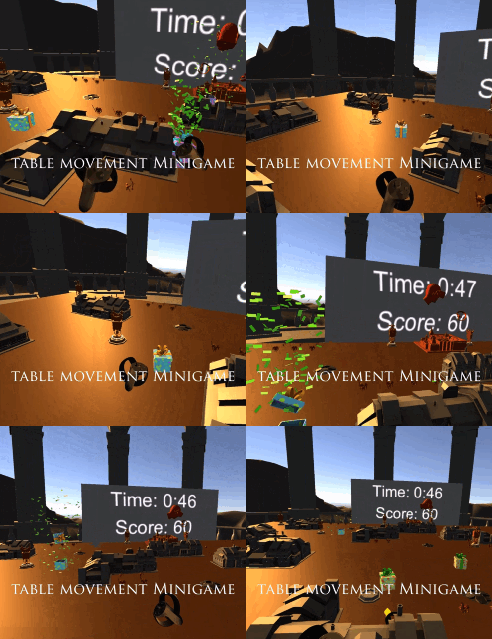
When we were fine-tuning the map drag functionality, we created a simple minigame that forced players to move around quickly and precisely. The player simply moved to various random spots around the board and 'popped' presents, Whack-a-mole style. At this time we didn't have a fully functioning game, so this activity was incredibly useful for inspiring team members to go for a high score (and bragging rights around the office)... allowing us to gather a fair amount of usability information along the way.
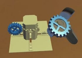 While Brass Tactics shipped with classic workers gathering ore from mines and returning it to a refinery, we experimented with pushing the mechanical theme even further with the idea that these "peons" were literally "cogs" in the machine. The player could build more cogs and insert them into production refineries to increase their output around the map. It felt fine to do so, but removing the workers would have diminished the classic strategy model... denying the option of attacking the enemy's economy.
In another exploration of placing cogs into a machine, we also tried a "gravity cartridge" that required two hands: One to hold open some sort of latch or housing, and the other to put a component in place. Perhaps with the correct machine this would have felt good, but it was too much for any action that could effectively have been a button.
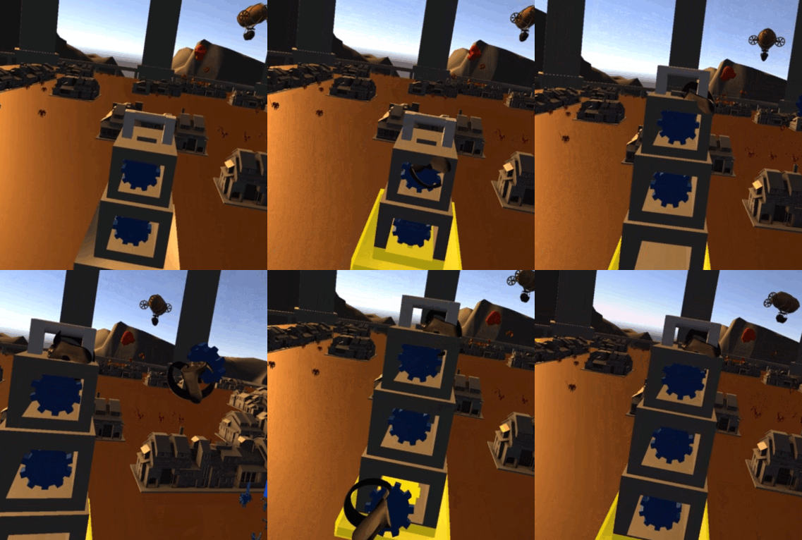
As part of our exploration we created a variety of cranks and levers with different lengths and rotation limits. Once we applied proper audio and haptics, these functions felt great. We used them in a few places, but wished we could have found more uses for them... Again, motion for motion's sake went against our core objectives.
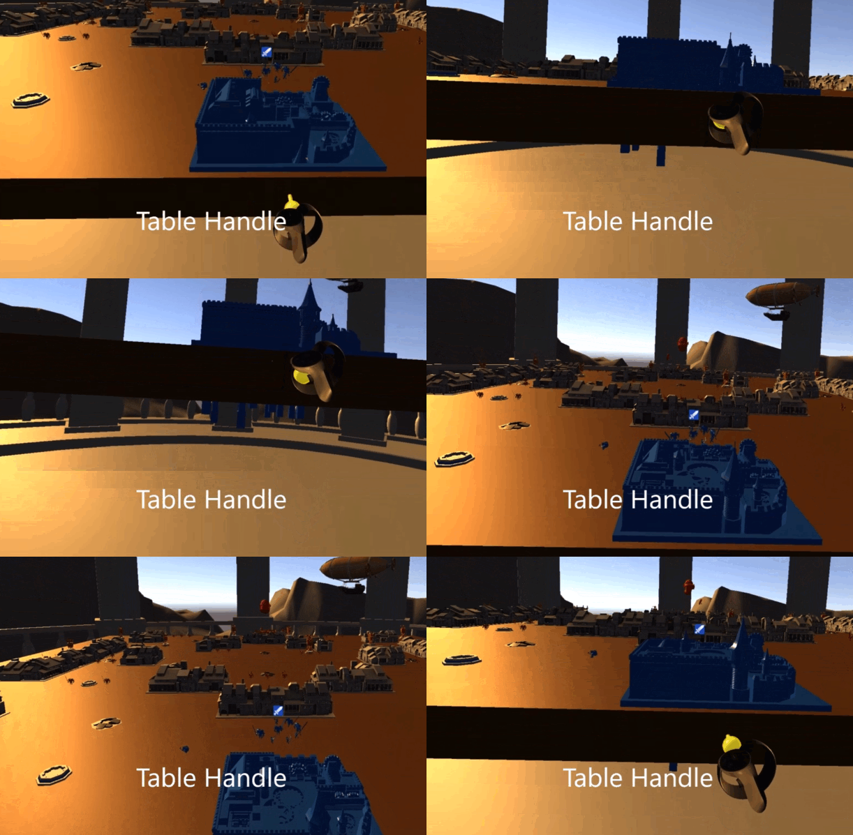
One function we knew we needed was the ability to raise and lower the table, to give a zoom in/zoom out equivalent during play. Our original plan for adjusting table height was using a knob or lever on the table itself, creating a clear physical analogy for this function. We got it working quickly and it functioned perfectly almost right away. However, this meant that for the player to adjust their view they would have to move to the edge of the table and grab a specific affordance... That was far, far too much to expect of a player who just wanted to get a better view of something they were already looking at. This was a clear example of something that felt good, had awesome feedback, was clear in how it functioned, but missed the player experience mark completely.
Our final result was a two-handed drag (extending our table movement interaction) that allowed the player to change their viewpoint anywhere on the map.
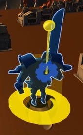 One of our most fascinating unit experiments was a wind-up giant. The player could directly pick this unit up and use those cranks we created to increase its power and speed, then place it on the map. Once again it felt fabulous. We certainly would have used this concept if the game ended up as more of a babysit-your-toys hands-on game, but being able to place units anywhere did create issues with the RTS gameplay we aimed for. By the time we tried this unit we started to get a feel for how much we were planning on diverging from actual RTS gameplay.
That said, it did inspire an idea for the Titan super-unit, which was a "slingshot" mechanic... The player would have been able to pull back a drawstring and "fling" the Titan into a charge in a given direction. This would have been a hands-on way to direct this unit without compromising the spirit of RTS, but unfortunately it didn't make the final feature cut. (You can't win 'em all!)
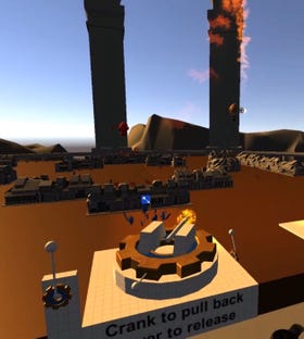 Catapults were a natural feature for any military miniatures game, and we knew there were a potentially strong addition to our toy box. We started with a classic catapult functionality, just to deliver on the fantasy of intricate machinery... Using the cranks we had developed, the player had to wind up and launch the catapult using different levers. The mechanism was fairly true to a functioning catapult, but it was definitely too fiddly to use in actual play.
In the end we simplified the catapult for the final game... The player could pull back and launch the catapult by interacting directly with the throwing arm. This is more akin to "flinging food with a spoon", and it worked out well. Its use was fairly skill-based, but we added a targeting sight and subtle audio-visual feedback to help the player repeat a previous launch.
One no-brainer use of Touch controllers in VR was allowing the player throw a physics object, so we naturally created a fireball spell. This sort of godlike spell-slinging was something we really wanted to have in Brass to supplement the catapult. The idea was that fireballs were a limited resource, manifesting as orbital meteors that streaked across the sky. A player could grab one from the sky and fling it down on their opponent.
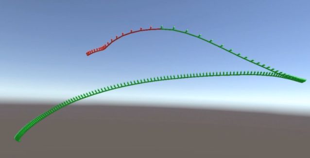
Upon implementation, we learned a lot about how throwing mechanics interacted with Touch controls. It turns out... that not everyone throws the same. (And not everyone can throw accurately.) In VR we relied on a player flinging their hand in an arc and releasing the grip trigger at just the right time to toss the object. Release too late? Well, your hand rapidly decelerates at the end of a throwing arc, and the release velocity at that time might be nearly zero... or straight down, or even backwards towards the player!
To learn more, we created a visualization tool to help us learn more about the mechanics of throwing with a VR controller, and saw how the release patterns differed from one player to the next. It was a subject that couldn't be ignored... it seemed that somewhere between 10-20% of people had this "different" throw pattern. In many cases these same people had the same release difficulties when moving the table. The solution became a combination of smoothing the last few frames of release with a measurement of peak velocity and direction, which eventually made it to table movement, which had many of the "point of release" issues with certain players.
It was a long, interesting ride to work our way through those problems and come out the other side with a game that's engaging, fun, tactile and VR-worthy... While there's always things we wish we had time for, we're pretty proud of the result overall. Personally, Brass Tactics was one of my favorite projects to work on... I felt like every day I learned something new.
These lessons are certainly useful when applied to any VR game, but the core of the philosophy applies to any game: Keep your eye on the objective, try to add things for the right reasons, and always check your results. Here's to the next one.
--Patrick Lipo, Lead Designer, Hidden Path Entertainment
Read more about:
Featured BlogsYou May Also Like