Trending
Opinion: How will Project 2025 impact game developers?
The Heritage Foundation's manifesto for the possible next administration could do great harm to many, including large portions of the game development community.
Trying to tell a moving story while letting your player write a part of it, is a difficult exercise. This is the story of how a small group of students tried to rationalize lexical fields into puzzles and create a systemic narrative game.

Trying to tell a moving story while letting your player write a part of it is a strenuous exercise. This is the story of how a small group of students tried to rationalize lexical fields into puzzles and create a systemic narrative game.
Hi! My name is Lila Grimaldi and I'm an aspiring system designer with a taste for storytelling.
Dear is about working for a shady corporation that preys on insecure people who're looking for experts in all fields of work to find answers to their problems. This goes from Grannies bored in their retirement home to narcissist plotting a putsch. Write them back using words from their own letter to gather data about them your company will resale. As a Dear Inc. employee, use the company's semantic fields analyzer to extract what is the essence of their letter and then use pre-written paragraphs to craft the most perfect answer.
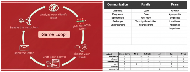
1 - picking your lexical field.
2 - picking your words within those fields
3 - picking and arranging pre-written paragraphs and add your words to them.
The goal was to add different layers to the players' experience by making them do rational yet mysterious choices.
By that, I mean that they have to first pick semantic fields based on what they deem necessary to answer the client's request, but they don't know which kind of words are hidden behind the one they choose. And once they have opened the semantic fields, they can't just use all the words inside to answer the letter. They have to choose a specific amount. And once they have secured the words, they finally discover the paragraphs they will have to craft the answer with.
We have picked the different semantic fields to add to our database based on our storyline and the personality of our characters. Each client has their own personality, likes and dislikes different words inside said fields (as displayed in the top right corner. You can see a picture from our database with semantic fields and the words they contain as well as words and their score when used with distinct characters)

There are two ways you can approach the way you play DEAR and the way you craft your letters:
- You can choose to analyze what the client is looking forward to in your answer and try to pick relevant semantic fields while guessing which helpful words they might hide.
- You can just click your heart away everywhere and when the time will come for you to craft your answer, you'll just enjoy the uncanny but funny paragraphs you'll be able to write.
.png/?width=700&auto=webp&quality=80&disable=upscale)
When using certain words, you are gathering points that will give you an invisible negative or positive score. This score is not displayed as numbers to players but is used to move the player up or down our narrative tree (see picture below)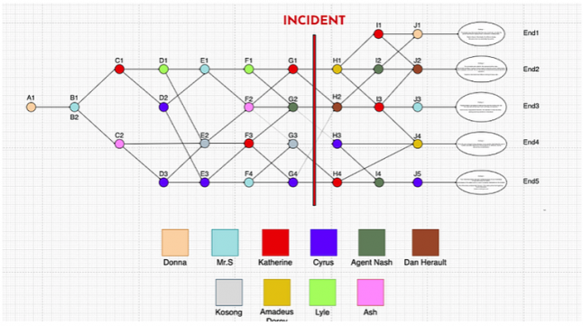
Players will go up on the tree if they gather a lot of information on their client (corporate way) and down if they focus on helping the clients (empathic way). There is no right or wrong, both ways will provide an interesting story plot but will provide different endings.
The only "failure" one can experience is not meeting the goals they set up for themselves. For example, if players choose to play in a certain style (e.g. the empathic way) and cannot connect with the client, they will move the opposite way in the story tree. They will learn at some point that they hurt a client's feelings or misguided them.
(See pictures below: you have access to an archive after each mission to see how each of your paragraphs has been perceived by the client: red = negatively / green positively)
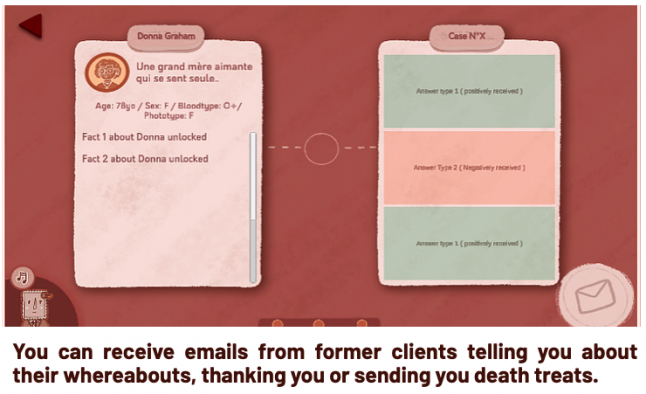
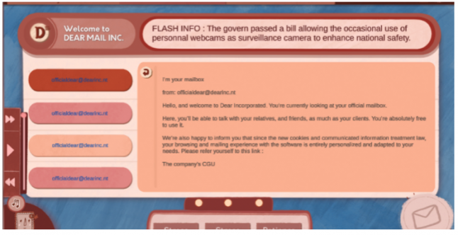
While players can play the way they want, we wanted to make our client's request more tricky to figure out as the game progresses to force "remarkable failures" to happen. As you embody a modest employee in a shady big corporation, even if you have the best intentions in the world, you have to do the job you're asked to do. We wanted our players to feel this dilemma between the pressure to do well and the pressure from the upper hierarchy.
The empathic path is more difficult to trigger if you play by clicking randomly on objects, while the corporate way will often be triggered if you chose random words since your client is more likely to be unsatisfied. Therefore, our players invested in the narration will be confronted with a greater challenge than the ones who just want to play with our "UI toy" to create random answers. But both can find joy in the experience.
We built the story tree to give players the possibility to experiment with the consequence of their choices, allowing them to still move up or down for the first couple of choices.
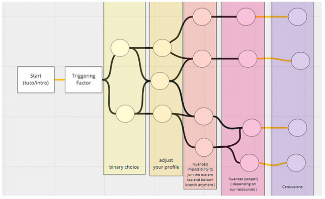
At some point, you cannot completely change your "profile" (empathic or corporate) but you can still move slightly up or down to bring nuances to your actions.
As a game designer focusing on UI & UX on the project, I made charts and storyboards to experiment with and iterate on different layouts for the game. As our game view is mainly a made up Operating System, we had to come up with a layout that felt intuitive to players using languages of OS that they're used to while making it a little more playful.​
Since I was the main "artist" on the game, I handled the translation of our game systems into interesting and aesthetic Ui panels. Depending on the feature, I first started with a doodled storyboard or with a game mechanic doc. I often let my graphic work inspire new little game features, but I had just as much fun trying to come up with a design to precisely showcase a mechanic.
We used "Miro" and "Draw.IO" to create interactive charts to showcase a design idea, to benchmark and test game design ideas as our game is mainly UI based.
With tools such as Miro, I could do quick wireframes AND test some mechanics. For example, we used to write ideas for paragraphs and would use Miro to move them around and pretend that we were building a letter with them. We could see if using them would come naturally to us or if we needed to rewrite them.
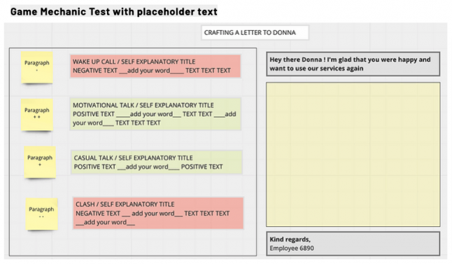
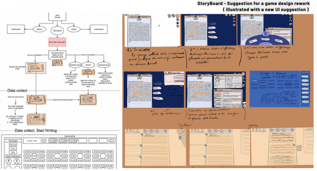
One of the major challenges I've faced was finding the best way to translate our mechanics into UI and make my best panel ideas look cohesive one after the other in the game flow. Sometimes I would have a good idea to display something, but it would feel too exotic compared to other panels with a more classic computer OS UX. A lot of iteration came into play to make the overall experience fun and seamless.
I used draw.io and procreate on my iPad mainly for flowcharts and storyboards such as the ones above.
Even though we were green-lighted, we decided not to release the game on Steam. Sometimes it's important to realize when a project just isn't ready to be released. We decided to upload it on Itch.io to share it with some people so you can check it out if you're interested. It lacks polish and content, but in the end, we were thrilled to have used this year to experiment and have fun with design and systems.
Read more about:
BlogsYou May Also Like