Trending
Opinion: How will Project 2025 impact game developers?
The Heritage Foundation's manifesto for the possible next administration could do great harm to many, including large portions of the game development community.
Starting a project can be sometimes overwhelming. How should the graphics be? What should be the style? What should we focus on? On the following post we share our approach on the matter.

Greetings! Ever since we decided to put together this team, we had been thinking about how awesome it would be to someday write in a dev blog and share our thoughts and experiences with the public. So, today, we would like to share with you all our creation process regarding the characters of our new game, Moribund. This process is not in any way refined or recommended, it's just an insight on how we operated. What follows is referring to the world of Moribund so we recommend you also check the trailer or the steam page in order to get a better understanding of what it is we are talking about. To describe the game briefly it's a local multiplayer platformer game where the players use a ranged weapon to eliminate their enemies. The use of physics and ragdols is quite often.
So according to my experience most games either start with a couple of good mechanics or with a good story. In our case we had the first one. So what we were missing was a story that could justify our mechanics, be interesting and ideally, unique. Let's take a step back and analyse the game a bit. It's a game that its easy to learn yet hard to master, its very competitive and sometimes stressful. It's not exactly "casual". So happy colors and hyperbolic shapes didn't seem the correct direction. We had to try something more "hardcore". Mad Max was still fresh when we had our first designs and all that post-apocalyptic setting appeared to match our game's conditions. So we started working on some characters while trying to develop their stories.
First Concept art of our characters. Five factions, ten characters. Eight of them made it in the game
A few notes about the characters. All the characters needed an illustration that would be used in the character selection screen and one side-facing character for inside the battle that should cover all the following requirements. The quantity of the characters came up based on that we set 5 main "factions" in which we allocated some distinct colors and personalities. Then we made a male and a female for each of them (except for a duo who are both males). Yeah, 4 out of the above 10 are females. It's post apocalyptic, what did you expect high heels and mini skirts?
1.Design Specifications
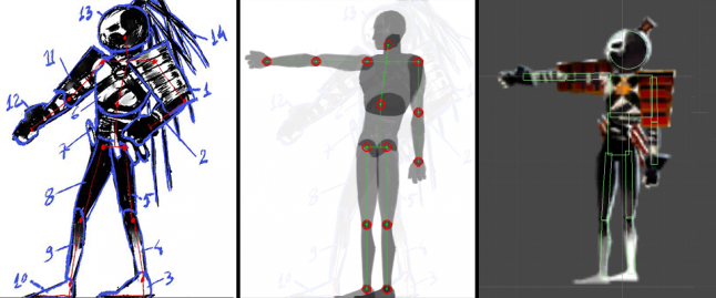
First (a lot of people seem to ask about this) they needed to have similar body proportions, otherwise they would affect the gameplay. In the game when a player gets shot we detect collisions with each limb separately. There is not a large collider surrounding the whole character. So if the proportions are very different, then the colliders would be different and that would cause unbalance. Yet again if we didn’t change the colliders, and simply have larger limbs on some characters, there would be many moments that the events on the screen would not be justified based on what the player sees (since the colliders would be very different from the actual sprite).
 Left: Joints and limb allocation
Middle: Prototype ragdol and skeleton creation
Right: Final ragdol with colliders, joints and Inverse kinematic points for easier animation. As you can see the colliders are not on the same shape as the sprites. The same skeleton/ colliders have been used for all the characters
Secondly the characters would not have different abilities but they should cover different personalities, genders and appearances so that anyone can find a character to connect with. Furthermore all the characters have voice acting, so each of them has also a personality to express throughout the battle.
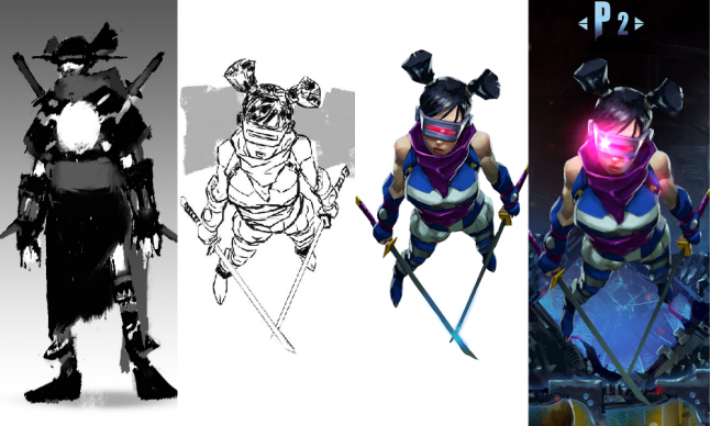
 Here you can see how the illustrations evolved over time.
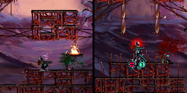
Finally the characters should "work" well in the levels besides simply looking good. They should be easy to get animated, they should have the right amount of detail given their size and they should be consistent with the level yet distinctive enough for the players to easily locate. Initially we had a hard time distinguishing the characters from the level so we separated them from the background by using an extra light just for them and adding a color behind them (which also helps to track your character and not confusing him with the enemies).

Left: The character in the battle with no modifications
Right: The character with extra light, back-color and user interface
Based on the feedback we have so far received, if you are about to do something similar, we would suggest more bulky body types for the characters. This basically means you will have more space to add distinguishing graphical details. Also try to define early on how the character design will differ from the one in the levels in order to secure optimal usability for the players.
Everything you see will probably be further improved, but the essence of our approach is here. Hopefully, all this was of some interest to you. If you have any comments on the post or the game please don't hesitate to post them here or in the steam forums.
This a blog post originally posted here
Read more about:
BlogsYou May Also Like