Trending
Opinion: How will Project 2025 impact game developers?
The Heritage Foundation's manifesto for the possible next administration could do great harm to many, including large portions of the game development community.

Featured Blog | This community-written post highlights the best of what the game industry has to offer. Read more like it on the Game Developer Blogs or learn how to Submit Your Own Blog Post
What was involved in creating a puzzle game about a dollhouse inside a dollhouse, inside a dollhouse, ad infinitum? In this Post-Mortem, the developer discusses the success and the struggles of creating The Recursive Dollhouse for the Ludum Dare game jam.

"I have a present for you," announced the father as he walks into his family home with a big wrapped package. Excited, his daughter hastily unwraps the box. Her face opens into a big smile: it's a dollhouse. "Take a look inside," encourages the father. The small girl lifts the roof of the dollhouse to reveal its content. From the single doll sitting next to the tea table, to the miniature tea-set set on top of it, the detailed content made the girl ecstatic. "Wow, it's beautiful," she exclaims.
Suddenly, their house rumbles. Startled, both the father and the daughter looks up to the ceiling. Or the sudden disappearance of it. Instead, as the sunlight seeps into their living room, a girl taller than skyscrapers looks down with a big grin. Holding their house's now-detached rooftop while looking down on the family, she booms, "Wow, this is beautiful!"
The commercial-length episode described above from the Japanese TV show, Tales of the Unusual (which is basically the Twilight Zone) became the main inspiration for our Ludum Dare 37 entry, The Recursive Dollhouse. Like most game jams, the development process of this game was a stressful experience perfecting the core mechanic of the game: traveling into and out of smaller dollhouses. Despite having a relatively unexplored central mechanic, though, it's quite surprising to realize how much of the game is derived from previous conventions.
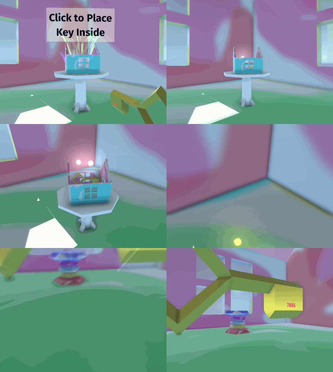
The Recursive Dollhouse is a first-person puzzle game that involves jumping into and out of dollhouses, shrinking or expanding the player to fit into the dollhouse comfortably. The game utilizes various different methods to provide unusual puzzles, such as ones that involves changing the sizes of objects, or using the recursive nature of the dollhouses to repeat rooms without backtracking.
Getting the "jump"right
Initially when we pitched the game, all we had as a game design document was these scribbled notes on our list of many game ideas based in one-room:
To translate this in proper English, we had a game idea about a house you can enter that's already in another house, which in turn is in another house. Needless to say, we really haven't thought through this idea at all, which made us fairly cautious of whether it'll work or not. Still, we took a couple hours to make this idea and see what it feels like:
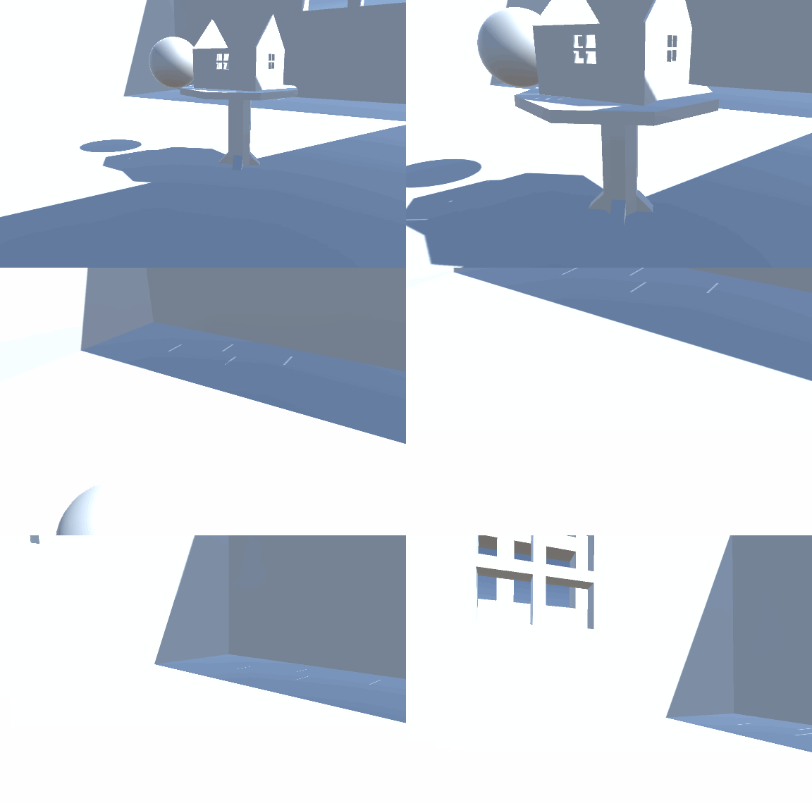
At the point we made this GIF, it was clear to us this was all we needed to continue with this idea to a full game. It felt pretty magical at the time, and opened to a lot of detail-hunting gameplay opportunities.
Building the puzzle components first
We tend to follow the Nintendo mentality of designing games around mechanics. Once we had the prototype ready, a lot of important questions emerged, such as: why would one want to dive into a house? Once they dived into a house, do they want to return back to the house they were in before? If so, why? And what makes diving into a house unique, that can't be done with mere doors and switches like in Zelda games?
The solutions we came up with were, while not extensive at addressing all these questions, attempts to solve some of them. For having a reason in diving into a house, we resolved it with the classic key-door mechanic; it gates your progress, thus incentivizing your exploration. Since at least one path is going to be blocked by the locked door meant that the game would need split paths and recursive loops for creating complexity.
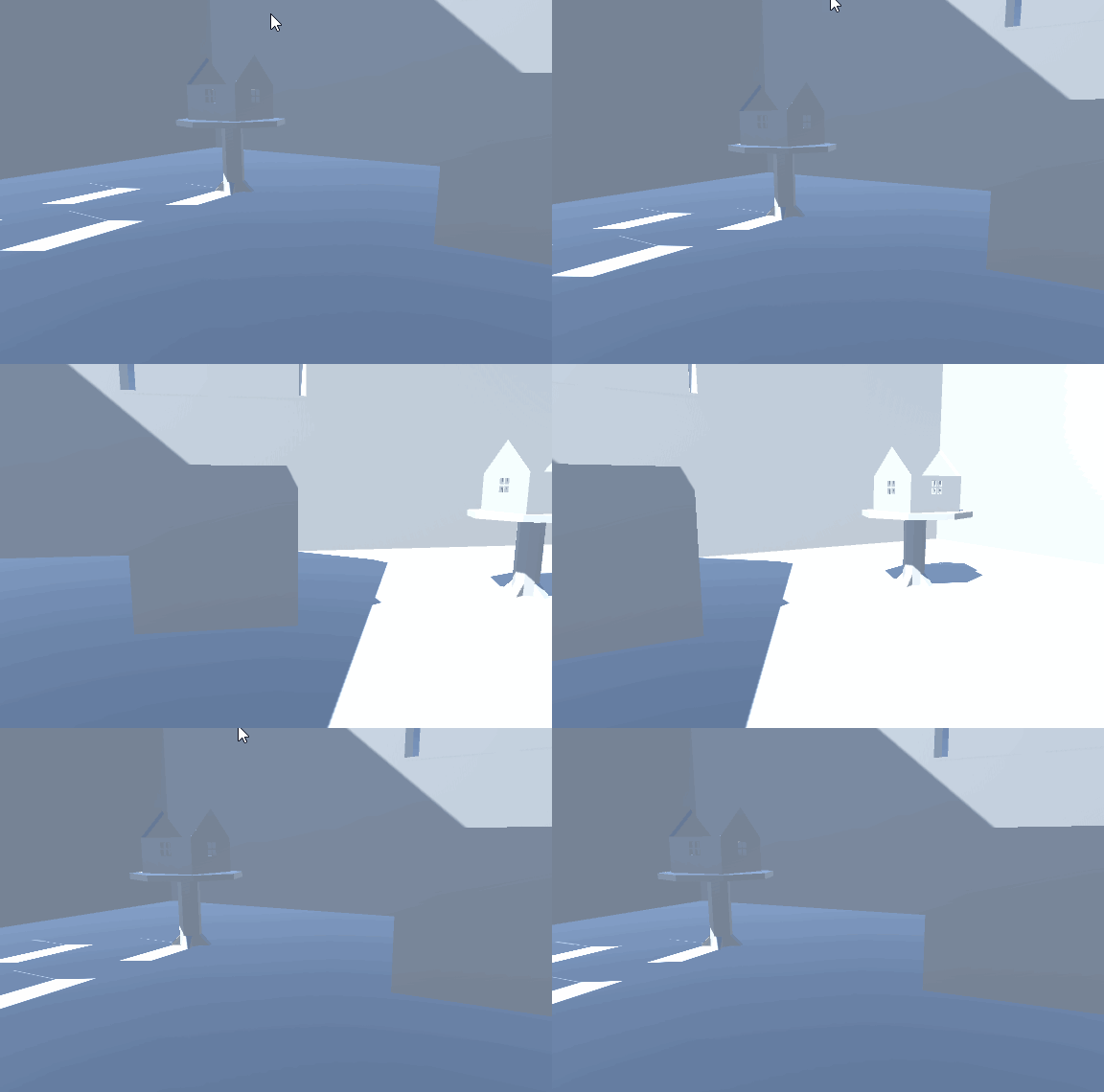
The emphasis on exploration inevitably answers the question of whether we want to return to our previous residence: yes! While a few different ideas were offered to to us by other jammers on returning the player, the method we chose was a spring to reverse the diving action. This decision was made largely out of practicality: it was the easiest action to implement, since it didn't require creating a new model and animations.
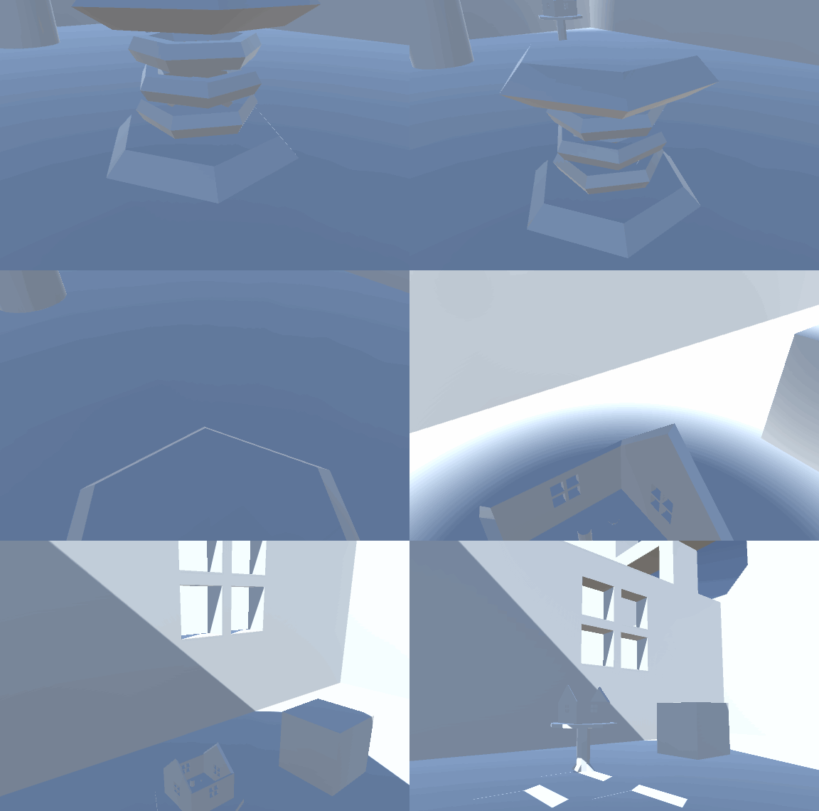
Finally, what makes this mechanic unique from normal dungeons? After all, the act of diving into a house is a lot like entering a puzzle room from the middle. To differentiate this game, we went to our favorite surrealist artist for reference:

"The Listening Room," by René Magritte was what inspired us to design puzzles that involves dropping a variety of items into smaller dollhouses (though only keys made it in due to lack of time). From there, we had a new question: why would one want to drop anything in the house? We resolved this by adding a code on the items that are initially too small to read. By using this mechanic to make the item larger, they can make the code legible, and thus, progress in the game. Clearly, this meant we needed to create coded doors, and that's what we did.
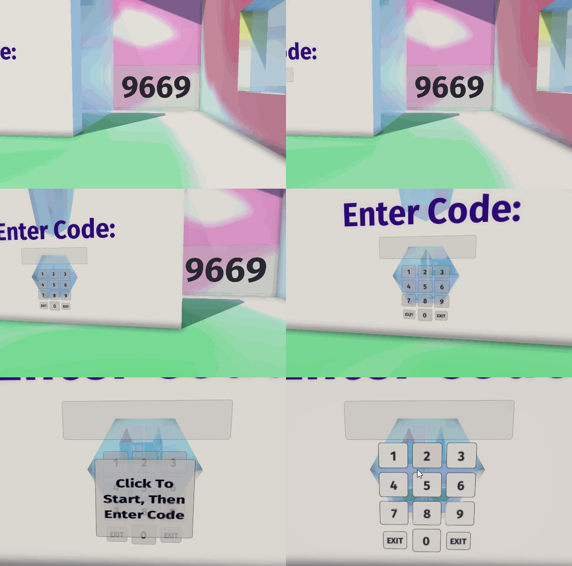
Thanks to the initial prototype, it helped us summarize our thoughts on which puzzles were needed in the game to make it stand out, and which weren't. We didn't add any block puzzles, for example, since those puzzles are often self-contained in a single room, and do not provide a good reason to hop between different rooms. With these tools available, we were able to start constructing levels that helped emphasize the core mechanic of the game.
Easy level design interface
Incidentally, a lot of features listed above required re-writing the first prototype on how the player shrinking and growing was achieved. Originally, we had just 3 dollhouses--each smaller than the other--embedded into each other. When the player jumped within the trigger area of each dollhouse, all the houses will grow in size. This rather round-about method of creating an illusion that the player was growing or shrinking was due to keeping the physics consistent, as larger objects fall slower in the Unity game engine, and faster for smaller objects.
While growing and shrinking the visible houses remains the same, the new version of the game required dynamically embedding and removing the dollhouse from the grow/shrink list so that recursion and split paths can be achieved. This was quite a significant effort to keep the illusion of houses being embedded into one another intact. A subtle fog was added to create a logical reason as to why larger houses disappears from view as they're being removed from the list and being cleaned up. Springs had to now retain a history of dollhouses you've traveled in, so it knows which house to return the player to. And each table that held a dollhouse now merely holds a reference to it. When they're needed, the table dynamically resize and position the dollhouse on top of itself.
This costed a lot of time, but it had a huge plus side beyond making many of the mechanics listed in the previous section above possible: the new change made it a lot easier to design levels. The original prototype required shrinking the embedded houses smaller and smaller, which which already tested Unity's ability to be able to render the dollhouse and their content. Since the tables now dynamically resize the houses to the proper size, every dollhouse can be designed with exactly the same size. No need to tediously resize each gameplay element to the proper size!
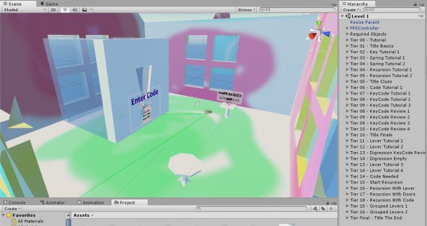
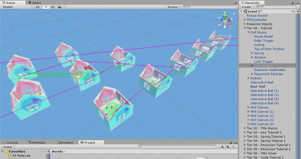
This also helped create a visually more understandable level design diagram in Unity itself. As seen in the screenshot below, dollhouse-holding tables are connected to their respective house with a magenta-colored line. With this visual, it helped us create a graph-like diagram that indicated how each house is connected with each other. As a consequence, it made it easy to verify that our development matched our own level design sketches.
Always testing your own puzzle designs
Fun fact: while designing the last few stages, one thing that became clear was that a sketched puzzle had a hole in it, causing the player to go through a loop of houses infinitely. Our regular habit of testing what's been implemented as early as possible helped us discover these kind of problems sooner, allowing us to quickly correct mistakes. In this case, we created a shortcut to the proper solution so that the player would not be stuck in an infinite loop. While this unfortunately made the last part filled with switches that served no purpose, we were still able to provide a solvable experience.
Practicing Blender
In every game jam game, we try to learn a new technique. This is largely so that we end the game jam with at least something new in our hands, preferably a good game, but at minimum with a new skill. This Ludum Dare helped us improve our Blender skill by utilizing the boolean modifier. While we probably abused this feature when simpler methods existed for combining or subtracting meshes, it helped us create a lot of low-poly models quickly enough for our beginner skills to create the elements in the game.
Too many codes!
In The Recursive Dollhouse, nearly everything has a code associated with it. From the key doors that has a code matching keys to the corresponding door, to the switches that has a code matching the doors it opens or closes. While these identifications adds complexity for keys-only or switches-only puzzles, they become a huge source of confusion when code doors are involved. Are the codes written on the key doors the answer to the code doors? This ambiguity forced us to make passcodes appear nearby the door they correspond to.
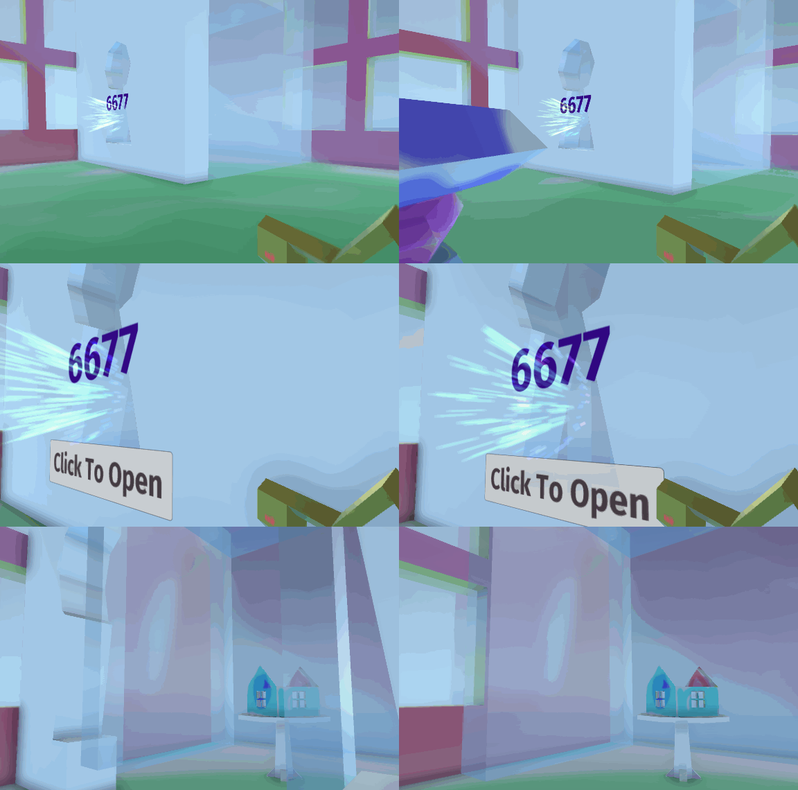
In fact, code doors themselves probably needs to be revisited. They're currently implemented quite poorly: in a game that locks and hides the cursor, the only way we could get the Unity GUI system to allow button pushing was to unlock and expose the cursor. This means the player's position is locked, and unable to move while entering the code, sometimes leaving the player in camera angles that doesn't expose the entire keypad (this can be escaped with ESC pause menu, but it's a work-around). Besides, codes requires significant memorization, creating a rather immersion-breaking experience.
Linear puzzle design
Despite having the name, "recursion" in the title, there's only one part in the game where the dollhouses actually loop into each other. There are also very few places that the paths split in the game. This resulted in creating a rather linear experience with little room for experimentation. Every puzzle has only one solution, and backtracking is kept to a minimum. Part of the reason we didn't add much complexity in our game had to do with the lack of time and how the current gameplay elements were implemented made it difficult to create these puzzles, but another part had to do with our lack of sleep. At one point while designing the puzzles, we were so confused with our own levels, we couldn't solve it while testing. While it made sense at the time to implement more linear puzzles during the jam, in hindsight, it felt like we cheapened the experience.
Larger houses are under-utilized
Currently, after diving into an embedded dollhouse, the previous house is visible through the windows. The now-large dollhouse, however, serves no purpose outside of visuals. This did feel like an underutilized feature, but we never found a good use of it until recently. While creating a shortcut to the last few puzzles, it just hit us while looking out the window that we could have hid a super-small code in the larger dollhouse that would only be legible through the window of an embedded dollhouse.
At one point while brainstorming on different gameplay elements into the game, an idea we had was to be able to carry and place dollhouses themselves. We didn't pursue this, however, due to the lack of puzzles that would justify such a mechanic, and the difficulty of resolving what should happen if the user clicked at a carry-able dollhouse with an item already in the house. The previous small-code hunting mechanic would have resolved the former problem, along with making it the primary method to carry levers. We just feel bad we weren't able to come up with these ideas sooner.
No visual variety
Since we were only beginners with 3D modelling in general, we were not very quick a creating models, let alone UV-mapping and texturing them. Seeing that justifying the core mechanic was our strength, we decided on focusing that aspect. This unfortunately meant that the graphics suffered: while we had plans on creating dollhouses with different shapes and window sizes, we did not have the time to make any of them. The textures on the dollhouses and the springs are actually just us color-coding which segment of the texture corresponds to which part of the model. The dollhouse's toy-like appearance is entirely coincidental. For a puzzle game that involves some back-tracking, a variety in graphics would have helped the player navigate the game by making it easier for them to memorize where each dollhouse is.
A lot of the bad parts in our design can be easily attributed to our lack of sleep, and poor pacing. Taking that into account, it might have been a good idea for us to scale back a bit and implement what is only necessary. Next time when we design a puzzle game, we should probably avoid numbers and/or code-based puzzles. If we want to add level designs that requires memorization we should make it more universal by relying on easy-to-recognize shapes and colors. Finally, we should emphasize more on exploration by adding multiple paths and hopefully multiple solutions to each puzzle, to create the appearance of complexity in each level.
Read more about:
Featured BlogsYou May Also Like