Trending
Opinion: How will Project 2025 impact game developers?
The Heritage Foundation's manifesto for the possible next administration could do great harm to many, including large portions of the game development community.

Featured Blog | This community-written post highlights the best of what the game industry has to offer. Read more like it on the Game Developer Blogs or learn how to Submit Your Own Blog Post
How should commercially-focused designers approach the mobile space? This article suggests starting with the interface, using explanations and examples to describe why.


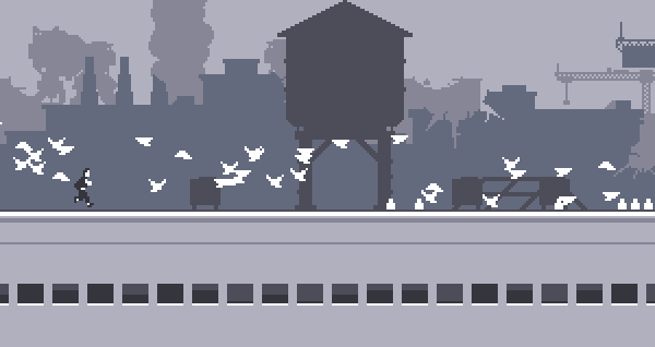
New genres aren't invented very often, but Adam Saltzman's Canabalt achieved just that when it effectively spawned the Infinite Runner genre. A lone figure races across the rooftops of a randomly generated world, responding to only a single input: the tap of the screen, which is treated as jump button. The point is to go as far as you can. The end. Canabalt's success put paid the argument that player's needed full control over a character's motion to have fun. This (thankfully) ended a lot of the fruitless efforts to design effective on-screen controllers that could mimic something as simple as the NES.
There have been several articles on one-button design, as well as game jams and competitions around the theme. If you don't feel a single button can carry a game, reading up on the topic will change your mind, and "incept" the idea of highly effective contextual controls.
2. The Swipe - Fruit Ninja

Laugh if you want, but Fruit Ninja has more installs than your game does. And people enjoy it. Yes, it's a game about killing fruit, but the takeaway is how satisfying it is to have the world react to your touch likes it's the blazing finger of God. THAT is why most people play games: not for your story, not for your beautiful complexity, and most especially not for your kitchen-sink method of Anything Goes game actions. They are playing games because they want to smile, because they want a break, because they want to be in control. Don't try for "design depth" and end up giving your players analysis paralysis. Give them a clear goal, give them a simple way to achieve that goal, give them fantastic feedback, and stop there. It might be enough.
Swipe controls received another burst of energy when Infinity Blade hit the scene. Note the similarities here: the swipe mimics the motion of a physical object in space. It's seen in Angry Birds, Bejewelled, Temple Run, Osmos, and countless more. Swipes really are the "native language" of mobile devices.
3. The Gesture - Flight Control

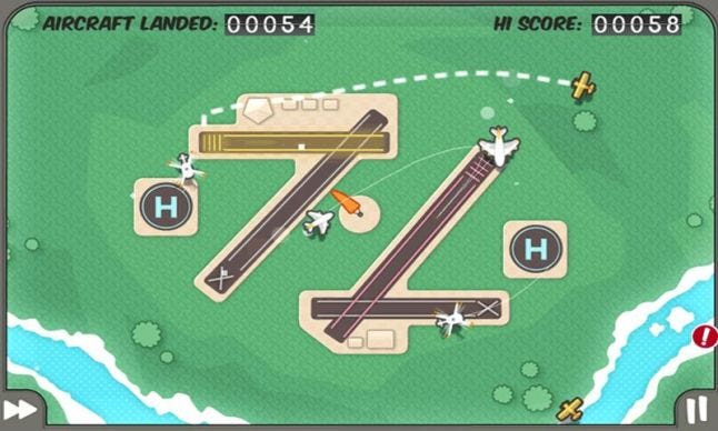
If there's one game design recipe that seems to work over and over again, it's "Give people one thing to achieve. When they master that, give them more." Flight Control is a great example of this. An early success on the App store, you trace paths for planes to follow as they try to land, doing your best to keep them from colliding. Once again, "that's it," and yet people couldn't stop playing. And don't forget what the stakes are here: nobody's asking for $60 of value from these titles. To be commercially viable, you have to take into account production cost as well as potential revenue.
Perhaps because gestures translate better to 2D space than 3D, I couldn't come up with many new titles that rely on gesture mechanics. Is it a design dead end, due to the physical limitations of constantly swiping? Or has someone just not discovered the right metaphor to crack it wide open?
4. The Tilt - Ridiculous Fishing

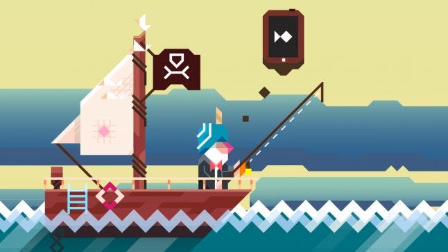
I believe that Ridiculous Fishing hides a textbook on game design beneath its diagonally-aligned screens. A steady tempo of pressure / release, upgrades that change the experience instead of simply increasing numbers, beautifully scheduled progression, and enough filagree elements to give the game a humorous, fictional foundation. If you haven't played it yet, do so.
The tilt input is used when dropping or raising the hook. Smooth and effective, it is punctuated by the general tap of drilling through fish that sit in your way, and then effectively counterbalanced by the frenetic tapping which follows a successful catch. It would have worked as a swipe or drag -- the hook just moves left and right, after all -- but having your finger on the screen obscures your view (which is important), and would have complicated other gestures that use the screen as their input. Its analog feel also adds to the general physical sensation of playing the game.
Ridiculous Fishing also exemplifies how depth can be achieved by naturally linking "small fun" activities. They can't support a game on their own, but when bound together, there's magic there.
Wrapping Up
This is only a primer: there is far more out there. Touches on specific objects, dragging, multi-touch, pinch and zoom, GPS… there are many inputs native to mobile devices. If you want to maximize your chances at being commercially viable, pick a few and exploit them to their fullest.
It's important to recognize that the future is, most likely, in your hands or pocket. The sooner you can accept it for what it can do, instead of using it as a poor analogue for computers and consoles, the sooner you'll find success.
Good luck out there.
Ted Brown is the founder of Oreganik, a boutique game developer and contract house based in Eugene, Oregon. He is actively involved in growing the local game dev community.
Read more about:
Featured BlogsYou May Also Like