Trending
Opinion: How will Project 2025 impact game developers?
The Heritage Foundation's manifesto for the possible next administration could do great harm to many, including large portions of the game development community.

Featured Blog | This community-written post highlights the best of what the game industry has to offer. Read more like it on the Game Developer Blogs or learn how to Submit Your Own Blog Post
Blog post outlining development process behind creating an exciting, fun event booth attraction centre piece for RS Components and the Electronica China show 2014, utilising Oculus Rift technology.
Originally posted on company website makemedia.com

RS Components approached the 3D team at Makemedia with a relatively tight budget to create a fun experience for visitors to their trade show booth at an electronics event in Shanghai, China called EPC, held mid-March 2014. Makemedia has previously worked with RS Components on the Design Spark website, amongst other online projects, so we knew the client well, their focus and their overall business aims and goals.
We set about brainstorming a number of ideas that would meet the following criteria:
Involve 3D
Be interactive
Be immersive
Be fun to use
Sell the core concepts of RS Components’ business
Once we had a number of ideas, we fleshed out the more valid, workable ones into proposals, outlining their interactions, the messages the user would get from them about the business, the hardware setup required and high-level core concepts. From this list, RS Components came back to us with a shortlist and a request to combine elements of each idea into one larger proposal.
From this, the RS Racer concept was born and we created the main idea of a racing game that utilised 4-player, networked Oculus Rifts together to form a timed-lap-based game, which would engage visitors to the booth, whilst subconsciously conveying key marketing messages related to business aspects of the company.
Based on the budget and the time we had available before the event, we decided early on to determine some key gameplay design principles that would make development straight forward but more importantly, realistic and achievable. These included:
The race would be “hot lap” focus, set over one lap
There would be no collision, with either the world or other racers
There would be no “ghosts” (transparent representations of fastest times)
Gameplay had to be simple to pick up and play
These design considerations came about because of the nature of the environment that the game would be played in and the people playing the game:
On a booth, with noise, crowds and other distractions
Players may not be gamers
Players would most likely only get one go
No learning curve, had to be instantly obvious what to do
No repeat play, learning racing lines, placement of track assets etc
Players most likely wouldn’t have used Oculus Rift before
RS Components were quick to understand the value of our proposal and so, signed off the budget and development began in earnest. This was late December 2013, just before the Christmas break, for which most of the team would be away from the office for two weeks. However, before we broke for the holidays, we had a clear design vision of what we wanted to achieve.
The core team we put on the project was kept relatively small, but we have a wide network of freelance artists, coders and specialists who we call upon depending upon the needs of each project. However, for this project, it being a game, we wanted to keep it in-house as much as possible and all provide input on the development since it was a break from the norm’. We did enlist one freelance concept artist however, to come up with initial designs for race craft and trackside buildings, to build upon the initial idea we’d sold to RS Components of a race track set in a futuristic city, stylised around circuit boards and electrical components.
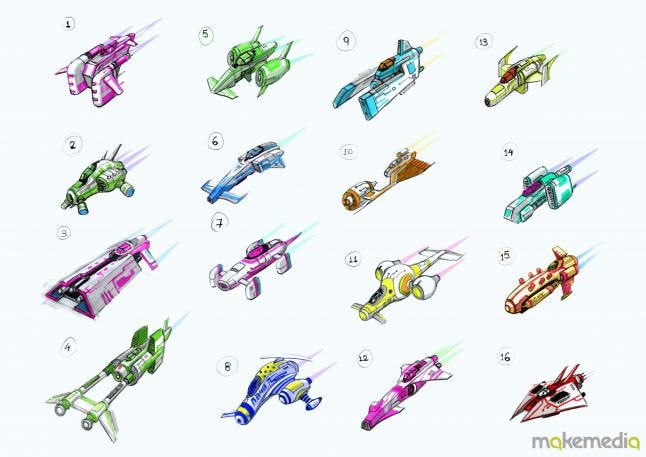
As you can see, the inspirations for the 16 potential designs were far and wide, ranging from well-known, popular games such as wipEout & F-Zero, as well as various sci-fi films and cartoons. There was much debate over which design we would go with for the final ship. We narrowed down our choice to 4 designs and then held a company-wide vote, along with input from the client, for which should be The One. N#16 won, unanimously chosen by all the staff & clients who cast a vote.
We had already decided that due to budget and time constraints, we would only model and provide players with one ship type to race in, but knew we could vary the colours on them to differentiate on track. During development we learnt that RS Components had managed to get four of their primary product manufacturers to effectively sponsor the game so these colours and logos became integral to the ship design as well.
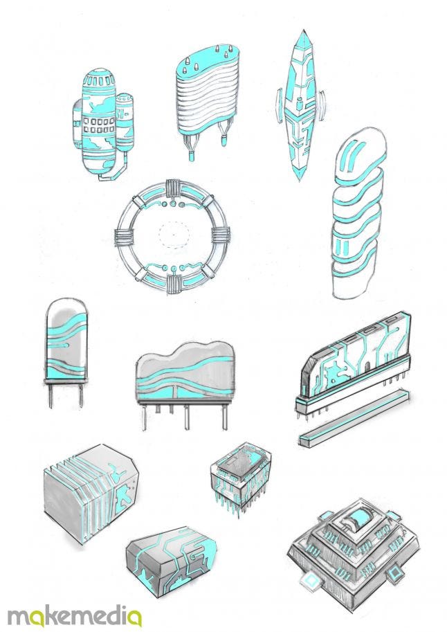 Once we had the ship design confirmed, we needed to design and come up with the concepts for the world within which the players would race them around. We asked the freelance concept artist to create us a number of buildings that followed on with the core concept of electronic components. We researched all about transistors, resistors, diodes and other circuit board elements, and how these could fit together on a much larger scale to create this futuristic vision of the city.
With the ship and the off-track assets designed and agreed, we had to create the final piece necessary to make it complete; a track to race on! We had already researched a lot of previously released futuristic, sci-fi racing games available and most of them stick to the obvious, flat track surface. We wanted to do something a little different and encompass the 3D VR aspects of the Oculus Rift as well as incorporating the circuit board style overall. One game from years past, F-Zero GX, had a small section within one of the tracks that allowed the player to race around a pipe, which fitted nicely into our concept. A pipe allows the racer to rotate around it 360-degrees and remains in-style and fitting with the circuit board since it represents the copper cooling pipes modern PCs have inside. It still allows for an element of skill and racing lines, if a player were to have more than one go or is a natural-born racer, since the inside of a curved pipe is a shorter distance than the outside of the bend.
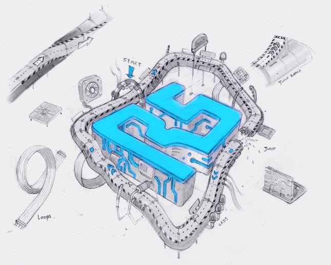
The initial proposal to RS Components, being that the game must sell the business and act as a booth attractor for event attendees, included the design suggestion that the track be in the shape of the RS logo. Thankfully because of the branding styling of the logo, this was easily feasible with the pipe track.
We had also proposed an additional element to the hardware setup which factored in two large TV screens positioned behind the players. One of these would be used to display the track from an overhead viewpoint, showing the track with the players’ current, real time positions on. So this would in fact act as a large, lit up version of the company logo on the booth drawing peoples’ gaze and attention to the booth.
Now when racing around the track, the player is not fully aware of the track shape and as mentioned already, they are likely to only get one go so would not learn the track. The track in-game also has severe (for a race track anyway) elevation changes, with swooping uphill corners and plummeting valleys, whereas from overhead it just looks flat. So it was important to have these additional screens showing the track from overhead so players could see the shape of it more obviously.
Developing for the Oculus Rift is fairly straight-forward, at a base level, since all you need is a copy of the Unity development tool. However, there are various shortcomings of the hardware at present that need to be taken into account when developing content to be viewed using the head mounted display.
We won’t go into detail what all these are here, there are papers and articles on the web that summarise and cover these issues much more succinctly than what we could here (although we have written our own Oculus Rift white paper for ConVR which you can read here).
There are a few main issues to cover though:
The Oculus Rift is currently only available as a dev kit (v1) and is not designed for public use nor consumer purchase at this stage. However, RS Components were aware of the current version hardware limitations but were still keen to use them despite these shortcomings. NB. At time of writing, Oculus Rift Dev Kit v2 has just been announced and made available for pre-order for release in July 2014.
The 3D space of Oculus Rift and the display shortcomings of the dev kit v1 do not really allow for fine text or overlaid user interface elements since the display resolution is quite low and assets appear aliased, coupled with the low resolution screendoor effect.
Making Unity content Oculus Rift friendly is simple, creating content that doesn’t cause users to experience motion sickness or dizziness is altogether more of a challenge. Control and refresh rates play a part in this, ensuring you reduce movement lag and latency.
We had to keep these concerns in mind when developing the 3D assets for the game world since we were planning on creating a fast-paced racing game that will allow the user to rotate the world upside-down and round again repeatedly. Also the in-game UI had to be minimal and work with the limiting factors of the Oculus Rift 3D display. Overlaid UI jars and removes the immersion, in conjunction with the initially low resolution of the dev kit v1 screens, which is why we embedded the speed gauge, time and player position display into the cockpit model itself as a virtual HUD.
Initially the client wanted 10 player support, with the idea being that they would be standing up whilst playing the game. Based on our experience with Oculus Rift, we thought having people standing up, especially first time users, was unsuitable and so we settled on four players sitting in gaming chairs (these actually ended up being actual Sparco rally car seats) to avoid any potential issues with players falling over and injuring themselves or motion sickness. In retrospect, this turned out to be a very wise decision since it emerged during the show that if a booth attendee had felt ill and complained to the event organisers, they would have had the authority to close the booth and game down.
We first created the pipe track and put this into Unity with the four ships racing around. Motion sickness wasn’t a factor at this stage since the game was purely a pipe floating in space with nothing to orientate the player as to what was up or down. So when we rotated around the pipe, no-one felt dizzy as a result.
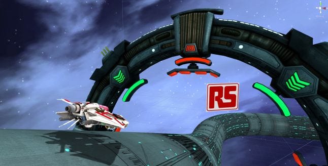
Once the 3D models for the world buildings started being put into the game, we were creating a sense of normality with a floor and a ceiling, which could easily be spun on its head. However, we were relieved to find that even with an up that could become down and back again, players weren’t showing signs of motion sickness and no-one reported feeling dizzy. They just wanted to play again.
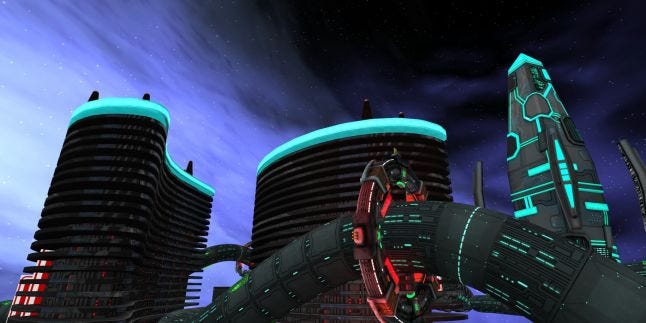
Other design decisions we made in order to reduce motion sickness specifically were:
Place the player in a sitting position so they are stable and steady as possible to begin with.
Place the player in a cockpit to position them in a situation they would expect to be in.
Use futuristic, non-real-world environment to help the brain determine the difference between the game and real world.
The pipe track asset provided a natural, stable element within the game world players could focus on.
Limited rapid changes in acceleration; despite the inclusion of speed boosts and slow-down gates, the overall difference in the sensation of speed experienced by the player wasn’t huge.
Being in a ship attached to a pipe meant there was a natural limit to player [camera] movement within the game world.
Designed the game with one timed lap which meant that overall, the length of time spent with the Oculus Rift headset on was no longer than three minutes.
Carry out extensive playtest sessions with as many different types of user as possible to measure responses, ability, ease-of-use and any sensations of sickness brought on through play.
There were a number of factors that, as developers and users, were beyond our control since the game would be played in a conference hall event and we didn’t have the ability to control:
allow configuration for each individual user
ambient temperature of the play space
varying age of player since it was a public event
varying health status of players (since it was a public event)
The final basic assets needed were those that would add the skill and competition elements to the game. For this, we designed two key track assets, a speed boost pad and slow-down gates.
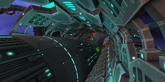
These are fairly self-explanatory; the speed boost gives you a limited increase in speed if you fly over it, whereas the rotating slow-down gates provide a moving barrier rotating around the pipe to avoid. The speed boosts were great to begin with but after gameplay testing, it quickly became apparent we needed something more so we experimented with chaining speed boosts together so if you flew over another speed boost pad whilst still under the affect of the previous one, you would get more of a boost, and so on. In the end we settled on being able to chain a maximum of three boosts together.
This took a further period of gameplay testing to get the placing of the speed boost pads on track correct so that they encouraged natural racers to aim for the inside line whilst offering a challenge to chain together as well as making it obvious to non-gamers.
Once we had the speed boosts nailed, we worked on the placement of the slowdown gates so that they were positioned in places on track that would provide a challenge but ultimately not a frustration. The last three together on the final straight can be a real game changer though!
The two large TVs behind the players were designed to show the overhead track, as previously mentioned, and F1-style trackside camera views during the race, highlighting exciting race action. Both of these screens were designed with a sports-broadcast / TV news show style in mind, with scrolling bulletins displaying key marketing messages and relevant company information on a scrolling tickertape panel.
We had to be careful when designing these screens as although they were designed to represent the track, which was in the shape of the RS Components logo, there were still brand guidelines regarding the use of the RS Components logo, colours, whitespace and representations that had to be taken into account and signed-off by the branding team.
During development we had many staffers and clients hopping into our chairs, strapping on an Oculus Rift and having a couple of laps between meetings and scrums. Everyone was positively enthusiastic and wanted to play again and again in order to try and better their lap time.
Ah yes, lap times. These became something of a contentious subject within the 3D team! The coder responsible for track asset placement (the speed boosts and slowdown gates) was suspiciously good and set a lap time that no-one else could come close to. Funny that.
During development, delivery of builds to the client wasn’t possible as the necessary hardware specified for the booth hadn’t arrived or was in storage, so we had to provide a series of gameplay videos and images throughout the process to guide them as to what they were actually getting. Fortunately our UK-based RS Components contact was able to visit the office and have a good play session so he was able to verbally confirm with the Chinese team that the game was in fact everything they had wanted. Thankfully, when they did actually get to play the game before the event in China during booth setup and hardware tests, they were impressed and very happy with the end result.
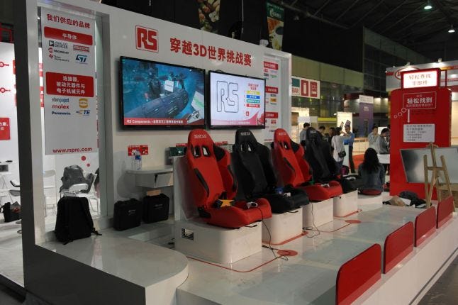
The electronics EPC China show, that RS Components had a large booth presence at, took place between 18th – 20th March 2014. We sent the gameplay coder out to provide technical support should anything go wrong with the setup, or to make any last minute code changes based on client feedback.
We had worked with the Chinese booth design team and PR teams to help design the physical game area, determine the hardware requirements, social media messaging and pre-show excitement build-up.
We haven’t had time to complete a full post-show post-mortem as yet but daily updates from our man on the ground were overwhelmingly positive. The game was serving its purpose, to attract attendees to RS Components booth and large crowds were constantly gathered around that area, sometimes too many much to the chagrin of the event organisers.
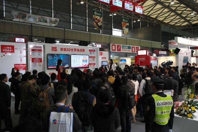
Game sessions were held for 30-minute sessions with a 10-minute break between sessions for the booth staff. They had two ladies designated with helping players in and out of the race chairs, putting on and taking off the Oculus Rift headsets etc. Then another lady was live commentating on each race, goading on the players and offering encouragement where necessary.
We had done timed tests in the office for ideal player “booth time”, measuring how long it took to get someone sat down, strapped in, racing and removing the headsets and out of the chairs again post-race. We designed the race length with this in mind and rough calculations show that it took approximately 5 minutes to get someone in, racing and out again. So all in all, over the course of three days, we had approximately 720 players get to play the game.
The feedback has been so positive, there is a good chance the game will pop up elsewhere around the world at further electronics trade shows… watch out for further details later in the year!
Overall, the end results have been so much more than what we initially set out to achieve. Whilst we were always confident in being able to deliver a solid, quality product for RS Components, the whole package together worked so well, everyone is really pleased with the results. The quality and setting of the booth, the game stability and use of emerging technology all proved to be a major draw to the booth for our client.
Elements of Oculus Rift support and use that we couldn’t really factor in thankfully didn’t become problematic with use. Ideally we would have been able to configure settings for each user, such as the Interpupillary Distance (IPD – the distance between a user’s two eyes) and changing the lenses to match their prescription but these would have dramatically increased time spent on each user and reduced the number of overall users through the game.
Thankfully, as we discovered early on, rotating around a pipe and turning the world upside-down didn’t make users suffer from motion sickness. We think this is partially down to the futuristic setting since the brain can interpret that it’s not a real world environment and dismiss the input to a degree. This is what we have found with other Oculus environments we have created based on real world locations with similar movement / control abilities.
Coming from simulation background, where image fidelity, stability and performance are key to increase immersion and realism, we always aimed for and achieved a rock solid 1080p/60fps with this game, something that current generations of games consoles (PS4 / Xbox One) struggle to deliver consistently. Therefore once we get our hands on the Oculus Rift Dev Kit v2 (OVR-DK2) in July, we will see an instant increase in quality and performance with our code straight away without any additional work effort required.
Read more about:
Featured BlogsYou May Also Like