Trending
Opinion: How will Project 2025 impact game developers?
The Heritage Foundation's manifesto for the possible next administration could do great harm to many, including large portions of the game development community.
“We want it to feel like you could almost reach into the rooms and touch things, but maybe also wonder whether you should,” says Little Nightmare's's senior narrative designer Dave Mervik.

Tarsier Studios released its horror-themed platform-adventure Little Nightmares last month. It follows a young girl called Six as she tries to escape a huge vessel known as The Maw. She’s chased by the monstrous staff and guests on board, who are much larger than her, forcing her to hide in crawlspaces and climb up shelves to out-of-reach places. She also has to battle an insatiable hunger that growls in her stomach every now and then, which forces her to feed on anything she can find...
Tarsier has been ruminating on the ideas that went into Little Nightmares for the past 13 years. “This game feels like it's been bubbling up in us ever since the company's been around,” says Dave Mervik, Little Nightmares’ senior narrative designer. It goes all the way back to 2004, when a bunch of talented students in Malmö, Sweden, were working on an adventure game called The City of Metronome. The game earned some decent attention, even getting an announcement trailer shown at E3 2005, due to its dark themes, unusual gameplay, and bizarre visual designs - something it shares with its successor, Little Nightmares.
The City of Metronome took place in a city where children are kidnapped, their soul is sucked out, and they are forced to work to keep industrial machines ticking. The main character is made to question this normality by a young girl, and goes on a quest to unravel the mysteries of the corporation in charge. He works his way through the city by recording sounds in the environment with a device on his back, and then changing their pitch, so that the same sound can be both soothing and aggressive. When played back, different types of sound have different effects on characters and parts of the world, either preventing or allowing progression.
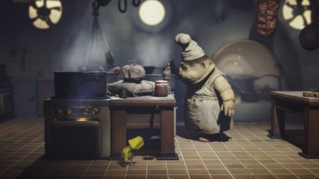
Unfortunately, The City of Metronome was never finished, and remains as merely a promising prototype to this day. “To make it into a full game would have needed more time, more people, and more money, so it was just an unfortunate case of having the right idea at the wrong time,” says Mervik. “That kind of game, though, never left our thoughts. It's always been a natural fit for us to make games in this kind of world, telling these kinds of stories. So, although there's no literal link between City of Metronome and Little Nightmares, they both came from the same minds, so they have shared DNA.”
Mervik joined the team at Tarsier seven years ago because he “wanted to make the kind of game that The City of Metronome promised to be.” But before that could happen, Tarsier had to build itself up as a company, and to do so it struck a deal with Sony. From 2008, the company worked on DLC and console ports for the PlayStation-exclusive LittleBigPlanet series and Tearaway, and a couple other PlayStation 3 titles.
As the team at Tarsier was finding its groove as a studio in those years, gaining experience as a more established production house, they began to think about what their first original game might be. “As it happened, the transition to Sumo Digital as the developer of LittleBigPlanet coincided with the point where we had a clear vision of where our future lay, so the timing felt about as good as it would ever get,” says Mervik. “Still, leaving the security of being a Sony-exclusive studio to being out there on our own was a weird mixture of exhilaration and abject terror, but we couldn't have dreamed of a better way to take that first leap!”
There were a number of ideas floating around the studio about what that first original game might be, but the earliest was spawned from a ‘dollhouse’ tech demo made in 2012. “With a cylindrical building as its focal point, it gave players the ability to pan, rotate, and zoom in to a bunch of individual, interconnected rooms, and managed to feel both playful and downright creepy,” Mervik wrote on the PlayStation blog. “It was a simple premise, but one that captured our imagination.”
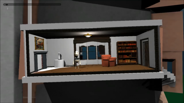
The "doll house" tech demo
That tech demo would serve as the core of Little Nightmares. What the team liked about its camera view was that it was limiting enough to not let players fully grasp their surroundings or know how close they were to danger. “We want it to feel like you could almost reach into the rooms and touch things, but maybe also wonder whether you should. There was lots that we liked about that sensation, things that married well with the feelings we wanted to create in the player,” says Mervik.
“The way that a dollhouse is both familiar, yet other; the creepy, voyeuristic feeling you can get from peering into someone else's world; there's a power dynamic too, in the way you are in control of what happens in the dollhouse world, which felt like a really cool contrast to play with considering your character's place in Little Nightmares' hierarchy. None of these things are shouted from the rooftops in the game, but if they creep into your subconscious, all the better.”
The idea was, in part, to let the player’s imagination make the environments and the people that lived in them much more disturbing than computer graphics could manage. That’s why one of the best moments in Little Nightmares sees Six crawling in the space between walls, when a pair of arms reach in to try to grab her. Not seeing the creature the arms are attached to somehow makes it scarier. The same goes for the chef enemies, who wear masks over their faces, sometimes reaching under them to itch - not seeing their faces lets you imagine how horrible they must be.
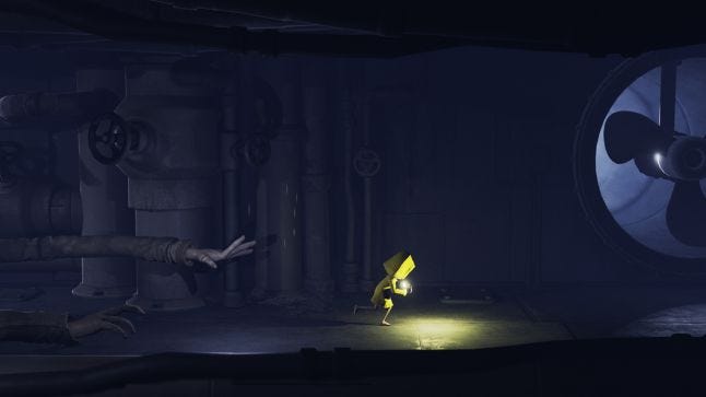
Those arms...
The other big advantage of that camera for Tarsier was that it features full 3D movement, which allows for thorough exploration of any environment. This combines well with the focus on the physicality of objects in Little Nightmares - most of the puzzles ask the player to interact with the environment, such as pushing a chair up to a door so Six can reach the handle. There was, at one point, talk of Little Nightmares having an inventory system, like a traditional adventure game, but that idea was quickly dropped.
“[An inventory system] always felt like it would overcomplicate the tactile core of the game, in which the player is able, and encouraged to, grab and interact with the environment,” Mervik says. “The goal from the beginning was to create a tactile, physical world that would increase the player's sense of connection to it. Of course, LittleBigPlanet did that so well, so of course you draw on your past experience when it makes sense.”
Initially, due to having worked on LittleBigPlanet, Tarsier had much more elaborate platforming sections in mind for Little Nightmares. But these were stripped down over time, and with lots of testing, so that the gameplay better served what Tarsier had in mind for the game: a combination of stealth, puzzle platforming, and chase sequences. “We knew from the very beginning that we didn't want to make a genre piece, whereby it would be all pretty much one thing. We were more keen to strike a balance, so that you could never really relax for too long in one mode,” says Mervik.
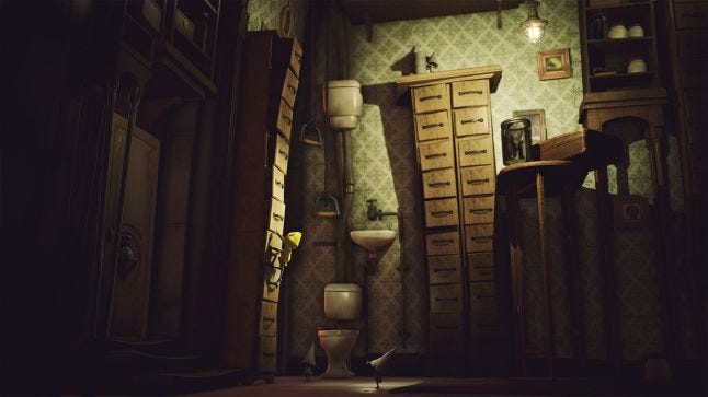
Tersier discovered that there was no shortcut to hitting the sweet spot between the three different elements, all of which provided different pacing and tension. It required them to dedicate to a lengthy process of iteration and constant testing for them to arrange the layout of those different components and get the game’s flow between action and story moments right.
Still, even with that effort, players have picked out moments in Little Nightmares that have caused frustration. The root of that frustration is the game’s 3D movement, which gets especially tricky when needing to balance Six as she walks across precariously thin beams. If the movement was locked to a single plane, such as in Playdead’s similar sidescrolling game Inside, that frustration could have been eliminated. But that wasn’t an option for Tarsier.
“This was a world that we wanted players to explore and really dig into, so it felt like it would be a missed opportunity to not let them do that,” Mervik says about the game’s 3D movement. “Once we got this idea of using the 'dollhouse camera', it lit us all up, we just knew it was the right fit for the kind of game we wanted to make.”
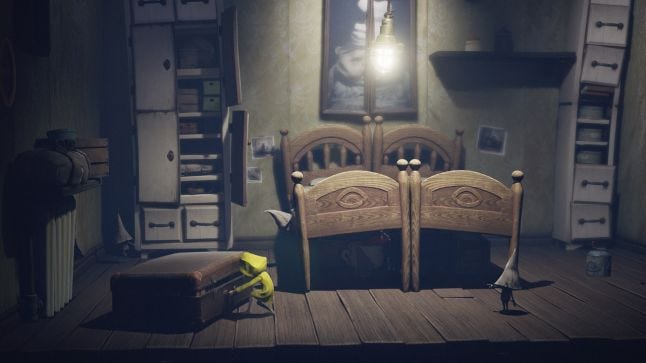
That’s not to say Tarsier hadn’t foreseen the issues with those moments that required precision control over Six. Initially, it was much harder, as the coders actually added extra systems to the game to help aid player controls and intent. The two systems that Mervik gave as example of this are called Jump Alignment and Beam Alignment.
“Jump Alignment helps by slightly directing the player movement directions as they are performing jumps,” he says. “This is useful for making them nail challenging jumps between platforms, aiming when jumping at door handles, swinging between lamps, and similar targeted actions.”
“Beam Alignment helps players stay within the confines of a beam while balancing high above the floor of a level,” continues Mervik. “If you press in the general direction of the beam, Six should stay on top of it, but if you do veer too much off course, she will eventually fall down.”
Any issues that came out of the controls or camera view of the game that these extra systems didn’t fix were considered a necessary sacrifice. What the team always prioritized, and wouldn’t compromise on, was the unnerving, otherworldly feeling created by the camera in Little Nightmares. You can see how it enthused the creativity of the team by looking at the game’s wonderful character concepts and art design.
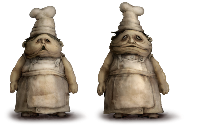
The world that you travel through in Little Nightmares is clearly built for people who are much bigger than Six and so travelling through it is both unwelcoming and challenging. To enhance that, shapes and bodies are exaggerated and bloated, stretched into surreal and sometimes horrific forms. “This is a stylistic approach that is designed to reflect the way Six, and children in general, might see the world. Everything is more than it is - the world is bigger, people are scarier, situations are more surreal - and this grows even more exaggerated in the retelling,” says Mervik. “There's this need to convey exactly HOW big a deal all of these things feel to them, and we wanted to capture some of that same spirit.”
For Mervik, as the narrative designer, the exaggeration in the art style also conveyed the game’s themes and story without words. “To have this world feel so 'other' so that you feel in your bones, that it was built for others, and that you simply don't belong there; and to meet these people whose inner life has shaped their outer form, it almost feels like these kind of ideas have to be seen and felt, rather than simply told,” he says. “Words can have a tendency to cheapen feelings - which, hopefully, I haven't just done!”
For his own input on the game, Mervik was inspired by his personal love affair with Roald Dahl’s children’s books, which depict “gutsy kids against a shitty world,” which he adds “feels as relevant now as it ever did.” But even with his job title, he didn’t get to decide the game’s themes and narrative by himself, as the structure at Tarsier is deliberately flat so that everyone knows as much as everyone else and has an equal voice. “We usually get into groups and talk about stuff for several hours, and by the end we usually know what we want to do without it being this big scary decision type thing,” says Mervik.
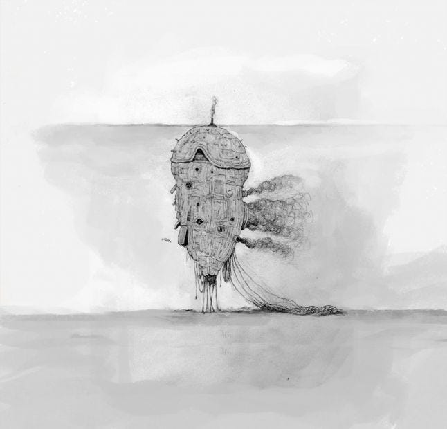
“The lack of dialogue or text is actually a perfect example of this. It was a subject that came up very early on, and I probably said words to the effect of 'nah, we don't need to talk in this one do we?' and we took it from there, and all agreed it was the right way to go,” Mervik says. “If I had been the only one who felt that way, that's when the discussions can prove invaluable, because there's clearly a disconnect somewhere and it's important to stay in sync if you want to make everything feel coherent.”
This collaborative studio culture at Tersier is primed towards making games that are unique and of a certain quality. The flat structure, as Mervik says, helps to keep everyone on the same level so that the finished game feels consistent throughout. Room is made for individual creativity within that structure too. For example, the way the characters and locations were invented was from the concept artists being given a brief, and then letting them sketch whatever they like to match it. Once finished, they show the rest of the team their drawings to see what catches everyone’s imagination, then there’s a round of feedback, and the favored concept is then used as a style guide to build assets and the rest of the art.
The one arguable downside of Tarsier’s approach to game development, which relies heavily on both iteration and feedback, is that it can be harder to make bigger games this way. This shows itself in one of the most common criticisms of Little Nightmares, which is that it’s too short. It took most players around two hours to complete, not including the optional items to find and collect.
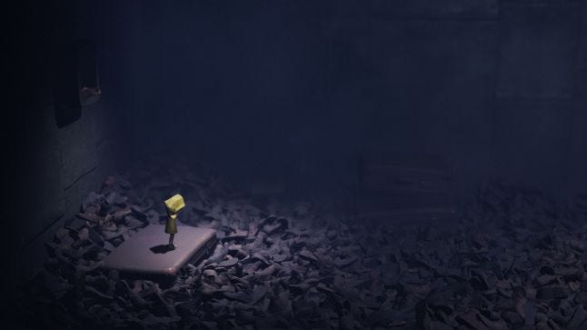
“It's a bittersweet thing to hear really, since you don't really want people to leave feeling unfulfilled, but at the same time, it's kinda nice to hear that they do want more,” says Mervik. “It can be too easy to conflate quality and quantity, but we were loath to make a game that was long just for the sake of it. In a practical sense too, we're a pretty small company and even if we wanted to make something more bloated, it just wasn't an option. Quality always has to come first.”
What’s clear is that Little Nightmares was always intended as a “smaller, more personal tale about a kid trying to escape a world full of monsters.” It has been that way since the seeds were sown those 13 years ago with the prototype for The City of Metronome. Tarsier knew that to try to make it bigger than it needed to be would be to harm the game overall. Plus, it would mean rushing past good ideas rather than building upon them and see where that process took them. The studio would rather make a high-quality dollhouse than a ramshackle tower block, so that’s what they set out to do.
You May Also Like