Trending
Opinion: How will Project 2025 impact game developers?
The Heritage Foundation's manifesto for the possible next administration could do great harm to many, including large portions of the game development community.

Featured Blog | This community-written post highlights the best of what the game industry has to offer. Read more like it on the Game Developer Blogs or learn how to Submit Your Own Blog Post
Lead Writer on Tahira: Echoes of the Astral Empire Peter Castle discusses his company's process when designing new characters for the game.

Hi, I’m Peter Castle, the Lead Writer at Whale Hammer Games. We’re five months into the development of our game, Tahira: Echoes of the Astral Empire, and so far we've had a lot of fun bringing the game's characters to life. As we move from pre-production into production we wanted to share that process with you.
Bear in mind that everything I'm discussing is a work in progress and it's likely that parts of it will change as we continue to develop the game.
Tahira: Echoes of the Astral Empire has a strong narrative component. The first step in the character concepting process is for me to work out the basics of who a character is and to identify any key pieces of visual information that our Lead Artist Peter Simpson needs to get started. That information usually consists of things like gender, age, race and in the Claw's case, his scar.
Peter takes that information and spends some time working on his interpretation. Once he's satisfied, he shows me and we bounce it back and forth until we’re happy with the result. Somewhere in that process (it varies) we sit down with our Designer, Tom, and decide what combat role the character will fill. You'll see in the first two concepts below that the Claw was initially drawn as an archer. The combat role decision is usually informed by the personality and history of the character as well as the needs of our combat system. In the Claw’s case,
Peter nailed the facial features on the first go and we moved straight into concepting the clothing and gear.
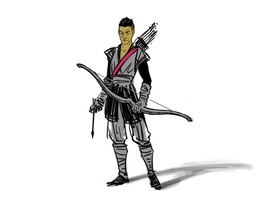
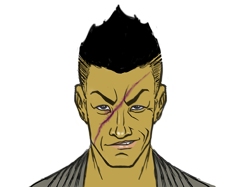
Peter spent some time iterating on the Claw design so we had some options to choose from. We are always trying to find a design that conveys key information about the character to the player visually rather than needing that information to be explicitly stated in the written narrative.
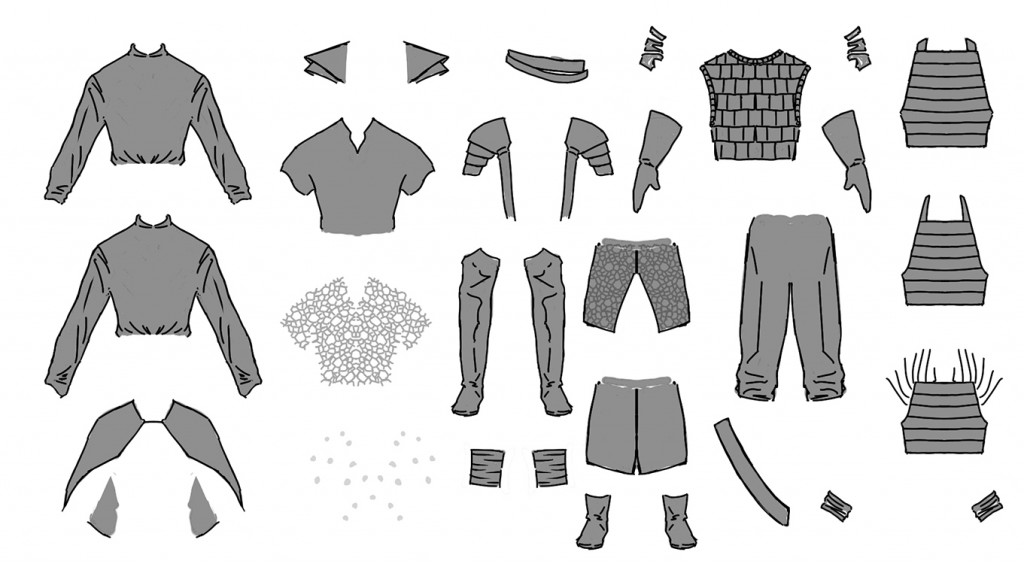
One of the things we had to consider when we put together his clothing and gear was what the player would actually see in the game. It's all very well to look up your favourite fantasy and medieval TV shows and movies for clothing reference, but when your character is only a couple of centimeters in size you quickly find that anything with too much detail doesn't work.
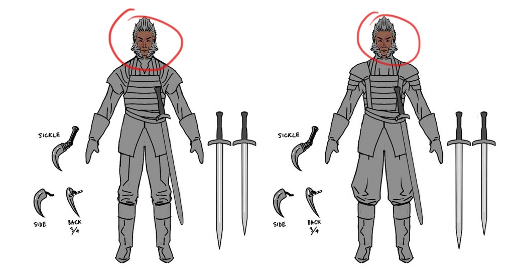
We liked the Wolverine-esque facial hair on the Claw, but decided it didn't fit with the character's vanity.
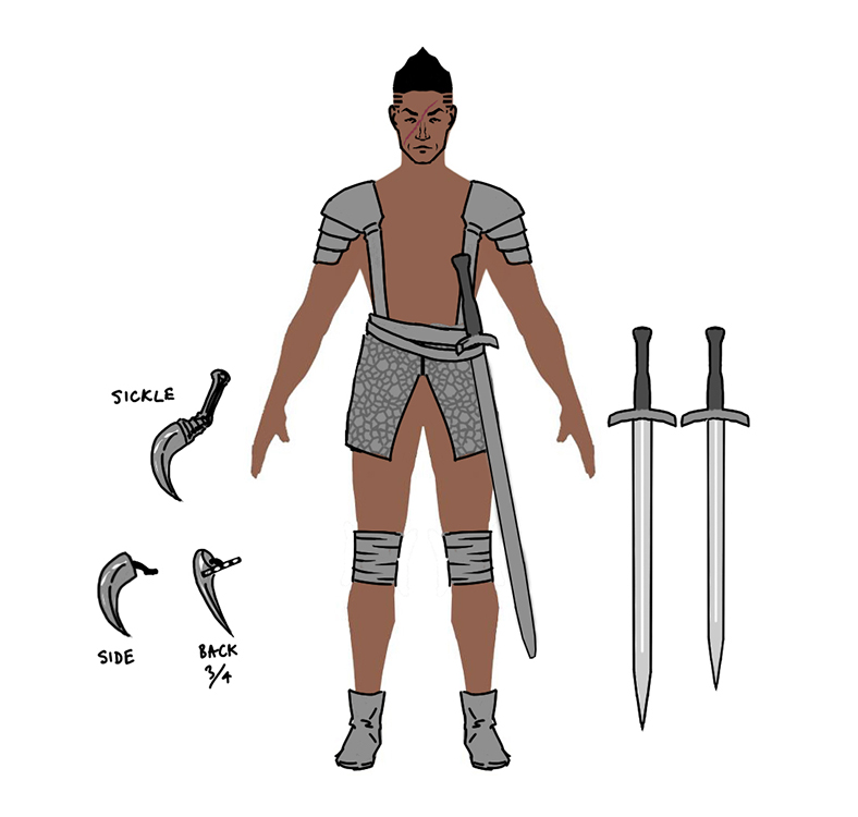
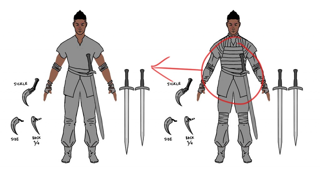
Peter scoured the web for all kinds of medieval and fantasy clothing. In the end we kept coming back to practicality. Characters like Jorah Mormont from HBO’s Game of Thrones have that mix of stylish but practical looking clothing and equipment and that was something we wanted to capture.
The Claw is a travelling mercenary, always on the road and ready to fight at a moment’s notice. The comfortable shirt and pants combination makes sense for someone who spends a lot of time in the saddle. We liked the heavier armour, but decided to use the light armour as it fits with the Claw's personality and combat role in the game.
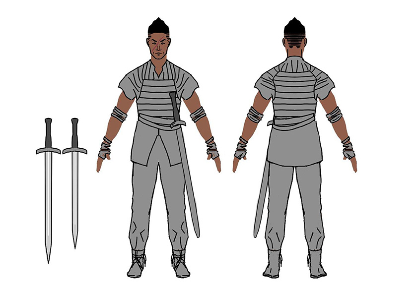
There are a number of factors we consider when we sit down to colour.
1) We need to create an interesting colour scheme that fits the character and the world.
2) Test that colour scheme against likely background colours.
3) Test its readability when you have a lot of other characters on the screen at the same time.
We're still quite early in development and colours are something we’ll be spending a lot more time on later in the process. For now though, we played around with a few different schemes and found a couple that we liked.
Generally we find it easier to do something roughly, even if we aren’t going to use it. That means when it comes time to do it properly we can iterate rather than starting from scratch. Thankfully our colouring workflow means that any time spent on the colouring now will save time later in the project. I’ll go into this in a lot more detail in a future post.
If you're looking to get started with colour, there is an excellent guide that Valve has put together on colour theory for Dota 2. You can view it here.
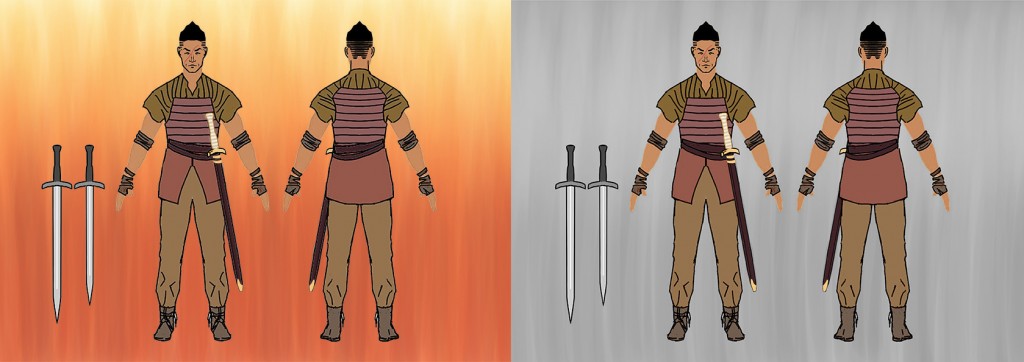
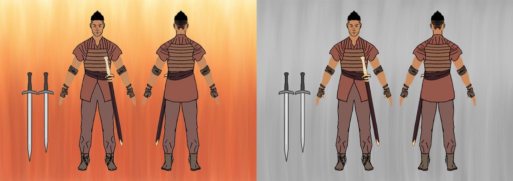
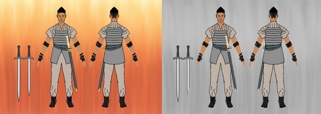
We were a bit surprised by how readable grey and beige are on a grey background.
That wraps up part one. If you have any questions or insights into the development process fire away in the comments. In Part Two, we will take the Claw concept and begin the process of turning him into an animated character.
For more development updates check out our website and follow us on Twitter and Facebook.
You May Also Like