Trending
Opinion: How will Project 2025 impact game developers?
The Heritage Foundation's manifesto for the possible next administration could do great harm to many, including large portions of the game development community.
Exactly how does one manage so many players in such a small, lawless space? Proper attention to spawning locations, pathing and flow can help bring order to structure to the chaos.

Game Developer Deep Dives are an ongoing series with a goal of shedding light on specific design, art, or technical features within a video game in order to show how seemingly simple, fundamental design decisions aren't really that simple at all.
I’m John Begg from Torn Banner. I am a Level Designer on Chivalry 2, which was released in June 2021. I joined Torn Banner in 2016 as QA before transitioning to a full-time level designer - and I was the level design lead on the Desecration of Galencourt map we added in August 2021 for the game’s Team Objective game mode.
What: Galencourt Ships for 64 players
In the middle of the massive Chivalry 2 map The Desecration of Galencourt, we took on one of our biggest challenges yet in level design: trying to cram 64 players on a boat, keeping that boat easily accessible through chaotic combat, all while giving the combatants a show of wood-splintering destruction. This wasn't such a simple task, but that was precisely what we needed to do.
Galencourt is a Team Objective mode map, which means it takes players on a journey through multiple objectives across a huge playing field. Think: raiding a castle, from the opening siege until the final moments of murdering the King’s heir inside the keep. Each Team Objective map tells a completely different story through its objectives, with attackers attempting to progress through the objectives while defenders try to halt their progress entirely. There are now six Team Objective maps in Chivalry 2, including Galencourt, although we’re always adding more (including the upcoming Raid on Aberfell map).
After players siege the city walls, a highlight of Galencourt is the second objective: where attackers must destroy a pair of docked ships in an explosive spectacle.
To do this, each ship conveniently has a big pile of explosives laid out at the base of the ship’s central mast. The attacking players can interact with the explosives and ignite them while the defending players must try to stop them.


This is where we encountered our first issue in level design: how do we position each ship and the surrounding paths so player flow to the objectives was both fun to navigate and clear enough for people to understand?
The answer we arrived at: staggering which objectives were visible and adjusting both teams' spawning locations, depending on if the first objective (where attackers sieged the city walls) had been completed. This allowed us to better focus players on the first ship and discourage players from overextending and wandering into the enemy spawners.
Another thing we needed to do to achieve our vision meant straying a bit away from realism and making some compromises for the sake of playability. We drifted away from what we saw were realistic portrayals of a dock to something that still read as a dock, but better fit what we needed from the space. This meant that areas that would normally be quite tight and perhaps impossible to move through were opened up to give us as much space as we could get. This additional space gained from straying a bit from realism allows having more control on the flow into the objective. We will see another instance of our level design drifting away from realism when we get to the layout of the ships themselves.

The second issue we encountered was: how do you get 64 players onto a ship without funneling them all over a single gangplank?
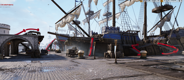
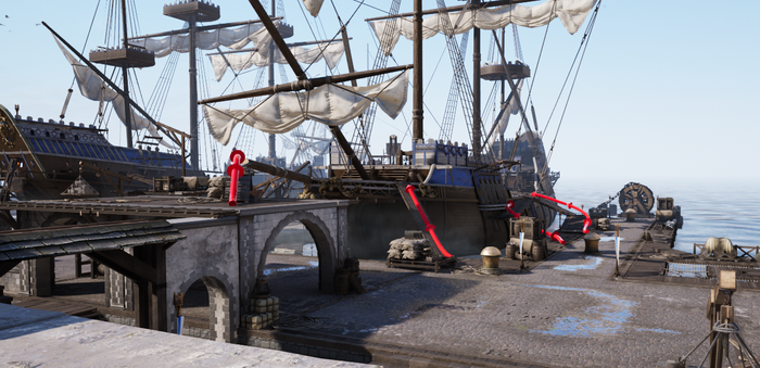
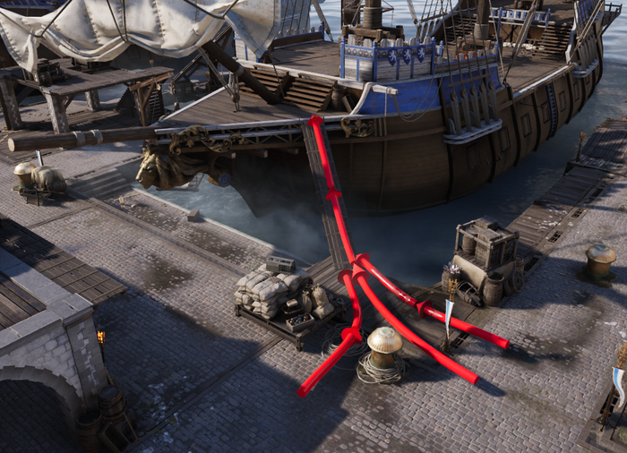
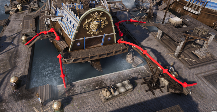
Well, we add more paths of course! But you can’t just add paths without taking into account if they would be useful or even used. Ensuring said paths are easily visible to both newly spawned players as well as players transitioning into the space from the previous stage is crucial to the flow into the objective’s space. For players transitioning into the area from the previous stage we ensured that the three paths were also visible to them from their likely new spawn point, the ramp from the building's roof to the ship, the long gangplank, and the larger boarding structure connecting to the main deck.
The width of these added paths was a concern but ultimately these narrow paths created fun moments in which a defending player was able to hold against the attackers onslaught, if the paths onto the ship were too limited then this fun moment would quickly turn into frustration for attacking players.
The final issue we will discuss is the actual layout of the ships themselves. While having hyper-realistic ships would be awesome, they don’t work for what we need. We needed a simplified ship layout, something much easier to get onto, navigate, and get off without getting snagged up on pesky edges and corners or feeling extra cramped when in a fight. We restricted players to the top decks as we found that having areas you can navigate below deck was much too cramped for combat and we just didn’t have the room to accommodate pathways to the lower decks.
Since the two ships are oriented differently this complicated things. Some of the pathways we used to gain access to the first ship could not be applied to the second ship. Luckily, flipping the second ship 180 degrees allowed us to open up the second ship’s main deck's lower balcony, giving us an entrance that the first ship didn’t have.

Why: For the sake of flow
When I think about flow in Chivalry 2’s Team Objective levels I think of it like a lake, its tributaries and the water comprising those things. Where the “lake” is the objective and the “tributaries” are the player's paths to said objective, and then players are the water in this example. Players, like water, will normally seek the quickest and most straightforward path to where they need to go or want to go. In my level design work, ensuring that these paths are clear and numerous enough so that we can get these players into the objective space without causing frustration about where to go or how to get there is paramount to the enjoyment of the space and objective.
The flow also affects the balance of the objective and stage. If the flow onto one ship is easier for one team and not the other, then the number of players in the objective area will likely be skewed. Now, this isn’t always a bad thing in Chivalry 2’s Team Objective maps, because sometimes for the sake of the overall progress of the map we want to make some objectives easier for the attackers than the defenders. Making sure that the flow for both attackers and defenders into the objective area is correctly calibrated to what you want to get out of the stage will make it much easier in reaching your vision for the stage.
Result: Structured Chaos
These decisions and reasonings helped us create what I would call structured chaos. Why chaos? Simple, 64 player battles are chaotic.
While always being engulfed in chaos can be overwhelming and tiring, giving it some rough boundaries can be beneficial. Giving players clear and sufficient paths to the battle helped us structure the chaos around the objective on the main deck of the ships in Galencourt. Since the chaos of battle was primarily focused on the ships, it allowed the area in between to become a fun area that players could use to traverse to their next objective without being overwhelmed by the enemy.
When the ships in Galencourt explode, it becomes a defining moment in the story of the battle. As the seconds count down on the objective timer for the lit powder keg to explode, the sudden chaos of war takes an almost comical pause: everyone glances upwards as a massive wooden ship mast careens down into the water, smashing through a few players in the process. It felt like a real success for me as a level designer to be able to bring this cathartic and memorable experience to players who battle through Galencourt.
You May Also Like