Trending
Opinion: How will Project 2025 impact game developers?
The Heritage Foundation's manifesto for the possible next administration could do great harm to many, including large portions of the game development community.

Featured Blog | This community-written post highlights the best of what the game industry has to offer. Read more like it on the Game Developer Blogs or learn how to Submit Your Own Blog Post
A look at several key design choices made in Spelunky and how they support the core experience.

I've recently re-discovered Spelunky on Vita and have come to appreciate many aspects of the frustratingly addictive gameplay. Had it not been for the tight controls, slick frame rate and well-designed gameplay it could have been the cause of a smashed OLED screen. This article aims to detail five factors of the game's design which supports the core challenge of survival whilst limiting player frustration and providing replay value.
1. Retro Logic Promoting Usability

Spelunky eases new users into the experience by referencing what has come before whilst remaining consistent with the player's expectation. Enemies can be jumped on (like Mario), secrets are accompanied by a melody (like Zelda), spikes can be walked over (like Prince of Persia) and bombs can be placed (like Bomberman). By leveraging this information, new enemies and hazards can be introduced steadily allowing the player to experiment with the tools at their disposal whilst the designer can tweak behaviours to push their own standard towards the end of the game.
2. Procedural Doesn't Mean Random

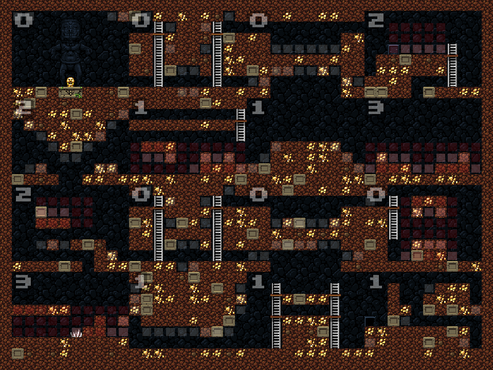
Procedural is the buzzword attached to many recent indie titles such as Rogue Legacy, Don't Starve and Minecraft. However, it can be mistaken for random which implies a lack of control. Spelunky is quite the opposite. The above example is taken from Spelunky Generator Lessons which highlights the layout of each 16 room environment, each numbered to determine room types and viable exits.
With more experience playing the game, common themes present themselves providing consistency across subsequent play throughs:
The start position is towards the top of the environment
The exit will generally be towards the opposite corner of the start position
Every level can be completed the without use of equipment
A maximum of one shop keeper appears per standard level
Enemies from the next world may appear before you progress to it (you are near the end and hint at upcoming hazards)
And the list goes on...
Layouts are definitely created with defined limitations in mind.
3. Variety Is The Spice Of Life

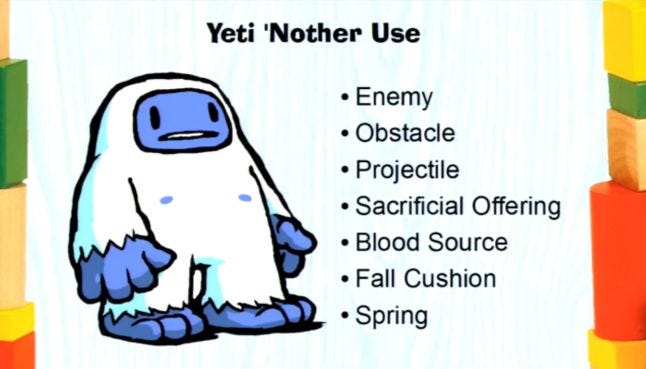
Taken from a talk at GDC 2013, Andy Hull (lead programmer on Spelunky) says that every item, hazard and enemy in the game was designed to have multiple uses. The above example of the Yeti taken from his presentation clearly demonstrates this, allowing the player to experiment with their approach in different situations.
On a different note, modifiers are infrequently applied to the environment in order to provide an additional layer of challenge or mystery. Examples such as having limited visibility in the form of darkness or raised water levels filled with piranhas significantly hamper the pace of player progression. Between the extensive array of elements, deterministic layouts and a handful of modifiers, plenty of complexity in variation is provided to prevent gameplay from going stale.
4. Dynamic Ecosystem

The ecosystem within Spelunky lends itself to aid the player's knowledge in their quest to survive such as; being able to lure dangerous enemies into traps, using a returning boomerang to push objects off a ledge or burn sticky cobwebs with a torch. Whilst the relationships of the game elements become familiar, a satisfying chain of dominos can be achieved when intended but it can also foster potentially hazardous and surprising outcomes when they are not. The oscillation between the two provides numerous scenarios where events range from familiar to unpredictable, making each play through unique.
5. Difficulty Management

Finally, Spelunky uses several techniques to help prevent players from quitting the game in frustration or exploiting a trivial challenge, some basic examples include:
When the player spends too long in a level, a ghost appears to push the player forward, denying space and limiting the amount of loot that can be acquired
When the player dies, a quick restart option allows players to gloss over their failure and head straight back into the action
When a game area is completed, an NPC called Tunnel Man provides access to a tunnel to skip levels if some resources are delivered to him
Additionally, the difficulty of each area in Spelunky doesn't get progressively harder. The Ice Caves (the third area) are significantly less challenging than the rest due to the abundance of open space and relatively fewer traps. Two reasons that could explain this choice may be to provide a release after overcoming the tension of a challenging area but it could also be related to how players are conditioned.
It's known from psychology that most people get good at the exact task that they are trained on. The pitfall of this is that humans suffer from the curse of specificity which prevents learning from being transferred to a similar, but not the same, task. In Spelunky's case for example; when you've safely ventured through the Mines and have begun to overcome the Jungle, returning to the Mines becomes a colossal task due to the unfamiliarity with the challenges encountered, even if the gameplay is the same (a similar effect can be experienced in Dark Souls).
TL;DR
Spelunky is a prime example of a game where the design fully supports the core experience and whilst it may be considered extremely difficult or even unfair, there are plenty of decisions that have been made to keep the fun intact and limit player frustration.
Read more about:
Featured BlogsYou May Also Like