Trending
Opinion: How will Project 2025 impact game developers?
The Heritage Foundation's manifesto for the possible next administration could do great harm to many, including large portions of the game development community.

Featured Blog | This community-written post highlights the best of what the game industry has to offer. Read more like it on the Game Developer Blogs or learn how to Submit Your Own Blog Post
Discussion of several design principles and how they do or do not apply to virtual reality

Artist and designers have been striving to create more immersive experiences for consumers and clients for a long time. As early as the nineteenth century, painters began painting 360-degree panoramic murals with the hope of making the viewer feel present in the image. In the mid- 1800’s, Charles Wheatstone discovered that the human brain interprets two identical 2-dimensional images viewed from each eye as one 3- dimensional image. Charles discovery led to the invention of the stereoscope and later in the 1930’s, the commonly known View-Master. ("History Of Virtual Reality," 2017).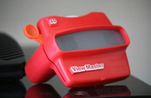 Without these early discoveries and attempts to immerse the viewer, modern virtual reality (VR) could not exist. Although these early artistic endeavors are important to the history of VR, their creators did not have to contend with the many complications that arise when attempting to immerse a user in a real-time 3-dimensional living/moving environment. The purpose of this document is to aid the modern designer, developer, artist, or story-teller in the creation of comfortable, immersive VR experiences. This document will discuss well-documented design principles and how they do or do not apply to VR content creation.
The first element of design to cover is probably the broadest element, color. Color exists in all visual creations; even a black-and-white image uses the colors of black and white. Rather than getting into the very long conversations about what emotions colors evoke, or what a color might signify, this discussion will focus on how to direct the attention of the user in VR.
One major complication of VR design is that the camera no longer belongs to the designer. The user has full control to look, and often move the camera in any direction they choose. This leads to a question. How can a design use color to direct the attention of the user? Herman Tulleken says “Value, saturation, and hue can all be used to distinguish important elements (Tulleken, 2015).”
The value of a color is how light or dark it appears (Learn.). A great video game example of using color value to direct focus is the game Limbo.
Limbo is a game designed only in grayscale. The player's attention is focused primarily on the fully black player character and foreground. The occasional fully white hazard stands out starkly in the grayscale game.
Using color value to direct attention is a design choice that holds true between the standard framed platform of a video game on the screen and the immersive environment viewed in a VR head-mounted display (HMD). Simply by making an element in the environment much lighter or darker than the surrounding environment, the designer can direct the attention of the user.
Saturation is the intensity of a color in an image (Webopedia). The more saturated an object or image compared to its surroundings, the more likely it is to draw attention (Lidwell, 2010). The overly white instructional signs in the game Portal are a good example of saturation being used to direct attention.
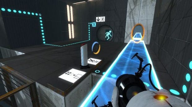 Again, saturation can be used in VR to direct user’s attention in the same way it has been used in media previously. This author suggests using desaturation to keep user’s focused in 360-degree VR environments. The further the user looks away from the designed area of interest, the image the user sees in the HMD should desaturate. Another example of desaturation is in the VR version of Alien: Isolation. If the player moves their camera through geometry in the scene, the designers make the camera fade to black (Pruett, 2017).
Hue refers to the three primary colors and the degree to which a color is representative of one of these colors (Learn). Color hue can be used to direct attention in VR by using a hue that is foreign to the environment it exists in or by using a hue that stands out against the rest of the environment. Mirror’s Edge uses a color pallet with mostly neutral hues so when a bright hue like red or yellow appear, they immediately direct the player’s attention.
 Color hue in VR can be used in the same way. If the designer wants the user to proceed a specific direction, then the path or objective should stand out from the rest of the environment regarding hue.
Confirmation is the second design principle to be covered. Confirmation is what it sounds like; it is a design technique used to confirm “critical actions, inputs, or commands (Lidwell, 2010).” This principle is mostly used with software but exists elsewhere in our everyday lives.
With software, the user is asked to click a confirmation button before the computer will complete a critical action.
Home appliances even use confirmation. The oven has the user press bake, then set a temperature, then press bake again to confirm.
In VR, gaze input is becoming common practice. Often, a means of confirmation is to have the user gaze at an object or image for a set amount of time.
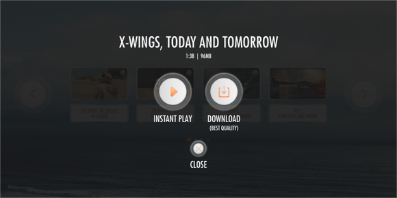 Further confirmation can be had by creating a pop-up to confirm the user intended to gaze at the object that creates the interaction. Creating a gaze interaction point that is off-center from the default central view is also highly suggested (Hsu, 2016).
When designing any application, consistency is vital. Consistency means that similar parts are expressed in similar ways (Lidwell, 2010).
 Think of how a stop sign and a stop light are both the color red. The platforms are completely different, but the purpose is the same, both tell a driver to stop.
Consistency is why the play and pause buttons on remotes, recorders, car stereos, and even computer applications all look the same.
 The symbol for play and pause has been learned and remains consistent across all platforms. In the same way, consistency is important in VR experiences. As mentioned earlier, the timed gaze control has already become a consistent feature in many VR applications. Users of VR devices have already learned that staring at an interactable object will cause it to function. The principle of consistency applies to VR in all the same ways it applies to every other form of media and design.
Many VR entertainment developers are already using forms of consistency in their products. Accounting by Crows Crows Crows uses constant dialog to direct the player on what to do. There is a phone that often appears in scenes the player needs to answer to receive direction. They also consistently use a virtual version of an HMD to transport the player to new areas.
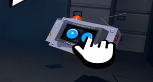 Another form of consistency becoming a standard in VR is the ability to teleport for locomotion. Many games handle teleportation in diverse ways, but the mechanic stays basically the same. This particular consistency evolved out of the need to be able to move users around larger areas without needing to walk in a room scale VR set-up or forcing a user to use a controller to move the camera. Moving the camera without the user’s body physically moving is a leading cause of sim-sickness.
Feedback loops in video games are vitally important. If done correctly a feedback loop can be the thing that keeps a user engaged and returning day after day. A feedback loop done incorrectly can be devastating to a game or experience. Feedback loops can be either positive or negative.
A positive feedback loop exists anytime doing one thing makes each subsequent thing easier. A great example of a positive feedback loop done correctly is the Diablo games. The player kills monsters and collects their dropped loot. The player then exchanges the collected loot at a merchant for better weapons and gear. Next, the player kills more powerful monsters who drop even better loot. Then, the player exchanges that loot for even better weapons and gear. The loop repeats over and over.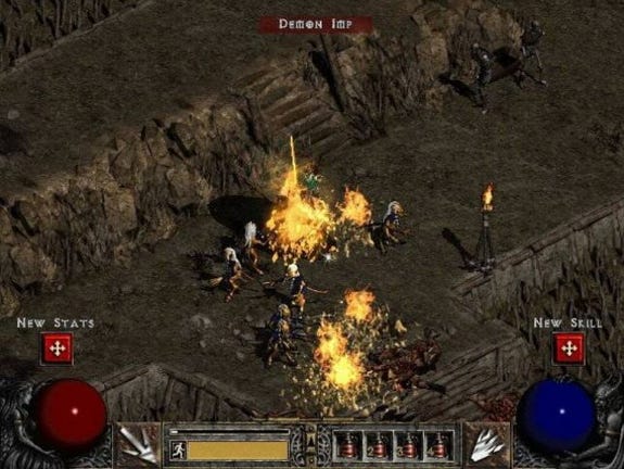
Most Real-Time Strategy games use a positive feedback loop by encouraging the player to gather resources to build factories or other structures. These new structures then produce even more resources. This is not necessarily a bad example of a positive feedback loop but it can easily become one in player versus player matches. If a game is not properly balanced and one player starts the game with more resources available than the other player. The player with the larger quantity of resources in the beginning will easily defeat the player with fewer resources.
A negative feedback loop works exactly the opposite of the positive feedback loop. When something bad or negative happens it increases the odds of another bad or negative thing happening.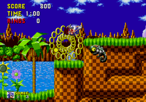
A good example of a negative feedback loop is in the classic game Sonic the Hedgehog. When sonic takes damage he loses all his rings. That's the first negative. Now because Sonic has no rings, if he gets hit again he'll die. Then, when Sonic respawns, he starts with no rings, even if the area he respawns is an extremely difficult area. Now Sonic is more likely to die again.
All the conditioning that designers create in users by implementing feedback loops translate into VR the same way they are implemented into standard framed video games today. VR experiences and games can and will benefit from the implementation of feedback loops. The early VR games and experiences will train the next generation of users. The early experiences must have good use of feedback loops for VR to be successful as a platform.
“The time required to move to a target is a function of the target size and distance to the target (Lidwell, 2010).” To easily understand Fitts law observe the image below.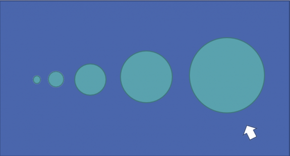
Which circle would you be able to move the white cursor into the fastest? The large circle should be your answer. It is the closest circle, and it is so large that it would take very little effort and movement to get the cursor into the large circle. The smallest circle on the left would take you the longest to touch with the cursor. You would start with a single large slide to get the cursor near the small circle and then a series of small refinement movements to get the cursor to touch the small circle. This cursor example is the essence of Fitts Law.
In VR Fitts law is still relevant. To prevent unnecessary neck strain, designers should make the most import elements in the scene large and close to the central focus of the viewer. Objects that are small and in the distance in VR will cause the user to move their neck much more frequently and potentially cause unnecessary harm.
Freeze, fight, flight, or forfeit is the natural stress response in humans (Lidwell, 2010). Video games have been inducing good and bad stress on players for years. The Resident Evil series is known for inducing fear-based stress. Online competitive games cause stress through exciting and challenging encounters and rivalries. Stress in these forms is often welcome and the reason people choose to play games.
VR experiences have the same opportunity to induce stress in the user. In standard framed gaming experiences, the user is aware of their physical surroundings. In VR, the user is completely shut off from their physical surroundings. A user in VR is completely immersed in the experience, and traumatic events in VR can seem real to the user. This level of immersion has the potential to leave lasting mental effects on the user. Due to the level of immersion, designers must question the ethics of creating obscenely graphic, disturbing, and horrifying VR experiences.
One such example of potentially unethical disturbing VR happened in 2016. Knott’s Berry Farm had worked with a development company to create a scary VR experience. Guest at the park would pay to be strapped into a hydraulically driven wheelchair while wearing a Samsung GearVR and headphones. Once inside the experience, the user was transported to a frightening medical facility.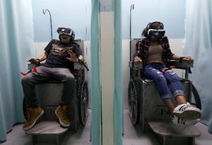
At the facility, a nurse would give the user a shot, which thanks to haptic feedback, the user could feel. Then the scene would fade to black as if the user had passed out only to suddenly awaken and be surrounded by bloody dead bodies and chased by zombies. Users were given a panic button they could use if the experience became too much to handle. Ultimately, the attraction was shut down but not due to the frightening nature of the experience. Many in the mental health community were outraged about the stigmas the experience propagated regarding individuals with mental health issues. (Craig, 2016).
The lesson to be learned from the Knox’s Berry Farm attraction is that people view VR differently than other forms of media due to its immersive nature and the potential it has to influence a person’s thoughts and actions. According to Emory Craig's article, IMDB list’s 99 horror films that rely on the mental health theme (2016). Several video games use mental health and mental health facilities as themes as well. When it comes to VR, designers must remain cognizant of the fact that they are creating an alternate reality that once immersed the user can and often will forget about the real world around them. That’s not to say horror and thriller VR experiences shouldn’t exist, only that such experiences should be properly labeled, and users should be warned about what they will experience.
The Gutenberg Diagram is an image divided into four quadrants that shows how the typical westernized human eye travels a page (Lidwell, 2010).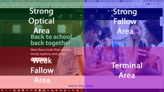
The Gutenberg Diagram works well for pages of text, but it is not always true in other forms of media. Think of the search results a user receives from an internet search engine. Typically, the user is inclined to use what has become known as the “F-Shape pattern.”
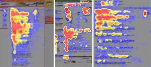 Using the F-shaped pattern, a user will look at the first line of text, then scan the second line, and then proceed to scroll down the left side of the page (Pernice, 2017).” The F-shaped pattern is created because the relevant information the user is searching for is held entirely to the left of the page. The right-side of the page generally contains ads and other data.
As discussed earlier, we know the Gutenberg diagram is primarily used for text-based pages in western culture. Knowing that the western user is always going to look to the top right of the screen first, how can we apply the Gutenberg diagram to VR? The simplest solution is to place the most relevant information to the user in the upper left corner of their screen. Similar in fashion to how standard framed video games put the health bar or other vital information in the top-left of the users heads-up-display (HUD).  The best solution in VR, regarding the Gutenberg Diagram, is to expel the previously held notion that a HUD is needed. Find a way to relay the information to the user without placing a static image anywhere in their view. Information should become part of the environment the user is in. Health bars should be replaced with visual damage to the hands or perhaps a wrist-watch type device. User Interfaces (UI), should be replaced with items that blend into the environment as well. Directions in an open world can be given with road signs, driving games can have GPS in the dashboard of the vehicle, and if all else fails, the user can have a virtual cell phone to look at. The cell phone can use the Gutenberg diagram and act as the UI for the entire experience. The way the UI is incorporated into the VR experience is dependent on the experiences theme, but with VR, there are better options than static floating images that break the immersion.
Highlighting is the act of bringing attention to an object, area, or text (Lidwell, 2010). The use of highlighting in video games has been around for some time. Many first-person games use highlighting by placing a glow around the edges of items, areas, or people of interest. 
Some games place markers above non-player characters (NPC) heads to draw the players attention. Whatever the method, Highlighting is another type of consistency that should be translated into VR. Not all VR experiences should use highlighting, the same way, not all video games should use highlighting. The use of highlighting is 100% dependent upon the type of experience the designer is attempting to relay to the user. For example, a training simulation in VR may use highlighting to help a trainee learn what objects are required to complete a task. A VR flight sim may opt not to use highlighting to convey a sense of realism to the user.
Highlighting doesn’t have to be just a glowing edge or marker on objects and areas. Highlighting can be done completely non-visual as well. Perhaps a radio broadcast in a VR world describing an incident the designer wants the player to get involved with, or NPC’s talking about the previously mentioned event. The designer could have NPC’s pointing at something, or perhaps the user’s character has a dog that points out objects and areas of interest. There are many ways a designer can choose to highlight. In the case of VR, highlighting is no different than standard framed video games. The method should be left to the designer and made to fit with the theme of the experience.
According to Lidwell, immersion is, “A state of mental focus so intense that awareness of the "real" world is lost, generally resulting in a feeling of joy and satisfaction (Lidwell, 2010).” It goes without saying that VR is the ultimate form of immersion in digital content. “Immersion into a virtual reality world is the perception of being present in a non-physical environment. This perception is created by surrounding the user with images, sound, and other stimuli to provide an engrossing experience (Eisenberg, 2017).
The second quote from Eisenberg is of particular interest regarding VR. Standard framed video games, movies, and even music already have the ability to immerse a user. With VR, we literally blind the user to any outside stimuli and often cover their ears with headphones deafening the user to anything but the audio emitted from the VR experience. As a designer, VR gives you the users complete focus and attention, something that was not possible in the past. This level of immersion, if wielded by the designer incorrectly could be dangerous. This author has personally seen users unintentionally harm themselves and others while immersed in VR. Users will flail their arms and hit surrounding objects and people; they will attempt to flee from a pursuing threat right into a real-world wall; users will even jump and forget where the floor is and land incorrectly hurting ankles and knees.
 As designers, we must remember that our user will be fully immersed in the experiences we create. It is vital that we sometimes remind the user of the outside world. How we choose to protect our users is design, and possibly platform, dependent but import all the same. As time goes on, the level of immersiveness with VR is only going to increase. Haptic devices, bodysuits, better resolution, tactile devices, and even smell reproduction devices are all being designed to further immerse users in the future.
Mapping is the final design principle to be discussed in this document. Mapping is how the controls are mapped to user input for ease of use (Lidwell, 2010). With the current iteration of VR, there are very few options on the market for input devices. Users with the HTC Vive get to use a large wand type controller with grip buttons on the side and a touchpad for the thumb. Oculus Rift user get the Touch controller that, in this authors opinion, fits more naturally into the user's hand. The Touch controller is sort of like a split Xbox controller with a joystick and two buttons for each thumb and a bumper and trigger for each pointer and middle finger. The Touch also incorporates a capacitive input on the bumper and thumb-pad area of each controller that can be used to determine if the finger is touching or not touching that area of the controller.
HTC has also introduced what they call a Puck Tracker that can be attached to any object or body part to track its location in 3D space. Other input devices exist like the Razer Hydra controllers but are less commonly used. The Rift can also be used with a standard Xbox One controller, but again, it is less commonly used than the touch.
As with all video games in the past, how the controller is mapped to the player's input can make or break a game. In VR, if the controller is improperly mapped not only is it game breaking it is also immersion breaking. Making the controls for VR experiences simple and natural is a priority. Experiences should be designed, so the user doesn’t need to think about what their hands are doing outside of the VR experience. In the near future, designers may not have to think about input mapping at all. Companies like Leap motion are attempting to make the human body a controller extinguishing the need for a separate device to input commands in virtual space.
Andrade, M. R. (2013). The Gutenberg Diagram in Web Design – User Experience – Medium.Retrieved 2017, from https://medium.com/user-experience-3/the-gutenberg-diagram-in-web-design-e5347c172627
Aphtin, V. (2015). Glow highlighting in Unity. Retrieved 2017, from http://xroft666.blogspot.com/2015/07/glow-highlighting-in-unity.html
Chronicler, C. (2015). Sonic the Hedgehog – Retro Repetition. Retrieved 2017, from https://chronicchronicler.wordpress.com/2015/09/27/sonic-the-hedgehog-retro-repetition
Eisenberg, A. (2017). VR Immersion: A Step Closer to the Matrix. Retrieved 2017, from https://appreal-vr.com/blog/virtual-reality-immersion-what-is-it-and-how-it-works/
History Of Virtual Reality. (2017). Retrieved 2017, from https://www.vrs.org.uk/virtual-reality/history.html
Hsu, J. (2016). 4 Things I learned Designing User Interfaces for VR at Disney. Retrieved 2017, from https://medium.com/startup-grind/4-things-i-learned-designing-user-interfaces-for-vr-cc08cac9e7ec
Lang, B. (2016). Including Controllers, Vive and Rift Could be Evenly Matched on Price. Retrieved 2017, from https://www.roadtovr.com/including-controllers-htc-vive-and-oculus-rift-could-be-evenly-matched-on-price-touch/
Learn. (n.d.). Retrieved 2017, from http://learn.leighcotnoir.com/artspeak/elements-color/hue-value-saturation/
Lehrer, A. (2016). 5 Ways to Optimize Immersion in Games. Retrieved 2017, from https://higheredrevolution.com/5-ways-to-optimize-immersion-in-games-ee408e94a6e4
Lidwell, W., Holden, K., & Butler, J. (2010). Universal principles of design. Gloucester, MA: Rockport.
Pernice, K. (2017). F-Shaped Pattern of Reading on the Web: Misunderstood, But Still Relevant (Even on Mobile). Retrieved 2017, from http://www.nngroup.com/articles/f-shaped-pattern-reading-web-content/
Pruett, C. (2017). Lessons from the Frontlines: Modern VR Design Patterns. Retrieved 2017, from https://developer.oculus.com/blog/lessons-from-the-frontlines-modern-vr-design-patterns/
Red Traffic Light Pictures, Images and Stock Photos. (n.d.). Retrieved 2017, from https://www.istockphoto.com/photos/red-traffic-light?excludenudity=true&sort=mostpopular&mediatype=photography&phrase=red traffic light
Reeves, B. (2016). Mirrors Edge Catalyst Review – A Hop, Skip, And A Sophomore Slump. Retrieved 2017, from http://www.gameinformer.com/games/mirrors_edge_catalyst/b/playstation4/archive/2016/06/06/mirrors-edge-catalyst-game-informer-review.aspx
Russell, B. (2016). Mattel’s new View-Master VR headset looks cool as hell. Retrieved 2017, from https://www.technobuffalo.com/2016/02/15/mattels-new-view-master-vr-headset-looks-cool-as-hell/
Schweit, F. (2016). 16 years later, Diablo 2 gets a patch, still no cow level. Retrieved 2017, from https://www.brokenjoysticks.net/2016/03/11/diablo-2-gets-patch/
Tulleken, H. (2015). Color in games: An in-depth look at one of game design's most useful tools. Retrieved 2017, from https://www.gamasutra.com/blogs/HermanTulleken/20150729/249761/Color_in_games_An_indepth_look_at_one_of_game_designs_most_useful_tools.php
Webopedia. (n.d.). Color saturation. Retrieved 2017, from https://www.webopedia.com/TERM/C/color_saturation.html
Read more about:
Featured BlogsYou May Also Like