Trending
Opinion: How will Project 2025 impact game developers?
The Heritage Foundation's manifesto for the possible next administration could do great harm to many, including large portions of the game development community.

Featured Blog | This community-written post highlights the best of what the game industry has to offer. Read more like it on the Game Developer Blogs or learn how to Submit Your Own Blog Post
A deeper look at the design of the game Quash

My name is Vincent. I’m a French game design student from Supinfogame Rubika, a game development school based in Valenciennes, France. I worked on many game projects during my studies that taught me a lot on game development and game design. I released games made with friends on Steam alongside my studies. The first one was Atma, a story-driven adventure game inspired by games like Zelda and Okami. The latest is Quash, a VR arcade game currently in early access on Steam.
I wrote this article to share the experience I had during the development of Quash. It taught me a lot about designing for VR. I wanted to talk about the process and the decisions we took to achieve our goals. I hope this article can help and/or inspire people who face difficulties during the development of their own VR game. (And I know how difficult and incredibly frightening it can be to design for VR).
Quash is a VR Arcade racket game where the player must destroy every brick in the wall in front of him. To destroy the bricks, the player has to strike a ball with their racket to create an explosion that blows the bricks within its range when the ball hits the wall.

You can easily describe the concept as a mix between Squash and Breakout.
The game is designed around 2 core pillars that drive the game’s experience.
Make the player feels strong and powerful
Everyone can play and succeed
Racket sports tend to be more difficult than we thought at first. It's complicated to aim accurately with a racket, and you need to be able to catch the ball, which is not easy. It made us realize that we don't want the player to have an experience similar to a real racket sport. We wanted something easier, more accessible, focused on the feeling of hitting a ball and destroying everything.
We want everyone to be able to smash this damn ball!
We wanted to create a game where everyone can succeed without sacrificing a sense of challenge and let players improve by themselves throughout the game.
Above all, we focused on the feeling of the gameplay to achieve our design goals.
In Quash, there aren't any real conditions for defeat. We needed to avoid “traditional Game Over” to let the player complete a level even if he didn't play well. We didn't want to break the flow of a game. We wanted the player to progress at their own pace.
To achieve this, we included a scoring and achievement system that evaluates the performance of players throughout a level. The achievements reward the player with stars which are the currency needed to unlock levels in the single player campaign. With these systems, we can shape and balance the player's progress based on their performance without punishing them while playing a level. We trust the player to know whether or not they are playing well during a game.
There's already a lot of VR racket games on Steam. Some of them have a concept close to Quash's. However, none of these games push their design around the feeling of fun you get when you crush something. VR is a powerful technology for conveying these kinds of feelings that are rarely reproduced in the real world. (because it’s obviously dangerous, and no one wants to blow up their own stuff)
We decided to put a lot of bricks on the wall to increase the pleasure the player can get by destroying many bricks. We had to find the right balance to display a lot of bricks without having readability or even performance issues. But putting a lot of bricks in the wall creates another obvious problem: It's harder to hit a small brick than a big one.
This is why we created the explosion mechanic.
The ball itself doesn't break the bricks. It is the explosion the ball creates when it hits the wall that destroys them. This mechanic allows the player to easily hit several bricks and doesn’t require a lot of accuracy. It makes the game easier, more accessible and improves the feeling of pleasure felt when destroying bricks.
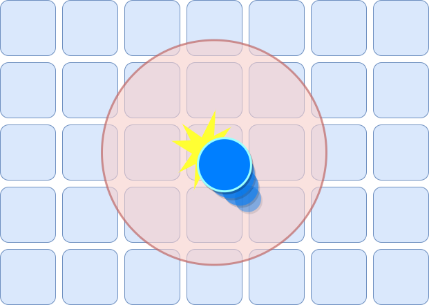
When the ball hits a brick or the front wall, a circle is generated (the explosion) and all bricks inside a radius starting from the impact point are detected
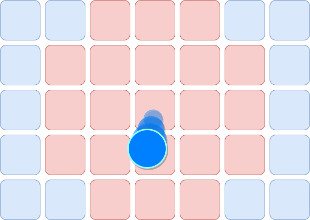
Then, all detected bricks are destroyed.
This mechanic requires less accuracy from the player and let them easily perform spectacular destruction
We designed the physics in a way that it helps and always advantages the player. We iterated a lot on it. We made sure that the velocity of the ball is always high (even with very small shots). Our limit was to make the action clear and easy to follow. We found that in many other racket games, the ball was too slow and at the same time harder to catch. We thought this was way too frustrating for the experience we wanted to design. So, we increased the speed when the players hit the ball and reduced it when the ball was moving towards the player's position.
We worked on the trajectories to make them as simple as possible. We want them to be easy to anticipate when the player strikes the ball.
In addition, the ball is automatically moving to a position that can be easily reached by the player when it comes back in their direction.
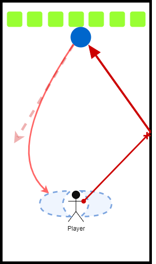
The ball always adjusts its trajectory to get back in the blue areas around the player
Once again, we cheated a bit (but in the right way). The racket’s collider is actually much bigger than the mesh itself. We did this to avoid the frustrating moment where the player misses the ball when it is visually very close to the racket.
We displayed the number of score points earned by each brick at their location. This seems to be a strange decision; many bricks are often destroyed at the same time. It is impossible for the player to count and know how many points they earned in a single hit. But that's not why we did it, we did it just for the feeling of “earning a lot”. If the player sees many numbers appearing at the same time, it will be perceived as “having more value” than only displaying the total of all those points added. Our goal with the scoring system wasn't scoring itself, but to emphasize the feeling of being powerful.

The pile of bills on the left seems at first glance more valuable than the bill alone on the right.
The scale of the object is super important in VR. We had trouble with this at the beginning of the project. We didn’t have a realistic scale for each object. The texture patterns were too large, the ball and rackets were gigantic, and the walls were not in believable proportions. So, we started to re-scale each object to realistic dimensions. With the right sizes of props and environments, it immediately feels more immersive. Once we got realistic dimensions, we started to adjust the scale of the objects a little bit and ended up with a big ball and a bigger racket. The ball got bigger to be easier to hit and more visible in the action. The racket was extended to hide the cheating we did with the colliders.
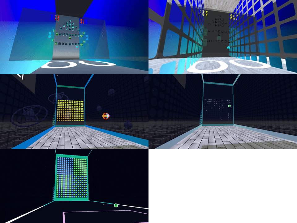
Camera shake is a very useful tool to make a game feel more enjoyable. It's easy to do and we can modify the shake to get a wide range of different effects. But in VR, camera shake is not as useful as it is in PC/Consoles/Mobile games. It can produce disturbing effects and we obviously didn't want that. But we wanted something similar to emphasize the destruction of bricks. We first tried to shake up the "world" around the player. But it didn't feel as good as we thought it would, so we found another solution: shake only the wall!
The effect is very subtle and almost only visible in VR. We found that shaking small parts of the world/environment can be a great way to replace our precious camera shake in VR.
In addition, we used the usual effects (such as post-processing, particles, etc.) to make each player's action more enjoyable and spectacular.
Each effect has only one purpose: to communicate a single piece of information to the player. But this will be explained in detail in the process part.
To work on the feel of the game, I used a very simple process that I apply to every game I work on.
First, I start by making a list of all the gameplay information at an atomic level that I need to communicate to the player. By atomic level, I mean that I will break down each simple gameplay information into smaller pieces.
For example, I need to communicate the movement of the ball. At the atomic level, it should be something like the ball's speed, trajectory, impact point, and so on.
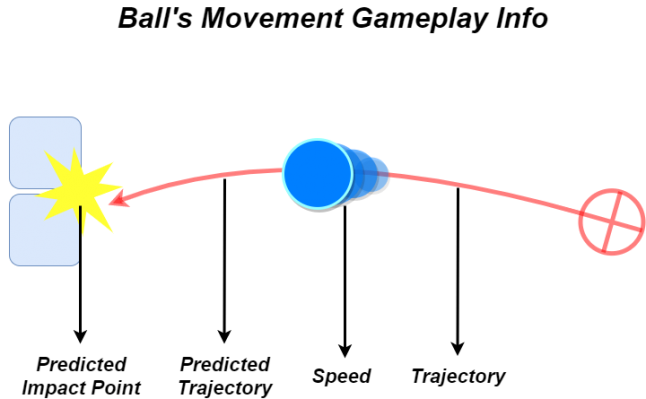
Making this list let me think about what needs to be communicated, what needs to be hidden and how much details is needed.
To do this, I evaluate each gameplay information according to a criterion of precision: on a scale of 0 to 5. 0 meaning that the gameplay information must be hidden and 5 meaning that it must be extremely precise (like displaying HP as big numbers on top of a huge health bar in a HUD).
Once I have a list with all the gameplay information I need to communicate, I think about all the possible ways to communicate those info. I always try to put too many things in my list so I can make choices later on. We never have the time and/or money to do everything. So, I always have to cut things and that's why I evaluated each piece of gameplay information according to a criterion of precision. This helps me to choose the gameplay info that needs more production and testing than another. But in general, and depending on the importance of the gameplay info, the more ways you have to communicate, the better. Another useful tip is to have a minimum of two communication channels (visual, sound, haptics, etc.) for each piece of critical gameplay info (Above or equal to 3).
Make a list of all the gameplay information at the most micro level possible
Determine the importance of each gameplay information
Lists all the possible ways to communicate gameplay info
Sort according to the precision needed each gameplay information with the time/budget available
Make sure that each critical gameplay information uses a minimum of 2 different communication channels
Never hesitate to do too much, even if it means reducing the intensity of the effects later on
Designing Quash was not easy, we struggled a lot to find a clear design direction and we discovered many problems with VR that we were not aware of before we started development. And this article doesn't mention another beast we had to deal with: multiplayer.
On top of that, the Covid-19 pandemic had a big negative impact on our production because not everyone on the team had VR headsets at home. In the end, we managed to overcome a lot of these problems and I'm really happy to see Quash on Steam. But it's not over yet and we still have a lot of things to improve thanks to the feedback from our community.
To conclude this article, I'd like to thank the whole Quash team:
Francois, Timothée & Alexis, our dear brave programmers.
Timothé and Tristan, my design teammates <3.
Geoffrey, our producer and great mail master.
Sonia, for her wonderful VFXs
And finally, Pierrick for his incredible SFXs and his awesome soundtrack!
But mostly thanks to you who read this article to the end. I hope there are some interesting and potentially useful things for your projects. I can’t wait to play your games!
Read more about:
Featured BlogsYou May Also Like