Trending
Opinion: How will Project 2025 impact game developers?
The Heritage Foundation's manifesto for the possible next administration could do great harm to many, including large portions of the game development community.
In this article, Westwood College faculty member and trained architect Christopher Totten explores how human psychology is understood by architects, how that can apply to level design, and explores games that use these techniques effectively.
June 21, 2011

Author: by Christopher W. Totten
[In this article, Westwood College faculty member and trained architect Christopher Totten explores how human psychology is understood by architects, how that can apply to level design, and explores games that use these techniques effectively.]
What is the difference between a good game level and a bad game level? According to American writer and philosopher Robert M. Pirsig, "quality" is indefinable, yet we have intuitive knowledge of its existence. If something is good, and therefore of high "quality", we invariably know it -- whether or not we can give a textbook definition of what makes it good.
Therefore with our game levels, as with anything in design: if the level is good, gamers will know. In game design, the particular flavor of quality we hope to achieve is known as "fun". Unfortunately for us, saying that fun is indefinable doesn't quite work.
The mysterious definitions of "quality" and "fun" are something that stump many a designer: how can a game designer determine whether their level is good?
Many will answer by saying that levels must be properly playtested, but for some companies that may not occur until the game is nearly finished -- way past the stage of initial level design. So what are the guidelines of good level design that can help us conceive good experiences from the very beginning of the level design process?
Scientists and usability experts monitor pleasurable experiences by observing the brain's production of the neurotransmitter called Dopamine, which provides feelings of pleasure and motivation when released into the brain. Controlling the production of this chemical in a player is a matter of using psychological methods to design our game environments.
A level designer at Valve once stated in an interview that "experience was key" to creating game environments, and as such they began their design processes from "core mechanics", similar to the way many good game designs begin. Designing from the core mechanic, the basic action a player takes within a game, starts the designer with a sound plan. From this plan, many basic psychological tools can be employed to support the core mechanic and create a pleasurable spatial experience: reward systems, operant conditioning, Montessori Method-style interactions, visual communication methods, and numerous others.
The basis of learning these methods and applying them to level design is understanding how they became part of our own "mental wiring". Like many things that are part of how we humans operate, they evolved from our prehistoric need to survive. Architectural theorists such as Grant Hildebrand highlight how many of our concepts of what are "pleasurable" in a spatial environment trace back to our own survival instincts.
Games already manipulate these instincts, requiring players to maintain the well-being of their avatar to continue and letting near-death gameplay situations provide dramatic tension. Game environments can provide this same psychological dramatic arc and create pleasurable experiences for players. It is therefore fair to say that understanding the spatial psychology of our own survival instincts can make us better level designers.
Architecture has for centuries revolved around creating human experiences through space. It is only in the last century, with the dawn of the postmodern movement, that it has become so heavily focused on the form of the building instead of the experience of being within. Modernists understood that a building was an environment for the creation of experiences: Franco-Swiss architect Le Corbusier is famously quoted as saying, "The house is a machine for living in", while Louis Sullivan expounded, "form follows function." We can take hints from their outlooks on spatial design, especially when it comes to survival. Maslow's Hierarchy of Needs highlights physiological needs such as food, water, and shelter as the most necessary to humans.
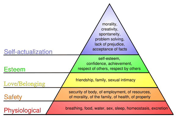
Maslow's Hierarchy of Needs
Architecture is for creating pleasure by creating spaces that feel safe, while level design is about creating spaces that create a sense of danger that is pleasurable to battle and overcome. If to architects the house was the machine for living, the game level should be the machine for living, dying, and creating tension by exploiting everything in between. In this article, I will highlight level design strategies based on the psychology of survival and exemplified by classic gaming precedents and real-world pieces of architecture.
To better understand how to create better levels by utilizing human survival instincts, we must first understand the connection between our in-game avatar and these instincts. As far as animals go, humans are pretty lame: we have no large claws or teeth for fighting, no poisons, no scary markings, no horns, no great running ability, and no armor plating. Proportionately we are weaker than ants, which can carry hundreds of times their own body weight.
We do have one huge advantage over pretty much everything else in the animal kingdom, however: our intelligence. With this amazing ability to reason, we can craft tools and gadgets that help us do everything from hunting down a wooly mammoth for our dinner to listening to hundreds of our favorite albums during our afternoon commute.
Games take advantage of this weakness and reliance on tools by using something I like to call "the problem of the protagonist." This describes a common situation in many games where a character finds him or herself in a position of natural weakness compared to his or her enemies. This simulates humanity's own natural disadvantages against the beasts that made our pre-agricultural lifestyles a hassle.
Game avatars, by their definition, are the player's representatives in the game world, sharing their natural strengths and weaknesses. Some games even try to more concretely solidify this relationship by making these protagonists silent or allowing the player to customize their appearance. Overcoming the disadvantages these characters possess as a human's representative is a popular mechanic in many games, such as Metroid and The Legend of Zelda.
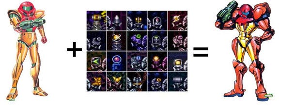
Samus Aran enhances her abilities with tools to become more powerful than her foes
Of Zelda, Shigeru Miyamoto once said that he envisioned it as a game where you began as a young boy in the forest who must gather items and become an accomplished adult. When the player has reached this stage, they can return to areas that were once threatening and feel that they are not afraid of them anymore. In the time between being the inexperienced child and being the accomplished and powerful adult, the player will feel the dramatic tension of nearly losing their (or more accurately, their character's) life many times.
In Hyrule, Zebes, and many other designed digital worlds, players find themselves in environments that act as both safe havens and dangerous wildernesses; using the dichotomy to their advantage and overcome their own disadvantages if possible.
Now that we know how games put players in the role of a simulated weak human, we can understand how the relationship of this character to its environment helps us create better levels through our own survival instincts. The first and most simple element of this relationship is the size of the space relative to the size of the player character. Like real life, the size of the space someone inhabits can generate feelings ranging from absolute comfort to crippling fear, in the case of claustrophobia. In games, the size of spaces can serve to create or alleviate tension, or set the stage for dramatic encounters. When discussing the size of game spaces, they can be split into three simple groups:
1. Narrow Space
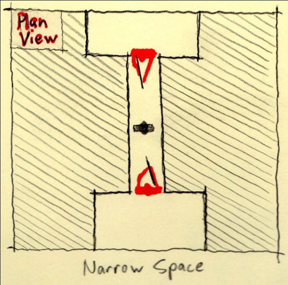
A small enclosed space where the occupant feels confined and unable to move. These spaces create a sense of vulnerability in the player's inability to properly defend themselves. These spaces are a staple of survival horror games like Resident Evil and Dead Space, the latter featuring areas where the player must crawl through confined ventilation shafts where no weapons or items may be used while Necromorph monsters make watch the player from nearby.
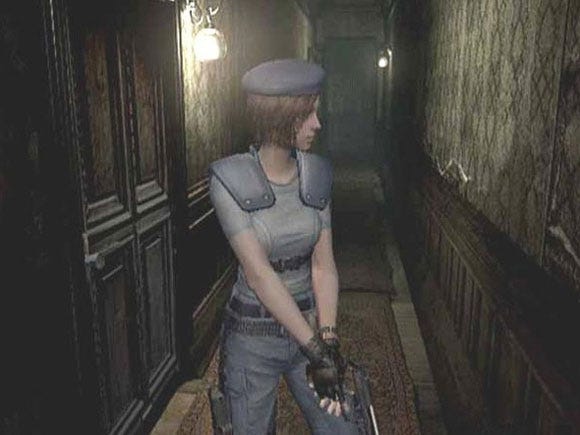
Narrow hallways are a staple of survival horror games like Resident Evil
The ability for these spaces to cause tension is clear: if something happens in them the player has little or no way of escaping the threat. In a narrow passage an enemy can literally become another wall of the space, diminishing the size of the space with each approaching step. This effect can be exacerbated with enemies and games specifically designed to elicit actual fear in the player, such as zombies or predatory aliens in horror games.
2. Intimate Space
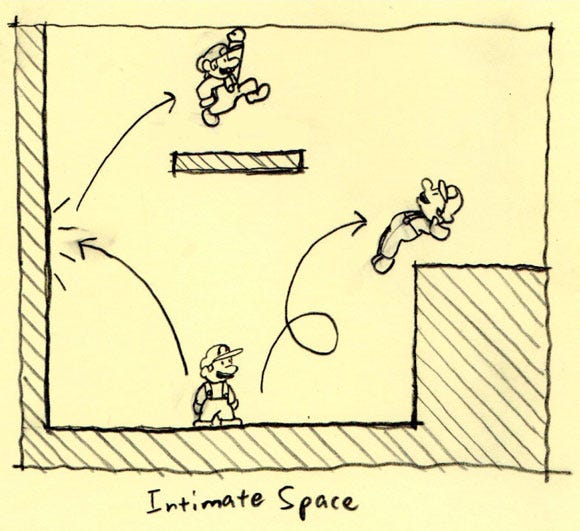
Players controlling Mario can reach everything Peach's Castle, making it a very pleasurable space to inhabit.
These spaces are neither confining nor overly large. While they can be large in overall scope, everything in the space should be immediately accessible to the player and within reach of their avatar and their inherent abilities. In a space like this, the player can feel as though they are in control, and that is the true importance of these spaces. One such example of this type of space is the hub environments of the 3D Super Mario games. In these spaces Mario can run, jump and utilize his other acrobatic moves to reach the limits of the space.
These spaces don't necessarily have to be devoid of enemies either. In Batman: Arkham Asylum, the designers wanted to utilize stealth gameplay in such a way that the player felt more powerful than their enemies. For this style of game they coined the term "predator gameplay."
One of the elements of the game that assisted in the player's feeling of power was the level of control they had over the game's environments. Even in the largest rooms of the asylum, Batman can jump and swing from the highest structural elements and maintain his vantage point above his enemies. Fitting the character of Batman, players have incredible freedom over spaces that would be overwhelming and dangerous in other games.
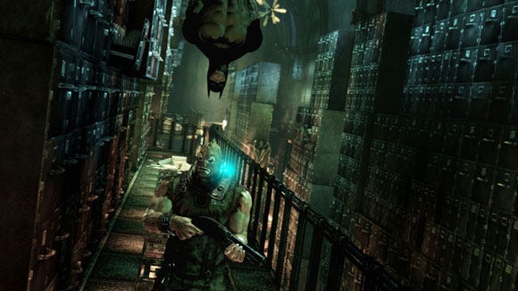
Players can feel as though they are Batman because they have control over their environment, giving them the ability to terrorize their enemies.
Perhaps one of the most important elements of these spaces is that they can expand over the course of a game. As players receive new abilities, such as in the previously mentioned Zelda or Metroid games, the space of intimacy becomes larger. When Samus acquires the space jump she can reach higher ledges, when Link gets the hookshot he can cross wide chasms.
3. Prospect Space
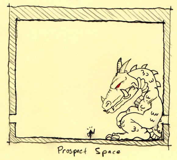
While this space is the exact opposite of narrow spaces, it produces a somewhat similar effect. Coined by architectural theorist Grant Hildebrand, Prospect Space describes a spatial condition that is wide open, within which the occupant is exposed to potential enemies. The idea that this type of space is unpleasant originates in ancient times when humans would have to cross open wilderness to reach food, shelter, and safety, facing the threat of predators and the elements. The fear of these places is called agoraphobia. The people that suffer from this disorder feel uncomfortable in open spaces with few places to hide.
In games these Prospects take on a few different forms. One type of Prospect is the Boss Room. Boss Rooms are typically wide-open places for staging elaborate encounters with strong enemies. One of the classic examples of these spaces is the Boss Rooms in the Mega Man series.
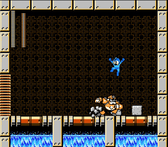
Boss Rooms in Mega Man often feature little or no elaboration or places to hide from the attacking Robot Master.
The other popular form of Prospect Space is that found in action games, where players are vulnerable to enemy fire. In games where players can exchange gunfire with one another, it's common for open areas, especially those viewable from higher elevations, to function as Prospect spaces that must be traveled through to reach goals or hiding places.
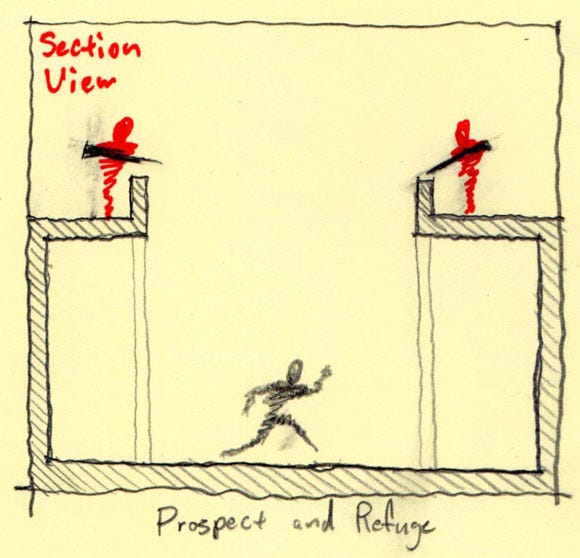
The relationship between Prospect Spaces and the hiding places that they occur between is a very important one to game designers, and it is the second important element of the human survival instinct that can educate level designers.
The definition of Prospect Space has already been described as an open space where the player is exposed to threats and feels vulnerable. If the open wilderness were all that was available to our ancestors, however, we wouldn't be here.
Humans survived dangerous Prospect conditions by hiding in enclosed and intimate spaces referred to as Refuges. Refuges are places like caves and tree covered areas where early humans could look out into the Prospect spaces of wilderness and evaluate potential threats.
Refuges have evolved over time to include things like covered porches, patios, or sunken places in rooms that have the impression of being separate spaces. They have the advantage of being either safely depressed into the ground or high enough to provide a safe lookout.
When dealing with interiors, things like ceiling height can give a space the impression of being either Prospect or Refuge, with the lower ceilings of course being the Refuges. They also have enough shadow for the hiding person to not be easily visible to their enemies.
Refuges have also historically been tied to water sources, since they provide hydration, security, and the potential to attract animals that can be hunted for food.
While this seems like a simple concept, it is the type of spatial sequence that is created by the alternations of Prospects and Refuges that is of particular importance to level designers.
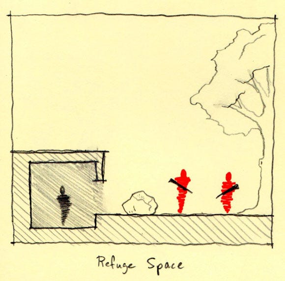
Refuges allow humans to look out upon their surroundings in a safe manner
When traveling, early man could rely on Refuges for safety at night or during adverse weather conditions. However, if this Refuge was temporary or simply a stopover for the human or group, they would use the Refuge as a place to look out for other Refuges. Making this goal would allow them to plan their passage over the Prospect space to the new Refuge, referred to as the "Secondary Refuge." Beyond the Secondary Refuge lies the Secondary Prospect, and so on until the final goal has been reached.
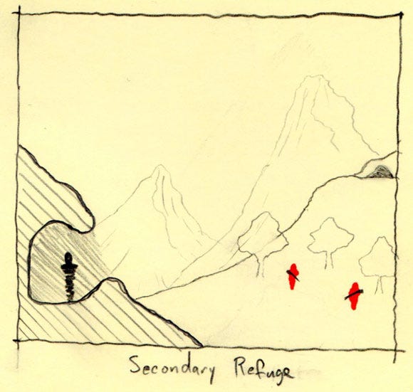
Secondary Refuges can urge the occupant of a space forward
As stated previously, the Prospect/Refuge/Secondary Refuge spatial sequence does not limit itself to travel over Stone Age plains, as these sequences are often featured in interior design. These examples are valuable to the level designer trying to come up with a path for their player. In a medium where there are still enemies lying in the Prospects, using Prospect/Refuge theory makes even more logical sense than it does in real architecture.
Prospects are often used to create areas of circulation and movement. The IT University in Copenhagen's Atrium, designed by Henning Larsen Architects, creates a large prospect space for travel between classes. The Refuges are the classrooms themselves, which look or project out into the atrium itself.
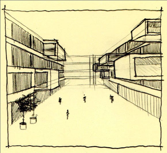
The projecting Refuge spaces are classrooms. The school somewhat appropriately features a program of study in Game Design.
Likewise, the architecture of Le Corbusier has been described as being largely Prospect-based. One of his main design philosophies was that man should rise above nature. He projected this in his architecture by placing buildings on sites that the building would starkly contrast. Living spaces, like that in his most famous project, Villa Savoye, were lifted into the air by thin columns and the spaces within were wide and flowed into one another. Ribbon windows were used to give the human the maximum view of their surroundings.
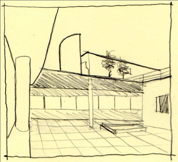
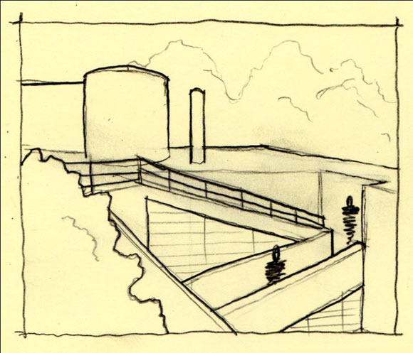
Selected views within Villa Savoye show the interior Prospect spaces
In many ways, Le Corbusier would have been a great designer of first person shooter maps. His architecture features many instances of wide open spaces and ramps leading to higher ground, like those found in Villa Savoye itself. In these games, rising levels connected by ramps allow for players to find better vantage points from which to snipe their opponents, and the spaces of a place like Villa Savoye would be very conducive to this type of competition. His architectural style is not unlike that employed in the Boardwalk map of Halo: Reach (to readers of my blog: I just complimented the design of a Halo level... please take a moment to look outside at the flying pigs) with its own rising levels, viewpoints of the surrounding game space, and geometric forms.
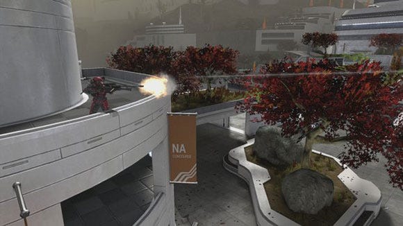
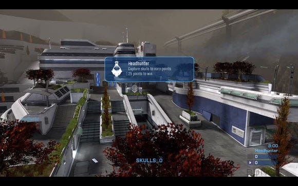
New Alexandria as featured in Boardwalk could very well be taken from Le Corbusier's Ville Contemporaine.
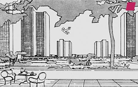
On the other hand, the architecture of Frank Lloyd Wright is often considered to be Refuge-based. Wright felt that the hearth was the center of the home, where the family would gather for warmth and safety. He utilized this concept in many of his building designs, and used it as his own "core mechanic" to inform everything from his room layouts to placement on sites. He liked to place houses within large groupings of trees. Even if they did not end up built in such spaces, he demanded that all perspective presentation drawings from his office be drawn with trees surrounding the house.
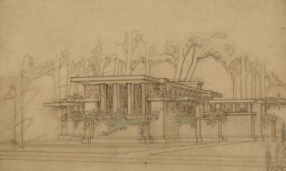
One example of a drafted perspective from Wright's office
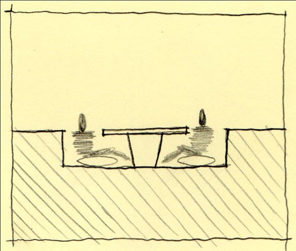
Wright had a fondness for depressed sitting areas, typical of Refuge spaces.
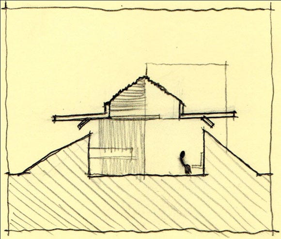
This section drawing shows a living room space depressed into the site itself.
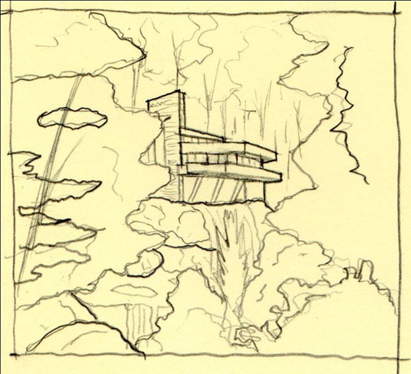
Fallingwater is situated in the woods of Western Pennsylvania
These Refuge spaces show up a lot in games where exploration and treasure finding are important mechanics. Wright may have found value in worlds such as those created for the Metroid Prime games, where Samus Aran fights her way through enclosed ruins and passages riddled with secrets. Environments like the Chozo Ruins feature large, sheltering cantilevers and heavy stone construction, adding the somberness of an abandoned city with its lived-in look.
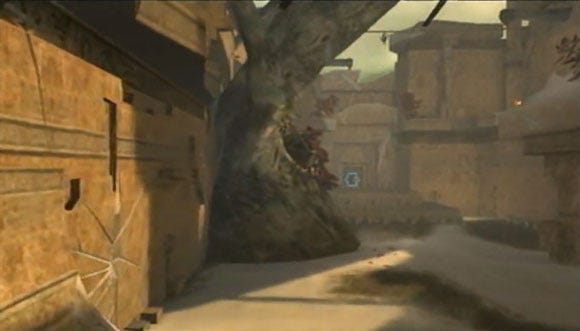
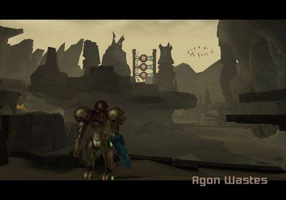
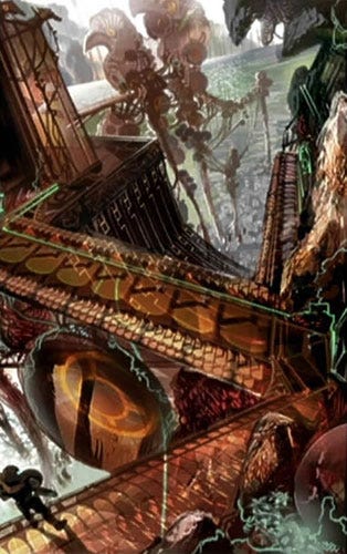
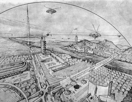
Concept art from the Metroid Prime series even at times resembles drawings of Wright's, like this one of the "Broadacre City" by showing similar spatial concerns.
While these examples take Prospect and Refuge for their individual values, there are instances in games that create very exciting sequences of these spaces. One such example is the stealth environments found in the Metal Gear Solid series.
I would argue that MGS's levels are actually based upon the Refuge-Prospect-Secondary Refuge sequence, as the stealth gameplay requires you to move from hiding place to hiding place. This type of gameplay changes mundane environmental elements like corners and lockers into safe places differentiated from the Prospect areas of the level with guards and cameras.
Half-Life 2, on the other hand, features a rather inventive expression of the Refuge-Prospect-Secondary Refuge sequence in the beach areas of the game. In this level, the player must cross a long stretch of beach without alerting alien insects called Antlions.
These monsters can hear the player character walk across the sand so the player must therefore use their Gravity Gun to move debris into bridge-like configurations between rock surfaces that the Antlions cannot reach. While not covered, the safe nature of the rocks makes them the Refuge spaces while the sand is the Prospect.
Previously worthless throwaway props like metal plates and wooden pallets become the most valuable items in the game, similar to Snake's legendary cardboard box. These items become portable Refuges: they are weaker in function than the level geometry versions, but their valued is heightened nonetheless.
Prospects and Refuges can also describe the mechanics of enemy encounters in games. To use Metal Gear Solid as an example: standard enemies are often found in areas where stealth is encouraged and therefore feature large percentages of Refuge space. In this way, Snake can sneak up on his foes and take them down silently in what is "typical" method of progressing through the game (people who still go through with guns blazing notwithstanding.) On the other hand, most boss encounters in MGS do away with actual Refuges altogether and opt for a more face-to-face spatial layout with most refuges existing as cover from weapons (again, with specific stealth-heavy examples like MGS3's battles with The End or The Boss notwithstanding.)
Another series of games where the number of Refuges changes in battle situations are those in the previously discussed Mega Man series. As discussed, the boss rooms in these games are large Prospect zones. This spatial type is very conducive to the types of theatrical showdowns that boss fights embody. Likewise, fights with smaller enemies often take place in areas where Mega Man can leap from platform to platform, allowing players to find good vantage points to shoot from or places to hide from enemy fire, such as when facing down enemies like Sniper Joe.
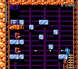
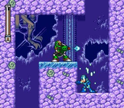
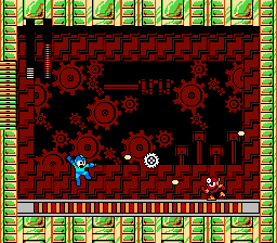
Spaces are given for hiding against minor enemies like Sniper Joe in Mega Man games while boss characters feature much more open rooms.
Prospects and Refuges are very useful for level designers as well as the player. However, there are elements of even refuges that if taken too far can create uncomfortable situations for players. Like any spatial survival concept, however, these can also be of great use to the level designer who is well educated in their usage.
Refuges were previously defined as having a certain amount of shadow that hides humans from their enemies.
Shadow, for our usage, will here be defined as a lack of light caused by a light source being obscured by a physical object.
Some games, such as Tom Clancy's Splinter Cell use Shadow to such an extreme that it creates the sense of being a different space altogether. The developers of Splinter Cell call this concept "Shadowspace."
Shadowspace creates the perception that one room is actually two: areas within the Shadow and areas in the light. Architecture shows us that this type of space is of great use when creating Prospect and Refuge experiences.
In the Alhambra's Court of the Lions, located in Granada, Spain, visitors enter the space from a covered arcade and can look out into the courtyard, which is open to the sky above.
While the columns of the arcade define a separate space, the shadows underneath solidify the impression that it is, indeed separate from the courtyard itself.
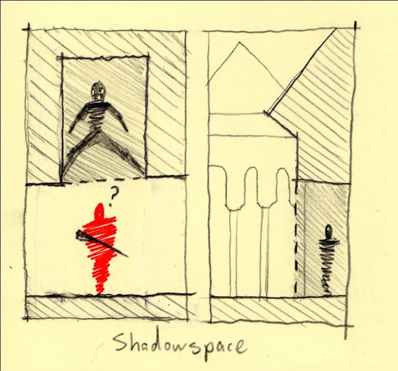
Shadows create their own separate feeling of space in places like the Court of the Lions. Some stealth games use this to their advantage.
What if there is a lot of shadow though? In situations where there is little light, moving from an area of light to dark becomes increasingly uncomfortable. This fear stems from the idea that what is in the dark space is not entirely visible to us and therefore, unknown, much like childhood fears of going into the basement. This has been put to great use in thrillers and horror movies such as Jaws or Paranormal Activity respectively. The idea is that the scariest thing is that which is your own imagination.
In the case of Jaws, water acts like Shadow would in a game level. Despite the fact that most people know what a Great White Shark looks like, the shark in Jaws is not seen for about an hour into the movie. The mental image projected by the audience of it silently stalking helpless bathers was much more terrifying than what they could have captured on screen. By taking the concept of "shark" away from a corporeal fish, Stephen Spielberg made the idea of "shark" synonymous with the water itself. By the time that the shark does show up in the film, he is of such mythic proportions that he seems omnipotent in the ocean.
More literally related to the concept of Shadow is the demon in Paranormal Activity. For much of the film, his presence seems to only impact action that occurs at night. In this way, when the house is its darkest is when the demon freely roams. The monster is also unseen, meaning that like the shark in Jaws it is omnipotent in the nightly shadows and the viewer's mind is left to fill in the demon's form with their worst nightmares. When the demon begins doing things to the couple in the daytime, the rules are broken and the viewer becomes even more terrified, he now owns the daytime as well.
Games can use this to great effect in areas where lighting is scarce. While some games, such as military first person shooters, merely use a lack of light as a nuisance that must be overcome with things like night-vision goggles, games in the survival horror genre and some others use shadow to create feelings of risk for the player. In Half-Life 2, the designers place caches of items in small alcoves for players to find. While these are typically marked with the lambda symbol used by the in-game rebel faction, there are instances of supplies being hidden without this logo. These hidden areas are also known to be homes for enemies known as Headcrabs, some of which are powerful enough to paralyze the player character and leave him with very low health. This gives entering even small shadowy alcoves an incredible feeling of risk, since they can contain either helpful items or a dangerous surprise.
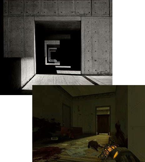
Shadows create a space of dangerous unknown that can be used to instill a sense of fear. This move by a level designer can allow the player's own paranoia to fill in the space with whatever scary object they wish.
Technological enhancements in games that allow dynamic lighting have given us games like Doom 3, Dementium: The Ward, and more recently, Dead Space. In Dead Space specifically, much of the game occurs in pitch-black surroundings with the player's flashlight as the only light source. In the tradition of allowing player imaginations to fill in the surrounding blackness, Necromorphs noisily move through an abandoned space ship around the player's character, a lone engineer ill-equipped for combat. As such, the least terrifying areas of the game turn out to be those where you are fighting visible enemies. It is the empty areas, pitch black but filled with the sounds of stalking mutants, where the player is the most terrified. Like the shark in Jaws, the Necromorphs command the environment with their lack of bodily presence.
In the sequel to Dead Space, players revisit the ship from the original for a brief period. The player character's previous traumatic experiences aboard the ship give the player the expectation that it is a beehive of space zombies. The designers wisely withhold enemy presence for the first half of the player's visit to the ship, ramping up the player's own paranoia of the Necromorphs before unleashing them in a swarm. While the amount of time the player spends without an enemy encounter is specifically notable in this part of the game, it is not the first example of this phenomenon. Dead Space 2 utilizes traditional horror surroundings to utilize pre-existing horror-movie fears in players, such as having players travel through churches and pre-schools to evoke horror imagery from films such as The Exorcist or Child's Play. In this way the game pulls no punches, taking environments that are thought of as friendly or safe and corrupting them, again in the cases of the church and the preschool, then bathing them in an all encompassing Shadow that sound and environmental hints fill with paranoid fear.
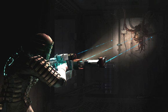
A ubiquitous darkness, atmospheric sound effects, and familiar horror imagery work together to intensify humanity's already existing fear of shadowy darkness.
Shade, on the other hand, creates a very different type of spatial quality. Where Shadow is primarily used to hide objects or the nature of spaces, Shade is used to obscure objects and evoke a sense of curiosity in players. In the Middle Ages, Gothic churches were purposefully designed with windows that would diffuse light and create an ethereal atmosphere known as Lux Nova, or "new light." Also referred to as "Mystic Light", this condition was believed to bring patrons closer to God.
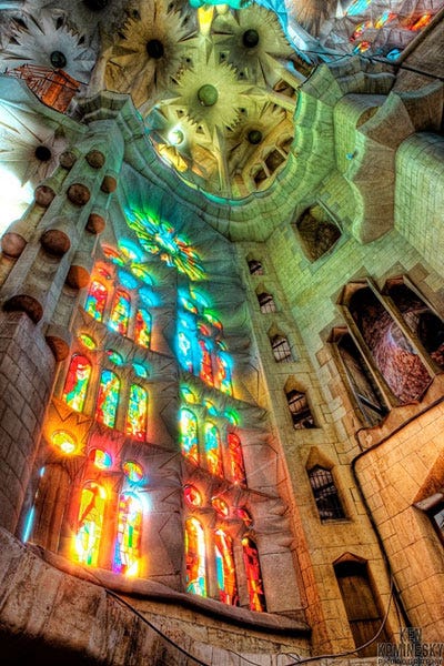
This image, in the yet-to-be-completed Sagrada Familia in Barcelona, Spain, demonstrates the diffused light used to create the effect of "Lux Nova."
In the Mosque of Cordoba, it is combined with the rhythmic arrangement of columns to create the aforementioned sense of curiosity in the visitor, urging them to continue farther into the space and explore its experiential boundaries.
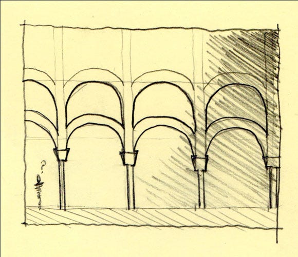
Rhythm and lighting create a sense of curiosity
If in games light is usually a signifier of spaces that are "safe" and Shadow is typically a signifier of spaces that are "dangerous", then Shade's middle ground creates a sense of Atmospheric Ambiguity. One series that uses this to great effect is The Legend of Zelda.
Zelda games have always been about exploration and mystery. As a game about interacting with the myths of a fantasy world's past, it also contains a fair amount of "sacred" items and places. The dungeon designs in these games, therefore, showcase shaded conditions in a way that keeps players wondering what lurks around the next corner. For example, it was previously mentioned that high ceilinged, wide-open Prospect spaces are often the setting for climactic Boss battles. However, these same spaces are also traditionally used in the real world for sacred purposes: churches, temples, etc. Zelda games use this dualism to create temples that, when shrouded in a blanket of fog or Shade, exudes a sense of mystery that players will want to investigate. While a dark Prospect space would seem to immediately indicate a Boss and one with rays of light filling the chamber would indicate a sacred space, Zelda games tease the player by using Shade.
In games such as The Legend of Zelda: Twilight Princess, players often face a high ceilinged room with an ambiguously shaded lighting condition inside. While the final Boss room of each dungeon is very plainly marked with a skull on the in-game map and a golden Boss Door, other large encounters are placed to surprise players. Like other games in the series, Twilight Princess' dungeons are given back stories, adding to the feeling of sacred mystery. As such, walking into an ambiguous Prospect space is often an invigorating experience for players: am I about to fight a difficult mini-boss or am I about to get a new weapon? Often the drama builds as the player surveys then actually enters the room, then ends with either the door ominously slamming shut behind Link or Link's new weapon revealing itself bathed in a beam of light. This technique also finds its way into the game's overworld, where players occasionally encounter a skeleton knight in a bright but ethereally lit space. Eventually the player learns that this is the spirit of a past hero that will teach Link new moves, but the first encounter with this character is filled with dramatic tension.
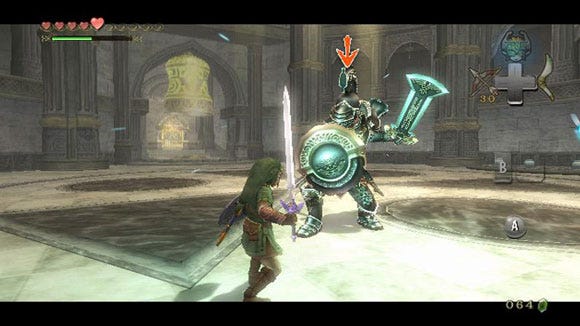
Players may expect a moment of repose in this obviously sacred space before armored knights suddenly attack
Even in instances where the space does house a new item for Link, enemies often still attack the player before they may earn the item. In a way, this invasion of enemies into a previously sacred temple is not unlike survival horror games infesting churches and preschools with monsters: corrupting the sacred spaces of our society. While in survival horror this is used to instill fear, games like Zelda allow players more freedom in fighting enemies and turn these scenes into heroic battles.
While used alone, both Shadow and Shade can be incredibly effective. However, when used together, they can keep players constantly guessing at the nature of the level they are exploring. Zelda's Boss Rooms are often shrouded in Shade that quickly dims and becomes black Shadow when the Boss attacks. Several games by Valve perhaps even more effectively utilize a collaboration of Shade and Shadow in their level designs.
The first instance of this collaboration is in Half-Life 2: Episode One. It was previously mentioned that the enemies known as Headcrabs often hide in shadowy outcroppings in level geometry in this game. Weapons caches, left by the player's allies, also often occupy these spaces. One particular section of the game has players exploring tunnels lit by dim blue lights. Players are left to wonder what the nature of this space will be: will the stacked cars and shadowy doorways provide supplies or am I about to be attacked?
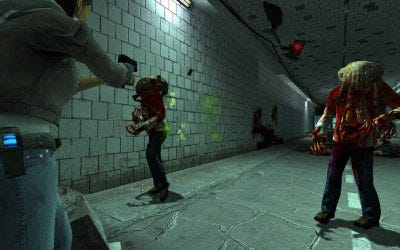
Lighting conditions allow the player to question whether a tunnel is safe or not…this tunnel isn't.
As the players press on into the space, a horde of Headcrab Zombies enters the tunnel and attacks. Zombies enter from any shadowy crevasse available and the player must hold them off with the help of an AI character. In this case the Shadow spaces that send mixed messages to players are combined with Shade that creates Atmospheric Ambiguity to lead up to a particularly dramatic action sequence.
This theme is also prevalent in the Left 4 Dead games. These games have the added benefit of featuring an AI Director that controls the location and amount of zombies the player will encounter, making every game different. Levels must therefore be crafted to provide the most Atmospheric Ambiguity possible, as an area that was safe in a previous playthrough may now be the site of the biggest battle of the game. To achieve these goals, shadowy alleyways or tunnels are often combined with a B-movie fog and film grain that provide the necessary Shade condition. Removing the Shade and replacing it with all shadows or even heavy rain takes the atmosphere from one of atmospherically ambiguous co-op fun to a claustrophobic tension not unlike that in Dead Space.
In his book, The Origins of Architectural Pleasure, Grant Hildebrand describes Joseph Campbell's monomyth of the Hero's Journey, and the dangers to the Hero's survival during the journey, in terms of materiality. Materiality is the quality of materials in an environment.
The beginning of the Hero's Journey, Hildebrand argues, began in a land of natural and pleasant material landscape. There were often quaint villages and lush forests near the hero's hometown, as well as a water source. Eventually something terrible happens to the hometown or someone in it, otherwise the hero of the story would have nothing to do that would keep our attention, so the Hero must leave home and venture into the dangerous world.
Hildebrand goes on to describe how as the Hero gets farther from home, into what Campbell would describe as the "challenges and temptations" stages of his journey, the quality of landscape steadily decreases.
Where there were once happy forests for the Hero to travel through there are now rocks and cliffs. Steadily these conditions too decline until the hero finds him or herself at the "abyss", where a climactic battle with evil or transformative event is to occur.
The materiality of this location is often one of man-made industrial darkness or deadly swampland. In Beowulf's story of battling Grendel his journey takes him from the mead halls of Heorot to the slimy cave home of Grendel's Mother.
In The Lord of the Rings, Frodo must leave the quaint and happy Shire, venture through Middle Earth to unpleasant landmarks such as the mountains of Emyn Muil, and ultimately reach the fire and shadows of Mordor.
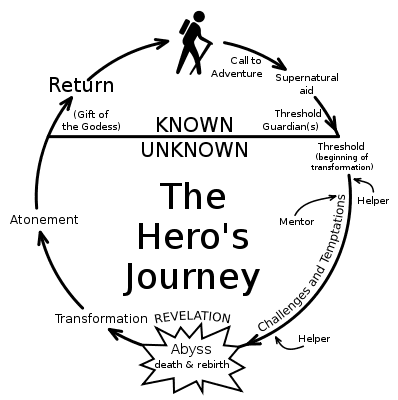
The Hero's Journey can be expressed through the material qualities of each part's setting
In games like Zelda and Super Mario Bros., it is easy to see how this idea translates into the material qualities of levels. Zelda games in particular begin in brightly colored and cheerful forestlands, such as Ocarina of Time's Kokiri Forest or Twilight Princess's Ordon Village. Each dungeon is like a Hero's Journey of its own: each tasks Link with defeating an evil monster to find a sacred item that will help the greater population of Hyrule. In this way, the Hero's Journey that is The Legend of Zelda is constantly changing material qualities from safe and natural to dangerous and industrial. Likewise each world in the original Super Mario Bros. begins in a simple grassland environment, to either a cavern or lake, then to a dangerous platforming level, then to one of Bowser's fiery castles.
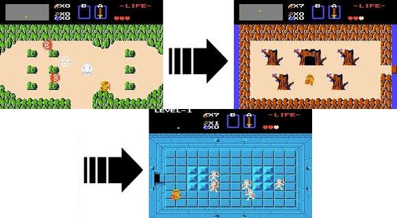
Changing materiality begins to describe the levels of danger present in these spaces.
These literary descriptions of materials stem from the survival instinct to be near Refuge-like spaces. As stated previously, Frank Lloyd Wright even responded to this strong human tendency by adding trees to his drawings of new building projects.
The final element of spatial survival that must be addressed is perhaps one of the most dramatic – height. Many people declare a fear of heights. However, high places can also serve as a strategic position for watching surrounding terrain. Towers, cliffs, helicopters, humans use all of these things to view their surroundings from a better vantage point. Le Corbusier believed that his architecture allowed man to "rise above" nature, and houses like Villa Savoye emphasize this by hierarchically organizing spaces with height. Grant Hildebrand, in his descriptions of Prospects and Refuge spaces, even says that high places can be valuable Refuges.
The key distinction is the security of the high point and the nature of the area around it. Height can be a terrifying thing when the ground falls away and the player is left tottering on the edge of a seemingly endless hole in the Earth's crust. Height can likewise provide a very secure feeling when surrounding structure such as walls or railings envelops players.
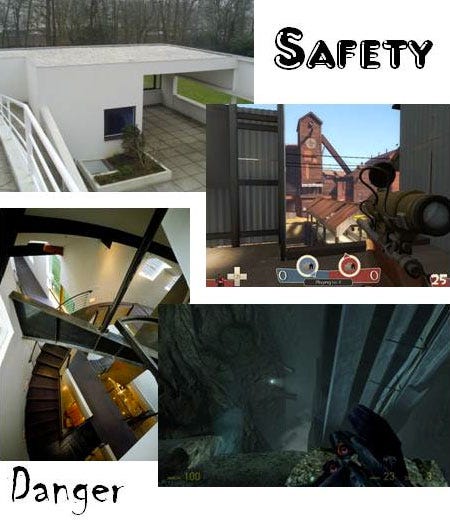
Why is this? In a way this is another example of the Prospect/Refuge relationship. High places with safeguards feel safe because there are things between the drop and us. Sniping would not be a very popular role in first person shooters were it not for this safe feeling. Le Corbusier uses height in Villa Savoye as the goal of the occupant in a building. If analyzed like a game, Villa Savoye's Core Mechanic might be "climbing." Ramps provide passage from the utilitarian spaces on the first floor all the way up to the roof garden. The reward for an occupant's passage is the ability to look down not only on the natural surroundings of the building, but on the other occupants within it as well.
Game levels can function in this way as well. Making a sniping position a prize to be won can have a profound impact on a level. This "king of the hill" style sniping contest could allow opportunities for other Prospect/Refuge spaces in a map, where properly navigating cover allows players to move in on a sniping player.
On the other hand, height when there is no enveloping structure keeping the player safe acts like a Prospect. The player is open to danger, but in this case, the greatest source of danger is not enemy creatures or combatants but the environment itself. This feeling is known as vertigo. Height used in this way is a very dramatic spatial element. Vertical elements such as structures or shadows can deepen the sense of vertigo by drawing the player's eyes deeper into the chasm.
Katie Salen and Eric Zimmerman in their book, Rules of Play: Game Design Fundamentals, point out that there is pleasure in overcoming dangerous situations, a principle they say is one of the most basic ideas of game design. When levels are engaging, players know, even if they cannot verbalize what makes them so pleasurable. Some modern texts on level design only teach readers to model environmental models and scenery. The levels designed by learning from these books have no way of engaging the player and provide no discernable amount of experience, so level designers have to look to other sources for inspiration. The alternative is creating the experience boredom or frustration for players, which is counterintuitive to the goal of making a "fun" game.
Level designers can take the concept of "pleasure from overcoming danger" to heart by utilizing the human survival instinct to create dramatic environments that play with the comfort levels of people interacting with them in a way that is motivated by creating pleasure. As stated previously, utilizing these spatial survival concepts to create levels gives players opportunities to not only interact with the game on a functional button-pressing manner, but also on a cognitive one that speaks to the instincts that help make video games fun in the first place.
Also, while these concepts are incredibly important to the practice of level design, they are but part of an expansive whole. Concepts such as Operant Conditioning and the articulation of short and long-term goals were mentioned among others. Again, as Salen and Zimmerman have pointed out, pleasure is derived from overcoming danger. This article has been about the spatial dangers or elements of space that create the impression of danger for players. The other concepts describe elements of the pleasures that follow, and other methods for training players.
For Further Reading:
- Zen And The Art of Motorcycle Maintenance: An Inquiry Into Values by Robert Pirsig
- Chambers For A Memory Palace by Donlyn Lyndon and Charles W. Moore
- Origins of Architectural Pleasure by Grant Hildebrand
- Emotional Design: Why We Love (Or Hate) Everyday Things by Donald A. Norman
- Rules of Play: Game Design Fundamentals by Katie Salen and Eric Zimmerman
- Space Time Play: Computer Games, Architecture, and Urbanism: The Next Level, edited by Freidrich von Borries, Steffen P. Walz, Matthias Bottger, Drew Davidson, Heather Kelley, and Julian Kucklich
Read more about:
FeaturesYou May Also Like