Trending
Opinion: How will Project 2025 impact game developers?
The Heritage Foundation's manifesto for the possible next administration could do great harm to many, including large portions of the game development community.
Game director Peter Johansson and lead game designer Robert Olsén deconstruct the design of Hand of Gilgamech's fun, accessible card battle system and reflect on what makes a good deckbuilding game.

When Swedish studio Image & Form finds a universe it likes, it sticks to it.
The team has been releasing games in its SteamWorld franchise since SteamWorld Tower Defense came out in 2010 for the Nintendo DS. And last month the developer released SteamWorld Quest: Hand of Gilgamech, the studio's fifth game in the SteamWorld universe.
But even though the studio chooses to live in SteamWorld, every single one of those games are in drastically different genres: tower defense, "metroidvania," strategy, and with Hand of Gilgamech, an RPG with a card-based battle system.
Image & Form's Peter Johansson, game director on Hand of Gilgamech, and Robert Olsén, lead game designer, jointly answered questions specifically about the game's fun and accessible card battle system.
I read that this came from an internal pitch session. What made you want to make an RPG that uses a card-based battle system?
Originally this game was very different, featuring a completely different game mechanic in place of the card battle system. Sadly, we found that the original concept wasn’t going to work out for a number of different reasons, so we put together a list of potential other directions to take the game in.
These varied wildly, but we settled on the card battle concept because we felt it had a nice balance of uniqueness, depth and familiarity. Several of us are long-time card game players and have spent a lot of time thinking about card game design, so we felt there was a lot we could do with that kind of system.
Can you explain the strike/upgrade/skill system in your own words, and was it in place from the start? How did you come up with that initial idea?
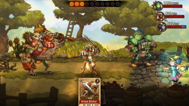
Cards are divided into “builders” (strikes/upgrades) and “spenders” (skills) that either generate steam pressure but are relatively weak on their own, or spend steam pressure [SP] for a strong effect. The design goal here is to present the player with an interesting problem to think about: How do I ensure a good flow of SP throughout the fight? How do I build my deck so that it isn’t too starved for SP, or wastes it to no use? Do I put strong but expensive cards in, or focus on cheap, consistent ones? When is the best time to play slowly and build up SP, and when should I cash them in?

This idea was not in place from the start, although the very earliest prototype had something similar (but, critically, steam pressure did not exist at that time). Back then the card types (“melee,” “magic,” and “support”) didn’t differ from each other at all, which made combat very same-y. We wanted to introduce something the player could work towards in combat; it just so happened that were playing a lot of Octopath Traveller at the time and liked its “boost” system, so we tried a system where you could build up pressure and them dump it all to make a card stronger.
Originally, you either built pressure or you spent it all. You couldn’t spend only a few points of SP. It was too difficult to design a wide variety of cards like this, so we eventually settled on a system close to what made it into release, with some cards being builders and others spenders. This way we could make it clear to the player how much to expect out of a card, i.e. the higher the cost of a card the stronger it is.
What did the battle system look like in its earliest iteration(s), and how did you prototype it?
After we discussed our options, we decided to sit down and make some paper prototypes to see if we could nail down a workable concept. There were three designers at that time, so each of us went off to a corner alone with some paper and a pair of scissors and made three independent paper prototypes for a card battle game that fit what we wanted for the game.
We played the prototypes for a while -- essentially simulating a boss battle with one person “playing” a computer-controlled enemy -- and evaluated each in terms of what we felt worked and what didn’t. Then, we made a fourth prototype that combined the best ideas from each, and once we felt it was a strong enough foundation to work from we made a computer implementation of it.

We knew from the start we wanted five heroes each of their own color, so that was in the fourth prototype. As mentioned, there were three card types. The rule at the time was that you would draw a hand of cards, then you could play any number of cards so long as they were either all from the same hero or all of the same card type. Each card also had an initiative value that determined whether it was a fast attack or a slow one, to incentivize the player to think about whether to gamble on slow but powerful attacks or try to sneak in quick ones before the enemy could react.
Monsters acted almost exactly like they do in the final game, except for the initiative values on cards. They also didn’t have finisher cards at the time; that only came after we added steam pressure to the game.
What were the design guidelines you followed when designing these cards?
We wanted each party member to contribute something unique to the party. Fairly early on we made this spreadsheet of the various things we could imagine the player doing in the game, and assigned one or two heroes that could do that thing. So one hero might be good at physical and fire damage, another might be strong at healing and defense abilities, and so on.
We tried to shoot for a small amount of overlap so you could still get a particular effect even if you didn’t want to play a particular hero, but not so much that your choice of party didn’t feel significant.

Through most of the process we worked very experimentally, designing fairly large volumes of cards in order to see what would stick, focusing on the effects of each card, rather than trying to get the numbers right. Much later, once we had a fairly stable list of cards we knew we wanted in the game, we did several balancing passes to make sure the power level was consistent (or at least controlled). We did this by allocating a “budget” to each card based on its steam pressure cost, and then figuring out how much particular effects were worth.
This gave us a good baseline to work from, which we then tweaked in several iterations.
Do you have a specific example of a card or two that you had to toss out when playtesting?
Most of the time if a card turned out to have a problem, we would just fix the problem instead of throwing the card out. But a few cards didn’t make it into the final product.
Orik used to have a lot more cards that changed his mask; in addition to the one that changes his physical attacks to storm damage, there were two that changed them to frost and fire damage, for example. We felt these muddled his niche too much, and decided it was better to focus his cards around storm and physical damage alone.
There was also a fox mask that made him inflict random status conditions with his attacks to synergize with his strong multi-hit attacks, but we felt that would work better as an equippable accessory (which made it into the final release as Pandora’s Box).

Copernica used to have a great deal of redundancy in her cards; there were several different cards that just did large chunks of fire or storm damage, for instance, with only minor numerical differences separating them. We made a conscious effort to reduce redundancy and either give cards unique effects, or cut them.
She also used to have arcane cards and even a magic-based physical attack card called Quake; the latter was cut, and the former (Dark Matter) was given to Tarah & Thayne where it fit better. Although, some enemies still do use the Quake card under a different name.
What exactly was the process when designing a card?
As mentioned, it was very experimental. Inspiration for a card could come from anywhere; it could be something out of thin air, or an adaptation of an attack you might see in another similar game, or just something functional we felt the player needed to have access to.
Other times, inspiration came from looking at the features our engine supported and trying to see if you could do something unique with that. We had a lot more features available to us than we had design time, so even though it sounds a bit backwards, a lot of cards that made it into the final design came from just trying to push the boundaries of the engine without adding new code.
Of course, we added new features too, when a card idea required it.
.jpg/?width=700&auto=webp&quality=80&disable=upscale)
In general we let designers work on cards on their own, putting whatever ideas they liked into the game, and then we playtested them and reviewed the results, weeding out or changing what didn’t work. Once we were pretty sure a card would make it in, we passed it onto the art and audio departments to provide artwork for the card itself, particle effects, sound effects, and so on.
Now that the game has launched, what are some key takeaways you acquired when it comes to deckbuilding and card design?
Card design is a lot more design heavy than we first anticipated. It takes a great deal of trial and error and it’s virtually impossible to design cards in a vacuum; you really do have to try a lot of things to see what will work and what won’t. And this takes time and effort.
A strong mathematical foundation is important, and you have to math things out sooner or later. We have consistently found that our intuitions about numbers are often dead wrong, both as designers and playtesters; numbers that can seem sensible at first glance may turn out to be wildly over- or underpowered in reality, and that can seriously undermine the quality of a game like this. Your players will figure these things out if you don’t, and by then it’s too late to do anything about it.
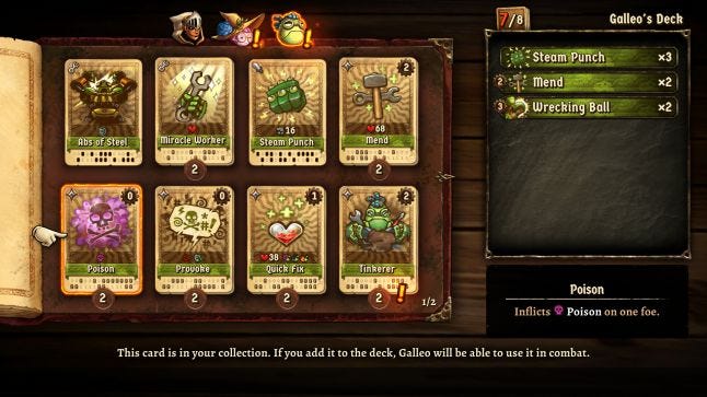
Deckbuilding is gameplay; by that we mean that one of the primary experiences in a game like this consists of staring at the deckbuilding screen and letting your mind run wild with ideas, trying to piece together cards into cohesive decks. The cards aren’t simply functional parts you use to make battle work, they are an important part of the gameplay in and of themselves! It’s critical to make sure the cards inspire the player to think and imagine what they could accomplish with the right combination of cards - and to actually deliver on those promises if they player does so.
If the deckbuilding experience itself is dull, uninspiring, perfunctory or just high-friction, you lose out on half the reason people are playing your game in the first place.
You May Also Like