Trending
Opinion: How will Project 2025 impact game developers?
The Heritage Foundation's manifesto for the possible next administration could do great harm to many, including large portions of the game development community.

Featured Blog | This community-written post highlights the best of what the game industry has to offer. Read more like it on the Game Developer Blogs or learn how to Submit Your Own Blog Post
A look into the game development process of Speed Limit and (un)popular game design choices we had to make to align gameplay perfectly with our vision for the game.

Hi, I’m Igor Kolar. I’m the game director for Speed Limit. I’m an industrial designer by trade, visual communications designer often by necessity, and sometimes like to pretend I’m a pixel artist.

I did the initial design and art for Speed Limit before we were able to get more competent people on board to do those things, like our lead artist Jurica Cvetko and level designer Jan Juracic.
I try to make the distinction between vintage and retro. Vintage is something genuinely old, for example, the games we’ve been inspired by are vintage, while Speed Limit a retro game, because it should remind you of those old games. Would that alone make it an homage though? It does in our press releases because it’s what people recognize and if it comes down to one word, that’s the best way to describe it.
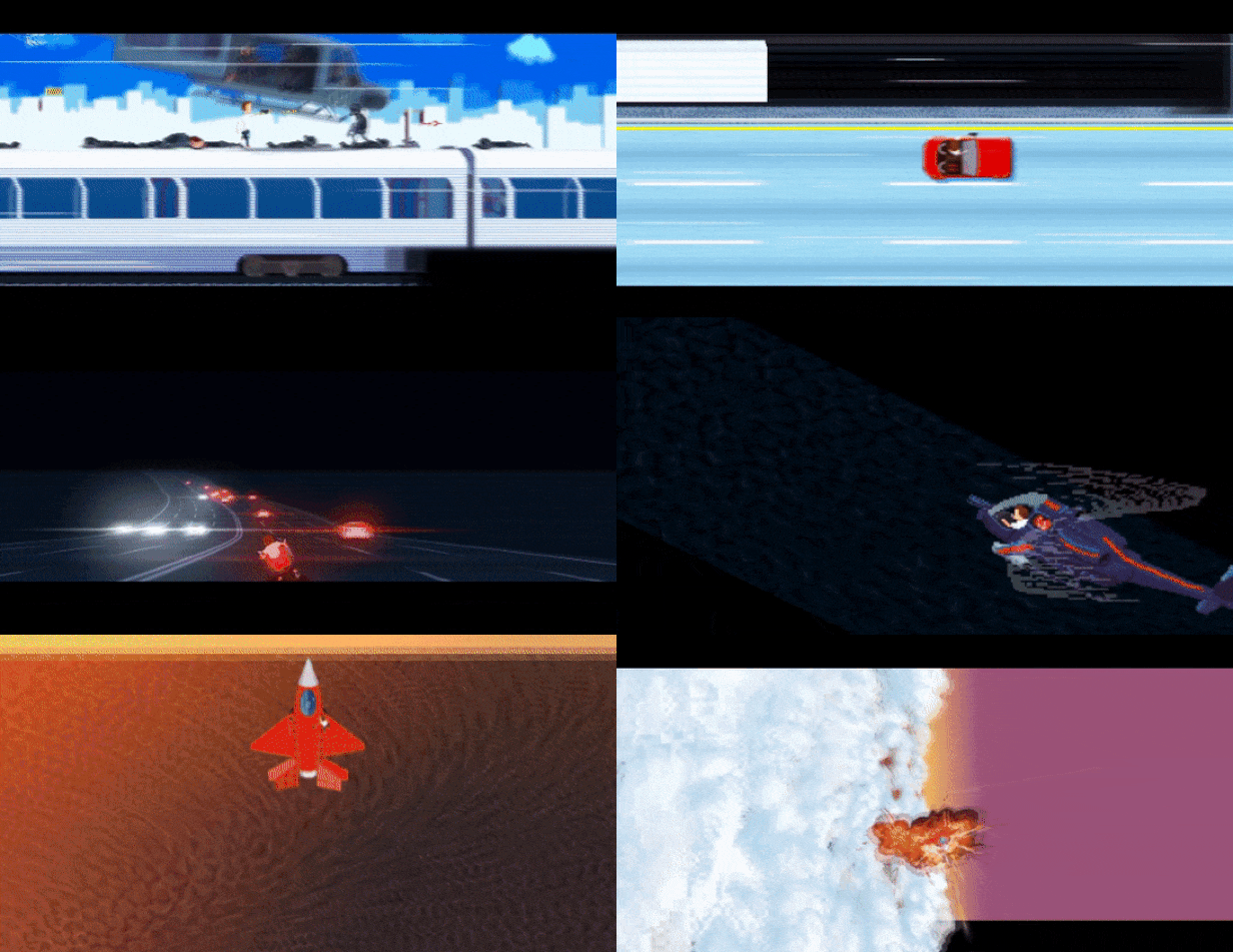
Like everything else we do at Gamechuck though, Speed Limit was always going to be something that’s learned from what we’ve perceived as the best practices, but without pretending progress didn’t happen. We took Speed Limit as far as we knew how with pixel art alone, but when we didn’t feel like it was quite enough, we used modern shaders and lighting effects to take it beyond that.
You could say I’m a fan of ‘retro’ games, there is compelling simplicity in their style, defined by either resolution or palette constraints. It’s the old story of constraints driving creativity. In general? Absolutely. I’m a big fan of things like air conditioning and anti-lock brakes, and would never go through the hassle of owning a vintage, say 1960s car with what I think is beautiful bodywork. I would however absolutely like to drive something that emulates that less aggressive styling of the period, the kind that reminds you that you’re allowed to like things that are fun.
I find there is refinement in retro stuff that you don’t find elsewhere. When there isn’t much an object can do, more thought is put into whatever it can do.
Like, if you don’t have the resources to make a complex 3D game, you can put your effort into making a compelling pixel art game with hand drawn animation where someone’s hair flies to the side when a bullet goes by their head.
When it comes to the ‘retro’ of games, there are several aspects that have become scarce through shear industrialization of game creation. One of them is respecting player’s time.
I’m a big believer in making shorter, but stronger, memorable experiences, over those which disrespect your time.
I like to think of Portal for this, a game which has roughly a three and a half hour play-through is the only one I remember playing that year. Whereas, the current industry-standard genre, the open world adventure game, has more than sixty hours, some of which is achieved through hunting useless trinkets, whether or not that makes sense story wise or not.
But on a smaller scale, the more epic a game is, the less it seems to want you to play it. Back in the Tomb Raider 2 era, I used to enjoy pre-rendered cut scenes, because I’m now as I was back then a big fan of well crafted 3D animation, but they were often, if not always skippable.
Walk into a games show, after this virus calamity has passed, and find a game which doesn’t take 5-10 minutes to get going, outside of the indie booths. Our Gamechuck Arcade cabinet usually draws attention to itself when we’re presenting the game, but even without it, I think one of Speed Limit’s strengths is that you can just sit down and play.

To that, I’d like to add the size of the game. Media files naturally take up the bulk of modern video games. Even our game, artificially constrained at a 640*360 resolution, bulked up significantly when our resident sound wizard Matija Malatestinic, added his awesome analogue synth soundtrack to it.
From the music’s perspective, I’m glad we were able to give him as much time to craft something he, and then obviously everybody else was happy with. Even the rejected tracks are so good they should make their way into some kind of compilation if not a game more suited for their style. With the addition of music and sound effects, the game could still fit on a CD, and you’re not gonna spend a lot of time downloading it.
One thing that is coming back into fashion, at least judging by big companies trying to earn back some favour after countless workforce mismanagement blunders, are demos.
Arguably, they never went out of fashion with smaller developers, earnest in their game design, and nurturing an actual craft, by trying to explore the medium beyond what we see in big budget games. We’ve learned a lot from people playing our demo, and with what’s available to us now in terms of downloadable content, our demo has evolved along with the game. Specifically, if you play the demo now, it will feature all the improvements we’ve added to the final game over the last year.
I still own a couple of big box releases, back from the stone age when CDs were a thing. Back then games didn’t just stack neatly between DVDs and Blu-rays, taking up instead a sizeable portion on a shelf, and sometimes infuriating store owners with their, at the time, non standardized but certainly creative shapes. Cradled inside, apart from the game was usually a number of other materials, like manuals and posters. It’s sad that this feeling of care that went into making all that, feels retro now. That’s why I’m happy that Speed Limit will have a physical release, even if it isn’t a big box one.

The VERY EARLY Speed Limit character in 3D (made in year 2000)
The concept of Speed Limit is an amalgamation of thinking about games which were available to me in the mid to late nineties, some early 3D titles, and some pixel art experience collected along the way. It probably has its roots, pun certainly intended, to discussing games while climbing trees with my friends as a kid.
As a kid, before we could buy a computer in 1997, the only gaming that was available to me, was through my friends’ Sega Master System and what was already at the time a beat up 386 with CGA graphics (think pink and cyan). Consequentially, the kinds of games we could play on those, and their limitations, shaped a lot of what would later go into Speed Limit as “imagine if we could have done x, back then”.
For example, imagine if you could do a game where you can walk around, top down around town, but then if you get into a car, it becomes a sim like the early Test Drives. If you get into a jet, it becomes a flight sim like F-15 (II at the time, I think) and so on. This was years before GTA San Andreas would, roughly accomplish that, but it wouldn’t have been long before something like Earthworm Jim was out. The absurd humour, the very appealing visuals and varied gameplay were very compelling to me as a kid, and I still think it’s one of the most creative platformers out there.
Fast forward to 2012, and my student organisation, BEST, needs to promote a programming competition at a faculty where posters and fliers have utterly oversaturated the landscape. Alex, co-founder of Gamechuck, leads the project, I do the design, and we get a programmer on board. In a weekend, we build an arcade cabinet out of donated building materials and an old computer, and create a one button (a big, red, industrial, smash-resistant button) runner game (inspired by Canabalt) by Monday.

This ends up being so much fun, that still 5 years later, I think: “what could we do if we had more than a weekend”. Whatever it is, due to current experience, it was clearly going to be pixel art, and it was going to be something that moves fast.
There is a particular thrill I think one gets from, let’s say things in motion.
The trope of the train heist has been around for a long time, and I’ve always had this fondness for game levels which somehow emphasized motion. Super Mario and Sonic The Hedgehog (specifically for the Master System of course), would have nerve wrecking levels which would push you along at their pace instead of yours.
Metal Slug had you board a train, giving you a sensation of a high speed pursuit while you focus on the enemies on screen. Soldier of Fortune had a whole level on a moving train where you jump carriages to find a bomb. Final Fantasy 8 would have you run on a train roof while pre rendered background whizzed by. Earthworm Jim would have you fight a boss while in free-fall (and another on a bungee rope). Dark Forces 2 had you running around a spaceship that was falling, making the entire level tilt as you hurtle to meet the ground.
For all the notoriety Lion King deservedly got (and the developers didn’t deserve), the Stampede was certainly an exciting level to me as a kid. These were my favourite kinds of levels growing up, and because I never learned programming, I never got to make a game that was just those kinds of thrill rides.

At around 2018 when Alex and I were wrapping up our first game, All You Can Eat, making Speed Limit the next easy, short project, seemed like a perfectly reasonable idea. The multi genre concept made a comeback, as did the idea of a game with ever faster vehicles. Looking back to where the ideas came from, it was clear this was going to be a 90s action movie.
I didn’t want Speed Limit to be a reference vehicle for actual 90s movies however, I’ve played and enjoyed some games that did that too, and they were fine. No, this was going to be its own thing.
And one of these things was going to be playing with the aspect ratio. Even though we all now use 16:9 screens, there is still something that screams ‘movie’ when you have black bars on top and bottom. So, we used those black bars to both create this cinematic feeling and to give the illusion of depth by placing certain foreground items in front of those black bars, like the ramps in the train stage and bullet casings in the motorcycle stage.
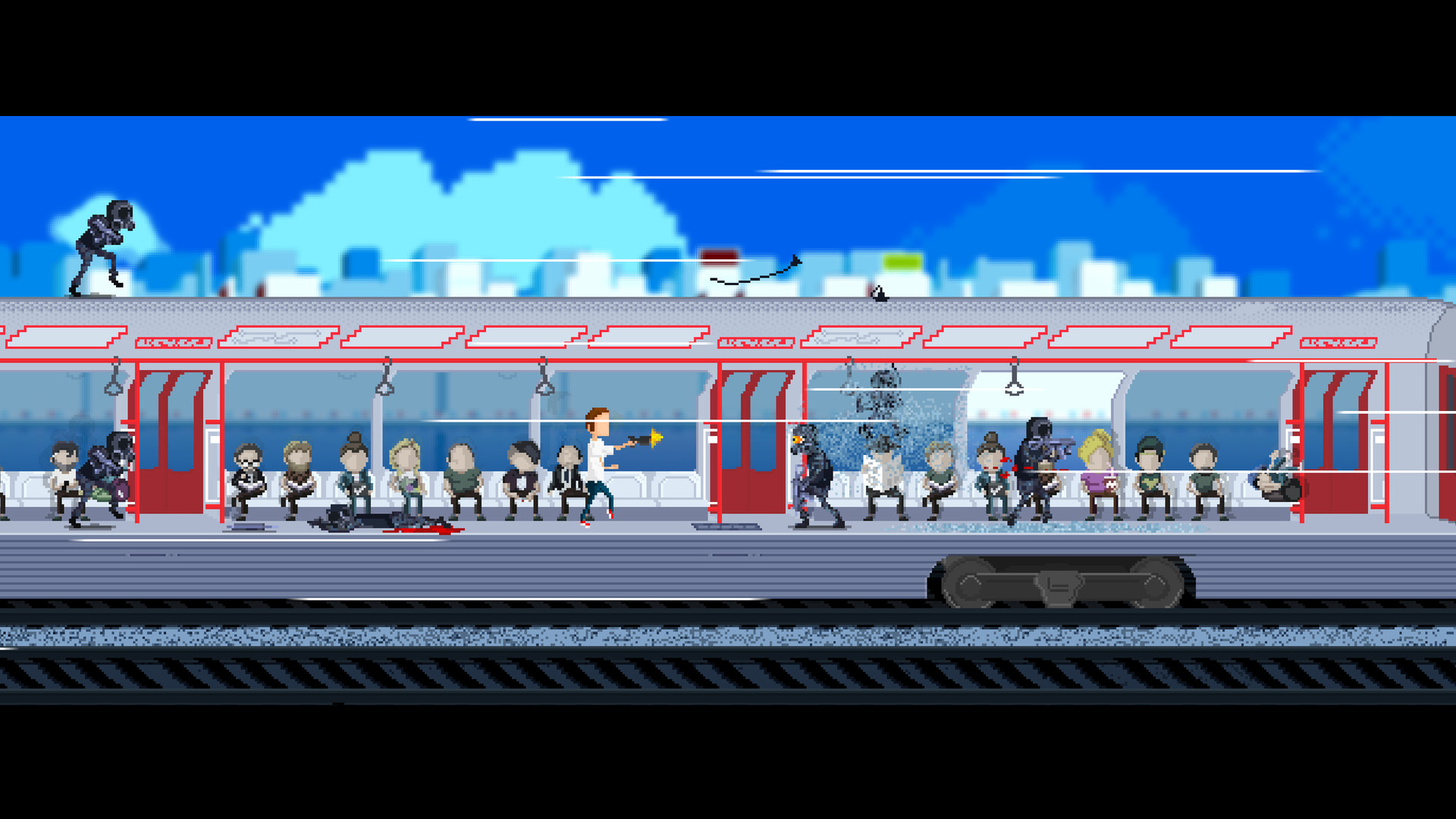
Because we wanted you to start from a stand still, yet still have this sensation of speed when you start the game, the first stage just had to be a train. A train, in which “something so fantastic happens to the protagonist that we simply had to make a game about it”. For the gameplay we looked heavily at Metal Slug, one of the finer examples of shooters, both visually and in shear, enjoyable gameplay.
We tailored the first level to roughly the same length of their first stage, but our baddies are a lot more dangerous. If you don’t believe me, try playing Metal Slug 1 again, and see how many enemies actually attack you on the first level. We were shocked too! The conga line of soldiers was an idea that came out of the prototype stage 1, when people would move either very cautiously or sometimes not at all, so we gave them something to run from. So, the levels are all designed to reward you for either going fast, or doing things with a little more skill.
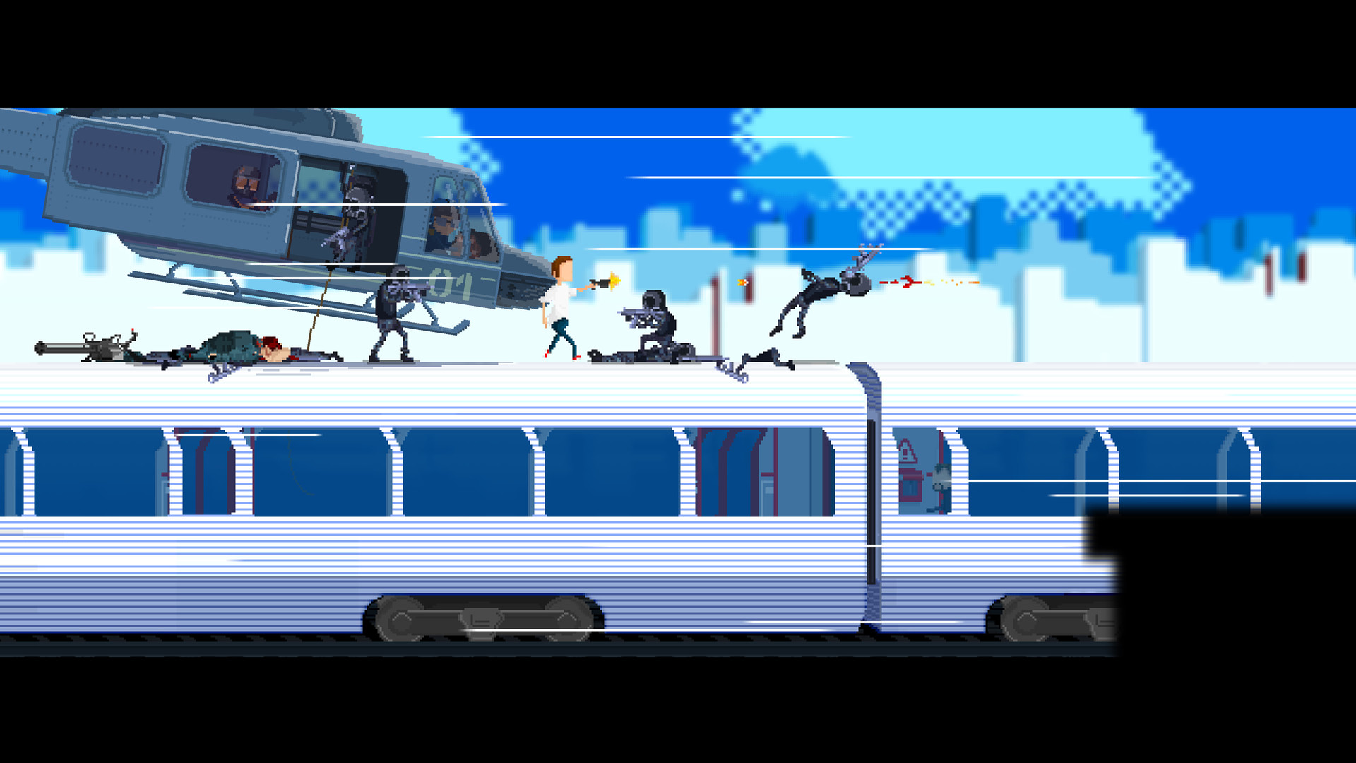
Two perhaps most notable inspirations for this level came from the 2013 movie Wolverine, and the styling behind Mirror’s Edge. This was the first stage that we actually worked on, because it seemed like it would be the easiest to prototype and to ‘understand’ in terms of mechanics. There are so many levels, and so many games where the boss is a helicopter you have to shoot down.
We had a design rule for the first two stages: whatever is off-plane from the action, doesn’t get affected.
Therefore, you never see any bystanders get hurt (or care about what’s going on for that matter), and you can’t shoot down the helicopter. And that’s also why you *can* shoot the baddies rappelling down from it.
The problem with working on a game like this is that you know something new is around the corner, and so getting to the end of this level was very exciting for us, because the quick and seamless transition between gameplays was a big part of our pitch.
Without the transitions, everyone’s perception was that Speed Limit was a collection of different games entirely. Incidentally, we couldn’t find a publisher before this element was completed. Every transition was different, and every time we had to resort to reinventing how we go about things; even going so far as animating a 3D plane for our Artist Jurica to draw over, to interpret its shape in pixel form better.
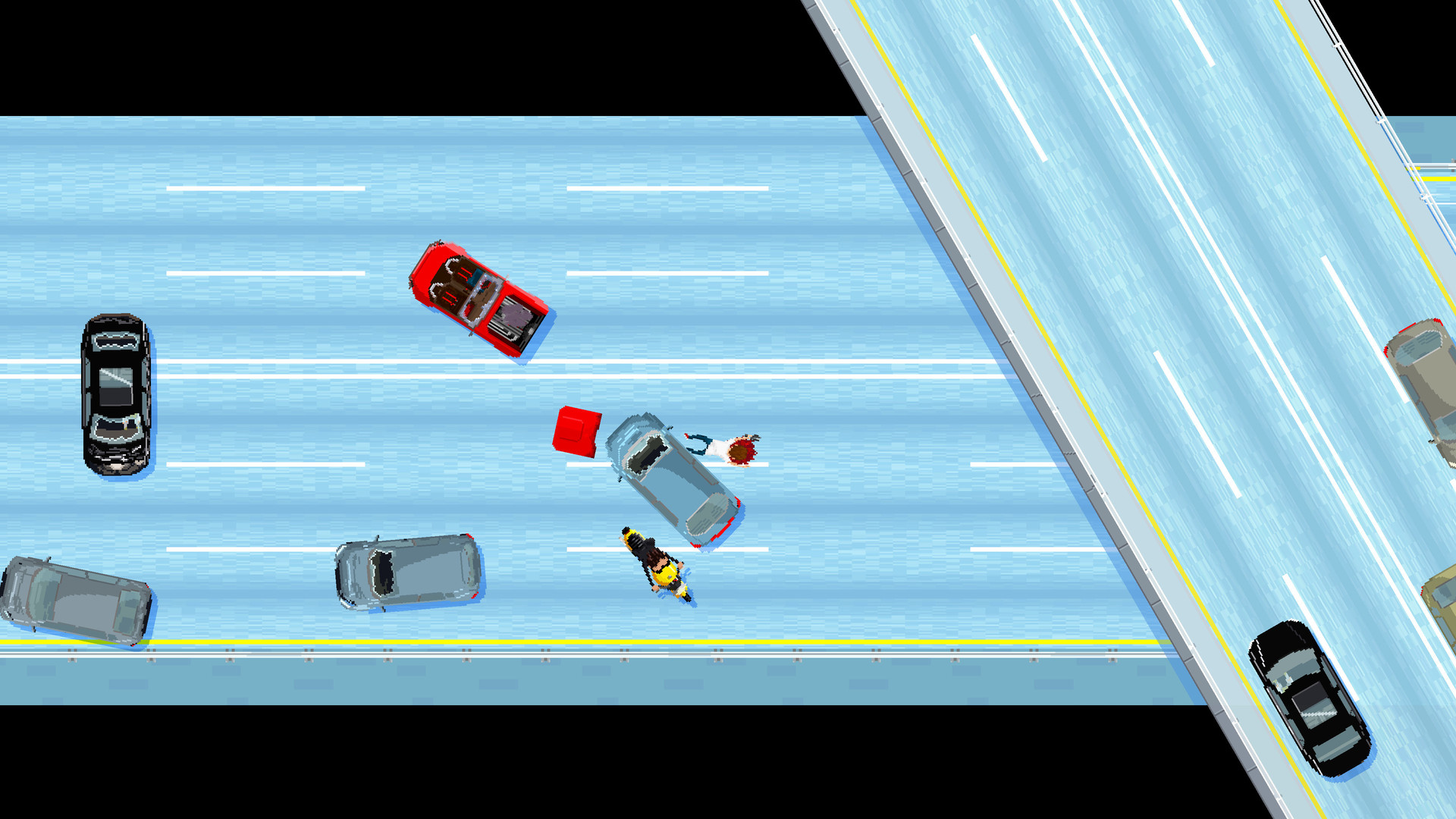
The car stage takes a lot of inspirations from, obviously GTA, but also Spy Hunter, and this one great Flash game Freeway Fury. I think our lead programmer Vanja Karanovic outdid himself with getting the right balance between realistic and believable-but-also-fun physics for the vehicles here.
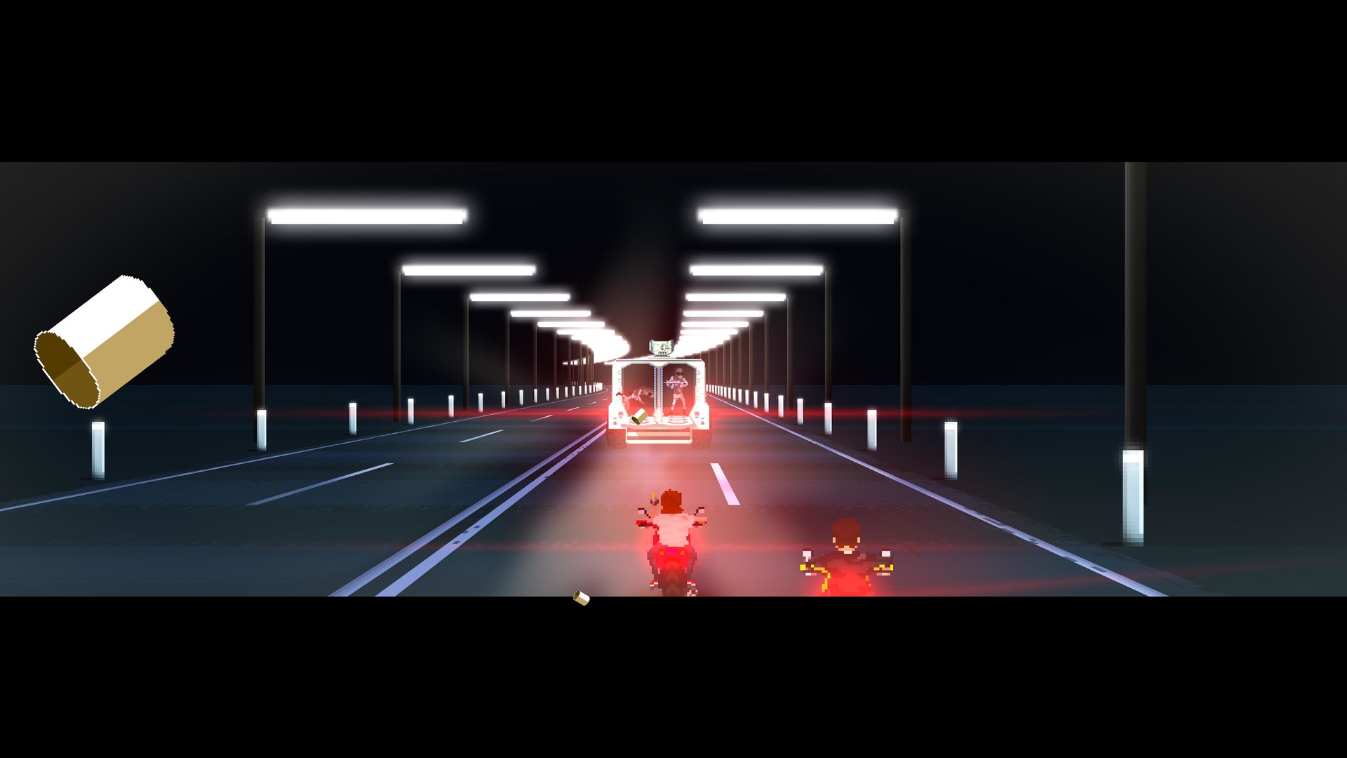
I was a big fan of the 1996 Road Rash. Despite its flaws overall, I found the motorcycle stage of Bart’s Virtual Nightmare to be fun too, at least back in the day. At one point we were looking closer to Road Rash for gameplay mechanics, but it ended up being a stretch of how it would fit with the rest of the game.
Having our character fight by kicking and/or punching seemed like giving him too much competency.
Also, riders get up and walk it off after being knocked off the bike in Road Rash, and we just couldn’t have crashing be so benign. So we ‘settled’ for a good, input friendly, feel of the motorcycle you’d just like to drive, enough danger from oncoming traffic, and then have enemies just spice things up. Shooters and racing games done from this perspective usually, I feel, give a very poor sense of distance. One game that stood out when doing research for this stage though was Black Viper for the Amiga.
Not having had an Amiga myself, I never heard of it before, but to me it seemed to come closest to a good perspective and easily judged distance. Our newest programmer at the time, Karlo Koscal stood up to that challenge, apart from jumping in mid-production, and the result to me feels like the best of the 2D behind-the-rider gameplay.
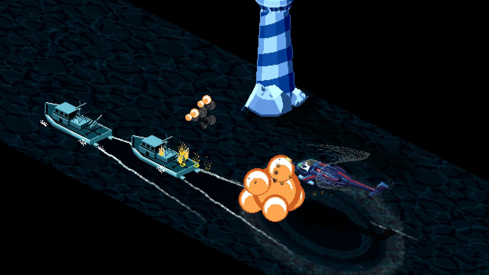
I never actually played the Return of the Jedi for the Atari, but I found the isometric perspective refreshing for a shooter. We could, arguably, have just as easily made the helicopter levels a top down shooter, but this is not a game that threads old ground. Even though we had this level back in our prototype stage when I thought we could pull off a perspective in the distance, the difference is so vast it could easily be mistaken for a different game. The helicopter started off as a mix between the one from Blue Thunder and the Apache, but I’m glad it ended up being the much more creative brain child of our artist Jurica Cvetko.
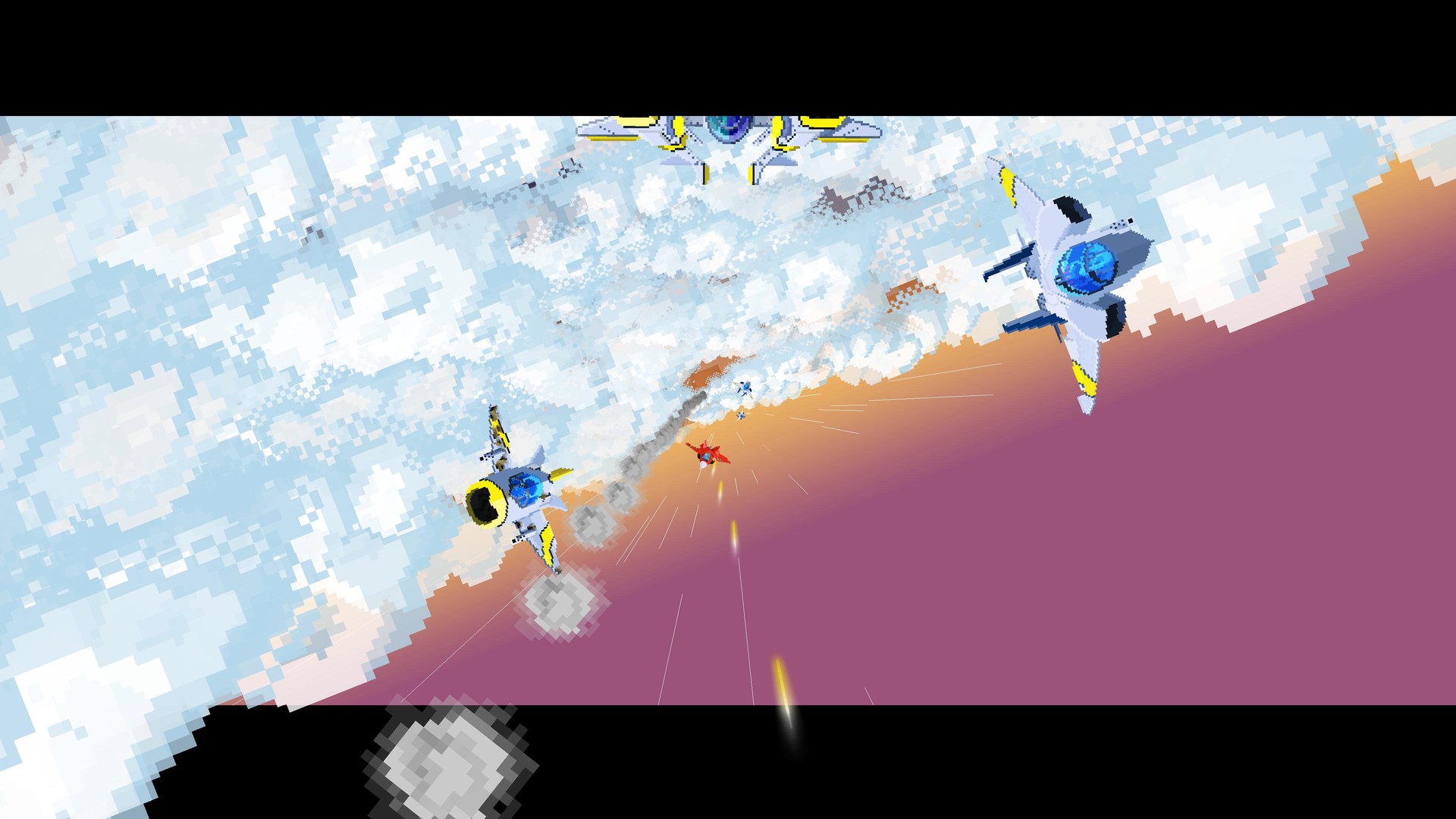
Out of all the stages, the plane level had the perhaps farthest leap from its original inspiration. Part 2 of the Moose hunters stage in Mickey Mania had this amazing 3D (or 3D looking) effect, magically rendered on the old 16-bit Sega Mega Drive. Also, anime often used hyper angled shots to relatively cheaply convey the sensation of speed, specially in the old days, before the extensive use of 3D. The result in the prototype however was somewhat underwhelming, so I’m really glad Jan Juracic came up with this barrel rolling idea out of the blue, pun certainly intended.
One thing I’m particularly fond of in this stage is the level of completely unnecessary realism. Everything moves very fast and you’re unlikely to catch it just by playing, but all the control surfaces on the planes react as they would in real life. So brakes, ailerons, lifts, rudders all move when they’re supposed to. Also, the damage is, like in the car level, location based. There is a structural frame layer drawn below the aircraft’s skin for each enemy, and you can see it as you peel away the top layer with bullets.

Since every two levels, the gameplay changes completely, we were learning how to design different styles of games on the fly. For the first one, we had cut-outs of every carriage with enemy positions and triggers drawn out months before the first line of code was even laid down.
For the car levels, Jan went into his architect mode and constructed what is probably the most proportionally accurate highway system in any pixel art game ever made. Because I have a background with 3D software, we created animations of behaviours we’d like to be able to experience, and entire full screen sequences of the level, again, before any code was available.
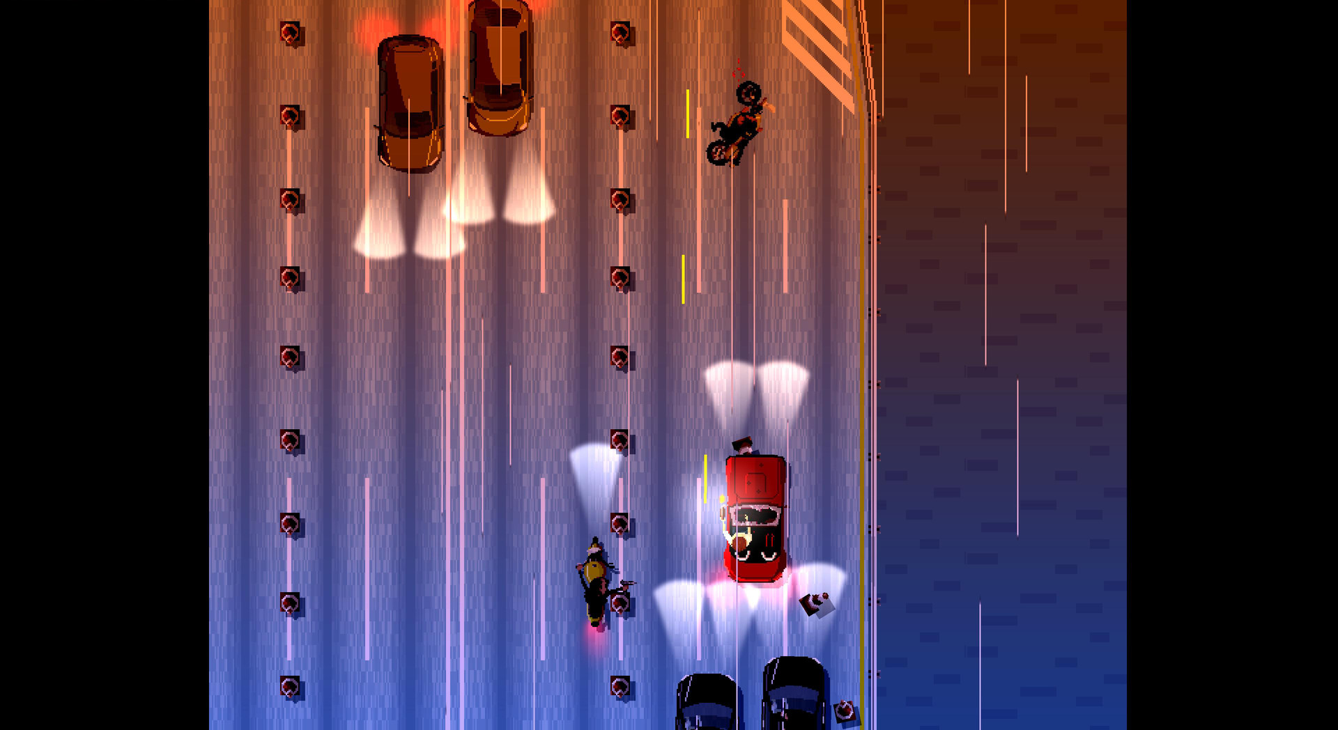
As the old saying goes, even the best laid out plans don’t survive contact with the enemy, in this case, playing the game. So of course nothing is exactly as it was initially drawn out. It did however give us a good foundation and understanding of what we wanted the feeling of *successful* playing the game to be.
Speed Limit started off as colour coded because I saw a style gap in pixel art games.
If we go back to the vintage games, pixel art was the only thing you could do because you only had so many pixels to spare. Outside of say Lemmings and the initial Super Mario, both of which did it brilliantly, I think there was only a handful of stylized characters, that really worked at such a low pixel density.
If you look at say Amiga games, they certainly went out of their way to create impressive, (let’s dare say early cyber impressionist) works of figurative art in their games. Visual communications designers having had their shot at web design and certain popular, design oriented companies have thoroughly infused minimalism into our collective consciousness these days. So too, in digital art we have gone back to the basics that is pixel art, trying to tell more with less.

The vestiges of the primary colour palette (red, blue, yellow) coding in Speed Limit can most notably be seen in the first few and last few levels, or rather, during daytime. However, since Speed Limit is a game that is all about shifting perspectives and gameplay styles, it was soon obvious that a single palette wouldn’t make sense for the entire game. So, as the night falls or the dawn rises, we move into secondary colours, and for night time we wash it out with tertiary colours, and focus on the lights.
There is no HUD in Speed Limit, and the only text you’ll read are the menus and the level titles.
After I’ve gone through the process of making a Latin and Cyrillic font for our previous game, I was dead set to have no text in the game, but due to the ever-changing nature of gameplay, we had to make some concessions. The game’s relentlessness between levels, and the sensation of going ever faster was a priority, so a quick explanation of controls was faster than tutorial sections.
Tutorial sections are a relatively good practice in my opinion, but we don’t want you to relax until you’re done playing, or you win the game. For that reason alone, you’re given as much warning, as our protagonist, he gets the gun and has to go, you get what the secondary button does and you have to go.
This, in combination with the minimalist character design is what I think wasn’t covered as much in retro games. At least, it wasn’t before we started working on it.
Speed Limit is an unapologetically hard game. I can’t say the one-shot, one-kill idea was there from the very beginning, but the more of the retro vibe it had, and the more hand-holding games we played over time, the more it became clear that authentically difficult was the way to go.
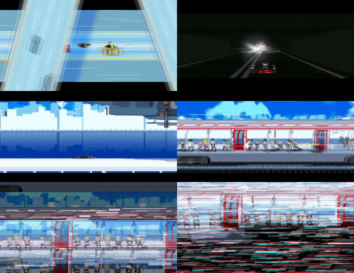
To be fair, it is “one shot-one kill” in only 4/10 (or is it 11? ;)), levels. What it specifically is, is telling a visual story. There are no hit points or health bars for you to keep an eye on. Instead, if you see your character get shot, your character dies. If you can see your car blowing smoke after the hood has been decorated with pixel-accurate-collision bullet holes, you know you’re almost gone.
This reactive-story telling is what made me reach out to Jan to come up with a more interesting backstory to the game. I’m not gonna reveal it here, and it doesn’t interfere with the gameplay at all, but I do hope people catch up on the little clues we’ve left around the game.
Hard games, of course, are not a new thing.
Motivation I think, is the main distinction to why a game should or shouldn’t be hard. Making a game incredibly difficult so that people would dish out quarters at the arcade because, by surprising the players with unexpected prompts, e.g. Dragon’s Lair, was in my opinion possibly good business, but bad design.
Likewise if you purposely add levels with different gameplay mechanics just to make it hard to beat a game in what would normally be a time you’d rent one for. However, I’m not into making skinner boxes that hold your hand and reward you for every bit of progress you do.
And eventually people realized that there is a market for people who enjoy the thrill of learning to play a new game. It’s why (the actual) Super Mario Brothers 2 exists. Some time later, that same approach would birth Ninja Gaiden Black, and the recent popularity of rogue like games, and perhaps most popularly Dark Souls and their plentiful imitators.
Stakes have to matter, even if we’re just pretending.
The trick is to make the game difficult, but fair. I think we did a good job at it, but we can only find out for sure once it is out.
[This content has been reposted from Speed Limit blog. You can check out Speed Limit (and try the demo!) at its Steam page.]
Read more about:
Featured BlogsYou May Also Like