Trending
Opinion: How will Project 2025 impact game developers?
The Heritage Foundation's manifesto for the possible next administration could do great harm to many, including large portions of the game development community.

Featured Blog | This community-written post highlights the best of what the game industry has to offer. Read more like it on the Game Developer Blogs or learn how to Submit Your Own Blog Post
A deep dive analysis of how diegesis is used in the gaming medium and how it may be used to create immersion and meaningful connections between the player and the characters.

Diegesis is a concept created in the Greek theaters that evolved into a modern tool to analyze and create content for any media. Diegetic elements implemented in games increases the player's immersion, taking advantage of the visual language of the game, it's world, fiction and the universe of the character.
First let's go back to the theaters and talk about the Fourth Wall.
Let's Imagine a theater seen from above. The theater has 3 walls, one behind and two on the sides. When Denis Diderot talks about the fourth wall, he defines it as an imaginary barrier that separates the stage from the audience. This wall is invisible looking from the outside in, allowing us to watch the presentation. On the other side of it are the actors, interpreting their characters, for whom this barrier is opaque and completely ignored, the characters are oblivious of the audience and the wall itself.
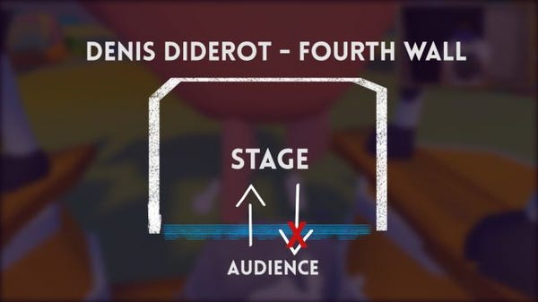
When a character interacts with an audience, we say that he is breaking the fourth wall.
Thus, diegesis is a way to label a game element in relation to the fourth wall.
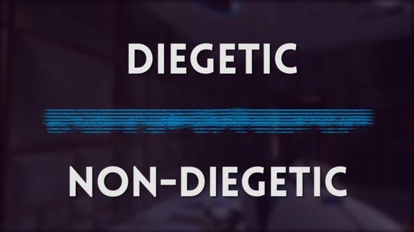
When a character, a song, sound or image exists within the game world, we say that it is diegetic: it belongs to the universe of the character and its located behind this wall. Otherwise, if this element exists only in the player's world, at the other side of the wall, we call it non-diegetic. If it's a menu or an interface element, we may even say that it's hanging on the wall, at the audience's side.
Let's analyze the elements of some games and see where they fit in this taxonomy
One of the first games I remember having several diegetic interface elements is the Nintendo 64 multiplayer favorite: Goldeneye 007.

Bond's watch, was a mix of pause menu, inventory and mission information. This information is primarily for player consumption but the fact that the character raises his arm and acknowledges the watch-menu as something he sees and which exists in his own world transforms the use of the menu into a character action such as walking or shooting. It also helps that impossible tech built in luxury accessories is a cliché in James Bond stories.
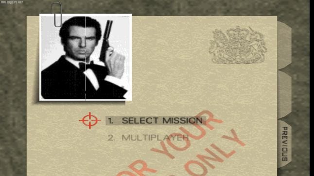
The menus of the game try to get that same feeling. All options are thematically tied with this top-secret-archive look. As if all these options were different documents, and the levels some kind of video in a report file.
Everything clicks so using this menu is no longer a player-only action such as interacting with traditional menus
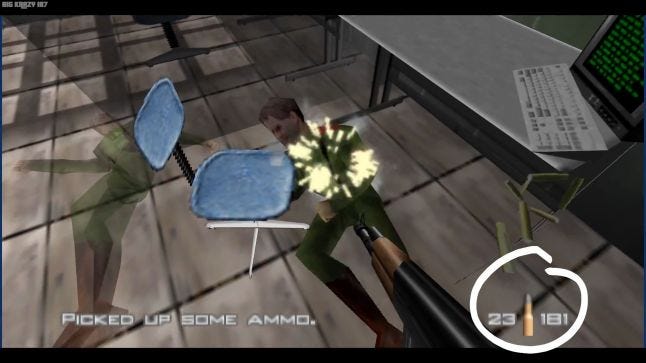
Speaking of traditions, one of the most traditional elements on shooting games is the interface element that shows the ammunition count. This element is an example of a non-diegetic interface necessary for the player to make informed decisions and read this information in a simple and quick way. One must balance the aesthetics with practicality.
Half-life was an innovation in the history of FPS storytelling and narrative, never taking away the player's control over the character and making them see the experience through his eyes. Even at the very beginning of the game, we're free to move and look around while taking that scripted tour through Black Mesa, sinking in the atmosphere

We have other diegetic elements that also make up this immersion: in Half-Life your HUD only appears, showing the amount of HP and ammunition, when you find and equip the HEV suit.
This is Valve's way to acknowledge this information within the game's world, and tell you that your character can see it, just like you, the player.
In Overwatch we have examples where both diegetic and non-diegetic interfaces were used.
In all cases we still have the classic non-diegetic, easy-to-read numbers (for the player) on the bottom of our screen. However, some characters have weapons with a display or detail that shows some of this information to the character as well:
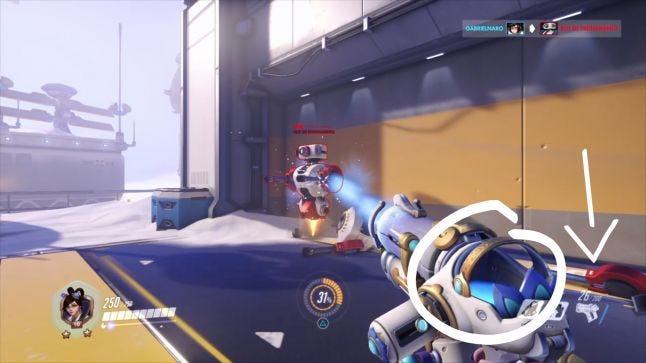
Mei's ice shooter has a visibile liquid charge that depletes.
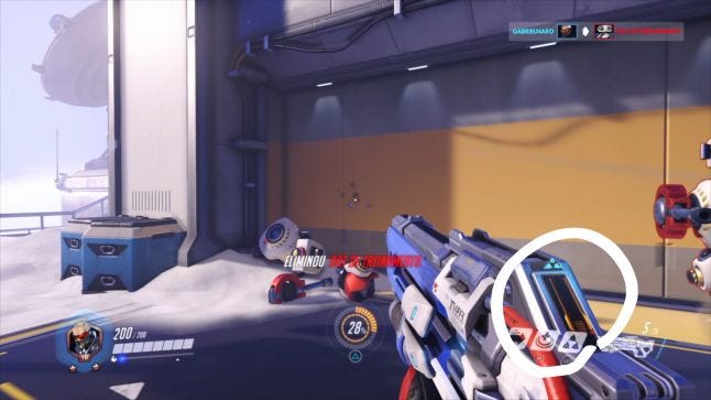
Soldier's weapon shows ammunition and Helix cooldown.
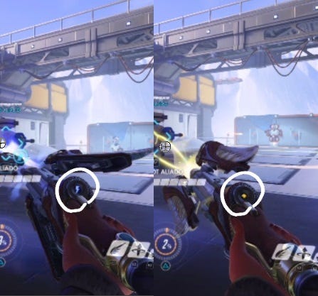
Mercy's staff changes icon depending on the beam.
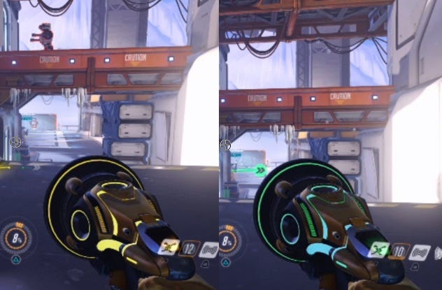
Lucio's sonic weapon changes it's color for each of the active buffs.

Sombra's sub-machine gun has a display to show her the ammunition.
These diegetic elements have two functions in the game: creating more player feedbacks and showing the personality of the heroes. The soldier's weapon represents his tactical-oriented thinking and shows a bit of the character's decision-making process. Contrasting with Roadhog, who puts a lot of iron scraps in his gun and does not care if he has a shot left over or not. The diegetic elements are used to build the characters personality and the world's narrative.
Sound and music are also elements that may exist in either side of the fourth wall.
At the beginning of Portal 1, when we wake up in our cell, the only thing we hear before being introduced to GladOS is the in-game's radion, which plays for Schell a samba version of the ending song.
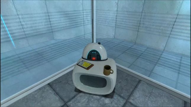
Diegetic soundtracks are somewhat rare, often because the player's movement will reposition them in relation to the sound source. Or simply because it is easily acceptable by the audience and sometimes better for the experience as a whole.
To handle that, designers and directors sometimes use a technique called diegetic switch, as in the ending of Portal 2:
At the start we hear a non-diegetic soundtrack. The song plays for the player, not the character.
This song is interrupted and we are presented with a new song, performed by the iconic turrets, for the character. At this very moment we're listening to the same thing Schell is.
When the elevator starts moving the music gets more distant. That's the rule: if it is diegetic it must exist in the character's universe, and therefore is affected by its physical world.
The apex of this section happens when we have an Opera of turrets playing the whole song. And as we quickly exit the room the song switches to a non-diegetic version of itself, which doesn't lower the volume over the distance.
These diegetic changes, especially with soundtracks, are common in movies and games.
Another example is the diegetic switch on the intro of Devil May Cry 4.
For a brief moment we can listen to the music coming out of Nero's headphones. As soon as he throws it away a non-diegetic version of that song starts playing in the background and the fighting scene begins. This intro also has an instance of Interscene Diegesis where Kyrie is singing in a church, the camera cuts to another place and the music from the previous scene keeps playing normally.
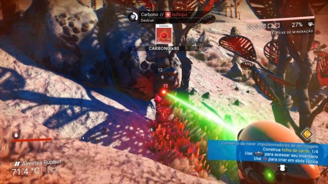
Similar to Half Life, all HUD elements in No Man's Sky such as the charge of your weapons, life support and weather-enduring systems are all diegetic, they are also acknowledged by the game and is actually displayed on the character's helmet. As soon as the player enters his ship, the panels are used to give information about speed, location and fuel, bringing the interface into the game's universe. No pun intended.
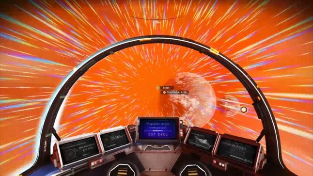
Popup infos like the quest and pause menu maintain the classic aesthetics of menus, and are not diegetic.
In Resident Evil 2 developers had a great idea to disguise the loading screen, which is naturally non-diagetic: using a simple animation of a door opening they could hide the loading and create a big thrill, bringing this moment to the game's world, and keeping the player immersed and anxious to find out what happens on the other side of the door.
 The other interesting element to highlight is your characters' animation when HP drops low. He starts walking slowly, arm crossed, hunched, in pain. A simple way to replace a non-diegetic life bar hanging at the corner of the screen.

Finally, one thing I've always found incredible in the game is the save point scheme. In Resident Evil the saves are diegetic and exist inside the game world as a typewriter. The character may find Ink Ribbon items, which are consumed when the character saves, as if writing a report of what happened until then.

A great way to create tension, taking away the player's ability to save at any given time, in a diegetic and elegant way!
Firewatch also heavily uses diegesis for narrative and immersion purposes.
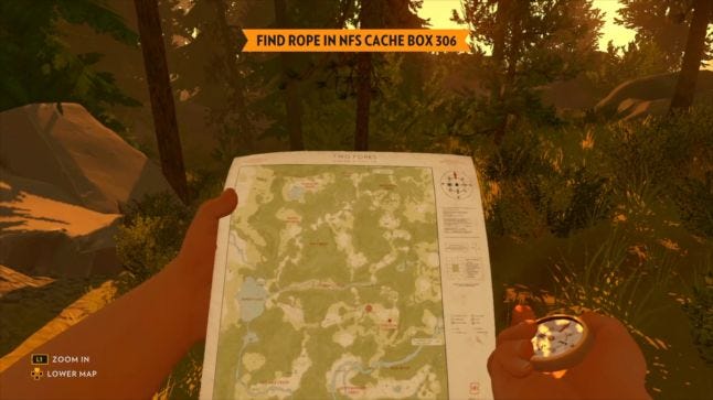
The most noticeable application is the way the map works. Instead of making an abstract map in a UI menu, outside of the our characters "reality", the developers at Campo Santo put it as object in the game, blocking your view and preventing the character from interacting with other objects while holding it. On the right hand, a compass. Using it together with the map transforms the way you move through the forest into a diegetic action so that now your actions mirror that of Henry: you're exploring and venturing trails in the middle of a forest.
Another way that the game plays with this concept is in the prologue. To tell us the backstory the developers used texts on the screen. When this happens it is usually a moment that the player is passive and only absorbs that information. The difference here is that we can make choices and decide the past of the character, things that have led him to start the adventure of the game and that will be brought back later in the story.

The interesting thing about this is that an element that usually belongs to the player (texts on the screen) gets transformed into a diegetic element of the game, as part of the thought process and memory of our character. This ambiguity is brought about by the fact that we have agency in these choices, even when there is no good options or when we're presented with a single, obligatory "choice".
Diegetic elements are a powerful tool to create immersion when properly designed. When it matches the game theme and has a good usability it elevates the game experience by making the fourth wall as thin as possible.
There is one last game that has been made with diegesis in mind that I'd like to talk about:
Whenever possible, Dead Space designers chose to create a diegetic way of interacting with the game. This rule appears in the first slides of this GDC talk by Dino Ignacio, Lead UI/UX for the game and affects sound, UI and game design.
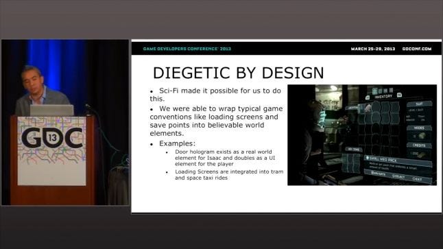
Sound design in Dead Space was a stellar implementation of diegesis in audio. Using only ambience sounds of the ship (and a few stingers here and there) with no music whatsoever during the gameplay. The lack of music not only serves the diegetic premise of the game, but also helps to build the ship in which the game takes place, the USG Ishimura, as a character, emphasizing its extremely industrial and violent environments, full of metal, gear and engine sounds.
(also THAT room)
An example of diegetic element that causes a change in game design is the save kiosks. In Dead Space (ss we've seen in Resident Evil 2) the player also needs to go to certain locations in order to save the game. This decision imposes certain challenges to the Level Design team, which now has to take into account where this save will fit in the level. This also influences the game's difficulty, generating new demands to the Game Design team, changing the resulting experience. Also inspired by Resident Evil, the ship's doors and the trains between chapters are nothing but disguised loading screens!

But surely the most apparent factor of this diegetic philosophy of the game is its User Interface. All the elements that usually require an interface: map, menu and inventory are shown diegetically in Dead Space. In fact it was this requirement that led to the creation of Isaac's suit, called the RIG, and it's ability to project the menus and maps in front of the character. Isaac's animation looking at the cursor and other menus further shows this acknowledgement of the interface and further cements this diegetic presence.

Crafted with such care and skill, this diegetic treatment coupled with great design has given birth to one of the most immersive horror/thriller games, where you don't feel any separation between you and the character, with the fourth wall so thin that it practically no longer exists. Dead Space created a new IP (no small feat) and won several awards in the year of its launch. It is a game that is worth replaying and analyzing it through these lenses.
Before wrapping up I'd like to bring a counterpoint to clarify that diegesis doesn't mean quality of experience, and is just another tool to analyze what we play, and to help us think and better communicate when we are creating our own games.

Games with very complex systems and less action-oriented mechanics still have much to gain from traditional non-diegetic interfaces, as is the case of the strategic game Europa Universalis IV and the indie hit FTL, which takes place almos entirely on an interface and yet they are full-featured, excellent games.

Virtual Reality experiences are showing great results going full on to the diegetic side of the spectrum, which makes a lot of sense. Examples of this are the Job Simulator game from Owlchemy Labs and Cow Milking Simulator, from the Brazilian studio Imgnation.
Disclaimer
This post is an written adaptation of this video essay I did on the subject (audio in Portuguese with English subs!):
Read more about:
Featured BlogsYou May Also Like