Trending
Opinion: How will Project 2025 impact game developers?
The Heritage Foundation's manifesto for the possible next administration could do great harm to many, including large portions of the game development community.
Designers don't design games, they just record what a game wants. The story concludes, with screenshots of the prototype.

Of the two problems that precision input brought, one of them required slower gameplay.
Slowing the gameplay was worse than blasphemous. It went against the original goal of a fast, light, to-and-fro fencing sim. I wrestled with this for a long while, but finally decided it was a question of either having cake or eating it. The to-and-fro aspect comes from the ability to intercept and return attacks, and for that to happen, a human player must have the time to see and react to that attack. Ignoring the reality of precision fencing maneuvers for the sake of twitch gameplay creates something other than fencing, which annuls the whole point much more completely than a relaxation of gameplay speed ever could. Besides, as long as the player is fully engaged with placement, lunging, dodging, parrying, beating, and riposting, then the gameplay feels fast. And the feeling, not the reality, is the design goal.

Less troubling but more work was the practical input problem. How should analog work in a fighting game? I purchased a dual-analog game controller, a clone of the Playstation controller, and started experimenting. Assigning the sword's tip to one stick was trivial, and foot movement to the other stick, obvious. Since attacking now consisted of pushing towards on one or both sticks, I now had a fighting game utterly controlled by two analog sticks and no buttons whatsoever. But this meant the old parrying method of pressing the same attack button as the opponent had would no longer work. I returned to consulting the source material.
Fencing has the notions of a sword being "in line" and "out of line". A sword is in line if it is aiming at the opponent's target area, and will typically stay that way until the opponent forces it out of line. Parrying is accomplished in many ways, but the commonest is the beat. A sideways wrist flick hits your opponent's sword, momentarily knocking it out of line and giving you right-of-way. Not only must he bring it back in line to be able to strike you, but he must cope with your right-of-way.

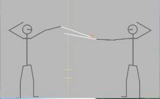
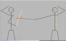
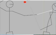
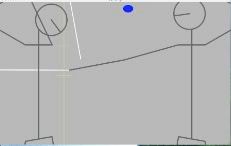
Fencing prototype pic 2
The beat button debuted, and with it a measure of how far out of line a sword was at any given moment. Tap the beat button when the swords were crossed to misalign your opponent's sword. (If the swords are not crossed when you beat, only your own sword is out of line.) The penalty time was originally constant, but playtesting found that the flow fell into lock-step. While that was certainly the to-and-fro aimed for, winning a duel was attritional: with every exchange you tried to perfectly place and time your beat to get a few frames closer to your opponent before his own sword came back in line. This was not fun. The penalty time was then calculated based on where the blades crossed. This produced "sweet spots" to beat or beat with, and the closer to the sweet spot you got, the bigger time window you were rewarded with. Not only was this a visible, mostly-controllable gameplay mechanic -- the out of line sword was shaded darker in proportion to the timer -- but this also created a bonus for a skilled player: against more predictable opponents, he would be able to hit the sweet spots regularly, gaining an enormous advantage. Now the duels were dynamic, believable, and rewarded skill. Now they were fun. Two more buttons were added as well. The disengage button flicks your blade to the other side of your opponent's with a quick circular wrist motion. A properly-timed disengagement will dodge ("deceive") your opponent's beat, keeping your blade in line and even allowing a counter-beat. This feature discouraged hammering on the beat button as soon as the swords crossed. Since deceptions require anticipating the opponent, I artificially lengthen the out-of-line time penalty for a deceived beat over a missed beat.
 Fencing is an old aristocratic art, filled with refreshingly euphemistic terms for many situations: baiting an attack is called an "invitation", forcing an attack through his guard is "to insist", and the point-scoring strike is a "touch" -- touché. Such a rich vocabulary is a designer's playground, because he can immediately analyze the interplay of the principal tokens for possible inclusion and expression within a design. Though the game lost some of its pick-up-and-play ability due to the new control scheme, people new to fighting games, or all videogames, have lost nothing. The re-designed gameplay mechanics are visible and readily understandable to everyone. And that is the final coup de grâce -- "graceful stroke".
 You May Also Like