Trending
Opinion: How will Project 2025 impact game developers?
The Heritage Foundation's manifesto for the possible next administration could do great harm to many, including large portions of the game development community.

Featured Blog | This community-written post highlights the best of what the game industry has to offer. Read more like it on the Game Developer Blogs or learn how to Submit Your Own Blog Post
In this post, I provide a few excerpts from my new book, An Architectural Approach to Level Design, which was recently published by CRC Press.

In the past few years, I have noticed a fascination in the game industry with architecture as a field that could be potentially helpful to the way we design. As a game developer with two degrees in architecture I have likewise seen the connections between the two fields. As an undergraduate architecture student I began making small video games with friends – creating art with the design software I used for classes. On the suggestion of some of my studio-mates, I began utilizing what I learned about game design in my class projects. I felt that architecture, like games, had a symbiotic relationship with its users and that well designed game levels had much in common with the work of architects like Frank Lloyd Wright, Le Corbusier, I.M. Pei, and others. Eventually, my work with both fields culminated in a graduate thesis on the intersections between games and architecture. After grad school, I became a game developer and continued my research into the ways architectural theory could be applied to level design. This work has allowed me to write several articles, give a few conference talks, and now publish a book.
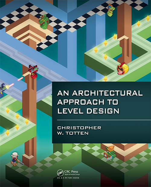
Released on June 12th by CRC Press, An Architectural Approach to Level Design integrates architectural and spatial design theory with the field of level design. The book explores the principles of level design through the context and history of architecture, providing information useful to both academics and game development professionals.
Presenting architectural techniques and theories for level designers to use in their own work, practical elements of how designers construct space are addressed along with experiential elements of how and why humans interact with this space. Throughout the text, readers learn skills for spatial layout, evoking emotion through gamespaces, and creating better levels through architectural theory.
This article contains several excerpts from the book showing basic architectural elements that can be applied to practical level design applications along with illustrations from the book taken from my own gameplay and design journals. These sections prepare the reader for further explorations of methods for visual communication, producing emotional responses in players, encouraging social interaction, and other things important to game worlds. I hope you enjoy reading it as much as I have enjoyed researching and writing it. The book can be purchased at http://www.crcpress.com/product/isbn/9781466585416
Ways of Seeing for Level Design – from Chapter 1: A Brief History of Architecture and Level Design
In order to fully understand spatial design principles for level design, it is necessary to analyze precedents from both real world architecture and video games. Hal Box, FAIA, Professor Emeritus and former Dean of the School of Architecture at the University of Texas at Austin argues for an educated form of seeing architecture based on study and analysis. In this case, “seeing” is not used to only describe using the visual senses, but also to process the spatial, formal, contextual, and historical elements that make a building unique.
For level designers, this type of “seeing” can be transformative for how we learn from the levels of previous games – both good and bad. Doing this may involve breaking some habits common to game players. For example, there is a saying that “gamers don’t look up” when playing games. As designers, the verticality of gamespaces can be an important element in establishing the grandiosity of a setting or for communicating direction with players. Likewise, as players, it is common to run directly to the next action scene rather than pause to explore game environments. Designers should look for ways to direct the pacing of a game environment in subtle ways – placing narrative elements in the way of player pathways or incentivizing exploration with rewards.
In his book, Think Like an Architect, Box proposes ten ways for exploring and understanding a building:
1. Learn why a building was built, what it was for, and what it is now.
2. Look up as you walk around – noticing visual elements, layering of forms, and materials.
3. Sense the space by its size, shape, and how it interacts with light, sound, and other spaces.
4. Train your eye to understand the structure of the building and how it holds the building up.
5. Determine how materials are working – in compression or tension – or if they feel heavy or light.
6. Determine how the building was constructed and from what materials.
7. Examine the historical precedents of the building.
8. Analyze the composition, proportions, and rhythms of building elements.
9. Observe the appropriateness of the building to its setting.
10. Analyze what makes the building special from others[i].
Obviously, not all of these apply to game levels. While the environment art of a level can represent structures that are in compression or tension, the game art itself will not be. Likewise, many game levels are held up by the fact that they are not defined as rigidbody objects in the game engine and thus, do not fall according to the engine’s physics system. However, many of these proposed ways of seeing are applicable to game levels in their current form, or may be modified slightly to fit our own purposes. In this way, we may say that level designers can modify their ways of seeing with these methods:
1. Identify what gameplay occurs in the space. What are the game mechanics supported?
2. Look up as you walk around – noticing visual elements, especially art that contrasts the rest of the environment or somehow calls attention to itself. Also look down – is the spaces’s verticality used in reverse to make you feel in danger?
3. Sense the space by its size, shape, and how it interacts with light, sound, and other spaces. How do the lighting or sound conditions make you feel?
4. Analyze the pacing of the level. Does the level usher you through itself quickly or are there opportunities to explore? Are these required or bonuses for extra curiosity?
5. Is there one gameplay style reflected in this level, or are multiple supported? (For example, does a deathmatch map have places for snipers, offensive players, defensive players, etc.? Does a game level play well for barbarians but poorly for mages?)
6. How does the space express the narrative of the game? Is it a backdrop or does exploring the level tell you about the game world in some way? Are narrative events scripted to occur around the player or are there cutscenes?
7. Examine any historical or gameplay precedents? What kinds of spatial experiences were in those games?
8. Analyze the composition, proportions, and rhythms of environment art elements.
9. How does level geometry compare with the movement abilities of your avatar? Is everything well within their capabilities or does the level space challenge these measurements? Is there anything that is outside of these capabilities? If so, does the game offer any way to expand these abilities?
10. What environment art elements are repeated? Are they interactive? If so, do they correspond to a specific gameplay mechanic?
These ways of seeing for level design, as well as the architectural and gamespace precedents found in the rest of this chapter, will guide our explorations of spatial design principles for level design.
Level Design Workflows – from Chapter 2: Tools and Techniques for Level Design
The American architect Louis Sullivan, often credited as the creator of the skyscraper, once famously said, “Form ever follows function.” This was shortened to the famous design idiom, “Form follows function.” With this phrase, Sullivan stated one of the driving principles of architectural modernism. Modernism was an architectural movement of the early twentieth century defined by an emphasis on creating buildings whose form was derived from their purpose. In modernist architecture, ornament was generally a product of the building itself or applied for a purpose, rather than simply for the sake of aesthetics. Similarly to Sullivan, Le Corbusier stated, “The house is a machine for living in.” Much of his architecture, as with the architecture of Frank Lloyd Wright, Walter Gropius, Louis Sullivan, and others was focused on purposefully creating an experience for the occupants.
As we have seen, the same can be said of level design. In level design, developers often design with a specific experiential goal in mind. In a 2008 interview, Valve level designer Dario Casali argued that “experience is key” when creating level design ideas[ii]. Earlier in this chapter, we discussed some goals of level design that related to how users use gamespace and how we as designers communicate to the user through the space. These experiential goals should dictate how we as level designers construct space: form follows function.
In this section, we will discuss some workflow processes that involve these same tools, beginning with how “form follows function” fits into game design.
Form Follows Core Mechanics
The tenants of form follows function thrive in game design through a concept known as the core mechanic. A core mechanic is often defined as the basic action that a player makes throughout the course of a game. In his doctoral dissertation, game designer Aki Jarvinen similarly created a core mechanic-centered design method where designers began from verbs[iii]. If one looks at core mechanics as the basic verb of what a player does in a game, they can understand the foundational elements of what builds each game’s unique experience. For example, Super Mario Bros[iv]. can be said to be about jumping, The Legend of Zelda[v] is about exploring, Katamari Damacy[vi] is about rolling, Angry Birds[vii] is about flinging, and so on. Beginning from this core, other actions are added that define the rules of the final game product.
When designing levels, having a similar core mechanic idea in mind is necessary. While many new designers assume that individual levels should simply follow the core mechanic of the game, it is possible to define level core mechanics to make each unique. An example is the Badwater Basin level (figure 2.43) of Valve’s Team Fortress 2 (TF2)[viii].
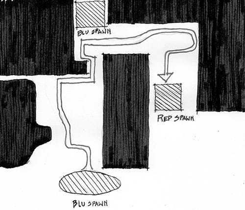
Figure 2.43 A plan diagram of Badwater Basin from Team Fortress 2. RED and BLU team bases are marked on the map, as are major circulation areas and BLU checkpoints between the two bases.
In this level, the game’s Builders League United (or BLU) team must push a bomb into their opponent’s, the Reliable Excavation Demolition (or RED) team’s, base via a mine cart on a track. The mine cart mechanic of Payload mode, which Badwater Basin is a map for, takes TF2’s standard team-based first person shooter mechanics and adds a twist. Not only does this change the mechanics of gameplay, but also the conditions of the levels spatial geometry.
One example cited by Casali, who helped design the level, was the level’s tunnel. In the first prototypes of the level, designers made the mine tunnels a standard width that they had used for other basic maps. However, upon playtesting the level with the mine cart-pushing mechanic in place, they realized that tunnels had to be widened to accommodate both players and cart. This seems like a small change, but it prevented a lot of aggrivation from players that had been getting blocked out of tunnels by the cart (figure 2.44.)
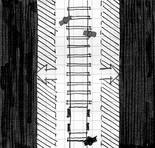
Figure 4.44 Modifying the width of the tunnel in Badwater Basin allowed for better circulation of both the player and mine cart through the level and made gameplay less aggravating for the offensive team.
As level designers, it is our job to design to the realities of how player avatars and other gameplay elements move through levels. Traversing levels is comfortable when level spaces comfortably accommodate metrics. As we will explore in later chapters, gameplay drama can be achieved when we create spaces that push metrics to the limit. Such spaces include gaps that require the farthest possible jump a character can do such as the one found in world 8-1 of Super Mario Bros. (figure 2.45) or tight corridors that restrict movement in horror games, such as Resident Evil[ix] (figure 2.46.)
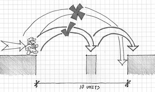
Figure 2.45 This section of Super Mario Bros.’s level 8-1 pushes Mario’s jumping metrics to their limit. The gap is 10 blocks wide, 1 block longer than Mario’s running jump distance of 9 blocks, so using the 1-block-wide middle island is necessary. Most strategies for crossing this gap call for a running jump to the middle island, and then another quick one off the 1-block-wide island so Mario’s landing inertia doesn’t launch the player into the pit.
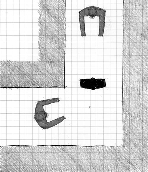
Figure 2.46: Many hallways in Resident Evil are barely wide enough for two characters standing shoulder to shoulder. In this way, a single zombie in these hallways can become a significant threat for players trying to get past. This spatial condition also gives the game a claustrophobic atmosphere.
Designing to gameplay does not solely have to involve measurements either. It can also mean designing to specific character abilities such as special attacks or movement modes. Stealth games, like Metal Gear Solid[x] provide a great example of how to construct levels based on different types of character movement. In Metal Gear Solid, the player character, Solid Snake, has the ability to hide behind walls and look around corners. This vastly changes the meaning of ninety-degree corners when compared with other action games – they are strategic hiding places rather than just level geometry. As such, the nuclear weapons facility that makes up Metal Gear Solid’s environments has lots of these corners so players can sneak from place to place, looking around corners to find their next refuge. While not measurement or metric based, these kinds of layouts are based on the character’s own mechanics, the gameplay actions that form the range of possibilities for how a character may act or interact with their environment.
Level Design Parti
Earlier in the chapter, we discussed the architect’s parti, basic formal explorations that architects utilize to determine what shape or orientation they want their building to take. For level designers coming off of determining the core mechanics of their level, a parti is another valuable tool for developing the spatial layout of your level.
Designing with parti is quite different than designing on graph paper or computer. Partis are meant to be sketches, and therefore will lack measurement. Sketching exercises allow designers to form ideas quickly before spending the time to plan measured versions of their designs. The key to a level designer’s parti is to sketch gameplay ideas as spatial diagrams. For example, a level design parti of the previously mentioned Badwater Basin level would be two large masses (representing the team’s base areas) with thinner zones of circulation in between the two to represent the mine cart track, and some smaller bases for BLU players to capture, similar to the diagram shown in 2.43.
In his discussions of level design from Indie Game: The Movie, Edmund McMillan argues that once a designer has created environmental mechanics, that is, interactive parts of a level that factor into gameplay, they should be usable in many different ways in order to be valuable. For the e4 Software’s mobile game, SWARM![xi], a ball-roller/platformer game where players had to lure enemies into traps, programmer/designer Taro Omiya created many sketches of the electric fence traps to visualize the different uses they could have (figure 2.47.) Likewise, Omiya and others working on the game made formal Partis on the computer and on paper to visualize spatial orientations of levels such as downhill slides, floating islands, and platforming areas (figure 2.48.)
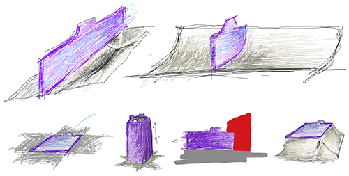
Figure 2.47 Once designers for SWARM! created the electric fence traps, they sketched many gameplay partis of them to visualize how they could be utilized through different levels.
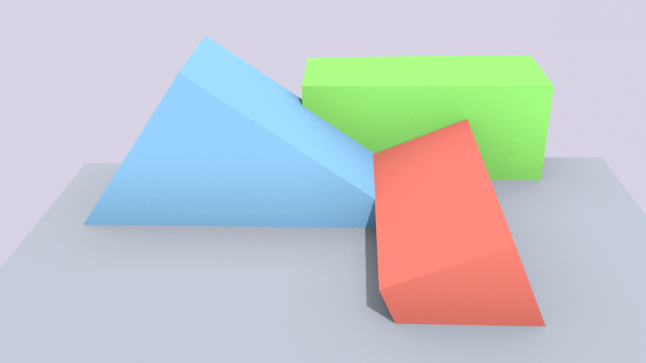

Figure 2.48 Formal partis for SWARM! show the visualization of different spatial orientations such as hills, tilted ledges, and others.
Digital Prototypes with Whiteblocking
When developers have moved from prototyping off the computer to prototyping in digital form, they create test levels through a process known as Whiteblocking. Whiteblocking is when a level designer creates a level out of simple geometry, most often white or simply-textured blocks (thus the name), to test whether levels accomplish the gameplay goals they want. Early on in the design process, when designers are trying to define gameplay metrics of player characters and other things, Whiteblocking can help determine what gameplay measurements should be. Likewise, designers can draft the spatial characteristics of their levels in a parti-like way, testing the sizes and shapes of certain environments for different gameplay experiences, before specific environmental art is added to a level (figure 2.51.)
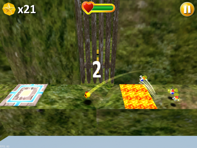
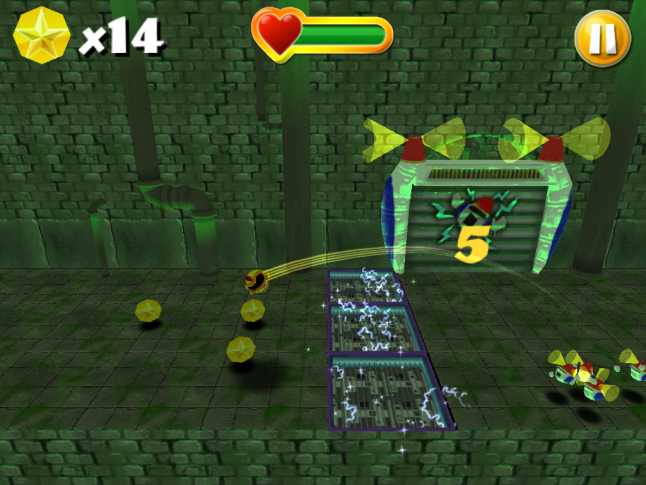
Figure 2.51 Whiteblocking done for SWARM! shows how an important section of a level meant to teach players how to kill enemies was thoroughly tested in simple geometry before environment art was added.
The geometry used to Whiteblock level spaces is usually the simplest needed to simulate the colliders that will be used in the eventual final level design. Colliders are a component of objects in game engines that simulate the interaction between physical objects. A box collider attached to a piece of level geometry, for example, will cause that object to interact with other objects as though it is the shape of a six-sided box, regardless of the shape of the actual environmental art (figure 2.52.) Colliders can be simple geometric shapes or can be made to tightly fit organic shapes.
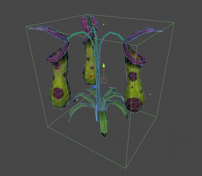
Figure 2.52: This plant has a box collider attached to it. Though its 3D model has an organic shape, player objects in a game will interact with it as though it were a rectangular solid.
Valve uses Whiteblocking extensively in its level design process. The construction rules for engine primitives in their level editor, Hammer, allows rapid 3D level prototyping through simple and precise building. Hammer’s primitives, called “brushes”, are used to roughly define level spaces, which are then playtested to see if the intended experience is created. Level designers see what worked properly and what did not, and then change the spaces by editing the brushes. When the designers find themselves editing little of major spaces and instead focusing on smaller details, the level is ready for environment art.
As an iterative process, Whiteblocking begins with almost parti-like interactive forms of levels and moves designers towards more art and ornament-centric design decisions that are not unlike interior design. As level geometries become better defined, standard pieces of environment art can be defined as well, eventually becoming the building blocks of levels.
Architectural Spatial Arrangements – from Chapter 3: Basic Gamespaces
As with the previous chapter, we will begin with lessons from Architecture. Where last time we focused on tools and techniques that were useful in game engine environments, this time we will discuss spatial arrangements that can be utilized in games.
Games and architecture differ in the fact that real-world Architecture must conform to real-world rules. For example, real-world buildings must both have an interior and exterior – with the shape of one influencing the other. Likewise, real-world architecture must take into consideration weather, geology, zoning regulations, and structural realities. Conversely, these are not things that gamespaces must deal with. To one extreme, this can mean experimental structures such as Atelier Ten Architects and GMO Tea-cup Communications Inc.’s Museum of the Globe[xii], a large elliptical structure formed from cubes floating in space (figure 3.1) or Hidenori Watanave’s explorable database sculpture on the life of Brazilian architect Oscar Niemeyer[xiii] - both former structures within the virtual world Second Life[xiv]. For more day-to-day level design, however, this means gamespaces that are free from interior/exterior requirements. This results in more freeform spatial layouts based on player movement patterns, narrative events, or game mechanics (figure 3.2.) Indeed, “interior” and “exterior” are little more than descriptions based on the art used to decorate the gamespace.
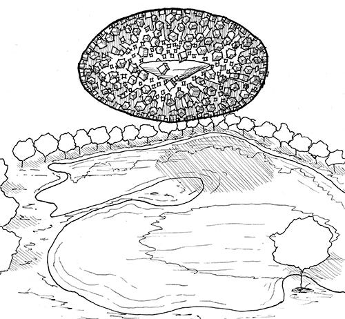
Figure 3.1 A sketch of Atelier Ten architects and GMO Tea Cup Communication, Inc’s Museum of the Globe. Since the building is built within a virtual world, it does not require any structure to hold up the hundreds of cubes making up its main body. The designers designed the buildings form in Microsoft Excel and then generated the geometry in an automatic modeling program.
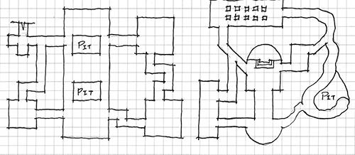
Figure 3.2 Parti diagram sketches of level plans. Game levels can take on unusual forma characteristics because they do not have to conform to a corresponding interior and exterior as real buildings do.
With these differences in mind, spatial designers for games can take advantage of architectural lessons within the freedom of game design environments. Some of these lessons even have conceptual links to how levels are constructed in many modern game engines.
Figure-Ground
The first architectural spatial arrangement we will explore is that of figure-ground. Figure-ground is derived from artistic notions of the positive and negative space of a composition, where positive space describes the area inhabited by the subject of a piece and negative space describes space outside of or in-between subjects (figure 3.3.)

Figure 3.3 This illustration, known as Rubin’s vase, shows the concept of positive and negative space and how they can be reversed. Based on whether the viewer is interpreting the black or white portions of the image as the negative space, this is either an illustration of two faces looking at one another or of a vase.
Figure-ground theory in architecture comes from the arrangement of positive space figures, often poche’d building masses, within a negative space ground. When viewed in plan, the designer can see how the placement of building figures begins to form spaces out of the ground. Indeed, the formation of such spaces in figure-ground drawings is as important as the placement of the figures themselves (figure 3.4.) According to architectural designer Matthew Frederick, spaces formed by arranged figures become positive space in their own right, since they now have a form just as the figures do[xv]. From an urban design standpoint, these framed spaces are often squares, courtyards, parks, nodes, and other meeting areas where people can “dwell”, while remaining negative spaces are for people to move through[xvi].
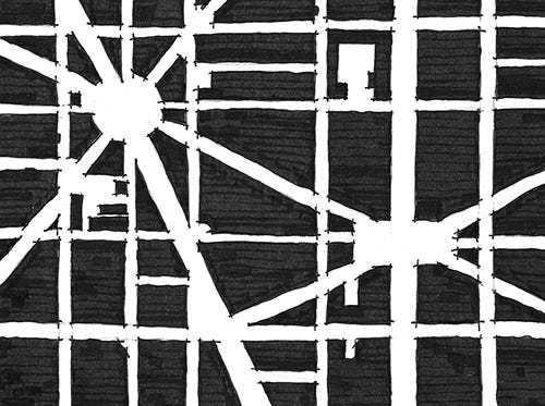
Figure 3.4 When mapping out spaces with figure-ground drawing, it is important to observe how the positive space figures create spaces out of the negative space ground. These spaces, having forms of their own, are considered positive space.
Frederick also points out that when utilizing figure-ground, both figural elements and spaces can be implied[xvii], either by demarcating a space with structural elements or by creating negative spaces that resemble the form of nearby figures (figure 3.5.) This echoes theoretical neuroscientist Gerd Sommerhoff who, as quoted by architect Grant Hildebrand, said,
The brain expects future event-and-image sets to be event-and-image sets previously experienced. When repetition of previous experience seems likely, the brain readies itself to reexperience the set. If expectances are confirmed, the model is reinforced, with a resultant sensation of pleasure.[xviii]
In this way, we can see how figure-ground becomes a powerful tool for level designers to create additive and subtractive spaces within many game engines. Many engines allow for the creation of additive figure elements to be arranged within negative 2D or 3D space. Gamespaces are often based on mechanics of movement through negative space,using positive elements as ledges or supports for a player’s journey. Under other mechanics, forming spaces in-between solid forms allows for the creations of rooms, corridors, and other spaces that players can run, chase and hide in. Additionally, designers can communicate with players via implied boundaries or highlighted spaces that use figure-ground articulations like those described by Sommerhoff (figure 3.6.)
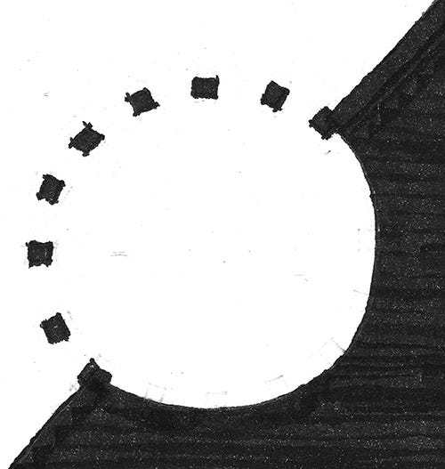
Figure 3.5 This illustration shows how figure-ground arrangements can be used to imply spaces or elements.
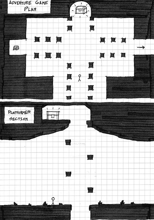
Figure 3.6 These illustrations show ways that figure-ground relationships can be utilized in many gamespaces, implying spatial relationships can be an effective way of relaying spatial messages to players.
Form-Void
Form-Void (also called solid-void) is in many ways a 3-dimensional evolution of figure-ground. Indeed, it is the natural application of figure-ground in games where the gamespace will be viewed from a non-top-down perspective (figure 3.7.) In form-void theory, spaces that are carved out of solid forms are implied to have a form of their own.
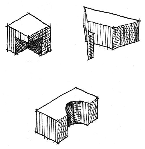
Figure 3.7 Some examples of form-void relationships between forms.
Just as figure-ground is spatial arrangement by marking off spaces with massive elements, form-void is spatial arrangement by adding masses or subtracting spaces from them. This further resembles the operation of many of the game engines described in Chapter 2: Tools and Techniques for Level Design, in how these engines allow for the placement of geometric forms or for their carving out of an endless mass. Similarly, 3D art programs allow for intersections between forms to be realized through either careful modeling or Boolean operations, where mathematical equations are used to combine 3D models in additive or subtractive ways. Buildings such as Peter Zumthor’s Therme Vals or Mario Botta’s Casa Bianchi, both in Switzerland, show how form-void relationships can be used to carve out spaces for balconies, doorways, windows, private rooms, and other functions (figure 3.8.) In games, such additions and subtractions can be used for hidden alcoves, secret passages, sniping spots, or even highlighted level goals.
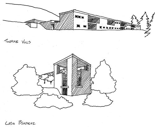
Figure 3.8 Sketches from Therme Vals by Peter Zumthor and Casa Bianchi by Mario Botta show how forms and voids can be used to define space.
Arrivals
Level design is an art of contrasts. It is also an art of sight lines, pathways, dramatic lead-ups, and ambiguity about the nature of where you are going. All of these elements contribute to the experience of an arrival, the way in which you come into a space for the first time.
Much of how we will communicate with the player is through arrivals in space. It is also in how that space ushers the player towards their next destination or provides the means for players to choose their own path. Much of how you experience a space when you arrive in it comes from the spatial conditions of the spaces that preceded it: if you are arriving in a big space, spaces leading up to it should be enclosed so the new space seems even bigger, light spaces should be preceded by dark, etc. In their book, Chambers For A Memory Palace, architects Donlyn Lindon and Charles W. Moore highlight John Portman & Associates’ Hyatt Regency Atlanta Hotel as featuring such arrival in its atrium space. Dubbed the “Jesus Chris Spot” by critics, it was not uncommon soon after the hotel was built for businessmen to arrive in the twenty-two-story atrium from the much lower-ceilinged spaces preceding it and mutter “Jee-sus Christ!” as they looked upward[xix] Similar spatial experiences are common in exploration-based games such as those in the Legend of Zelda or Metroid series for leading up to important enemy encounters, item acquisitions, or story events (figure 3.9.)
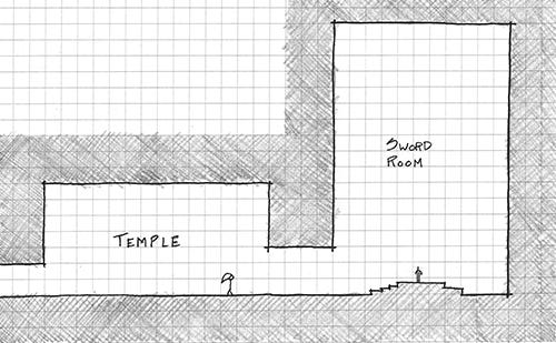
Figure 3.9 Many games use contrasting spatial conditions to highlight the approaches to gameplay-important spaces such as boss rooms or goals. This diagram of the Temple of Time from The Legend of Zelda: Ocarina of Time, where the player receives a narrative-important sword, shows how contrasted spaces and a Byzantine-esque basilica plan emphasize the importance of the sword chamber.
Another important element of how players arrive at spaces is their point of view from the arrival point. As we will see later in the chapter, camera angles in games have a great deal of influence with how a player understands space. However, dramatic reveals and arrivals are possible regardless of the chosen point-of-view. In classical architecture, the procession-like approach to the Parthenon in Athens, Greece shows how an occupant’s point of view is steered towards dramatic reveals. Visitors climbing up the steps of the Acropolis would first see the Parthenon from below. Then, passing through the Propylaea, the portico-like entrance building of the Acropolis, they would be greeted by a three-quarters view of the Parthenon from its Northwestern corner rather than a more 2-dimensional view from straight on. The path then forced visitors to walk around the building before they would wind back to the entrance of the Parthenon itself. From this forced path, visitors got a more theatric approach to the Parthenon than if they had walked straight up to its entrance (figure 3.10.)
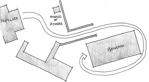
Figure 3.10 Diagram of the entry procession to the Parthenon. Visitors did not approach from the entryway side, but from a corner. They then had to walk around the building. Since all elevations of the building were equally intricate, it could be enjoyed from all sides as visitors walked around to the entrance.
Genius Loci
A last architectural spatial lesson is less of an arrangement and more of another goal for designing your own spaces. This lesson is known as Genius Loci, also known as Spirit of Place. This term comes from a Roman belief that spirits would protect towns or other populated areas, acting as the town’s Genius. This term was adopted by late 20th century architects to describe the identifying qualities or emotional experience of a place. Some call designing to the concept of Genius Loci placemaking, that is, creating memorable or unique experiences in a designed space.
In Chapter 2, we discussed the Nintendo Power Method of level design, where the designer creates a macro-scaled parti or plan of their level, then distributes highlighted moments of gameplay as though developing a map for a game magazine. Each of these highlighted moments of gameplay; be they enemy encounters, movement puzzles, or helpful stopping points; have potential for their own Genius Loci. Are these places for rest or for battle? Should the player feel relaxed, tense, or meditative in these gamespaces? The answers to these questions depend highly on the game you are building, but can help you determine the kind of feel you want for your levels.
Beyond individual gameplay encounters, level designers can implant Genius Loci within the entirety of their gamespaces and use it as a tool for moving players from one point to another. Genius Loci can be built through manipulations in lighting, shadows, spatial organization, and the size of spaces – which will all be discussed in detail later in the book. If you are building a level for a horror game, for example, the Genius Loci you build should be one of dread, created through careful selection of environmental art, lighting, sound effects, and other assets. Likewise, spaces in a game with little or no Genius Loci can be circulation spaces, that is, spaces for the player to move through to get to their next destination. Depending on the gameplay you are creating, circulation spaces may be a chance to rest between intensive encounters or tools for building suspense before a player gets to the next memorable gameplay moment.
[i] Box, Hal. Think Like an Architect. Austin: University of Texas Press, 2007. Pgs. 13-17.
[ii] Casali, Dario. Interview by author. Personal. Valve Corporation – Bellvue, Washington, October 27, 2008.
[iii] Jarvinen, Aki. "GameGame." GameGame. N.p., n.d. Web. 3 Jan. 2013. <http://gamegame.blogs.com/>;.
[iv] Super Mario Bros. Nintendo (dev and pub). September 13, 1985. Nintendo Entertainment System game.
[v] The Legend of Zelda. Nintendo (dev and pub). February 21, 1986. Nintendo Entertainment System game.
[vi] Katamari Damacy. Namco, Now Productions (dev) Namco (pub). September 22, 2004. Sony Playstation 2 game.
[vii] Angry Birds. Rovio Entertainment (dev) Chillingo (pub). December 11, 2009. Mobile device game.
[viii] Team Fortress 2. Valve Corporation (dev and pub). October 9, 2007. PC Computer game.
[ix] Resident Evil. Capcom (dev and pub). March 22, 1996. Sony Playstation game.
[x] Metal Gear Solid. Konami Computer Entertainment Japan (dev) Konami (pub). September 3, 1998. Sony Playstation game.
[xi] SWARM!. e4 Software (dev and pub). Jan 2, 2013. Mobile device game.
[xii] Watanave, Hidenori. "Archidemo: The museum of the globe." Archidemo. http://archidemo.blogspot.com/2008/07/museum-of-globe.html (accessed February 20, 2013).
[xiii] Watanave, Hidenori. "Archidemo: Oscar Niemeyer in Second Life." Archidemo. http://archidemo.blogspot.com/p/oscar-niemeyer-in-second-life.html (accessed February 20, 2013).
[xiv] Second Life. Linden Research Inc. (dev and pub) June 23, 2003. Online virtual world.
[xv] Frederick, Matthew. 101 Things I Learned In Architecture School. Cambridge, Mass.: MIT Press, 2007. P. 3.
[xvi] Frederick, Matthew. 101 Things I Learned In Architecture School. Cambridge, Mass.: MIT Press, 2007. P. 6
[xvii] Frederick, Matthew. 101 Things I Learned In Architecture School. Cambridge, Mass.: MIT Press, 2007. P. 4.
[xviii] Hildebrand, Grant. Origins Of Architectural Pleasure. Berkeley: University of California Press, 1999. P. 95.
[xix] Lyndon, Donlyn, and Charles Willard Moore. Chambers For A Memory Palace. Cambridge, Mass.: MIT Press, 1994. P. 212.
You May Also Like