Trending
Opinion: How will Project 2025 impact game developers?
The Heritage Foundation's manifesto for the possible next administration could do great harm to many, including large portions of the game development community.

Featured Blog | This community-written post highlights the best of what the game industry has to offer. Read more like it on the Game Developer Blogs or learn how to Submit Your Own Blog Post
Thimbleweed Park: The Town. A look at a novel approach in open-world city design (and planning) for 2D adventure games.

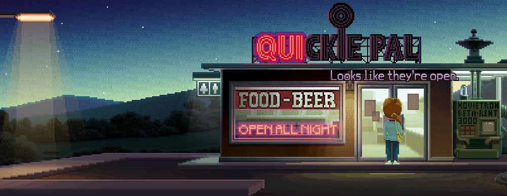
Setting an adventure game in a town or a city is far from a revolutionary concept. It is also something that can be successfully realized with the combination of a well-drawn map, a few panoramic views, and some wisely selected and properly fleshed out locations. Gabriel Knight’s vibrant New Orleans is a fine example of a believable genre city, whereas Monkey Island’s settlements are an excellent case study on immersive, abstracted, virtual geographies.
Creating an open world city for an adventure game, on the other hand, easily borders on the revolutionary, and yet this is exactly what the ambitious (and quite frankly excellent) Thimbleweed Park by Ron Gilbert, Gary Winnick, David Fox, Mark Ferrari, and Jenn Sandercock set out to achieve. It is as if Maniac Mansion has been expanded to a new scale, and then allowed to spread itself over a modern open world, albeit one filled with interactions for five playable characters. An open world that manages to support pixel-art visuals and puzzle-based gameplay.
Despite being in 2D, and maintaining a side-on perspective, Thimbleweed Park opens-up most of its game world right from the start, and lets players wander around, explore, and fiddle with things (and people). Interestingly, what I first noticed, and what instantly set this small open world apart, is that it felt incredibly vibrant and immersive. Being able to “look at” everything simply brings life and substance to the surroundings, whereas being allowed to push, open, and use things makes the world almost palpable.
Of course, this being both an adventure game and an open world, means it is an incredibly assets-heavy project too. From animation frames to lines of recorded dialogue, and from lighting effects to environmental interactions, I simply have to assume that some corners had to be cut. Impressively this is only very rarely apparent, and only if you look too hard and obsessively click on everything that catches your fancy.
Thimbleweed Park and its environs, Terrible Toybox’s novel open world, is a wonderful, stunningly illustrated place to visit, that will easily distract and immerse you, and let any small omissions fade into the the background. Hopefully, it will also be a game that will inspire adventure developers to try exciting new things with the construction of their settings.
Taking a careful look at the structure of Thimbleweed Park’s own setting would be a good starting place for any such endeavor.
Its world is roughly divided into the main urban area of the town, and its environs. Players start off under a train bridge at the western outskirts of town where a pixelating (oh, no!) body is discovered, and the existence of the major railway infrastructure provides with some initial hints regarding the wider area. Leaving the bridge, players begin their walk down a suitably but not boringly long road that is geographically broken up by a very sensibly placed cemetery. This road leads to the town limits.
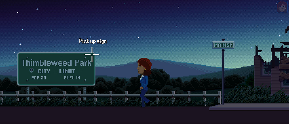
Being greeted by a Thimbleweed Park City Limit sign may seem banal, but it is a very effective, and very simple way of delineating the core urban area of the game, while also catering to the expectations of experienced urban dwellers (us humans, that is). Mentioning the population and elevation is another little yet realistic world-building touch, as is the fact that the first building players run into, their first contact with the town, is a dilapidated, abandoned house. The tone is instantly set. Thimbleweed Park is not a thriving community.
It is also a very small place, which could easily be attributed to both its apparently obscure location, and the fact that there’s evidently a crisis going on. Handily, a half-deserted, run-down town of 80 people is a settlement that can be abstracted and successfully condensed. Constructed as a single main street (the, uhh, Main Street) that’s connected to two minor ones (Street A and Street B) and a tiny alley, might sound too small, but in practice it works and feels okay. Besides, on the eastern limits of town there’s even an iconic Quickie Pal.
Street A cannot initially be visited, meaning that even this small town is introduced wisely in a piecemeal fashion, making it even easier to mentally map. Each street comes with minor landmarks, places that are well-lit and/or seem to play an important role in the game, that have been logically arranged. On the main street you’ll find the town hall, bank, and a diner, on Street A you’ll visit the Nickel News newspaper, the post office, and an occult bookstore, whereas Street B features the Tube Town shop, the Park Arcade, and the bus station. Everything between those locations is abandoned buildings.
In the following collage you can see Main Street in all its glory. The arrows marked A and B lead to the respective and similarly arranged streets A and B. The exits to the road towards the cemetery, and to the town’s eastern outskirts are also noted, as is the entry point to the alley. The realistic size of each city block is also evident and, believe it or not, a true videogame rarity.

Urban decay is obvious throughout all three streets, and this characterful trait of the town also showcases the importance of allowing the economy to influence world building. Having built Thimbleweed Park around a pillow factory that is now in dire straits is what makes this possible. The crucial urban function of the economy, which obviously includes the function of production and thus the factory, was central in constructing this imaginary place’s history. The town rose with the factory and fell with it, and its environments fully reflect that.
Even talking to the few remaining Thimbleweed Park residents usually touches upon said economic history, and gives the town (even more) life. The dynamism of decay, the changes in the place’s economy, everyone’s wish to move on to a fresh pillow-less future, the nostalgia towards the good old days, and the hopes and ideologies of local people become evident via dialogues.
Talking to residents also helps players find out more about the place, and learn to orient themselves. Besides, most people are usually eager to explain things to newcomers in real life too.
Eventually and through the dialogue the small community of the town makes its size and civic customs felt, and appears all the more real (and realistically nasty) when expressing its mistrust to outcasts like insult-clown Ransom and homeless people.
After players get to grips with the town and its inhabitants, and only after many more puzzles have been solved, are they finally allowed into the rest of the open world. These eastern suburbs feature a far-off mansion, the aforementioned pillow factory, the radio station, the circus, a trail, and a gloriously out of proportion hotel.
Greater Thimbleweed Park is a truly picturesque place; one that virtual tourists would absolutely love to visit. Its geography — both natural and man-made — is well thought out, beautifully illustrated and thus effective; also interesting. The secluded rich live far from the workers, the polluting factory is outside the city limits, and the circus is enjoying suburban cheap prices while remaining close to downtown. The rivers, mountains, and forests also feel realistic, and even the local flora, fauna, and weather have not been forgotten.
It does seem then that Ron Gilbert and team, have done a stellar world-building job. They have created an open and highly interactive place that makes sense, enables the type of gameplay needed, is extremely efficient in using its assets, can be easily navigated, and despite all the fourth wall breaking jokes feels grounded. I’d call this a successful marriage of game design, rudimentary urban planning, and geographic simplification.
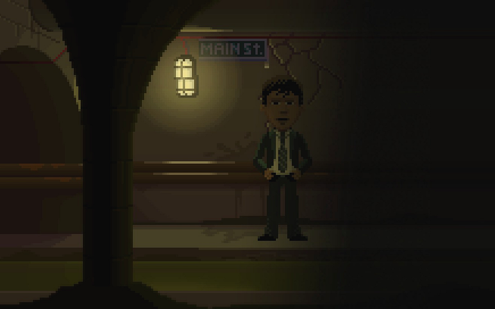
The abundance of details, the spatially organized soundscape, the well-selected urban furniture, the intriguing places, and the excellent art direction further improve things and help draw players in. Oh, and I simply have to mention the underground section, which, even if short, really tied everything together for me by feeling truly connected to the town above — the mere use of signs like the Main St. one below was enough to paint the picture of a functioning town underbelly.
Of course, not everything can be perfect; let alone a game city. Thimbleweed Park for example would have benefited greatly from being slightly bigger, more complex, and with a richer street life. A greater variation of land uses, and a few — parked if necessary — vehicles would also add a lot. These additions though would require a lot of extra assets, and I can fully understand why they couldn’t (probably) be implemented.
What are though some things I believe that could have been changed or made in another way without requiring a bigger budget? Well, I would definitely change the in-game map for starters. This one:
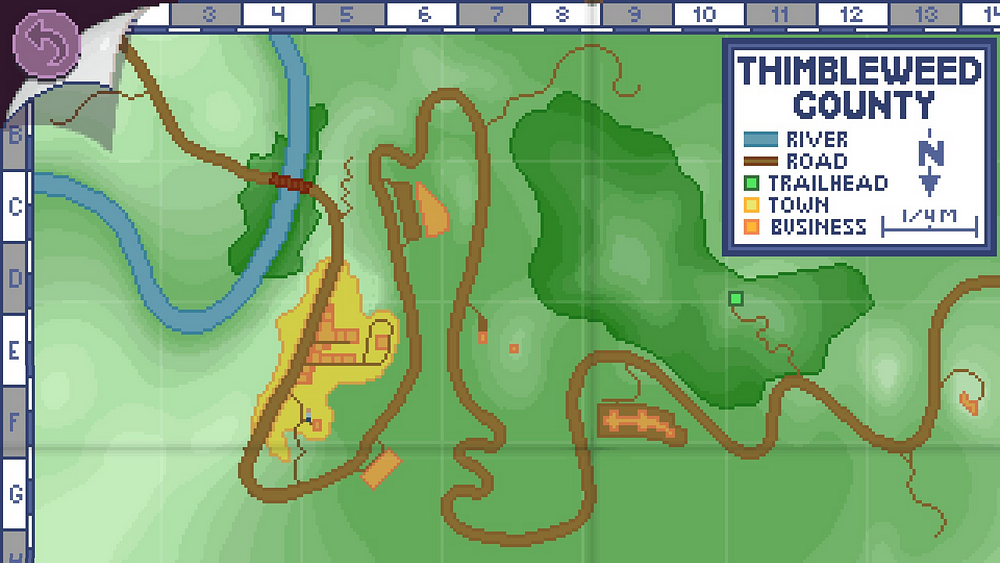
First of all, it really doesn’t look good. Secondly, I am incredibly bothered by the fact that the forest seems to have been shaped around the needs of the legend box. Then, the contours look bad, are at certain points plain odd (where the forest meets with the radio station hill for example), and they do not make sense when the road is taken into account.
As for the city part of the map, the yellow blob trying to imply a wider town than the one players got to visit, instead of really bringing everything together is a vague mess. It could have been so much more instead; could have implied civic details and function, and could have even used one of several widely applied and much more effective mapping styles reserved for urban environments.
The map could have also been used to mask the glaring lack of houses in Thimbleweed Park. Residence, you see, has been a major function of all cities throughout history, and its lack is uncanny. Of course, this does eventually get explained plotwise, but this is less than satisfying and happens too late. Same thing applies to functions such as education or health care. They could have been tackled with a minimal amount of new assets, maybe even hinted at as shapes in the foreground, as buildings without signs, or maybe by a mention in a dialog or on the map. A couple houses could have been drawn on top of shops too.
Livelier streets and sidewalks would also have helped the place breathe a bit more, whereas a few implied but blocked off locations could have made Thimbleweed Park feel bigger and more complex; more mysterious even. Frankly, I can’t believe mixing around some of the existing character sprites and scripting them to semi-purposefully walk around the town streets would have been too expensive.
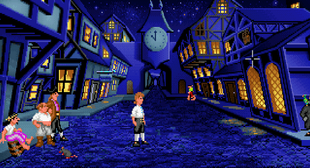
Another minor quibble is that the whole town sometimes feels a bit like a single long road. I do of course respect and understand the aesthetic choices made, but can’t help but believe that certain other perspectives can — generally speaking — really help with expressing 2D adventure game urbanism; take this wonderful VGA screenshot for example:
Honestly though, I can’t help but feel that I’m nitpicking. Probably due to some sort of professional fetish. Despite my few criticism I absolutely adored the virtual space Thimbleweed Park constructed, and can’t help but feel that it includes many lessons for adventure game developers, along with some wonderful experiences for gamers.
Read more about:
Featured BlogsYou May Also Like