Trending
Opinion: How will Project 2025 impact game developers?
The Heritage Foundation's manifesto for the possible next administration could do great harm to many, including large portions of the game development community.
"In a frantic local-multiplayer game, readability is hugely important. In our case, where there are two teams of two players on-screen at all time, it can be tricky to keep track of your character."
August 12, 2016

Author: by Michael McMaster, Jacob Strasser
Game Design Deep Dive is an ongoing Gamasutra series with the goal of shedding light on specific design features or mechanics within a video game, in order to show how seemingly simple, fundamental design decisions aren't really that simple at all.
Check out earlier installments on the the action-based RPG battles in Undertale, situational awareness and player frustration in GRIP, and the capital ship invasions in Dead Star.
Also, dig into our ever-growing Deep Dive archive for developer-minded features on everything from rocket jumping in Rocket League to Dying Light's Natural Movement System.
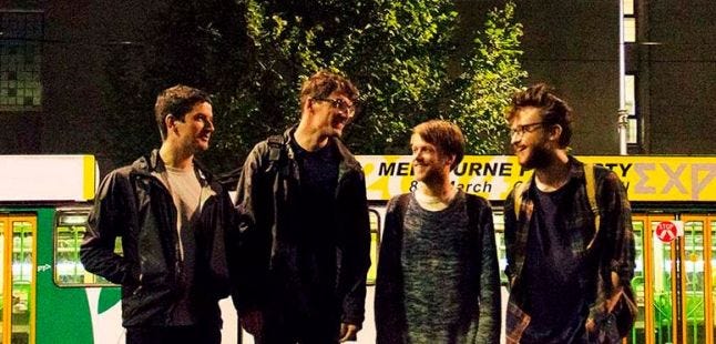
We’re Michael and Jake from House House, which is a very small videogame company from Melbourne, Australia. We’re a four-person team without any real specializations, so it’s tricky to pin down what our roles are, since we each work intensely collaboratively on basically every aspect of game production - especially concerning our visual design, which is what we’re discussing today. Broadly speaking, Michael’s input tends towards big-picture art direction (working out visual styles, color palettes, graphic design, etc.) whereas Jake takes care of the more concrete and granular pieces of the game (assets and environment art, UI details, etc.). Mostly, though, our workflow is a big mess where every design problem and solution - including the one outlined today - is talked through and solved collaboratively.
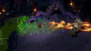
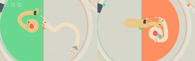
Earlier this year we released our first videogame - a local-multiplayer game called Push Me Pull You. The short pitch for PMPY is that it’s a 2v2 sports game, where each team shares a single elongated body whose ends move independently, which they can grow and shrink as they wrestle the opposing team for possession of a ball. It’s been described most concisely as Noby Noby Boy meets Hokra, which happen to be two of our biggest points of inspiration.
 House House: Michael McMaster, Stuart Gillespie-Cook, Nico Disseldorp, Jacob Strasser
Fundamentally, it’s also a game about bodies - although we never set out to make a body-horror game, we certainly wanted to make a game that felt fleshy and friendly and tangibly human. We wanted to make a game about normal people playing normal sports, who just happened to be big naked flesh-tubes. Choosing to represent “normal people” meant that we had a responsibility to represent all kinds of people, and since our game depicts an awful lot of skin, this manifested (in part) through a diversity of skin tones.
Early on in the development of PMPY, we settled on a specific set of constraints regarding our game’s graphical style - it was drawn entirely in vectors (i.e. no rasterized sprites) with everything rendered as clean, single-color shapes (i.e. no lines, gradients or textures). We were working within a very particular color palette - a lot of of soft, bright hues that didn’t contrast too strongly against each other - so we found our specific color choices to be incredibly important, not only in defining our game’s visual identity, but in how it impacts the game’s overall readability.
In a frantic local-multiplayer game, readability is hugely important. In our case, where there are two teams of two players on-screen at all time, it can be tricky to keep track of your character amidst the wild mess of bodies. Since our game’s strategy is so dependent on cooperation and communication, it’s also really essential that players have a way of describing what’s going on to their teammates. Our game’s visual design - with its strong hues and lack of detail - meant that these colors quickly became a shorthand for how players identified themselves.
Unfortunately, this raised a particular conceptual problem - since the most prominent color of each player was their skin color, players would take to this as their team’s defining feature. Watching people play our game at events, we’d hear them describe the match setup as “black team versus white team”, referring to the onscreen skin tones. Rooting players’ identities in this specifically racial language made us uncomfortable - at best, it felt out of tone with the game we wanted to make, and at worst it framed the in-game competition as this surreal battle-of-the-races.
To be fair, this isn't wholly surprising in retrospect - players needed a way to identify either team on the fly, and the skin color was the clearest way to do this. This isn’t problematic in itself: “character color” is a useful shorthand to distinguish players, and a lot of local-multiplayer games codify their characters and teams in this way (i.e. Samurai Gunn, Towerfall). The difference in our game is that we weren’t using primary colors like red, blue, green - these were nude bodies, not costumes, and we didn’t want their skin-tones to be essentialized into something as arbitrary and elective as a team color.
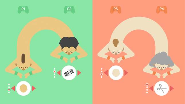
We already had a system in place to distinguish players - during character customization, when you selected your haircut and skin color, players would also select a team color. The problem we faced is that these team colors was far less visible in-game than the skin colors, which is why they were largely ignored, in favor of racial descriptions of the players.
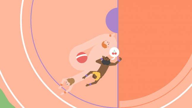
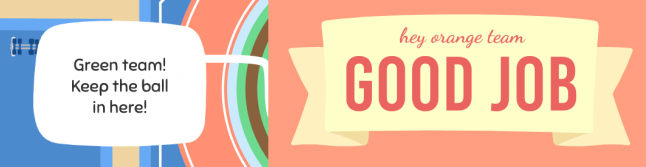
Our solution was to emphasize and specify these team colors wherever possible. The most obvious approach to this was to make these team colors as visible as we could, by depicting them in-game as often as possible. All of the in-game court markings and UI elements are depicted in their respective team’s color - since we signify scoring through a growing circle of color, teams would more strongly associate with that color’s significance. Team colors mark progress towards a point, or mark a destination for the ball, or in some cases literally denote a team’s ownership of a ball. If something is important to a specific team, it should be colored as such.
We extended this design ideology to the out-of-game UI - any screens that were relevant to the individual players were split in half, with either side colored accordingly. This huge, bright fill of color subsumed the skin tone to the extent that it began to feel like another physical detail of the character, rather than something relevant to the game itself. This had a nice side-effect of reinforcing these teams’ physical location on the screen: players would begin to associate their team with the left or right side of the screen, which carries over to the configuration of the in-game court.
Beyond simply making these colors more prominent throughout the game, we took another, more subtle approach to helping players identify by their team colors - we refined our color palette with an eye for language.
We wanted our team colors to be very specific and nameable - each color should have a commonly-understood English name, with no murky inbetweens or contentious synonyms. Conversely, we wanted to keep the skin colors relatively vague, so that we were presenting a range of tones that weren’t trying to pin down any particular ethnicity.
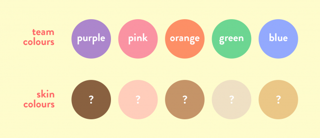
We were careful when laying out our color palettes to make sure that each skin tone felt specific and interesting, without tending towards caricature - for instance, we made sure that when you scrolled through skin colors on the customization screen they didn’t progress from light-to-dark. Bodies and skin and identities are deeply political, and we didn’t want to iron that flat by putting them on a slider (which carries its own weird implications of order or hierarchy).
Furthermore, we made sure we expressed these team names explicitly throughout the course of a match, in both the pre-game countdown and the post-game results screen. These are relatively understated UI elements in the broader scope of the game, but we believe they go a long way in equipping players with an explicit language to refer to their teams.
In retrospect, this seems like a lot of work to solve a relatively minor problem, especially since the problem itself wasn’t an issue with the game’s mechanical design, nor did it really impact players’ experience of the game (regardless of the language they used, they still seemed to like the game). That said, we feel that the tone of our game is incredibly important, and designing for a particular tone can be as important and complex a challenge as refining its mechanics and systems.
By changing the way players’ teams are framed by the game itself, we noticed a clear dropoff of the racially-focused language that players originally used to identify themselves and the opposing team. Through a series of tweaks to our game’s visual design, we’ve been able to shape the language used to explain its onscreen action, while preserving the inclusivity and diversity we felt responsible to strive for in making a videogame about bodies.
You May Also Like