Trending
Opinion: How will Project 2025 impact game developers?
The Heritage Foundation's manifesto for the possible next administration could do great harm to many, including large portions of the game development community.
"I began to strip everything away that could lead to a problem, and ended up with the bare movement of the muscles" - Philipp Stollenmayer, creator of ZIP ZAP.

Deep Dive is an ongoing Gamasutra series with the goal of shedding light on specific design, art, or technical features within a video game, in order to show how seemingly simple, fundamental design decisions aren't really that simple at all.
Check out earlier installments, including creating believable crowds in Planet Coaster, achieving seamless branching in Watch Dogs 2’s Invasion of Privacy missions, and creating the intricate level design of Dishonored 2's Clockwork Mansion.
Kamibox is a German one man studio. My name is Philipp Stollenmayer and I am currently studying information design with a focus on interaction and user interface. Kami is Japanese for paper, because the studio started with free papercraft models, and the first two apps have been how-tos for paper toys. For a few years, I have designed and developed mostly casual mobile games, like Okay? or Pancake – the Game, but also more elaborate ones like Sometimes You Die.
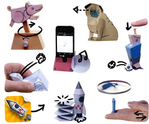
Tings you can make with Kamibox's Awesome Paper Toys app
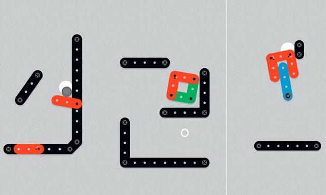
I try to make games without text. ZIP ZAP is the kind of game where you can’t really describe what the goal is, but you understand it after the first move. In an erector-kit-like game setting, you control one or more hinges of mechanical structures, and move something on the screen in a way that one or more white circles are being touched by something.
It is a physics puzzle, basically, somehow even more physical than most of the other physics puzzles. The interaction is as simple as it can be: Touch to contract all hinges, release to let go. Despite that super technical description of the content, there is a kind of empathy that arises.
"Console games don’t work on mobile, and it took a while for developers to notice that."
My first game was a university project. I wanted to distribute it because I had put so much effort into it, and I wanted to show it to the world (few cared though). But I didn’t want to pay any extra money for translations, so I explained everything with icons and animations. Today I know that translations aren’t that expensive, but the core remains: Making games that are able to explain themselves in a few seconds.
Mobile players have a drastically shorter attention span than console players, because of the oversupply of games, the short play sessions of mobile, and the power to pronounce the game dead with a click on the biggest button an inch below the game. In other words, console games don’t work on mobile, and it took a while for developers to notice that. What adds to that is that anything with more than two buttons is a cramp to control. The challenge is to make a game that is so simple to control that it is intuitive within the first ten seconds and still has enough potential to last for at least a few hours.
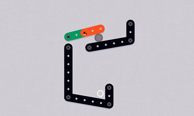
My situation: I like platformers. The problem: Platformers don’t work on mobile, because there are three buttons - Left, right, jump. So I began to strip everything away that could lead to a problem, and ended up with the barest movement of the muscles — a game controlled by only two choices: contract or release.
"I began to strip everything away, and ended up with the barest movement of the muscles — a game controlled by only two choices: contract or release."
This matches the concept of a button that has two states: up and down. QWOP does this is an excellent way, but as the title suggests, there are 4 buttons needed to make the character move. Also, the result is far from controllable. To be able to control the whole character in my game required a dramatic simplification, and ended up in a single 'muscle'.
At that point, I still thought it was going to be a platformer, but control via a single muscle initially reminded me of that frog leg stimulation experiment from high school biology,.. and it still wasn’t very easy to control. You could move it from A to B and back with a little practice, but the frustration potential was very high. Timing was very important, and so delicate that it just wasn't fun anymore. A platformer in which the player already fails without having gone one meter forward?
At this point, I usually make what I call the housewife test — I give the phone to my mom. Then I found out that it is not just difficult to control, but impossible to control.
Back to the drawing board. I had to change the whole concept. Instead of a platformer, I planned to make a bite-sized physics puzzle that always fit on the whole screen. That allowed me to have very, very short levels, because traveling long distances with one muscle is exhausting and frustrating. I cut every everything human and ended up with the concept of a more or less abstract mechanical world—just figural enough to convey the idea of actual valid physics.

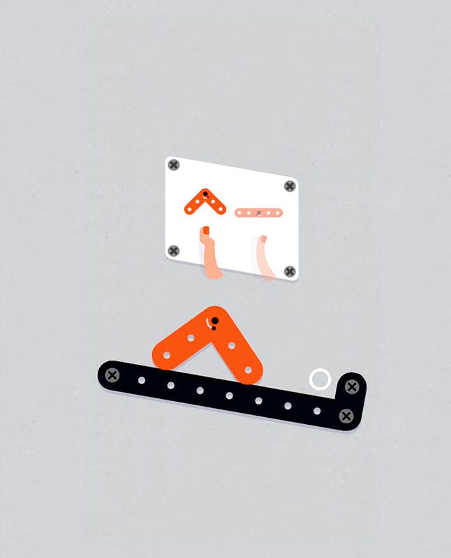
The next challenge was to explain the player how the controls work in a few seconds. Touch to contract, release to let go sounds like a concept that every mentally aware person should understand, but it isn’t even so easy to explain without words. I split the learning process into three phases:
 The first level is designed in a way that makes it impossible to fail. You learn what happens when you touch the screen, and the L-shaped thing moves automatically to the target as you find out what happens when you touch the screen. You can’t do anything wrong. After three touches, you have understood the concept, and the level is solved.
In the second level, you learn that you have to touch the target ring for two seconds to win. Again, you can’t fail, but you can only reach the target ring when you hold your finger on the screen. In that way, you learn that this is not only about tapping, but also about holding.
In the third level, the figure falls down, and you have to restart. You learn that restarting is done with swiping from right to left. That has two purposes: On the one hand, restarting can be done with the same finger and not accidentally. On the other hand, you learn that swiping does not affect the movement of the figure (My testers were tempted to influence the direction through swiping).
From then on, I introduce new features that do not directly affect the mechanics, but expand their functionality. Early in the game, you have to solve a level that is similar to a level before, but this time it has two hinges that you control at once. The first hinge kicks the ball, the second one holds it in place. The key to the first one is pushing, to the second one is releasing. You have to be able to switch your mood from active to passive while the ball is in mid-air, and react correspondingly. In world two, multiple hinges don’t only work chronologically, but also simultaneously.
 The last level of the first world is a hanging figure. The new thing is that you don’t control the point where it hangs, but the figure’s virtual hip. That means, you have to find out how to generate momentum. I do gymnastics, and many figures are inspired by a gymnastic apparatus. This level was inspired by the horizontal bar, and was one of the first levels I designed. The process of gaining momentum is similar to how you gain momentum with your legs when you are sitting on a swing. My testers were mostly able to transfer that knowledge through their finger onto the character, but for others the swing levels are a huge question mark.
Another dimension of timing is added through the usage of motorized blocks. They make the elements turn, and you either have to avoid or utilize them. You have to find out that it can give the ball a great amount of momentum when timed correctly, like a baseball pitching machine.
Through combinations of new elements, all pitfalls of physically moving things, lever principles, rotation velocity, momentum and so on, are at first learned, then foreseen, then improved. With every new level, one specific point of that is in the focus.
I said previously, that this game is more physical than most other physics puzzles. That is because you need to estimate the center of mass, the friction, the rotation speed in relation to the shape change, and so on.
All these factors end up in a result that is nearly impossible to predict. The paper prototype that I was pretty proud of was super useless, because the behavior was completely different than I had planned. What was bad for me was good for the game, because you find yourself in situations where something unexpected happens, but after the first attempt, it makes total sense and is influenceable.
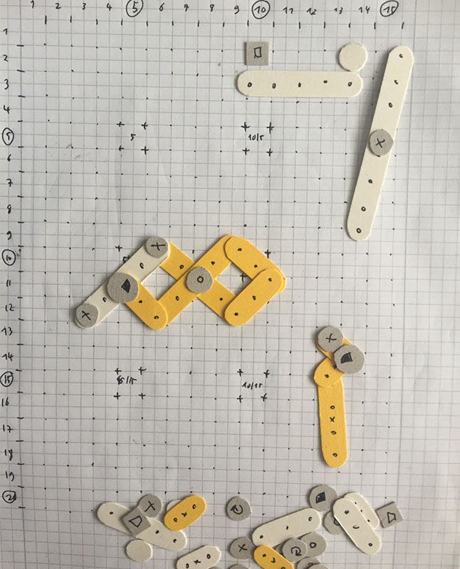
Another point that surprised me is the very low frustration level. Somehow, the simple shapes add up to a creature with a soul, so clumsy that parental instincts are aroused. Of course it is your fault, somehow, that the figures fall down, but you always feel like you have total control, just because there is so little to control. So the only one to blame would be the figure on the screen, but you just can’t be angry with it. The result is an interesting contrast between minimum control and maximum responsibility.
You May Also Like