Trending
Opinion: How will Project 2025 impact game developers?
The Heritage Foundation's manifesto for the possible next administration could do great harm to many, including large portions of the game development community.
"We didn't want to dilute the gravity of the situation Sasha is dealing with, but our aim was to portray the weight of the situation, not the gore of it," says Augusto Quijano, concept lead on Severed

Game Design Deep Dive is an ongoing Gamasutra series with the goal of shedding light on specific design features or mechanics within a video game, in order to show how seemingly simple, fundamental design decisions aren't really that simple at all.
Check out earlier installments, including the action-based RPG battles in Undertale, using a real human skull for the audio of Inside, and the realistic chat system of Mr. Robot:1.51exfiltrati0n.
Hello, I'm Augusto. I present outlandish ideas to the very talented team at Drinkbox Studios, and usually (after much struggle) we end up with an amazing video game. I'm responsible for pitching the world and characters for Guacamelee, and a crude version of what Severed became.
Severed's initial internal pitch animatic
We've done a wide variety of games, starting with the stylish puzzle-platformers About a Blob and Mutant Blobs Attack!, to our most famous title, the mextroidvania Guacamelee!, but our latest endeavor Severed is in my opinion the weirdest of them all.
For those unfamiliar with Severed, it’s a combat/exploration game that plays like an old-school dungeon crawler, but with touch control swiping used for the battles.
Severed trailer
One of the first things I settled on with Severed was that the story and the world should be a deeper dive (!) into the protagonist Sasha’s psyche. The atmosphere is all about mystery, death and loss, and the story centers around Sasha coming to terms with these, so you would naturally expect it to look dark and gloomy.
Severed's setting in not conventional fantasy either, even though I love euro-centric folklore and have drawn more than my share of orcs and elves, I felt that if we're making a fantasy world anyways, we didn't need to be bound to pre-established mythologies. We could do anything we wanted.
We also wanted it to feel visceral; I wanted to stress the "tactile" feeling. I remember being young and turning the pages of an old atlas in my grandma’s house and not wanting to touch the pages with worms and salamanders. I thought it would be great feeling to have a bit of a repulsive aspect to the characters. But the problem: this could be really distracting and off-putting.
 A couple of our programmers felt uneasy working on this enemy when we added the holes in the mushroom caps.
How did we decide to tackle the problem of making this gross, sad game fun to experience? Making the art style bright and colorful softens the impact of both these things! The game stays visually appealing and varied. Plus it plays to our strengths.
We discovered that if we packaged these dark themes into a world built with simple shapes and bright colors (a style that comes natural to us if you know the studio's history) we found that we could push the themes further.

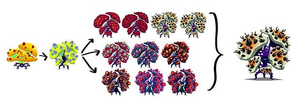
Shroomster's character design process
I’ll give you a concrete example with one of our enemies we call “Shroomster”.
The first thing is to get something-- anything, and having it working in the game. Like an animated sketch that we can test in the game.
Then we had to adjust art direction. In the case of “Shroomster” the direction involved ‘less cupcake’ and ‘more boils, tadpole eggs, and spores’. We also wanted to adjust the color palette to be bright, but not as friendly. Ben Thomas did some explorations with this and we picked one.
We did a polish pass on the animation file. (Sometimes several iterations because of gameplay tuning).
The stylization is a tool for both the gameplay and the story. We didn't want to dilute the gravity of the situation Sasha is dealing with, but our aim was to portray the weight of the situation, not the gore of it. It was important the character felt the consequences of what was going on, but the player was not put off by it all. It feels like a great victory when a player slashes a monster’s eye, then chops off its limbs amidst spraying blood, and comments, "This game is so pretty."
But settling on a visual design wasn't easy, it was a constant balance. We didn't know with how much we could get away with. Sometimes we had to tone visuals back a bit because they became distracting, and sometimes we had to add more.
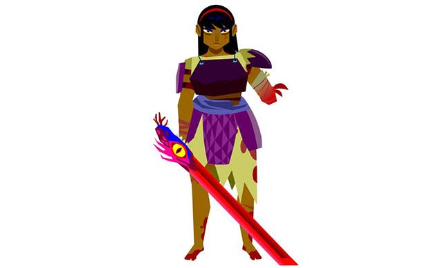
In a way, the mindset was to make it real for Sasha, I mean, when you first meet her in the game she has just lost her arm and is given a living blade by a mysterious dark figure. The game is not 'friendly', so thematically we couldn't allow ourselves to pull punches. But in the execution of the game and the art style, the character's journey was always the beacon, and when things distract from that you're no longer serving the desired player experience.

Sasha, Severed's protagonist
It was also a challenge to get the team in the same page. After wrapping up Guacamelee, it took a while to get the tone for Severed. This wasn't a Saturday morning cartoon fantasy. Instead, this was a dark story about a character letting go of guilt, and accepting loss. That's quite a switch! I praise the studio for having the guts to make such a dramatic tonal shift successfully.
It was a goal of mine to not end up with enemies that looked like orcs, or ogres, or humanoids for that matter, since a lot of times nobody challenges these conventions. I also found out why: It is way harder to make up new stuff than to go along with established ideas.
This was also a very technically challenging game to build. There was so much weight being carried by the enemy animations having to be so tied to the gameplay. At the end of the day, the game is about communicating the atmosphere and story clearly, but more importantly, the art and animation needed to communicate the rules of gameplay clearly. Simple shapes, clear animation, and leading the player's eyes is what MUST work for players to have a smooth gameplay experience.
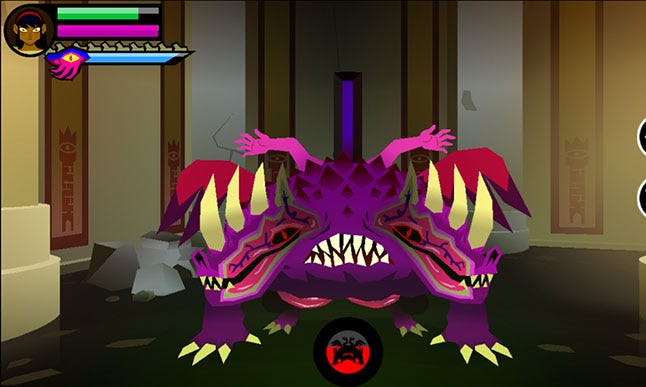
Sometimes I wonder if we should've just gone with ogres and axes instead of a robed creature with no eyes and arms on its head, that transforms to a split-faced horned demon with intestines hanging out and wings and arms...

...but it looks so pretty.
You May Also Like