Trending
Opinion: How will Project 2025 impact game developers?
The Heritage Foundation's manifesto for the possible next administration could do great harm to many, including large portions of the game development community.
"We needed to cut as much of excess fat as possible and figure out what was really necessary to get the feeling you are on the "knife's edge"." - Henri Mustonen, Senior Level Designer at Housemarque.

Deep Dive is an ongoing Gamasutra series with the goal of shedding light on specific design, art, or technical features within a video game, in order to show how seemingly simple, fundamental design decisions aren't really that simple at all.
Check out earlier installments, including creating the striking pixel animations of Crawl, achieving seamless branching in Watch Dogs 2’s Invasion of Privacy missions, and creating the intricate level design of Dishonored 2's Clockwork Mansion.
Hello, my name is Henri Mustonen. I've been with Housemarque Since 2009 and worked with such titles as Dead Nation, Outland, Super Stardust Delta, Resogun and Alienation. My work entails game design and level design.
For those unfamiliar with Nex Machina, it is a fast paced twin-stick arcade shooter with deep scoring mechanics. It’s a collaboration project with Eugene Jarvis, and it is inspired by Robotron 2084.
"Instant action. Eliminate downtime as much as possible" was one of our guiding principles when designing the core gameplay. We wanted players to be immersed from the very start of the level and to keep the action ongoing. This meant we needed to cut as much of excess fat as possible and figure out what was really necessary to get the feeling you are on the "knife's edge".
You enter a level, rescue humans, kill all the enemies and then you fly to the next. The progression is quite fast and you won’t be stuck in a level for more than around 15-30 seconds. You need to be able to read each situation in less than a second and form a battle plan based on that. That means we need to have the actual challenges, entity behaviors (humans and enemies) and the consequences of your actions really obvious so you can make good moment-to-moment decisions.
Urgency is also an important point. We want you to prioritize things and try to do your best in a limited timeframe.

We are asking the player to balance multiple things during gameplay. Layouts, humans, enemy spawns, dashing, secondary weapon, secret exits, visitor patterns, beacons, random Disruptor enemies and so on.
”Ok now I flew to a new level, I need to rescue the humans, shoot this turret that's bothering me – but if I spend time on that, then I miss the temporary bonus enemy on the opposite side”
The more things we are asking you to do in a limited time the more swift you need to be in you prioritization. You cannot do everything unless you plan your gameplay. So whenever you enter a level, you formulate an initial plan of action and pretty much go from there.
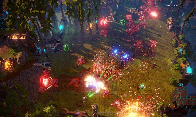
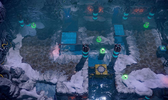
The first, most obvious thing you observe after landing, is the layout. Clear changes in shapes, sizes and traversable areas are essential as a base to build from. We wanted all of our layouts to be open so you would remain in danger throughout the level since there is nowhere to hide. Starting location of each room determines how you are to navigate it and what options you have. If we felt some levels needed to have more intensity, we generally experimented moving the player spawn into the middle of the room. That made you especially vulnerable to any upcoming attacks and gives the feeling of unease. As a rule thumb, we wanted to make an effort to place the player in danger.
With the ongoing pressure of enemies, it is important to have the layouts instantly readable with color differences between walkable areas and non-walkable areas. We want to give you as clear information as possible on where to navigate and what areas will cause you dead ends.

On our tests, one of our fans pointed out the best levels always had initial pre spawned enemies waiting for you before new ones spawn. That served to keep up the pace and give you an initial challenge as you are saving the humans. It also acted as an introduction to the upcoming level’s rules and enemy usage. Often times you got a taste on what to expect.
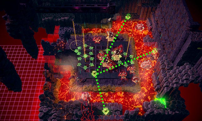
Most of our enemies are placed as groups, not as individual enemies. Generally we place splines, portals and area spawners and define how those are populated. Enemy type, amount, direction, spawn frequency and so on. We learned that spline like shapes were most recognizable and felt the most fun to combat as a player. You learn the general shapes of spawners in each world and subconsciously you are completing the shapes inside your head during the spawns. That gives you a small upper hand on the enemy spawns as you learn those.
As far as placement goes: we wanted to play with the strengths of each layout and encourage you to navigate them using enemy spawns along with humans. We want to pull you in and draw you away using the spawns. The more we can make you progress and dance in the layout the better.
Most spawns happen with a quite rapid interval. This is to help you prioritize and understand what is going on in the playfield. If we had 5 long, independent spawners for example, spawning with different paces, it’s hard to keep up what comes next, which spawner is completed and so on. It’s much more fun to have small compact challenges that you can overcome and move on.
The humans are pretty mindless creatures, absorbed in their tablet devices, wandering around the playfield with no concern for their own safety. Your goal is to save the humans for various score and token drop benefits.
All levels' humans are visible from the start, always. It gives you a plan of action when entering a new level. This also gave us certain anchor points for level design since we can trust players to try navigating through them. Added to that we also had Harvester-enemies that try to capture humans so you need to go to their aid before they are killed.
We wanted to create a sense of urgency as often as possible by having humans threatened by Harvester-enemies. If you are playing for high score, you do not rescue all humans at once(your combo will drop), opening more opportunities for the Harvester enemies to capture the humans during gameplay. This is one of the ways we force players to re evaluate their game plan when they see a human is in danger that they had left on it’s own devices.

Forming a plan of action based on the layout, initial enemy spawns and human placement, players get a quick idea of what they need to do and in what order, and they can begin to navigate the level accordingly. Next you just have to see how the level starts unfolding and adjust.
After the start of each level we want to add pressure and something to shoot at, at all times. We want you to experience a sense of urgency that if you do not deal with the challenges presented right now, they will escalate. We use enemy accumulation and human threats for this. We don’t really try to stop players from feeling overwhelmed. It’s mainly up to you to prioritize correctly and control the playfield with your toolkit.
There is a balance though. We could just spawn everything at the very start of each level and be done with it. You sort it out! Understandably however, we wanted there to be a good flow with the challenges that we give to the player without the levels being too front or back heavy. Levels start with a taste of what’s to come, expanding on that and then ramping it up. We want to keep you in that engaged state as long as possible and “waiting for something to happen” isn’t engaging. Nor is frustration over impossible odds.
We are mixing time and event based triggering for the spawns. Time based ones act independently of your actions and event based generally act on enemies killed. This was to give some predictability and structure without being too obvious. Every level tends to unfold a little differently each time you play it.
Some levels also have additional elements like randomly spawned disruptor enemies, visitor groups you need to locate and destroy before they disappear, beacons you need to destroy and secret blocks you need to blow up. We overlay these elements along with regular gameplay to bring extra challenges.
The level gameplay iteration wasn’t exact science. Generally we just kept our eyes open whenever there was a level that was clearly above the others and paid attention to it quite naturally. Those were just really fun to play! Most of the time though it was playing and replaying the level again and again over a long period of time. Something might feel good for a day or two, but after a week you start seeing it’s faults and how it no longer holds up. Then you iterate it more or try something else. In general though, we didn’t settle over a positive first reaction. We wanted the first and lasting impression of each level to be enjoyable.

In each world it was important to find good synergies between enemies so that they can be mixed well and provide interesting challenges. Requiring different approaches/solutions from you. We want players to feel that they managed to beat the odds by reading the playfield and doing the best decision accordingly in a short time. Understanding the enemy behaviors, prioritizing the most dangerous ones, then using your toolkit to destroy them as fast as possible is challenging and rewarding. Keeping you on the knife's edge.
We have a different pool of enemies allocated for each world(excluding the final). On a high level we aimed to have shooting enemies that encourage dashing, medium / high durability enemies for secondary weapon use and basic popcorns that give you most freedom on how to approach them. You will not encounter only small mutations of the same enemy throughout the game but need to adapt to each world and it's challenges.
We are trying to manage what sorts of things we require from you. The clearer the purpose of an enemy, the clearer it is what it requires from the player. It’s also easier to couple clear role enemies with each other and make more intentional gameplay. Enemies that combat over the same role often do not sit well with each other or really bring anything new when used in the same world.
We are asking a lot in terms of stress and attention so managing that is really important. Levels need to have variety in terms of difficulty and challenges we present. We wanted to maintain a steady progression but have more manageable parts as well.
We wanted the levels to have a clear identity and phases within them. If you are just bombarded with constantly spawning enemies without any clear logic, it feels messy and taxing. The game doesn't feel well thought out. Granted that might be the experience for some at first but the further your skills increase in prioritization and enemy controlling, the more you start seeing patterns and phases in the levels. Finding order and rules among the chaos becomes fun.
Spawning the enemies themselves needs to be readable and have a clear rhythm. Things need to be spaced out in good taste and not for example be too front heavy. Spawn frequency and location also play a factor here. While playing, you unconsciously allocate certain parts of the layout to have spawns/be dangerous. Having those easily groupable areas makes the gameplay more understandable.
You need to create a dialogue with the player on how the world works. Timing and grouping are crucial in that. Having clear waves and phases help control and understand the continuous swarms of enemies. Rules of spawning, recurring patterns, spawn intervals and so on.
“Big hand enemy always at the center after some time has passed”
“Lines of popcorns appearing to the sides of the room with a fast interval”
“That one point in the middle when both spawn”
“Those 4-way bullet enemies that trap me towards the end”
Waves and phases within a level give you a mental checkpoint on how far you got in the level and what happened in it. Not using all world’s enemy types at once makes the challenges more recognizable as well and gives the enemies their own spotlight levels to shine in.
Layouts define how hard you can hit the players. If you are navigating a large layout, you obviously have more choices and ways to to tackle any given situation. So the smaller the layout goes, the less room for error players have and the more stress you endure. Naturally the enemy types themselves and how they are mixed play an important role on how taxing things get as well. Small layouts can remain easy if you are presented with only popcorns for example.

In the end of each level the action starts to peter down, the final enemy is highlighted and upon destroying it, you are presented with the end level minigame before flying to the next level. This serves as a breather and a brief heads up for the upcoming level. However it doesn’t last longer than a couple of seconds. We wanted to keep the loop tight between levels so you don’t go cold and still remember your human combo from one level to the next.
In an early build we had the player navigate to a level exit block when finishing a level. Upon touching the block they would fly to the next level. This made some levels last longer than they should have since you needed to find the exit and depending on your playstyle, you would end up in a different part of the level per playthrough. Sometimes close to the exit, other times on the opposite side.
In the final system the end level sequence is automated, starting as soon as you kill the last enemy. You can speed it up and gain extra points if you succeed in the end level minigame, resulting in an almost instant transition to the next level no matter where you are.
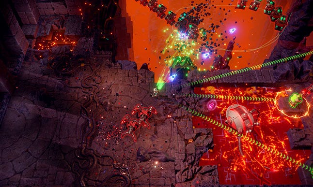
We often aimed to show you any upcoming levels while playing the current one so you have a vague understanding of what’s to come even if you don’t consciously think about it. It also makes the world feel more alive since you see playable areas all around you, not only set dressing.
It took a surprising amount of work to have the levels placed in relation to each other in a way that ‘felt’ good. We wanted to avoid the progression becoming dull and repetitive. We placed levels sideways, upside down, left, right, up, down in relation to each other. This made the level to level transitions more fun and enabled us to show interesting areas. We also used rotated levels to mix with expectations every once in awhile.
We had a ‘goal direction’ guiding the overall placement of levels so you can somewhat understand what the overall direction is. In the lava world, you see glimpses of the bottom lava pit through multiple levels and in the City you see the ominous tower on the background as you progress, finally ending up in both target locations.

In Nex Machina we wanted to create a throwback to the pure classical arcade experience. Intense, fast action without cutscenes or anything to draw you out of the action. We wanted the gameplay to be really tight. Many of us are big fans of Robotron so collaborating with Eugene Jarvis was a dream come true. Modernizing the tried and tested gameplay with new elements and new options for the player was really fun to do.
Establishing the Knife’s Edge principle helped us make better decisions and move forward with a guiding light. Naturally it took some time and sitting down to name it, understand what it meant and how to emphasize it.
We had plenty of ideas on what to try out and even our worlds (Forest, City, Labs, etc.) were originally around 50 levels long. All worlds ended up being 15 levels. That is one of the more concrete examples of cutting excess fat to not drag things too long for their own good. We wanted to end up the best and most engaging content possible.
Whenever we would play the game, blasting through different enemies, rescuing humans and moving around felt great. The longer it went on, the more engaged you started to feel. When you needed to wait for new spawns or walk to a new area in order to progress, it broke the flow and drew you back from that engaged state. Then you needed to work again to get there. Cutting excess fat from enemy spawns, level transitions, and using compact layouts helped staying in “the zone”.
You May Also Like