Trending
Opinion: How will Project 2025 impact game developers?
The Heritage Foundation's manifesto for the possible next administration could do great harm to many, including large portions of the game development community.
"If there’s one takeaway from this piece, it’s that every decision we made was massively influenced by playtesting. I can’t stress enough how important this was for ending up with clear, understandable game systems."

Game Design Deep Dive is an ongoing Gamasutra series with the goal of shedding light on specific design features or mechanics within a video game, in order to show how seemingly simple, fundamental design decisions aren't really that simple at all.
Check out earlier installments on the action-based RPG battles of Undertale the music-reactive Paranormical, and the traffic systems of Cities: Skylines.
Also, dig into our ever-growing Deep Dive archive for developer-minded features on everything from rocket jumping in Rocket League to the one-hit kills in Titan Souls.
I'm Matt Hammill, co-founder of Asteroid Base in Toronto and lead game designer/artist/animator on our studio’s first game, Lovers in a Dangerous Spacetime (Xbox One/PC/Mac). Before that, I was designer and artist of Gesundheit! (iOS), and before that, I was an animator and children's book illustrator. I tend to think and work really visually when it comes to game design.
Lovers in a Dangerous Spacetime is a 1- or 2-player couch co-op game about flying a spaceship with a friend. It controls like a platformer within a shooter, all in real time. It’s meant to be a fun, ridiculous experience, but also one that emphasizes on true co-operation, since there are 4 station types (Turrets, Engine, Shield and Super-Weapon) but only 2 players to man them at any given time.
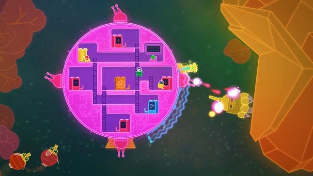
I’m going to dive into how the power-up system fits into this design. If there’s one takeaway from this piece, it’s that every decision we made was massively influenced by playtesting. From an early stage, we were exhibiting the game at events every few months (often small, local gatherings in Toronto) while also distributing builds to testers. I can’t stress enough how important this was for ending up with clear, understandable game systems. Nothing is quite so motivating as seeing a player give up in frustration after failing to understand a basic system.
So, power-ups! The reason for adding them was to bring more depth and variety to longer play sessions, but we had to make the system work with these two main points of the game:
Lovers is all about local co-op, and we wanted to avoid situations where one player would be mucking about in an upgrade menu while the other player twiddled their thumbs.
The challenge of the game is in balancing what’s happening inside the ship with what’s happening outside the ship, and because of this built-in complexity we kept the controls super simple -- just a stick and two buttons (jump and fire). We didn’t want the power-up system to add any more complexity to the controls.
Our first-draft power-ups were added to the game in a panic as GDC 2013 was approaching and we realized we needed to quickly flesh out the experience. We made some simple collectibles, like increasing your rate-of-fire, as rewards for clearing enemies off of planets. A random power-up would automatically appear, automatically be collected, and automatically be activated. Because there were only three kinds of power-ups, and you could collect them pretty quickly, we had to make these upgrades temporary lest players “max out” too soon and have nothing else to look forward to.
This system added a bit of variety, and it kept the controls simple, but testing it with players revealed two big downsides:
Players weren't making any decisions; it was all just random. They were happy to become more powerful, but they weren't really interacting with the game, or, for that matter, with each other.
Players were bummed out when their upgrades would expire -- they wanted to be building something that lasts.
When we got back from GDC we decided to make our power-up system more flexible and user-driven. If we could create, say, 3 different flavors of power-ups, and let players choose which station to place them in, then players could mix and match three types of power-ups with four types of stations for a total of 12 different combinations! With that much variety, we could make them permanent throughout each campaign, too, since different power-ups could be useful in different situations, and players would never really “max out.”
Now all we needed was an interface with which players could interact with this upgrade system. We wanted to avoid a game-pausing menu system, because we didn't want to have one player spending a bunch of time in menus while the other player would grow bored. As such, we decided to cast the power-ups as gems that player characters could pick up and drop off in any station they like. (Fun fact: in our first sketch of this system, the upgrades took the form of magic sauces that you would pour on your control stations... um, yeah, weird.)
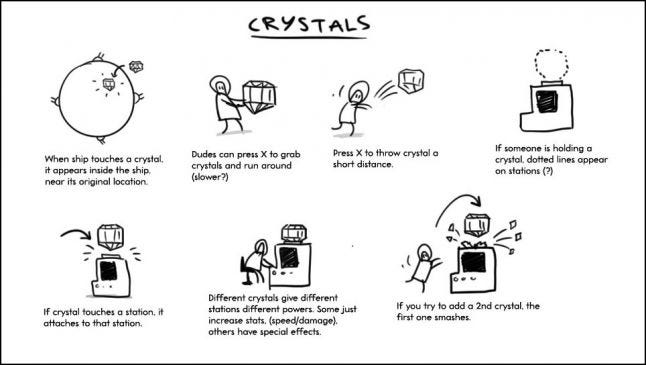 Initial sketch of crystal-based upgrade system. We ended up calling them “gems” because it’s a shorter word.
We now needed a logical way to get power-ups from the outside world into the ship, into players’ hands, and being dropped into stations. We employed a bunch of visual cues to make it clear:
Power-ups are found in space in capsules marked with a "?" -- practically begging players to shoot them.
Shooting a capsule reveals a present, which is pulled towards the ship and ends up on board in a corridor, bouncing in place -- practically begging players to open it.
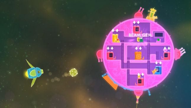
When a player opens a present, they’re suddenly holding one of 3 gems, and the ship's stations begin flashing with arrows indicating where it can be placed -- practically begging players to use it.
Once a gem has been dropped into a station, the weapon changes and sparkles -- practically begging players to try it out.
Because opening a present and dropping it into a station could both be handled using the fire button (with simple contextual button prompts to teach players), we were able to graft this flexible power-up system onto the game without adding any extra controls.
Now for the fun part -- designing all the power-ups! Throughout this process we had been doodling every single idea for power-ups that we could think of, no matter how ridiculous: Space swords, biological shields, grabbing robot arms, etc. Because Lovers is meant as an accessible co-op game, we didn’t want power-ups that would just noodle with stats, we wanted big gameplay differences between power-ups, so players could have fun trying things out and discussing them. Designing in doodles was great for this kind of brainstorming.
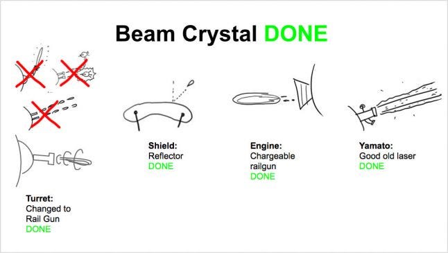
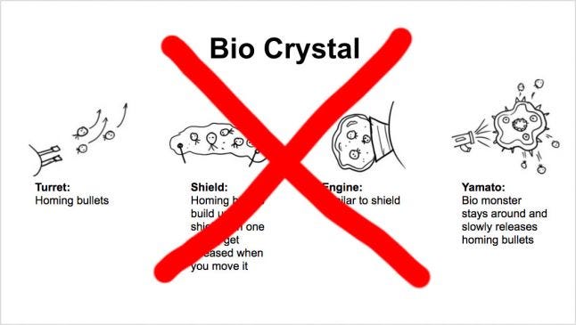
Example final and rejected power-up concepts, shared among the team in Google Docs
We eventually whittled these down and organized them into three gem types: Power, Beam and Metal. Some of these upgrades would be predictable (e.g. applying a Metal gem to your Shield results in a stronger but heavier shield) but some could still be a surprise (e.g. applying a Metal gem to your Super Weapon changes the default cannon into a giant orbital buzzsaw). At this point we were planning to expand our gem roster as time went on, but this never happened (I'll explain why shortly).
We quickly got this new system in front of our players. Feedback was positive, but unfortunately it still wasn't deep enough -- players would experiment with different power-up combinations, but by the time they were finished the first campaign (of four) they already had their favorite weapons, and there was no more discovery. We still needed more depth! We had two options: either keep generating fresh types of gems to introduce throughout the campaign, or go with a plan that had been in the back of our minds since we started doing the gem system, and let players combine more than one gem into a single station (a la the combo mechanic from the Genesis classic Gunstar Heroes). Once players themselves started requesting the ability to combine gems, it was impossible to not go down that path.
But why was a combo system more engaging than just adding more gem variety? I think it's because we were engaging a player's imagination -- they would try to predict what certain combos would result in. If a Beam Turret resulted in a railgun weapon, and a Metal Turret resulted in a swinging space flail, what could a Beam-Metal turret be? Players would want to see if they were right, and fill in that space in their mental chart of upgrades.
Our long-time beta testers loved this system, but when we soon realized it was too much for beginners to take in -- players were combining power-ups before they were even aware of how the base forms worked. We needed a way to time-release the combo system as players became more experienced. After much debate, we ended up tying this into one of the other systems of the game: rescuing bunnies. Depending on how many space-bunnies you rescued in each level, you could "rank up" and unlock the second gem slot in each station, one at a time.
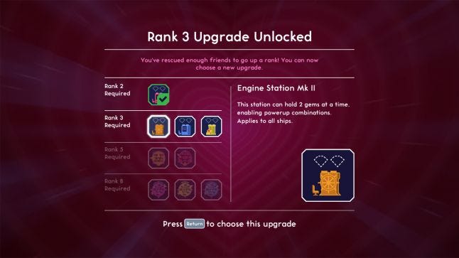
Adding this menu-based upgrade system was contrary to our original goal of keeping constant gameplay engagement for both players, but at this point we were running out of runway. On the plus side, this upgrade menu would only appear between levels, which were already calm moments of downtime as your ship travels to the next area (inspired by the safe rooms of Left 4 Dead). In the end, this “rank up” menu system worked really well as a secondary way to accumulate upgrades, and we ended up adding bonus spaceship unlocks here too (but that’s another post!)
We were especially pleased when we would overhear players discussing which stations they should upgrade first. Even though only one player was controlling the menu, they were still thinking it through together. In light of this, we probably could have gotten away with an even deeper menu-driven upgrade system if we had known players would approach it co-operatively like this... oh well!
The final change we made to the upgrade system happened in the last weeks before we entered Xbox One certification. At this point, players could only place gems into stations, and never remove them. A player’s only option to change out upgrades was to insert new gems to overwrite the previous ones. Our thinking was that this would result in players having fun trying all the gems, instead of being able to just constantly remove and replace gems to get their usual favourite loadouts (boring!). But players made it clear that they did not like this, and that it was actually discouraging upgrade experimentation, because to overwrite an upgrade you had to sacrifice a gem. We considered a few different ways to let players move gems around, but we didn't want to allow full freedom to change all your gems, as then there would be no continuity in your ship's loadout through a campaign.
Because it was so late in production and there was very little time for playtesting, we went with a system that piggybacked on our existing gem item system: a new type of item called a Remover that could be used once to pop gems out of stations. You would only receive one of them at a time, during the downtime between levels. It was a risky change, because we couldn’t extensively test it, but it seems to have paid off. Watching videos of the game, we have yet to see players struggle to understand this item. Phew!
Overall we're happy with the upgrade system. Combining gems is often cited by players as one of their favorite bits of the game. On the downside, creating a bunch of weapons with really different behaviors rather than going with stat-based upgrades certainly wasn't fast or cheap.
The other major downside of the combo system is that it gets hugely expensive to expand the roster of gem types, since any new gem must be able to combine with all three other gems. With all these combos, adding one new gem type means we'd need to create 20 different station upgrades -- not a simple prospect!
Despite these shortcomings, we're pleased with how it ended up, especially when we see fans excited enough to chart out all the combos. And there's nothing that will ever replace the thrill of having a PAX booth burst into applause when some panic-stricken players wipe out a screen full of enemies with a gigantic space disco laser.
You May Also Like