Trending
Opinion: How will Project 2025 impact game developers?
The Heritage Foundation's manifesto for the possible next administration could do great harm to many, including large portions of the game development community.

Featured Blog | This community-written post highlights the best of what the game industry has to offer. Read more like it on the Game Developer Blogs or learn how to Submit Your Own Blog Post
A step-by-step design analysis of the very long, long introduction to a recent popular game. The goal: To show how it could be shortened to make a more effective game and a less grueling experience for the player.

In this chapter, I unwisely critique the work of my betters. |
I recently wrote an article about how video games have too many words. We designers don't properly edit our writing to make sure our words are worth a player’s time reading them.
I want to do a case study where I go through a wordy game, step-by-step, and show what it's doing right and wrong and how it could be doing better. Most game criticism frustrates me. It tends to deal with generalities and floaty ideas, instead of dirtying its hands with specifics that could actually help make for better games. This is my chance to egotistically provide a different approach.
This breakdown will be long and gritty, but I'll try to include a lot of solid pointers. I'll throw in some jokes along the way.
The Subject
Let's look at the very beginning of Pillars of Eternity, developed by Obsidian and released in 2015. This game was a huge hit, critically and financially, taking advantage of a shortage of quality Baldur's Gate-style, gritty, isometric-view, story-heavy titles.
I really wanted a game like that, so I bought it. I finished it in a little over 20 hours. The combat was fine, though really chaotic and hard to follow. (The best description I read was "clusterf***y".) The story was OK, but the game is loaded with words, many of them written by Kickstarter backers. I ended up getting through all the conversations in the back third of the game by typing the '1' key as fast as I could.
I did play Pillars until the end, which is rare for me. Overall, it was pretty good. It made a lot of money, and the crowdfunding for the sequel is doing quite well.
I don't usually like being negative about the work of other sincere, industrious creators. Luckily this game got enough cash and acclaim that its creators can comfortably ignore the nattering of a non-entity like me.
This is how I picture the devs of Pillars of Eternity. They walk everywhere with big clip art watermarks floating over their chests. |
"So What's Your Complaint?"
Too many words.
Pillars of Eternity wants to have a really elaborate world and story, which is fine. It wants to have a creative game system, with new, innovative sorts of character classes and spells, which is great.
However, it doesn't do a good job of communicating stuff to the player, because there's no editing and care in giving out information. The game just floods the player with text, important bits buried in gushes of irrelevant detail, practically training the player to think that the words aren't really important. (Again, I played a huge chunk of the game without reading anything but the quest log.)
To illustrate this, I'm going to go, step by step, through the introduction and character creation, the stuff anyone who tries the game is sure to see. Let's see what the game thinks is worth the player's time and how good a job it does splitting up vital knowledge from static.
"So What? You're Just Scared of Words, You Sub-Literate?"
No, I have a problem with the pacing. The human brain can only absorb so many random facts about game systems and lore at one sitting. This stuff needs to be carefully paced out, or it'll just slide off of the brain.
But character creation in this game floods the player with tons of facts, both about the game and the world. I came out of it feeling numb and confused, and almost none of it stuck.
So. You start the game. You pick your difficulty. And then you begin the eleven (!!!) steps of character creation.
I. Introduction.

A pretty graphic and some basic text saying what is going on (you're on a caravan going to some fantasy town, you feel sick), read by an old guy. About 140 words. It's fine.
II. Pick Your Sex
And now the troubles begin. You need to choose whether you are male or female. Here's a description:

Describing the sexes is about 160 words total. But look, it mentions a bunch of different countries. Let's mouse over one of them and see what their deal is.

Yikes! That's a lot of words. All the descriptions together are about 330 words, much of it references to random game locations the player has no knowledge of. "Ein Glanfath" "Dyrwood" "Glanfathan" "Ixamitl" "Naasitaq" How can anyone get anything coherent from this tangle? This is literally the second thing the game shows you.
Seriously, try this: Read the description of "Eir Glanfath" above. Then close your eyes and count to ten. Then say everything you recall about Eir Glanfath. I'll bet you retained very little. And that's setting aside whether this stuff is actually necessary to play the game. (Not really.)
And, worse, it's all irrelevant to the actual choice the player has to make, because the vast majority of players will know whether they want to play a man or a woman before they even launch the game. If a woman only ever plays female characters, telling her, "The men of the Derpaderp Tribe of Sirius XII are in charge of all of their basket-weaving!" isn't going to turn her head around.
My Friendly Suggestion - Go through all these random facts and see if there are one or two of them the player MUST know. Pluck them out and put them in the Introduction. Cram the rest of the lore in books the player finds in the game world. Then make Male/Female be a toggle in the next screen.
III. Pick Your Race
OK, we're into solid fantasy RPG territory now. Here are six races to choose from:
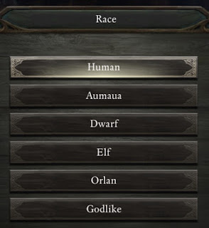
You've never heard of three of the races. This is good. Pillars's desire to create new, weird things is one of its good points. Each race has about fifty words of description:
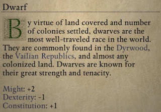
Now, this is a description of a "dwarf." But, if you have even the slightest familiarity with fantasy, you know what we're talking about here: Standard-issue, Tolkein dwarves. Short. Stocky. Like digging holes, gold, and ale. Grumpy. Scottish accents. We get it. All you need to say here is, "Strong, durable, great warriors."
For each of the races, the description mainly says the lands they live in. Let's be clear. This is useless information. If I tell you dwarves come from New Jersey, whether or not you've heard of New Jersey, this tells you nothing about whether you want to be a dwarf in your adolescent power fantasy.
It's a total cliche to say, "Show, Don't Tell," but this is a PERFECT example of why this is a key concept in writing. If I say, "Dwarves come from New Jersey," and you've never even heard of New Jersey (or dwarves), you won't care. But if you go to New Jersey, look around, and see nothing but dwarves, you'll instantly be all, "Oh, I get it! I'm in Dwarfland!"
But it gets trickier. This is the first choice you make that has actual impact on the gameplay. There are six statistics in the game, and your race affects what you start with. Each statistic description is 50 more words. Let's take a look at one:
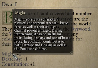
What "Might" means is important information. The player needs this. This text needs to be punchy and clear. Something like, "Improves damage from all attacks. Gives a bonus when healing. Helps intimidate people in conversation."
And this description does that, but messily and with lots of extra words. Pillars tries to do a lot of things differently from other RPGs, so it needs to be extra-clear about the surprising stuff. Having the strength skill also improve spells and healing is neat, but it's also really unusual. ("Dwarves are better wizards? Wut!?")
My Friendly Suggestion - Editing pass. Shorter and clearer. Ask, "Why does the player need to know this?" If you don't have a good answer, save this lore for much later.
IV. Pick your Sub-Race
This is where the seriously over-designed quality of Pillars starts to show up. Picking a race isn't enough. You have to pick your sub-race:
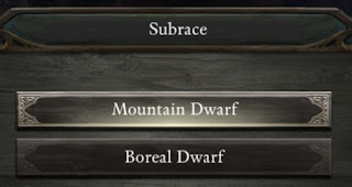
So about 160 words (not counting rollover text), to learn about the woods dwarves and the mountain dwarves:
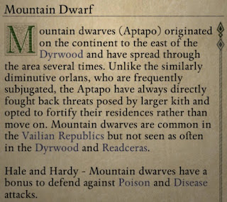

None of this lore has anything to do with the actual game.
What bugs me here is that this choice has gameplay significance. One choice gives you resistance to Poison and Disease (though you have no idea how serious these conditions are or how often they appear in the game), and one gives you a bonus against "Wilder" and "Primordial" creatures (though you have no idea what on Earth those are, let alone how often they show up in the game).
Giving a player seemingly high-impact decisions with no ability to tell which one is correct is stressful and confusing.
My Friendly Suggestion - Ditch sub-races. Instead, give Dwarves BOTH of these bonuses. This creates more distinction between the races and getting multiple bonuses helps the player feel more powerful instead of confused and stressed.
"Cutting Out Lore? What Is Your Problem With Lore In Games, You Jerk?"
Lore in games is great, as long is it's not thrown at the player too quickly and without any gameplay context that makes it mean something.
If you love lore, I want you to get lore, but in a way that spares the people who find huge dumps of it grueling. There are ways to make everyone happy!
Anyway, let's keep going. There's a LOT more screens to go.
V. Pick Your Class
Hokay! At last, this is the big one! This makes a huge difference in your play experience. Here are your eleven choices:
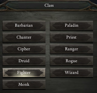
One of the coolest things about Pillars is that they tried to make some weird classes unlike anything in other games. The cost of creativity, however, is that you have to be extra-careful when explaining to the player the weird stuff they've never seen before.
When I started the game, my eyes were instantly drawn to "Cipher". That sounds neat! And here is the description ...
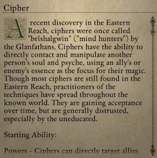

Yikes.
The main description of the class is four long sentences, but only the second sentence actually says much about what the class does. Then a very vague description of the powers, which involve something vitally important called a "Soul Whip," with no explanation of what that actually is. Then a bunch of algebra.
That's about 120 words, for one class. You have to go through all of it to get a vague idea of how the class plays. The other ten class descriptions are comparably complex.
This is just too much stuff to muck through, too early, for a choice so important to the play experience. Bear in mind that we are still less than halfway to actually playing a game.
My Friendly Suggestion - For each class, only show the stat bonuses and two or three carefully written sentences describing what it's like. Move all the weird lore and mathematical formulae to a different tab that can be opened by those who care. When the player starts using the class in the game, bring up some tutorial windows saying the key details of how to actually use it, like what a "Soul Whip" is.
VI. Pick Your Class Details.
If you're a priest, you have to pick your god. If you're a caster, you have to select a spell or two from the starting list. For the Cipher, the list looks like this ...

The spell descriptions look like this ...

Again, a ton of reading, referring to statistics, distances, statuses, damage amounts, damage types, etc. that mean nothing because you've never actually played the game.
My Friendly Suggestion - Lose this screen entirely. Pick one basic, useful ability (the best one) and give it to the character automatically to get through the tutorial. Then, after the first bunch of fights, have the player meet a trainer and be able to choose new abilities in an informed way.
VII. Edit Your Character Attributes.
Figure out how many points of Strength, Constitution, etc. you have. The game, to its credit, says which ones are most important for your class. Standard RPG fare.
VIII. Pick Your Culture
IF YOU'RE JUST SPEED-SCROLLING THROUGH THIS ARTICLE, STOP HERE AND READ THIS!!!!
Yeah, I know you aren't reading all of this. This post is wayyyyy too long and gritty and nit-picky and tedious. But reading this article takes much less time than actually picking through all of these windows in the game. Which is too long. That is my main point. Now scroll to the end and call me an idiot in comments.
Anyway, yeah, pick some country you're from ...

Each of the 7 contures has about 70 words of description.

None of this has anything to do with playing the game.
This is the most unnecessary step in the whole process. When making an RPG character, you need to build two things: Its stats/abilities and its personality.
Knowing your character is from "The White that Wends" tells you nothing about its abilities, and it's a lousy way to determine his or her personality. If you read the description of "The White that Wends," and learn that people from there are mean and selfish, that's still not the way you want to player to create a mean, selfish character. You do that by giving play options in the game that are mean and selfish and letting the player pick them. Show, don't tell.
My Friendly Suggestion - Lose it entirely.
IX. Pick Your Background.
Choose from one of nine backgrounds.

The main thing this affects is that, every once in a while, it will open up a new dialogue option. This never makes a big difference.
My Friendly Suggestion - There's a real lost opportunity here. Once again, "Show, Don't Tell." Instead of having me declare that my character is a Slave or Aristocrat or whatever, why not, once you’re in the game, make every conversation option for all of these different nine backgrounds available to me when the game starts.
Then, if I keep making the "Aristocrat" pick, start removing the other options, so that I end up always talking like an Aristocrat. Then my character's personality emerges organically from the sort of dialogue choices I make in the actual game.
X. Choose Appearance and Voice.
Standard appearance editor and list of different voices. It's fine.
XI. Choose Your Name.
Gladly.

XII. The Game.
And, finally, the games starts with the tutorial. Which begins with a long conversation. Which I barely pay attention to, because my stupid brain is tired.

It's all way too much. Too many words, too many irrelevant choices, exhausting when it should be informative. Not that they will listen to me, but it might be an improvement to look for in Pillars of Eternity 2, because the market is not what it was in 2015.
"But Who Cares? The Game Was a Hit, Right?"
The real test of how good a game it is, is not how it sells, but how much its sequel sells. And it is entirely fair to ask what business a pissant like me has criticizing a hit game written by a bunch of big names.
Let's leave behind the idea of craftsmanship and a desire to always keep improving our work.
Lately, sequels to hit RPGs have been selling far worse than their predecessors. Obsidian's successor to Pillars, Tyranny, by their own words, underperformed.
Also, I looked at the Steam achievement statistics for Pillars of Eternity. According to those, fewer than half of players finished the first chapter. Only about 10% of players completed the game.
Now granted, this is not unusual. Most games remain unfinished. But that still invites this question: If the vast majority of players didn't want to experience the Pillars of Eternity they already paid for, why think that they will want to buy more?
Everyone should keep improving, if just for their survival in this mercilessly competitive business.
Video games are a new art form, and there is still so much we have to figure out. That's the terrifying and awesome thing about making them. And now, having already written way too many words, I will take my own advice and cease.
###
The author sells his own flawed, wordy, old-school RPGs at Spiderweb Software. He opines on Twitter.
Read more about:
Featured BlogsYou May Also Like