Trending
Opinion: How will Project 2025 impact game developers?
The Heritage Foundation's manifesto for the possible next administration could do great harm to many, including large portions of the game development community.

Featured Blog | This community-written post highlights the best of what the game industry has to offer. Read more like it on the Game Developer Blogs or learn how to Submit Your Own Blog Post
This article looks at Dark Souls' environmental concept and compares it with other games' comparable environmental art to hypothesize how it may have substantially influenced its contemporaneously atypical level design.

Dark Souls’ environments are in part distinguished by their emphasis on focal points. These lend your journey’s progression a rich visual drama and spatial perspective. You have distinct things to look forward to, and distinct things to look back upon once you’re there. In a curious way, it’s a type of design that recalls traditional models of civic planning. It also taps into a common pleasure of being able to break trips up into parts, which may be why some of us choose to take comparatively rural side roads to get somewhere when driving instead of a highway, where all we have to look at is an endless gray strip lined with advertisements. Beside this is a sense of structural clarity. Although the world is interconnected, it can be easily and enjoyably divided into distinct rooms, or spaces. Dark Souls has no map for us to consult, yet the general consensus seems to be that navigating Lordran on its own terms works anyway.
What is this clarity, exactly? In the midst of other action-adventure games from the last and current generation of consoles, Dark Souls’ spaces have an unusually concentrated organization. This has a functional justification, as the challenge is very much built on your opponents’ location. In his insightful article, Dark Souls: It’s Like an NES Game!, James Margaris writes,
“Spatial positioning, rather than dodges or counters, is at the heart of many NES games and at the heart of Dark Souls combat.”
Furthermore,
“The first time you encounter a Black Knight in Dark Souls it’s likely the one in Undead Burg. You can walk right by if you want. If you choose to fight the fight is awkward, taking place in a narrow corridor with no room to dodge. […] At the end of the game you fight a variety of Black Knights again. This time you fight them one at a time in open space. It’s not hard. […] …the difficulty of Black Knights was always an illusion. […] They only functioned as competent enemies in the context of other enemies and an environmental layout that played to their strengths.”
Margaris also writes,
“In modern games it’s common for invisible walls to block off areas that should logically be accessible. […] Dark Souls takes the opposite approach - much like how Dark Souls’ combat is ‘What You Do is What You Get’ Dark Souls’ layout is ‘What You See is What You Get.’ […] In Dark Souls gameplay fidelity take priority over graphical fidelity.”
Since “gameplay” is sort of an unwieldy term when used outside of the context of footage of a game being played, let me attempt to clarify Margaris’ statement by saying: when you look at a spot in Dark Souls, it’s often fairly easy to determine how that space is delineated. Its environments have a spatially explicability that’s uncommon for modern 3D games. I think that one reason why I and others find Anor Londo so striking is that we can look down from an elevation, see that the area is sectioned into identifiable landmarks, or focal points – a central walkway, an elevator-tower, or a great church – and also know that we can visit each.
To digress for a minute, the above observations are perhaps a reason why the game’s more open and natural areas are not as interesting on a moment-to-moment basis. When much of the game’s situations depend on the explicit structural identity of architecture, there’s a reduction of specific design and discretely divisible landscaping when the space has exploded. This doesn’t mean that the relevant areas are bad to the core, really. It just means that places like the Darkroot Basin or Demon Ruins offer a different experience than the Undead Parish or Sen’s Fortress. They offer the mystery of space that has suddenly and atypically expanded, such that you can look at its vaguer sprawl and wonder about its extent. Just how far, and just how deep does this body of land go? Of course, this also means that once you do know their extent, it’s harder for those same places to register as engaging on later playthroughs.
ANYWAY: All this having been said, I think it’s thought-provoking to refer to the game’s concept art (or what of it we were shown in the book Dark Souls: Design Works), because in certain ways it is atypical compared to the concept art for games developed by European and American teams, and it may suggest on a partial but significant level why Dark Souls’ level design is the way it is. My intent here is not to establish absolutes of value in creative approaches or make inherent nationalistic claims; it’s to make a selective comparison. What stands out to me when I look at a lot of Dark Souls’ environmental concept art, and then compare it to that of other games with relatable settings, is how they have a drama of definition. The imagery is just as much about establishing an atmosphere as it is about zoning in on memorable characteristics of the space, or making them memorable by restraining details, such as what the first image below (depicting the prison cell you begin the game in) does. There is an almost theatrical aspect to these images in how they consciously centralize or emphasize features while letting other details fade away.
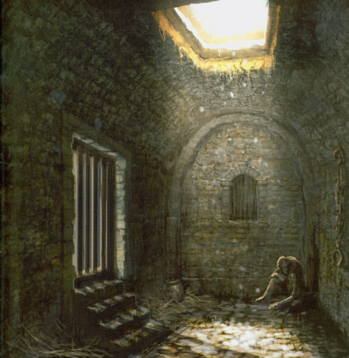
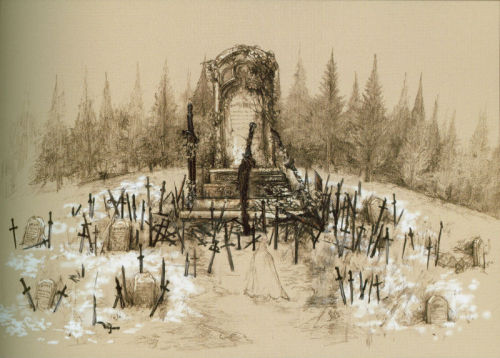
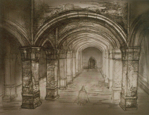
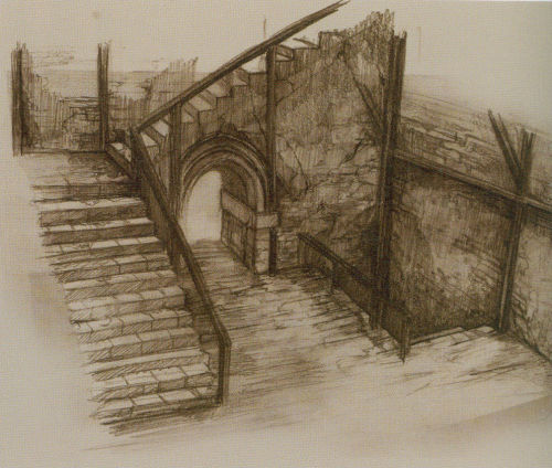
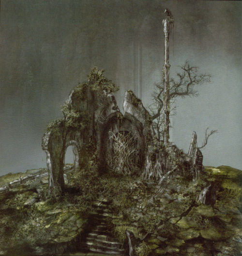
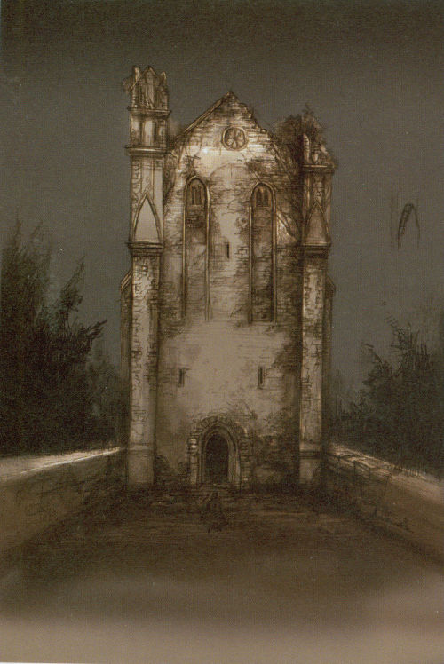
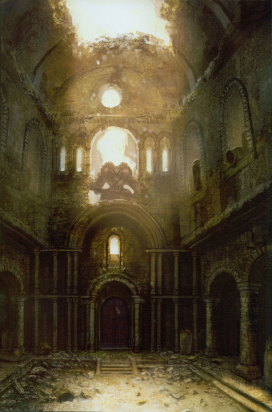
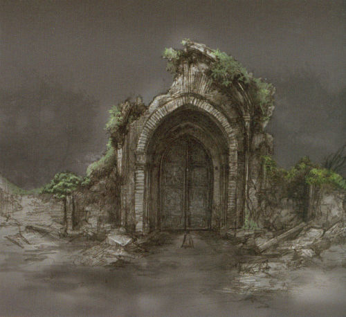
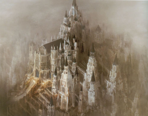
When the imagery’s complexity increases because of a scene’s scope and/or ornamental density, that drama of definition still remains to a notable degree. In one picture of Anor Londo, the great church is surrounded by the spires and towers of adjacent buildings, but their presence is suggested in only the loosest sense. The church itself is emboldened by darker colors and committed linework, and the railings of the stairway that precedes its front doors have been gilded with a golden color as if to reinforce their climactic attribute.
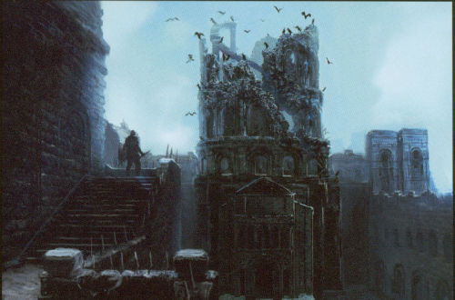
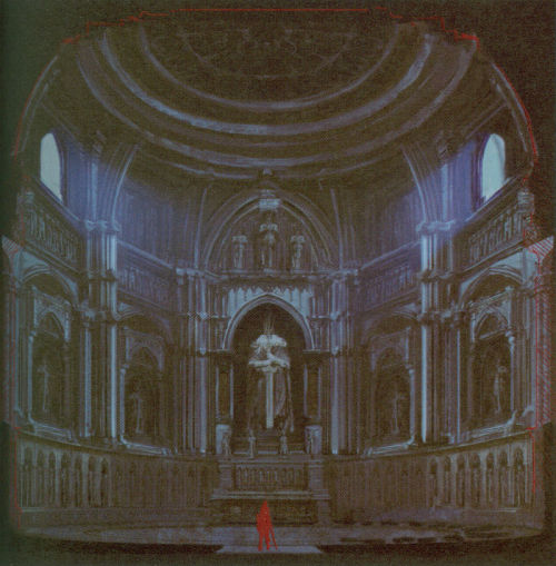
The second image below depicts the Painted World of Ariamis. Everything about the composition places a clean and clear significance on the cylindrical tower – its central position, its uncontested height, the flock of birds flying around and sitting atop its crown – and this is indeed the impression we get of Ariamis when playing. That very tower is what we must pass through to reach the Painted World’s end. Even the infernal image of the Demon Ruins, among the book’s vaguest conceptual depictions of an environment, has a focal point, thanks to the basically symmetrical composition and the fact that the darkened arched portal, leading to a boss, is framed by bold pairs of columns.
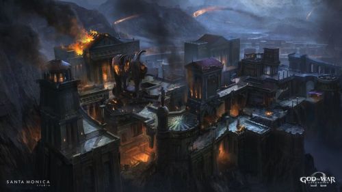
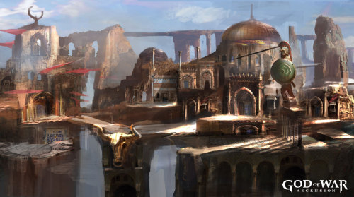
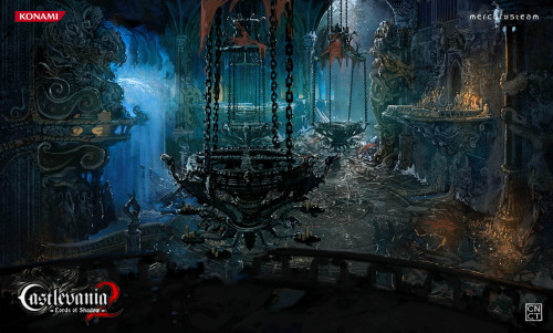
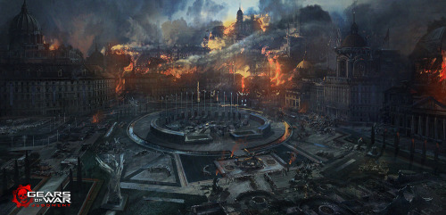
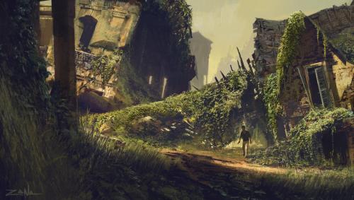
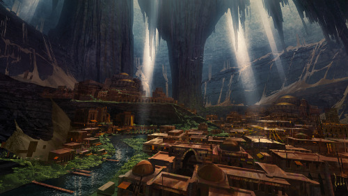
A casual review of the environmental concept art for games such as God of War: Ascension, Castlevania: Lords of Shadow 2, Dragon Age: Inquisition, Gears of War: Judgment, or titles in the Uncharted series, reveals a different pattern. Here, there is a stronger emphasis on macro scenery – the totality of a given environment rendered in as much detail as possible. Asymmetry is more prevalent than symmetry, and it’s harder to divide the environments into distinct chunks. In general, these games and others seem to prioritize compositional principles that (although present in many cultures’ creative expressions beforehand) were popularized in Europe and America during the twentieth century (there is also perhaps something else to be said, outside of this article’s reach, about artist Nicolas Bouvier’s influence within the videogame medium).
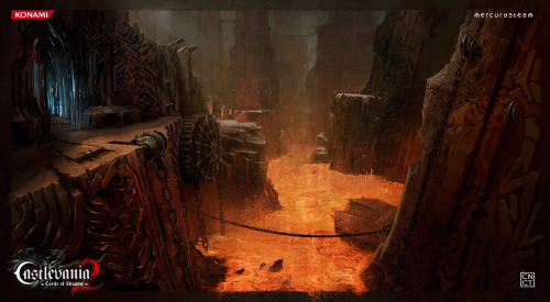
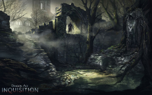
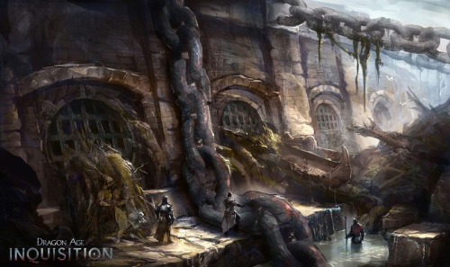
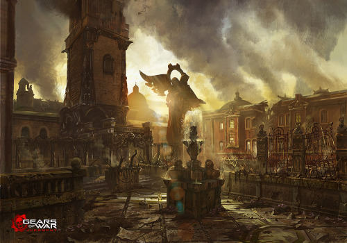
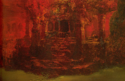
By comparison, Dark Souls’ concept art and Lordran’s layout evoke the compositional principles of what’s been termed “world landscape”, maybe best exemplified by the painter Joachim Patinir (1480-1524). When we look at a painting such as “Landscape with Saint Jerome“, the scope is enormous, yet we can cleanly segregate this scope because each landmark or scene is given its own delineated space. We could also skip ahead several centuries and look at the paintings of Karl Friedrich Schinkel (1781-1841) or Caspar David Friedrich (1774-1840) to see an evolution of these principles. Schinkel’s “Medieval Town by Water” has all the makings of a Dark Souls vista with its clear as day and dramatic architectural hierarchy (it’s no coincidence that Schinkel was also a set designer, and a very good one at that). And the parallels between Friedrich’s “The Abbey in the Oakwood” and the image far above of the tombstone set upon a forest hill are unmistakable.
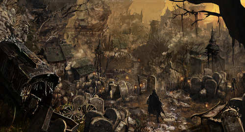
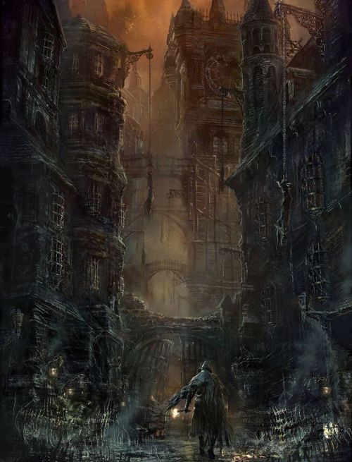
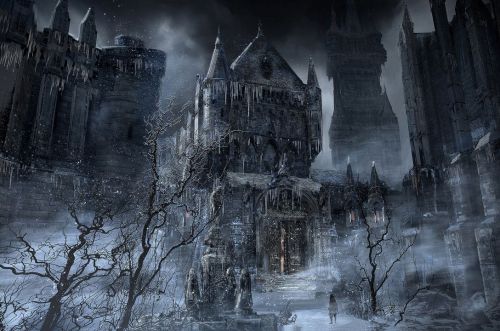
I want to reiterate that all of this is a selective comparison. We have no idea how much environmental concept art Dark Souls actually had; all we can go on is what’s in Design Works. And there are a few pages which do depict settings on a large-scale, non-specific, and non-hierarchical way, although it’s important to note that almost none of these depictions manifested in-game. It’s possible that they didn’t lead to any concrete or doable ideas, or they only served as tonal suggestions for the game’s universe. Despite advising this cautious approach, and with no behind-the-scenes book to assist as of yet, I can’t help but make assumptions about Bloodborne, the densest and least focal-point-oriented of the relevant games, based on the scant pieces of environmental concept art for it we currently have.
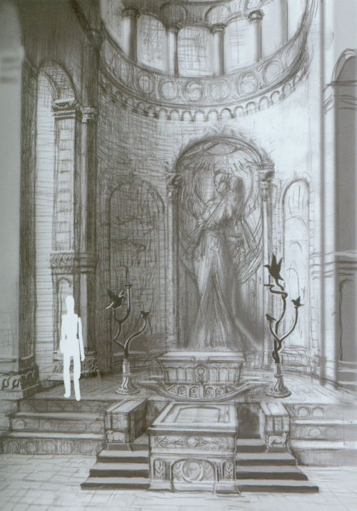
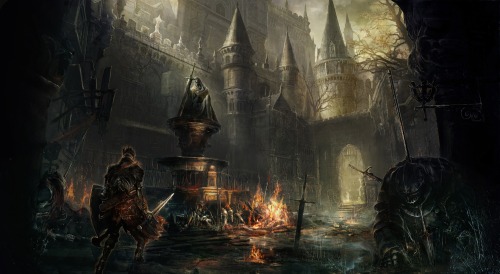
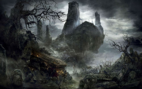
By extension, I also wonder how Dark Souls 3 will be spatially characterized (see the last two images below). With the jump to more powerful technology, it seems that From Software’s concept artists and level designers have been motivated (from personal enthusiasm, corporate pressure, or both) to multiply the volume of detail by a huge degree. I just wonder if this will ultimately be detrimental for Dark Souls 3. Density that bordered on obsessiveness and a lesser concern for discretely organized landscapes worked for Bloodborne since it both echoed and reinforced its narrative of insanity and sublimity. Perhaps Dark Souls 3 will somehow justify those same aspects by virtue of its more urgently apocalyptic scenario.
Ario Barzan can be reached and followed on Twitter and Tumblr.
Read more about:
Featured BlogsYou May Also Like