Trending
Opinion: How will Project 2025 impact game developers?
The Heritage Foundation's manifesto for the possible next administration could do great harm to many, including large portions of the game development community.
Using a high degree of graphical realism changes player expectations and thus makes must be designed around.

A while ago I described what I call the Chair Problem. In the real world I can do a lot of different things with a chair. I can sit on it, stand on it, throw it at people, destroy it, and so on. Now, Resident Evil 6 has some amazingly detailed chairs. They look real but you can't do anything with them. They are just another barrier and might as well be bolted to the ground. In most games the fact that I can't interact with such a common object in normal ways is to be expected but the high degree of detail in a game like RE6 only heightens the contrast between what I would expect to be able to do with a chair and what I can actually do with it in game. The more real it looks, the more real I expect it to act. This is important to remember, an increase in graphical realism changes player expectations.

Once you start giving some people in a game realistic facial expressions you have to give them to everyone in the game, even background characters. Once you establish that level of realism and detail then it missing from other characters in the game becomes glaring and confusing because of the change in expectation. This is how a little thing can become overwhelmingly costly and burdensome.
When the graphics aren't realistic then the player instinctively understands that you can't interact with this world in super realistic ways. Abstract graphics imply abstract gameplay and world interaction. It might not be realistic but it is consistent and so players can more easily go along with it. Realistic graphics on the other hand, implies more realism in terms of gameplay. This shift in expectations is a problem for basically every part of a game but I want to focus on how it effects level design today.
In the same way I have an instinctual understanding of how a face moves when a person is upset (even though I couldn't describe it if my life depended on it) we all have an instinctual understanding of the types of spaces we spend our lives traversing. Violating that understanding makes the area feel less real, or worse is actively confusing as our instincts for how to navigate the space kick in but are completely wrong. We know where the water cooler should be but instead it is in a place that makes absolutely no sense (except that the game needs it to be there for some reason).
When the graphics are hyper realistic people will start to understand the space as a literal representation of a world and so will notice if there are never any bathrooms, parking garages, or how annoying it would be to work in a building that required hand cranks to get around. Those are things you can get away with in a game that represents everything abstractly but that you can't easily get away with that in a game whose graphics ask you to think of the game world as you would the real world. Again, realism implies realism, and when that expectation isn't met it is confusing or immersion breaking.

This is generally why I'm rarely excited about HD remakes of games. Some scenes just won't work when given a high level of graphical realism.
Spaces in the real world aren't made to be interesting to move through. In fact most spaces are very repetitive in a very boring way. Apartment buildings, offices, and schools are all buildings with dozens of identical spaces repeated over and over again. These spaces, left to their own devices, make really boring levels. So games will often cordon off large parts of the building (the parts that would be repetitive dead ends) or make the space more interesting to move though by having you traverse it in a non-traditional way. We then have to come up with reasons why you can't go to cordoned off places and interesting ways to gate a level that fit the degree of realism the game is going for. As evidenced by the number of games that just have the protagonist say "I don't want to go over there" in order to keep the player on track, this is hard to do.
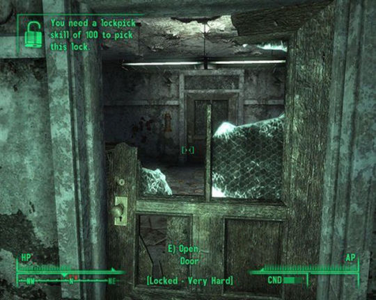
A lot of post-apocalyptic games will take normal spaces and then put holes in the walls and rubble blocking hallways in order to make the space more interesting from a level design standpoint. It was an office, but now it is in ruins and the level designer can ignore the floor plan and do whatever they want with it. The problem here though is that this reminds the players that walls aren't invulnerable. Why can't we just tear a hole in this wall? Maybe we don't have to go face that unspeakable evil in order to get a key, maybe we can just punch a hole through this dry wall.

I have a rocket launcher, why do I ever have to use a door?
This isn't to say that graphical realism is bad or leads to intractable problems, I’m simply trying to say that it leads to further expectations that must be taken into account along side the thousands of others things that need to be handled. You have to make the space feel like it existed for a purpose other than being interesting for the player to move through. Gone Home does this brilliantly, it is an amazing example of a space that feels like a home all while making it interesting to move through and explore.

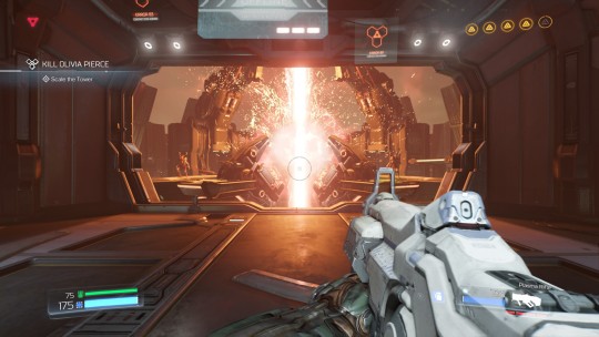
DOOM gets away with having areas that don't serve a clear purpose by way of the fact that no one knows the general flow and feel of a hell based power plant on Mars is. People will realize a space makes no sense when they are very familiar with that type of space, but if it is a completely type alien space you can get away with a lot more.
At the end of the day though, this is just another goal/limitation that a designer must balance against the thousands of other factors that they have to deal with. But it is important to understand that these elements don't exist in a vacuum. This gets at the deeper problem of player expectations. It isn’t a question of “What can the player do”, but “What do they expect to be able to do?” When a game is super realistically rendered then the message being sent to the player is to take everything they see at face value. This is what it is, definitively. When the graphics are lower res or more abstract then the player understands that what they are seeing is a rough approximation and their brain will help fill in the rest.
Those expectations can come from a thousand different places: graphics, story, game mechanics, genre traditions, and so on. Every game has limitations, players understand that. Accepting those limitations is generally not a problem for players, unless they feel like they were promised otherwise. So, be wary of what your game implicitly promises.
Read more about:
BlogsYou May Also Like