Trending
Opinion: How will Project 2025 impact game developers?
The Heritage Foundation's manifesto for the possible next administration could do great harm to many, including large portions of the game development community.
The Game Kitchen's Enrique Colinet, level designer on Blasphemous, gives a behind the scenes look at the design and iteration of levels, from whiteboard to final product.

The formula for the Metroidvania is pretty much set in stone. Almost all of them feature a large interconnected world with inaccessible areas that require players to backtrack in order to unlock new abilities. The Seville-based studio The Game Kitchen, however, took a different approach when making the gothic action platformer Blasphemous.
Taking inspiration from Dark Souls, the developers wanted to give players the ability to choose how they explore more freely. This meant devising a map that would be satisfying to explore non-linearly and translating techniques from popular three-dimensional games into a two-dimensional context. The studio used a number of tools to map the game out, developing the layout from a simple whiteboard sketch to the version you see today.
In Blasphemous, you play as the Penitent One, the last survivor from a congregation known as the Silent Sorrow. Tasked with ending the curse inflicted upon the land of Cvstodia, you explore a world inspired by Spanish folklore and religious iconography, completing several trials and defeating challenging bosses. Along the way, you’ll unlock new shortcuts, discover helpful relics, and talk to NPCs within the world.
“I was pretty confident that people expected something similar to Castlevania,” says Enrique Colinet, the level designer on Blasphemous. “It looks like a Metroidvania game, so it had to feel like one. So, the problem was we were not really…comfortable or confident about the idea of opening areas with new abilities. Our intention was if you are the kind of player who likes to explore every corner of the map, then that’s fine, but we don’t want players to backtrack or explore areas if they don’t want to.”
The initial approach they took when building the map was to have each themed area take the form of a scrolling environment. You can see a demonstration of this in the narrative prototype that was shared with the game’s Kickstarter backers. However, in June 2018, the team switched to a screen-based approach, as the levels began to feel too big, were hard to work on collaboratively as a studio, and were not optimal for performance.
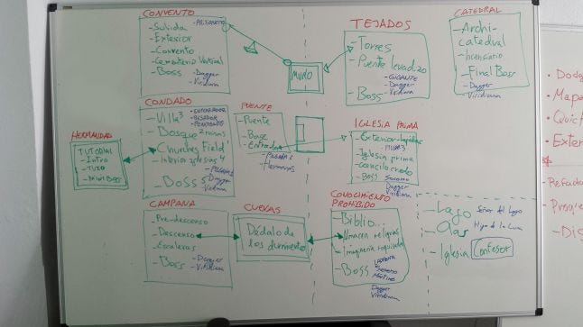
The studio put together a rough outline of this new map on a whiteboard using this different approach, and came up with the idea of splitting areas into three distinct categories: districts, zones, and scenes.

fig. 1
“The text that is in red (see fig.1), that’s what we called districts,” says Colinet. “So a district will contain several smaller areas called zones. The text in green are the zones, and inside the zones are all the scenes that compose it.”
The first district, for example, is composed of the villa, the forest (bosque), and the Cemetery of Churches (or Churches Field). Areas that were grouped together like this would have a strong similarity “thematically”, “artistically” and mechanically.
Though one unexpected challenge of adapting these techniques was connecting the areas in a way that felt believable. The game has a number of outdoor areas, which makes it hard to add new scenes on top of others without the composition of areas feeling slightly off. As a result, the studio developed an alternative map you can see in the game, which helps to put the world into its proper context.
“There is a map of Cvstodia that you see when you use any of the teleports,” says Colinet. “And that was our attempt to create a realistic arrangement of all the areas from 2D to 3D, so even if everything is connected in two-axis on the world map, we see it as an abstract representation. It doesn’t mean that things are on top of things, it’s just that they are connected from that place. For example, if you are climbing the mountains, it makes sense that those things are on top of all the areas.”
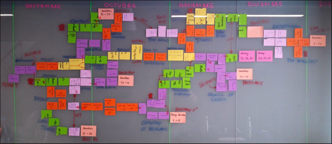
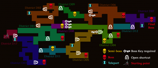
The developers created another mock-up of how the world would link together using recycled post-it notes to signify each zone, with colors representing the district (fig.2). This then acted as the basis for an illustration in photoshop (fig.3), demonstrating where the shortcuts would appear.
In Blasphemous, shortcuts can be unlocked using interactable items, with levers being the first of these objects that were added to the game. Players would be able to explore an area, come up against a locked gate, and then they could loop back around to the other side to open the shortcut.

fig. 2
“We knew we needed some levers,” states Colinet. “But I think that we overused it when we entered into production, because we didn’t have another element to interact with.”
One of the main concerns with using levers was that they could only be interacted with once and they took up a lot of room on the screen long after the player had any use for them. As a result, the team came up with another mechanism for unlocking shortcuts, a small glass case that players could smash with their sword to open pathways.
Reusable shortcuts, such as teleports and elevators, were also implemented too, connecting earlier districts like the village Albero to more challenging locations like the Convent of our Lady of the Charred Visage high above and Grievance Ascends towards the bottom. This meant players would not have to take lengthy detours through other districts every time they wanted to travel between areas. The influences behind this approach were FromSoftware’s 3D action-roleplaying game Dark Souls and the early God of War games.

fig. 3
“The inspiration that I took for [placing boss fights near shortcuts] was actually God of War, but the classic ones,” says Colinet. “Because in the classic ones, you maybe explore for fifty seconds [after completing a boss fight] and then you open a gate and you revisit an area that was at the beginning of the whole area, like ‘Oh wow, that’s the door.’ I wanted to have the same feeling. I want players to beat the boss and go straight to wherever they want to be.”
The problem with opening up the world for exploration was that Colinet and the team had to design the map with every kind of player in mind. From those who want to challenge themselves immediately to those who want to play at a more leisurely pace.
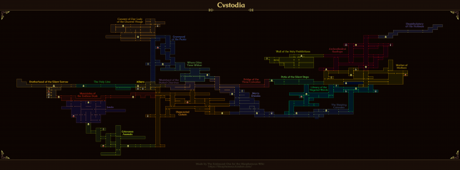
One trick they used was to keep the level design fairly linear to begin with (fig.4), to force players to get acquainted with the combat and platforming mechanics. It’s only when players cross the Wasteland of the Buried Churches that they are presented with their first real example of branching. Here they are offered three potential choices of where to go, with only two of them being valid. One leading to the difficult mountain area Where Olive Trees Wither and the other ending up in the far easier subterranean location known as Mercy Dreams.

fig. 4
Recently, for a patch, Colinet went back and modified the scene where this branch occurs, in order to try to tempt more players to go pick Mercy Dreams as their first port of call. This was a decision made based on feedback from those who had accidentally taken the harder pathway first and struggled. Whereas before there was a gap in this scene, Colinet changed it so that there is a much safer looking stepladder enticing players to below ground.
Colinet explains, “This is an open-world game, so they can go where they want. But I think if some players entered the mountain area first and found themselves struggling with the combat, it’s not good in terms of perception.”
This approach means that players can still opt into the more difficult experience first, but that they are less likely to make that decision on accident.
Blasphemous also contains some world guidelines to help to smooth out the experience. These range from the sizing and spacing of objects on screen to the placement of specific areas. For example, checkpoints (called Prie Dieu altars in the game) were placed so that there was roughly one per area and never more than seven screens apart. These altars operate much like bonfires in Dark Souls, replenishing the player’s healing items and updating their respawn point. Players can also find and open doors on the z-axis, but these locations will never lead to a new district, unless you fast travel inside one using a portal.
“Designing a non-linear map in the style of a Metroidvania game is like being the first person exploring it,” says Colinet. “You design routes that you think are optimal and shortcuts that you think are convenient but, as the time passes, you find out that not all explorers use the same tools or don't have the same conception of exploring that you had.”
He argues that failing was an important part of designing the map of Blasphemous and is gradually evolving Cystodia’s design as new players venture into its ominous lands.
As for his advice for those who want to follow in The Game Kitchen’s footsteps, he has this to say: “It's pretty hard to design a flawless world if you are unaware of what makes your world unpleasant for the players, so look for those answers as soon as possible and design your world expecting to fail. That's how it will embrace evolution [on] the way to perfection.”
You May Also Like