Trending
Opinion: How will Project 2025 impact game developers?
The Heritage Foundation's manifesto for the possible next administration could do great harm to many, including large portions of the game development community.

Featured Blog | This community-written post highlights the best of what the game industry has to offer. Read more like it on the Game Developer Blogs or learn how to Submit Your Own Blog Post
Sometimes you have to use text communicate in a video game, but players just skip it, right? Here's what you can do to get them to read...

This was originally posted on our website where we occasionally share what we've learned while making Cannon Brawl.
We started doing everything wrong when showing character dialogue and text to players in Cannon Brawl. People would often get confused by something that was explained in text they had skipped or ignored. We didn’t even have that much text in our game!
After a lot of playtesting and studying other games, here’s what I’ve learned about how to get people to read in your game. I hope to this can help you better communicate information to your players. Here we go:
1. If you can do it without text through either visuals or voice acting, try that first. Otherwise...
2. Everything must pause in the game when text is on the screen. Sounds obvious, but hey I messed this up the first time. People can only focus on one thing at a time.
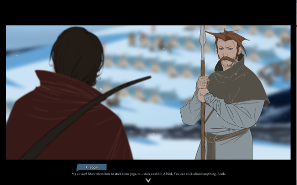
3. Try to minimize the amount the player’s eye must move around the screen to process what you’re showing. So, do not put more than 8-10 words on a line. If you have more words, drop them on to a second line. You know how the pages of novels are pretty narrow? That’s not only to help you hold the book, but also to help you eye easily move through the text. To better illustrate this, here’s an example from Banner Saga:

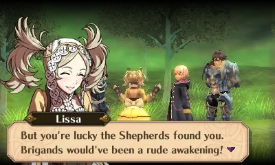
They have very long lines of text. My eye must travel pretty far from the characters faces to the text and pretty far to read the text itself. This makes it slower to read and harder to digest the story. In contrast, here’s an example from Fire Emblem Awakening:

They have short chunks of text (and it’s overlayed on top of who is actually talking). My eye barely has to move and my brain has to do little work to digest the text. This 8-10 word 2 line rule applies for all text in a game, item descriptions, mission briefing, etc - not just character dialogue.
To further drive this home, subtitled movies have the same issue as games (people must read and look at the visuals) and they too generally follow the 8-10 word rule.
Going further, I'd recommend that you don't show more than 2 lines at a time. If you have more than two lines, show them sequentially. Players quickly ignore walls of text, they are more likely to read it if it's presented in two lines at a time.
4. Show dialog text one word at a time, revealing the full block shown over about a full second. In our experience, revealing it word by word (but quickly) sparks a fraction of a second of intrigue from the player, and makes them more likely to read it. Of course, always allow them to reveal the full block with the press of a button immediately.
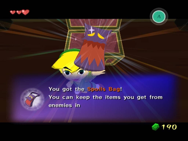
5. If you are trying to teach things in text (which we do in Cannon Brawl), color specific important words differently. Comprehension went up in playtests of Cannon Brawl after we started inline coloring words. Zelda games do this a lot, here's an example from Wind Waker:

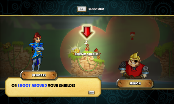
And finally, here's all those rules applied to our game Cannon Brawl. We're trying to communicate to the play that they could try shooting around a shield (instead of trying to pound through it). Before we applied all the rules, no one tried flanking shields. Afterwards, the majority of people try it:

Hopefully this helps you get text information across to your player more effectively! If you have any other tips, lets hear them in comments!
Read more about:
Featured BlogsYou May Also Like