Trending
Opinion: How will Project 2025 impact game developers?
The Heritage Foundation's manifesto for the possible next administration could do great harm to many, including large portions of the game development community.

Featured Blog | This community-written post highlights the best of what the game industry has to offer. Read more like it on the Game Developer Blogs or learn how to Submit Your Own Blog Post
Let's look at how certain parts of UI can keep players in the game, or fail to do so.

This is a repost from my personal blog.
UI in games has many functions and purposes. From just being something that draws players in because it’s usually the first thing they see, to providing the most comfortable means to do a particular action. One of pretty big functions UI can perform is retention. And I’m going to talk about why this is important on the example of the game AaaaAAAaaaAAA!!! for the Awesome.
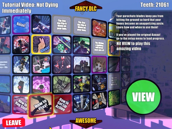
I really like AaaaAAAaaaAAA!!! It may not look like much, but it’s a very thrilling skydiving experience, and it’s skill-based – mastery is needed to acquire the most stars and the most points in the game. But despite the game being fun, it fails at a number of points that relate to UI and that would actually drive players to keep playing the game more. Let’s take a look at this screen:

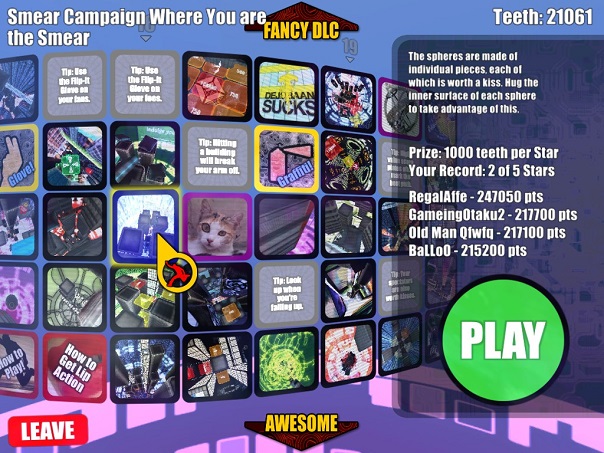
This is the level selection menu. Can you look at it and answer the following questions:
1. Which levels have I completed?
2. How many stars I’ve got on each level?
You can’t, because there’s absolutely no information regarding that. I need to point out that all levels are locked at the beginning and greyed out. Unlocking gives color to the selection. But after that there’s no visual indication of the level’s state. Because to answer the two questions above, you need to select the level itself.

One day as I was finishing up with levels from the game, I accidentally found out that there were levels I haven’t actually completed because I had 0 stars in them. The fact that you can’t answer the two above questions unless selecting a level is problematic for two reasons:
1. What gives the player the impression that he has completed the whole game is the fact of unlocking all levels. Not even completing them, just unlocking, as that’s what is easily visible on the selection screen.
2. Replayability suffers a lot. What usually happens in this kind of skill games is: player’s aren’t experienced, they get more skillful as they complete the game once, they pass through all levels, they see all places where they’ve performed badly previously and it gives the desire to improve the score now that they’re better at the game. AaaaAAAaaaAAA!!! doesn’t give a reason for that desire to appear. Mind you that there will still be players who have it, but a lot more people would start replaying levels if there had been this little nudge.
Also, very problematic is the fact that you see only top player scores for each level. Most players won’t ever reach it, so they have absolutely no interest in that information. They would have really big interest in comparing scores to their friends, but the game doesn’t provide any ability to do so. So the game doesn’t take advantages of competition between friends, which is another thing that can drive replayability and retention.

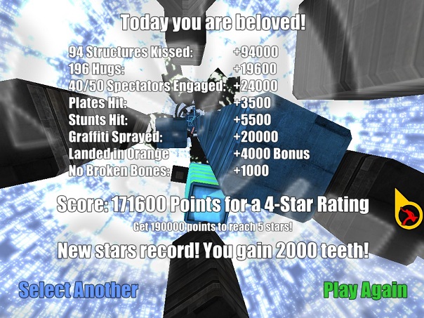
Now, let’s take a look at another important screen: the results after completing a level. In AaaaAAAaaaAAA!!! It’s also quite problematic. It’s just a boring list of stats. This screen doesn’t provide excitement for achieving a new record. It doesn’t provide excitement for achieving 4 stars. It’s actually quite hard to quickly see that information. And when there’s 1 star or 2 stars, it doesn’t provide reason to try and replay for a better score. And the animation of all these stats appearing is uninspiring as well, it’s just one line after another line in a quick succession, there’s no punch to successes and no sadness to possible failures.
All those things that I’ve listed might not seem like much, but they’re very important. Because at a certain point, people stop caring about this screen. I did. After a while it stops mattering to you what kind of information is shown there, you’re just gonna keep going to complete the game, not to replay or better your score or anything.
Look at the ending of a level in Rayman Legends (6:58 of the video) which is a very different kind of game and has only one parameter to worry about in terms of final score – the amount of lums, so scoring is very simplistic in comparison, but that is not the point.
Look at the animation, the sounds, that suspenseful feeling regarding will your points reach the next threshold or not, the party at the end due to a perfect score. All this transforms the fact of getting all lums into an enjoyable experience, which is why players would want to do this again and again. Even if after a while they usually speed up the animation, there’s still this sense of enjoying a little achievement that later is part of the reason that you get back to replay something.
Now, AaaaAAAaaaAAA!!! doesn’t need to replicate that exact style, of course. The point I’m trying to make is that its result screen is not providing enough sense of reward, and doesn’t encourage to get better results. While AaaaAAAaaaAAA!!! is still a fun game, it could be even more appealing for a bigger amount of people.
I hope these examples show how UI is important at providing more reasons to play and replay a game, and maybe even give some food for thought regarding improving that part of the experience in one of your projects.
Thank you all for reading. Feel free to leave any comments below. If you’d like to keep an eye on my future blog posts, feel free to follow me on Twitter
@farlander1991 :)
And if you’d like, consider supporting my work on Patreon! Thank you very much!
Read more about:
Featured BlogsYou May Also Like