Trending
Opinion: How will Project 2025 impact game developers?
The Heritage Foundation's manifesto for the possible next administration could do great harm to many, including large portions of the game development community.

Isles of Sea and Sky developer Jason Newman talks about how working within certain limitations helped spark creative ideas in puzzle crafting.

The IGF (Independent Games Festival) aims to encourage innovation in game development and to recognize independent game developers advancing the medium. Every year, Game Developer sits down with the finalists for the IGF ahead of GDC to explore the themes, design decisions, and tools behind each entry. Game Developer and GDC are sibling organizations under Informa Tech.
Isles of Sea and Sky is an open world of interconnected islands filled with puzzles players can tackle in whatever order they like.
Game Developer had a chat with Jason Newman, the game’s developer, to talk about how world mythologies and creation legends helped birth the game’s own wordless story, how limitations and strong thematic elements helped inspire creativity in the puzzle design, and making it all work with a simple control style that only required directional inputs.
Who are you, and what was your role in developing Isles of Sea and Sky?
My name is Jason Newman and I’m the developer of Isles of Sea and Sky. I did all the art, design, and programming for the game.
What's your background in making games?
I started making games as a kid for my friends. Craig Collver, who is the composer for Isles of Sea and Sky, Dan Collver my producer and Craig’s younger brother, and myself all grew up together across the street from each other. So, I used to make games for them. I remember making games using sidewalk chalk and also creating a sort of LARPing game based on Zelda games (we didn’t know what LARPing was back then). I also used to create campaigns for both D&D and Hero Quest, but it was a bit harder to convince the less nerdy kids to partake in those.
When my family got a computer, one of my first games was Command & Conquer: Red Alert. I learned you could mess with the game files. You could do crazy things like create a tank that shot attack dogs, that was my first taste of game modding and I was absolutely hooked. After that I got into RPG Maker, the Warcraft 3 World Editor, and GameMaker.
Of course, I’ve had countless hobby projects that I gave up on over the years, or small games that I never really tried to put out there. I’ve done a few game jams and I have a small puzzle game on Steam called Triga. But Isles of Sea and Sky is my first big commercial project.

Images via Cicada Games and Gamera Games
How did you come up with the concept for Isles of Sea and Sky?
It was definitely something that grew organically over time and many iterations. It started out as a Chip’s Challenge clone, but over time it changed drastically. Early on, I had this idea that puzzle rooms would be interconnected by an overworld to create a more free-flowing puzzle game. And then one day I thought “You know what’s cool as hell? Islands.” So, then the game was on an island with interconnected rooms. After that I was thinking about the art style, and eventually I landed on something very much inspired by the Game Boy Color Zelda games. I felt it was a unique art style that could catch people’s eye, as well as a style that I still feel is criminally underutilized.
Eventually I started thinking about a story and the concept exploded from there. I wanted to create a very primordial story that could appeal to almost anyone without text, so I started looking into mythology and creation stories. It was astounding how many cultures and people all over the world, and throughout time, even with little or no contact with each other, had very similar ideas, stories, and character archetypes. That was something that spoke very deeply to me that I wanted to capture.
What development tools were used to build your game?
I’m using GameMaker, and even the horribly janky built-in sprite editor because I’ve been using GameMaker for so long that I’ve become very accustomed to it (But I am praying they will update that tool soon). Aside from that, pretty much just GitHub for version control.
Isles of Sea and Sky is filled with block-pushing puzzles. Can you tell us about your process in creating so many different twists on that style of puzzle? How you created new variants that would continually stump and delight players?
That’s an excellent question! The variety of mechanics and number of twists on the basic concept are something I’m very proud of.
First, I’ve learned something about myself while working on this game over the past few years: My motivation for creating games is to see the joy people get from playing them (Recorded playthroughs with player commentary and watching streamer playthroughs is a huge part of my design process). So, to see how people respond to those pleasant surprises and little twists is absolutely delightful and something that keeps me going. I think that motivation helps me try to keep the game interesting and full of new experiences so that I can see people’s wonderful reactions [laughs].
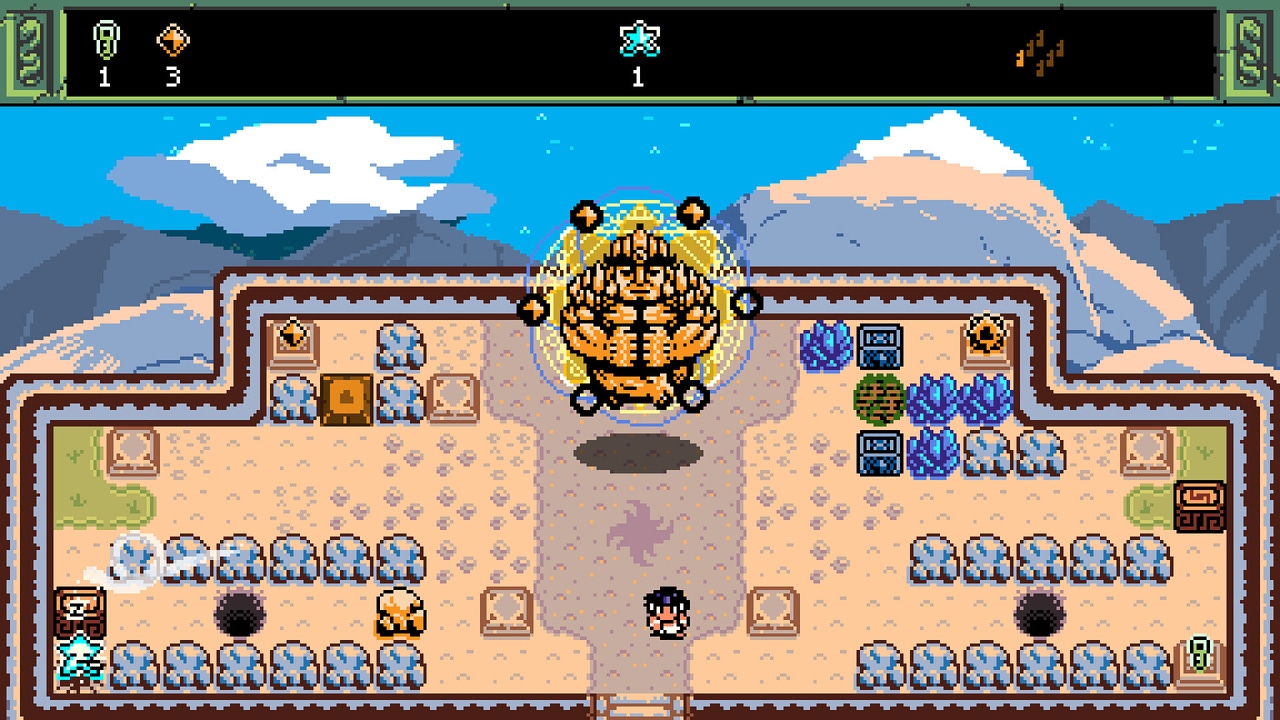
Second, I really leaned into the theme in order to inform the design. It may sound obvious, but the reality is that many traditional puzzle games are abstracted and have many elements that don’t represent anything in the real world. So, for instance, there are four main islands themed around the classic four elements (earth, water, fire, air), and each island introduces a block with mechanics inspired by that theme. Having that limited canvas of sticking to a strong theme helped me narrow down ideas for mechanics that felt natural and intuitive, but also spawned much more imaginative ideas.
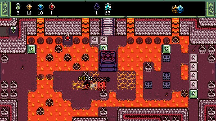
It also helps determine what makes sense for interactions between puzzle elements. The puzzle objects in the game usually have many properties from subtle details like the stone block being nearly indestructible, to much more grand mechanics like the metal blocks in the Volcano area which can accumulate heat and then explode like a bomb. When you start stacking those thematic details and interactions from all the various objects in the game, the puzzle design space becomes rife with interesting opportunities to create those wonderful “Eureka moments” that are so important in a good puzzle game.
The game features a straightforward control scheme through directional movement. How did this limited movement style affect the kinds of puzzles you could make? How did this limitation inspire creativity in the puzzles you made?
Yet another great question! A limited canvas was something I was interested in throughout the game, from the art style, the size of the rooms, to the genre itself, and obviously the controls. I’ve always felt that a limited canvas is key to spark incredible ideas. At least that’s what has worked for me.
A quick bit background about the controls: One of the reasons I was inspired to have directional movement only was that one of my favorite games of all time, EarthBound, was playable with one hand. I don’t know why, but I just loved that detail. I also hoped that the simplicity of the controls could attract a wide audience as well as acting as an accessibility feature.
Anyway, the choice to have directional controls only has massively impacted the design! It’s definitely one of the biggest influences on innovation in the game. I struggled earlier on in development, battling myself against the urge to add even a single in-game button press (there is a confirm and cancel button for menus, but no buttons for in-game interactions). The result is that the player’s interface with the game is the simplest possible: all they need do is push into things to see what they do. The player is free to focus completely with their own brain power and puzzle solving skills. The game still provides items and powers that allow players to do new and interesting things, though, like interacting with new objects that change the puzzle landscape and exploring new areas filled with more mysteries, but all while preserving the most basic and simple interaction: Pushing. Making that work resulted in some very interesting mechanics.

Images via Cicada Games and Gamera Games
Isles of Sea and Sky is filled with many puzzles, but if you feel stuck, you can set off somewhere else in the world and just come back later. What challenges did you face in creating a non-linear puzzle game? In creating a game where you didn't carefully dole out the puzzles in a specific order of difficulty?
Some difficulties were in teaching players new concepts, creating a logical and satisfying flow to the game, and the requirement for extensive testing and refinement.
In order to teach players new concepts, I blocked off progress to new areas that require a basic understanding of the new mechanic and the player has to learn and utilize the new mechanic in order to progress. For example, in order for the player to enter the stone island, they must first push a stone block through a crystal that is blocking their path. This way, I’m doing my best to introduce them to the mechanic, but to further drive it home after they get past that initial “tutorial”, I try to follow “the rule of three.” I try to have at least two more opportunities for the player to use the basic mechanic again, sometimes with some variation that can expand their understanding of it.
Creating a good flow of progress was tricky and required a lot of testing (see below), but basically I provided a fairly straightforward path to the end of the game which is hopefully challenging but achievable for more casual players while also providing lots of gated off areas that require some real gumption and elbow grease to open up [laughs]. These areas are full of much more difficult challenges and interesting content for explorers, completionists, and big-brained puzzle masters.
One of the most important aspects for creating a non-linear puzzle game was extensive testing by way of recorded playthroughs with player commentary. In order to make the game understandable and smooth for as many people as possible, I needed to see how different people interacted with it, interpreted it, and where the most common pain points were.
You mention that this game is approachable and satisfying for players of various puzzle-solving skill levels. How do you design puzzles that will satisfy newcomers as well as people who are very good at these kinds of games? How do you appeal to both?
There are two important factors for achieving this. The first is the idea that “interesting puzzles are better than hard puzzles.” Even if a puzzle is easy, it can still be satisfying and enjoyable, or even have a delightful eureka moment, which I think puzzle veterans actually greatly appreciate. The second factor is providing a straightforward path to the end of the game as mentioned in the previous answer, which is hopefully achievable for casual players, and then also providing much more difficult and hard-to-unlock content for players that like to explore or want a greater challenge. So, the open world puzzle concept combined with some gating and road signs for more casual players allows for a fantastically flexible experience.
You also mention that puzzles can subvert expectations with some solutions that will require players to think creatively. Can you tell us how you designed the puzzles with that desire in mind? Can you walk us through the design of one such puzzle that you're particularly proud of?
When designing a puzzle, usually I’ll have an idea of the intended difficulty, some rewards for the puzzle in mind (the player’s end goal), and some key objects I want to utilize. From there it becomes apparent how obscure the “Ah-ha” moment or twist should be; maybe there will even be multiple twists for an even more challenging puzzle. The game also features multi-stage puzzles with a basic reward, and additional parts with more obscure twists that must be solved in order to get further rewards. I think those twists are the most important parts of a puzzle, so I’ll focus on them first and build from there.
I should interject here that I think a common misconception is that more challenging puzzles equate to more moves, but in reality this is simply adding tedium to something that probably isn’t that hard to figure out to begin with. So, the key here is the obscurity mentioned above. I always try to avoid situations in which a player KNOWS exactly what to do, but lets out a groan of misery because they realize they have to go through a bunch of annoying steps to get there. Once a player has that ah-ha moment, I want the puzzle to be easy enough to get through.
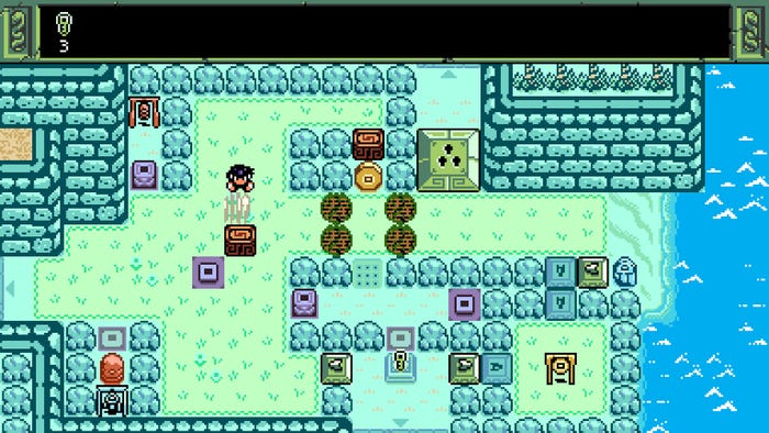
A very basic example is the portal puzzle on the first island in the game. The player is being introduced to a portal for the first time. They walk into it and teleport up to a higher area. The goal of the puzzle is to get a wooden block onto a pressure plate which will allow the player to grab a key. Everything is set up to entice the player into trying to simply push the block towards the button, but they quickly discover it is impossible based on the layout of certain obstacles. So, the player must then make a logical leap: “Can I push a block through a portal?” Sure enough, you can, and that is the key to solving the puzzle.
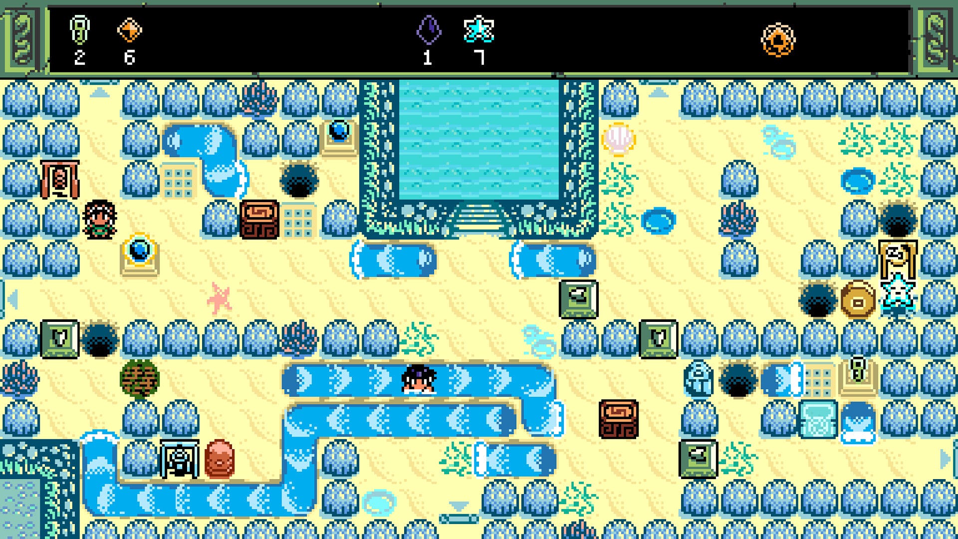
A more complex example (and one I’m particularly proud of) is an extremely tiny puzzle on the “Tidal Reef” island. It’s no more than a 3 by 5 tile area. It’s completely unassuming, yet quite the stumper. At first it even seems like a nonsense collection of objects (That’s something I love to do in the Metroidvania style—to show the player something that just seems bizarre and pointless, but once they gain a new power or perspective, they can come back and view it in a totally new way).
Ok back to the puzzle [laughs]. It’s a bit hard to explain for folks that have not played the game, but essentially the player has to realize that they can copy a block with a water elemental, reposition the original block, and then send the new wooden block through a river which causes it to smash through the original, freeing the path to an item. At first it just seems like such a bizarre layout that does absolutely nothing, and it’s so tiny, yet it’s pretty packed with interesting interactions that must be pieced together in an imaginative way on the player’s part.

Images via Cicada Games and Gamera Games
Many of your puzzles communicate the means to solve them through their visuals. How do you teach the player about your various puzzle-solving techniques and puzzling demands purely through the visuals of the elements they'll work with?
Since the game is very low-res pixel art, visual communication is a huge challenge. On one hand, for players like myself who grew up playing games from the NES, SNES, etc. eras, the visual style should be like riding a bike: Retro games have established a universal visual language that many gamers understand intuitively. So, for that player group, the classic vibe does a lot of heavy lifting. However, since I want to appeal to a larger audience, I try to shore everything up with multiple layers of feedback (to the player) in the form of multiple visual indicators, audio, and other effects. It’s also important that the player has the freedom to experiment safely. Finally, I try to set up a strong developer-player trust relationship (i.e. when the player feels “tricked,” it is not a bad feeling where I did them dirty by pulling the rug out from under them).
So, for players in the latter group who didn’t grow up with retro games, they don’t have to immediately grasp everything they are seeing. Through a freedom of experimentation and interaction they will quickly learn how things work—maybe even create their own interpretations of the objects on screen—but most importantly they will learn the language of the game fairly quickly because it is well-enforced, communicated in multiple ways, and consistent.
Likewise, you use visual effects to make solving these puzzles feel really satisfying. What thoughts went into creating these impressive effects within the art style? How do you make solving a puzzle feel good through the visuals alone?
I don’t know where this need comes from within myself, but yeah, I am constantly thinking “How could this feel better?” Sometimes it’s to the point where I have to tell myself to stop tinkering with some minor detail and just move on. I think if you play a lot of indie games and old games that have some funny idiosyncrasies, you will at some point experience some very “flat” games with little or no “juice.” I feel the player is very tenuously tethered to your game through whatever input device they are using, so there is a need to have a lot of Oomph to the feedback they receive for their actions to feel satisfying and keep them engrossed.
But, as you mention, it’s got to fit the art style to feel right. The process for achieving this in Isles of Sea and Sky has definitely been one of repeated iterations, and sometimes even scrapping things completely and starting over again or going back and forth trying to figure out which version of something felt the best [laughs]. I mentioned before that watching playthroughs is key for me, so keeping an eye out for any confusion caused by my in-game feedback to the player is also really important. Trying to create satisfying and informative feedback to the player has been a very organic process of iteration and sticking to the notions of good game feel that I described above.
You also communicate a great deal of story and create friendships throughout the game without saying a word. What ideas went into infusing the world with a story without saying anything? Through use of puzzles and visuals?
I wanted to have a story that was open to interpretation, and also hopefully understandable across language barriers. Additionally, the story is from the perspective of the main character who is exploring and experiencing new things without necessarily knowing what to make of it all. I wanted the player to share in that perspective. I’ve also been heavily influenced by some fantastic games without in-game text or dialogue like Super Metroid, Another World / Out of This World, and Seiklus. It’s super impressive how games like these can really spark the imagination and actually end up feeling more engrossing without text.
As far as player discovery through their own actions and puzzle solving, one of the most powerful things I’ve found about the idea of “show don't tell,” is that players feel like the discovery belongs to them because they earned it. Rather than reading through a wall of text to gain new information, the player realized something on their own and it seems to make those instances more memorable and enjoyable experiences, making the information much easier to recall.
You May Also Like