Trending
Opinion: How will Project 2025 impact game developers?
The Heritage Foundation's manifesto for the possible next administration could do great harm to many, including large portions of the game development community.

Featured Blog | This community-written post highlights the best of what the game industry has to offer. Read more like it on the Game Developer Blogs or learn how to Submit Your Own Blog Post
Leap Motion Engineer and UX Researcher, Daniel Plemmons, shares common challenges and pitfalls facing creators of motion controlled games; and offers insights as to how to avoid and mitigate them to create magical motion controlled experiences.

Leap Motion Engineer and UX Researcher, Daniel Plemmons, shares common challenges and pitfalls facing creators of motion controlled games; and offers insights as to how to avoid and mitigate them to create magical motion controlled experiences.
Input is a fundamental part of the gaming experience, and we live in exciting times. Every week, it seems there’s a cool new natural interface startup or Kickstarter, and our choices about interaction aesthetics now begin with the crucial choice of input hardware. We live in the age of the Oculus Rift, the Myo, the Leap Motion Controller, Project Morpheus, the Kinect, PS-Move, the WiiMote, Sifteo Cubes, Omni-Treadmills, webcam computer vision, accelerometer and gyroscope-enabled mobile phones, and the Razor Hydra. Not to mention the scores of custom installations like the ones we saw at this year’s alt.ctrl.gdc show.

The Leap Motion Controller at work. Detailed, real-time hand tracking.
The qualities and limitations of any individual input device shape the mechanics we design and the psychology of our players. The resulting interaction aesthetics have a significant impact on our play experiences. Historically, there has been a relatively limited number of reasonable input device options. For most developers, the toolbox included a keyboard and mouse, a gamepad, and maybe a joystick or racing wheel. There’s been no lack of variety created with these traditional input devices, but the recent explosion of new input and output technologies has opened up a lot of new design opportunities and challenges.
One of the essential features of motion control is its power to change the player’s mindset. When our bodies are involved in the play experience, we become part of the game, along with the space around us. How this manifests depends on the interaction aesthetics you choose to build. When I play Johann Sebastian Joust with a set of Playstation Move controllers, one of the coolest moments is when someone finds a creative way to use the world or the objects around the playspace to their momentary advantage. When I play Dance Central on my Kinect, I feel a sense of presence in my experience and am energized by the full-body interactions of the game. There’s also a performative aspect to the game – in my case, mostly making myself look very silly. When I play Dropchord with my Leap Motion Controller, I’m focused on the minutiae of how I move, aware of each motion and the paths my hands take to reach each location, lending the experience a sense of flow.

Die Gute Fabrik’s JS Joust engages players’ bodies and the playspace
With all these new options, it’s easy to get excited about motion controls. It’s even easier to be blinded by their novelty and miss out on creating a great experience. If you’d like to take the plunge into motion control design, there are some common pitfalls, that if you work to avoid, your life will be far easier. In return for new opportunities for motion control, we cast off 40+ years of games and interfaces designed for keyboards and buttons and mice. Discrete, binary input systems. Designers working with NUI input devices must work in a very different headspace.
I often meet enthusiastic developers who’d like to add motion control to just about everything. I love and share their passion, but it’s a double-edged sword. Not every concept is a good candidate for motion control. Designers must consider the mechanics and interaction aesthetics they’re looking to create, and weigh them against the strengths and weaknesses of their chosen input device.
If you’re selecting between in-air motion controls or a handheld device, consider the following. Players have a very high expectation of binary input. If a discrete action only works 90–95% of the time, players are going to be very frustrated. Devices like the Playstation Move and Razor Hydra solve this problem by placing physical buttons on the controllers you hold in your hands. Developers using in-air controllers like the Leap Motion Controller or Kinect don’t have that luxury. Instead, they trade binary interactions for many more dimensions of rich analog data, allowing them to map gameplay and feedback to a wide variety of variables – like the relative angles of joints, the directions of individual fingers, and the rotation and velocity of the user’s palm. This flexibility lends itself to creating rich interactions that would otherwise be impossible. Consider these tradeoffs carefully when selecting your inputs and your mechanics; and consider them a guide when designing the rest of your game experience.
In a similar vein, bad UI can quickly hamstring a title. At Leap Motion, many of our own early internal prototypes and applications struggled with this.
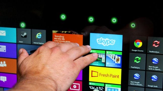
Touchless enables some very cool interactions, but suffers from an underwhelming UI.
Mechanics we’re used to supporting with the myriad of buttons, analog sticks, and knobs at our disposal are suddenly difficult to map onto the organic analog data that motion control presents. When considering motion controls, make sure to understand how players will interact with game options and menus, how they’ll pause your game, and how they’ll switch weapons or tools. It’s important to not overly pack the input space, especially with in-air motion controllers where gesture detection can be varied and fuzzy. As gestures and inputs become increasingly similar, the odds that a player will be confused, unable to remember an input, or for the game to register false positive and false negative responses increase. Good design will stem from deliberate planning and mapping of controls. A game’s menus don’t always have to be mapped to the primary motion controls either.
Many of the UI and mechanic challenges described above can be alleviated by smart use of multi-modal input – multiple input devices creating a single experience. By mixing and matching input devices, designers can negate many of the limitations of each individual device. For instance, Double Fine Productions’ Leap Motion title Autonomous uses traditional WASD controls for moving the player, while using gestural input for look, weapons, and other ‘analog’ actions.
The challenge with multimodal input is in the transition between modalities. If a player’s hands are busy interacting in the air, it may be frustrating to lower them to a keyboard. By the same token, the game must not register this lowering of the hand as its own input. Autonomous solves this by dedicating each hand to a single input device, but this is certainly not the only design pattern available.
Once you’ve settled on a concept and input device, the core input needs to play well before additional art and mechanics are layered on. Too many motion control games get mired in production before finding the fun in their input. A game’s design and assets often become solidified too early and the changes needed to make their motion controls work aren’t realistic later in production. Plan for extensive prototyping time early in development. As a game’s input changes, the mechanics, visual feedback, or even a game’s entire visual style will need to adapt.
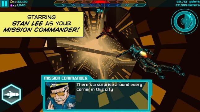
The core flight mechanics of Verticus lent themselves well to motion control.
This also highlights the dangers of porting a game to a motion-controlled platform. Unless a game strongly lends itself mechanically to motion controls, porting it will be incredibly difficult. Even games that are good fits for motion control often have to significantly redesign their UIs and menus to support a good motion control experience. When embarking on a port, be prepared to rebuild a lot of UI to support your chosen input device.
Motion control games will be played by many players who have never used the particular input device before and may not have a clear idea what it does or how it works. In addition to training users on how to use the game, a small part of the experience should be dedicated to familiarizing players with the new input device.
Patrick Hackett (@playmorevgames) and Drew Skillman (@dskillsaw) from Double Fine describe this in their Gamasutra article all about developing their first Leap Motion Controller title, Dropchord:
"...as new technology emerges and we create the initial wave of applications, it’s important to clear the cache and re-think how the first consumers are going to approach the product."
“To familiarize players with the ideal locations of their hands, the initial screen requires the player to line up and hold their fingers over spinning circles. When done correctly, there is audible and visual feedback and the game beam slowly forms.”
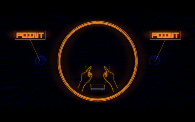
Dropchord’s start screen focuses on teaching how to use the input device
Dropchord uses its start screen, complete with dynamic audio and visual feedback, to teach players how to use the device. The message is clear and simple for new players, while expert players can move past the screen quickly and are treated to beautiful audio and visual effects along the way.
Designing for traditional input devices, we’re used to binary states: hovering or not; touching or not; mouseDown, or not. With motion control platforms, the experience is defined less by individual states, and more by transitions between those states. To account for this, designers must reconsider the structure of their visual and auditory feedback. Just as our controls use motion, so must our feedback. I’ve found myself referring to this as “dynamic feedback,” but I’ve also heard “motive feedback” or “analog feedback.”
As the player moves their body in the scene, the application should constantly respond to their motions; communicating what the interface cares about at any one time. This is in contrast to most traditional desktop and mobile design, where the interface only changes when the user directly interacts with the game. The nearest design analog on desktop is hover effects on buttons. It may help to think of dynamic feedback as “super hover.”
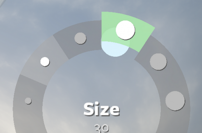
The menus in Leap Motion’s application Freeform use constant dynamic feedback to aid usability.
In our prototyping and user research at Leap Motion, we’ve found the addition of bold, clear dynamic feedback drastically improves users’ experiences. While developing one of the early Leap Motion applications, Freeform, our design team ran through a rigorous process of prototyping and iteration to develop the UI interactions for the app. In doing so, we developed a set of very successful design patterns and resources for the wider development community. You can find a more detailed discussion of our process and dynamic feedback in Freeform’s UI design in our post on the Leap Motion blog.
While motion controls allow for a high degree of freedom and nuance, they lack many of the traditional signals and feedback we’re used to from our hardware input devices. For example, let's compare and contrast the physical and mental processes that take place selecting a button on a web page, with a mouse and with the Leap Motion Controller.
(1) First, you put your hand on the mouse. You can feel it and you know the mouse can “detect” your input (tactile feedback). You’ve declared your intent to interact with the computer. You move the mouse along the table. It takes a moment for you to find your cursor on the screen, but as long as that cursor moves when you move the mouse (visual feedback), you know the mouse is working.
Touch, sight, and proprioception all combine to let you move your mouse pointer quickly and easily.
(2) You move your cursor towards the button. The feeling of resistance from the table and your sense of proprioception (where the parts of your body lie in relation to each other) tell you how far you’ve moved your arm. The cursor on the screen simply confirms your expectations. As the cursor nears your target, your eyes focus on it, letting you correct your exact position. You’re not thinking about it, but you’re constantly making tiny corrections as you move.
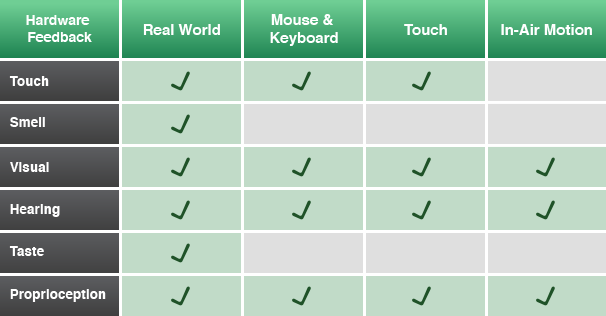
The various feedback vectors available per platform
(3) Your cursor crosses the boundary of the button, and it highlights (visual feedback).
(4) Your index finger presses down on the left mouse button (or left side of the mouse if you’re on a Mac). You feel the resistance of the button and then the reassuring pop as you exert enough force to depress it (tactile feedback). You also hear the ubiquitous “click” sound we’re all used to (hardware auditory feedback). You’ve used this so much you know this means the computer has registered your input. On the screen, the button confirms your input by changing color and/or shading.
Additional visual feedback communicates the system state.
(5) Within milliseconds, your finger releases its pressure on the button, you feel another “pop,” and you hear the second half of the anticipated “click.” The main content area of the webpage flashes white, the button you just pressed transitions from a light background to a dark one, and a small spinner appears next to the name of the browser tab. All this confirms that your input was registered by the website, and it is in fact navigating.
We experience this loop thousands of times per day as we “pick and click” our way through modern desktop interfaces. It takes a 10th of a second, but each piece of feedback is key to the efficient use of the mouse. When a piece of feedback returns an unexpected result, it tells us immediately what’s wrong. Is your cursor not moving? Your mouse must be disconnected, or the computer is locked up. Didn’t feel the button press? You’ve got a broken mouse. Did the button not highlight? It’s probably disabled.
Notice how much of this loop is tactile and auditory. When you’re designing for motion control, your interface must make up for these missing links in the feedback chain. We’re subconsciously aware of a lot of information about the state of our hardware, and the application we control with it. If we’re denied this by a lack of foundational feedback, we conclude an interface is unresponsive, dodgy, confusing, or broken.
Now let’s take the common motion control version of these events – moving to an item and selecting it. Many applications today like Photo Explore, Touchless, and Verticus use an in-air “screen tap” gesture for selection. They use a cursor with dynamic feedback to show the user when they’ve made a “click”. As you read this, it’s worth noting that between touch, sight, and hearing, sight is the slowest responding of our senses.
(1) You start by placing your hand in the area you expect the sensor to detect you and point with your index finger. Assuming you’re in the right area, a cursor appears on the screen. Just like the mouse, you may take a moment to find it (visual feedback).
(2) You move the cursor towards the button. You’re relying on your sense of proprioception and watching the cursor to see when its in the right place. Each motion control application you’re using has slightly different calibration, so it’s difficult to get a reliable sense of motion.
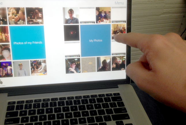
With in-air gestures you rely on sight and proprioception to help guide and steady your hand.
(3) As your cursor crosses the boundary of the button, it highlights – telling you it’s an active interface element. You hold your hand steady in the air over the button. It’s relatively large, so it’s not too hard.
(4) You push your finger forward, watching the cursor to make sure you keep your finger steady pointing at the right item, making small adjustments as you push forward. As you move forward, an inner circle on the cursor grows to meet the outer circle, signalling a “click” (visual feedback).
Dynamic on-screen feedback is critical to communicating system state.
(5) When the two circles meet, the main content area of the webpage flashes white, the button you just pressed transitions from a light background to a dark one, and a small spinner appears next to the name of the browser tab (visual feedback). Again, this confirms that your input was properly registered. You drop your hand, relaxing the joints.
This flow seems quite useable, but challenges crop up when something along the line doesn’t work properly. What if you don’t see your cursor? Is your hand simply too low or is it too far to the right or is the device not working? What if when you push your finger in to “click” and the click doesn’t happen? Are you performing the gesture wrong? If so, how? What if the website doesn’t take the click? Are you gesturing wrong or is the site at fault? Does this website even support this motion tracker?
It’s up to the developers of motion control software to provide users with the answers to these questions. This is where constant dynamic feedback can be a very useful tool. Don’t underestimate the value of good audible feedback either. “Pops” and “clicks” can lend a sense of physicality and don’t require your player to be focused on any individual on-screen element to be useful.
Uncharted Territory
Working with emerging technologies can be risky, difficult, and rewarding. A lot of times it feels like stumbling in the dark, but each step forward defines the fundamental methods and best practices for interacting with games and media in the modern age. There’s an opportunity to build experiences no one has before. It takes a lot of prototyping, experimentation, and iteration; which as game developers we’re intimately familiar with. With games as a sandbox for experimentation, we’re well-positioned to push this medium forward in new and innovative ways.
I’m very excited about this modern explosion of motion controllers, and I hope you’ll be a part of the journey to explore this growing design space.
Much thanks to @pohungchen, @alexcolgan, @binxed, @katescarmitch, @plainspace, @cabbibo, et. al. for their input, editing, and design work that led to many of the learnings in this article.
Read more about:
Featured BlogsYou May Also Like