Trending
Opinion: How will Project 2025 impact game developers?
The Heritage Foundation's manifesto for the possible next administration could do great harm to many, including large portions of the game development community.

Featured Blog | This community-written post highlights the best of what the game industry has to offer. Read more like it on the Game Developer Blogs or learn how to Submit Your Own Blog Post
When working on a game involving a lot of jumping and platforming, it's important for players to be able to form an intuitive sense of the avatar's jump height and distance. This article shows how this is being handled in upcoming platformer Suzy Cube.

I hate ambiguous jumps in games! If your game involves jumping, then you owe it to your player to make sure it's easy to get a feel for what heights and gaps can be traversed. And as a designer, all it takes is a little measuring up!
Some games, like Super Mario or Suzy Cube make liberal use of very blocky level objects making it quite easy to measure the heights and distances of features. Other games, like the latest crop of Rayman platformers, have levels made up of much more organic looking elements. This, however doesn't mean they take the precise placement of platforms and obstacles any less seriously and neither should you!
Jump ambiguity happens when your player has a tough time judging whether or not a jump can be achieved successfully. This can lead to situations where the player feels cheated because of a fatal fall between a gap that seemed small enough to jump across or by wasting time trying to jump up to a spot that seems just barely within reach.
In Suzy Cube, I decided to solve the problem quite simply. I made Suzy jump 2.5 times the height of the smallest level feature. In practical terms, this means that I've imposed upon myself the restriction of never making important level features less that 2 cubic units in size. And Suzy, she can jump a maximum of 5 units.

Suzy can jump up to 5 units high
In the image above we see that by jumping 5 units high, she can clearly make the jump onto the two stacked boxes on the left, while clearly not making the jump onto the three stacked boxes on the right.


Clear jump VS ambiguous jump
In these examples, we see how her jump height of 5 units allows her to come down on top of the 4 unit stack on the left but just barely make the jump onto the 5 unit stack the right. The jump on the right just doesn't look or feel as good. The landing is abrupt and the jump lacks an arc. The jump on the left, on the other hand allows Suzy to get a little hang time before coming down onto the platform. It's clearer, looks better and feels better too.
By not bothering to measure precisely, a level designer can inadvertently end up creating situations where one obstacle is barely low enough to jump onto while another is just barely too high. The heights of these two obstacles will, likely, be indistinguishable to the player, leading to confusion and frustration.
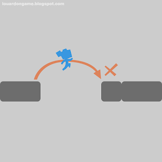
The same is true of jump distances, of course!

It's best to know
Based on Suzy's maximum jump distance, the top gap can unambiguously be jumped across while the bottom gap is clearly too wide. This is perfect since a player who, say, dies after attempting to jump the second gap should, hopefully, learn fairly quickly that it's just too far to jump.

Unclear distance
This situation, on the other hand is no good! Sure the player can clear the gap, but it lies at the exact maximum distance of the player's jump, meaning that only a pixel perfect, edge of the platform jump will make it across. This is a recipe for frustration!

Jump distance comparison
Just like jump height, make sure your gaps are unambiguously wide or narrow. Distancing platforms with no regard for measurements can lead to those same frustrating situations where players may continually attempt to jump over a gap that can't be cleared or worse, getting across a gap you hadn't intended them to!
So, pick a minimum feature size and stick to it. For Suzy Cube, 2 units made sense as that's roughly Suzy's height, making it fairly obvious whether or not she can jump onto something as her feet either go half a block over the obstacle or it comes up to her waist. Either way, there's no mistake.

Too high and just right!
In practice, you can see that 6 units is just too high for her to reach but 4 units is obviously low enough to jump onto. If there's ever a situation where a jump height of 5 units exists in the game, well, I've messed something up somewhere!
Paying attention to this sort of stuff may seem overly fussy to some, but it's this kind of clear and consistent messaging that will lead your players to internalize the rules and mechanisms of your game. And, in a platform game, what's more fundamental than mastering jumping?
Have any thoughts? Want to share stories of frustrating ambiguous jumps in games you've played? Share them in the comments!
Read more about:
Featured BlogsYou May Also Like