Trending
Opinion: How will Project 2025 impact game developers?
The Heritage Foundation's manifesto for the possible next administration could do great harm to many, including large portions of the game development community.

Featured Blog | This community-written post highlights the best of what the game industry has to offer. Read more like it on the Game Developer Blogs or learn how to Submit Your Own Blog Post
Level Design breakdown of one of the most iconic levels of The Witcher 3: Wild Hunt, Oxenfurt. Methods and production processes for recreating a level inside UE4.

The Witcher 3: Wild Hunt, developed by CD Projekt Red, was an experience that left a mark and one of the games that I hold most dear, re-creating the level of Oxenfurt is my personal love letter to this game. The making of this project was a real challenge in terms of analyzing the design as well as the production itself, but this endeavor pushed me forward in order to achieve a result of which I’m really proud of, I hope to have done justice to the amazing work done by the CD Projekt Red team!
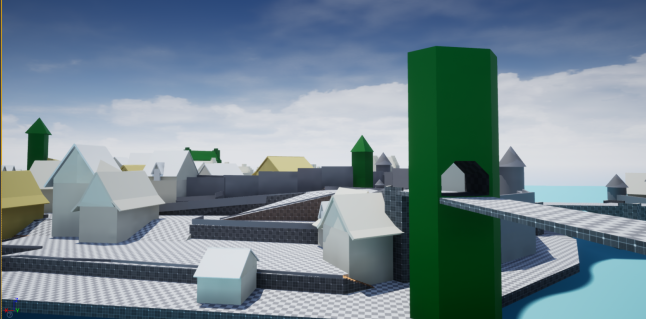
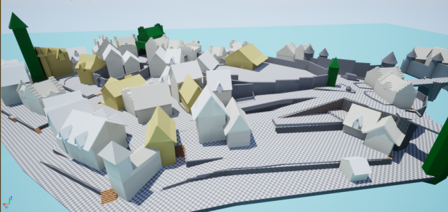
This is an analysis and adaptation of the city of Oxenfurt from The Witcher 3: Wild Hunt. I will mostly talk about the production process, from analyzing the level in-game in order to establish some metrics of reference, to working inside UE4 and creating a blockout of the level. You can check out this video for the complete overview of the greybox!
Establishing Layout & Metrics
If we take a look at the Oxenfurt level, the first thing that meets the eye it’s the city structure and its complex subdivision of each area inside it. Having acknowledged these factors helped me to better understand on how to proceed with my work, and take a step back. So, before even putting down on paper some sketches of the layout, I decided to spend some more time analyzing the level in-game trying to understand more about its structure and composition. Spending this extra time was extremely useful, not only because it gave me more insight about the topography of the level layout and it’s verticality (Which we’ll talk more about it later), but also it made me appreciate more the key role of composition and the great use of landmarks and points of interest.
 Still, I was having a really hard time figuring out the overall metrics of the spaces inside the level, before even opening the Unreal 4 editor and iterate with the BSP, I needed to be sure to have a strong foundation to build upon. For these reasons, creating a metric library was my first course of action. Geralt, the main character, was my point of reference for the entirety of this process, I used different techniques for taking measurements in-game;
Slowing down Geralt's walk: The standard movement was too fast for taking any measurement, in The Witcher 3 with just the press of a button you can make the character walk slowly, this allowed me to standardize my process: 1 step = 1 meter. This method allowed me to take metrics data for the length and width of; Roads, Building, Stairs and Props.
Converting time in meters: When re-creating a level from another game, you always have to keep into consideration some margin of error, things will not be exactly as you would find them in the actual game. This is usually seen as something negative since it feels like you won’t have complete control over your work, but I actually think is a great element of strength, because it allows for more flexibility especially when it comes to metrics. And so the second method I used to gain measurements was basically timing the distances between the spaces that I needed and then converting these distances in meters.
These two methods allowed me more flexibility in calculating each space and were the overall foundation of my production process.
Managing Spaces & Verticality
I can easily say that the biggest challenge for this project was managing verticality. In level design, vertical spaces give another layer of depth to your design and really make the difference in creating a compelling space. In the Oxenfurt level though, verticality was everywhere, the entire Island was designed based on this principle, giving a great sense of wonder to the player. For the same reason, analyzing and managing each vertical area was a big challenge, one that I was eager to accomplish.
 As you can see from this screenshot, the level starts really high, where the main access point is accessible only by a bridge. The level develops downhill, gradually converging to the main square and the city center. In green, you can see some of the landmarks visible from almost any position of the island.
 CD Projekt Red team did an amazing job in creating an immersive level, the city is divided into very clear spaces: There’s the Main Square with the Auction House, the Mansion of the most notorious Whoreson Junior located in the very center of the city, the Academy, the Harbor and so on. The great beauty, though, lies in between each of these areas where the player can completely get lost wondering about all the different passages and secondary roads that eventually will all lead into the different points of interest listed before.
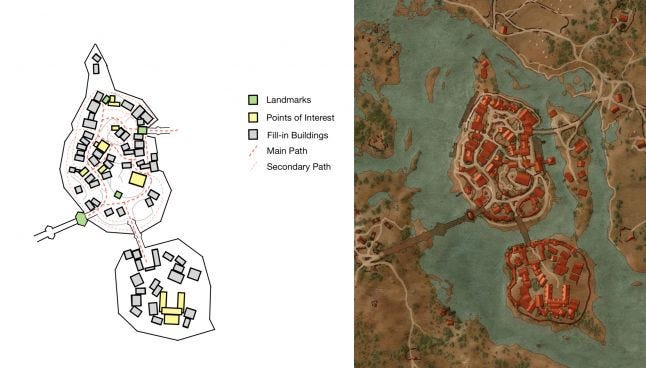
 While blocking out it was really important to always keep an eye on the overall structure and composition of the level. In the left layout above (the beautiful layout from the right was taken in-game) you can see there’s a subdivision between main and secondary roads, establishing the metrics of the main road early on helped me to form a clear vision for the overall scale, length and width of the level, doing this allowed me to have a better sense on how to manage all the different secondary roads.
Composition & Design
I find composition to be one of the greatest strength of this level, leading lines and framing are used to gently guide the player through the level. Additionally, the placement of landmarks perfectly blends in with the environment, they all fit the vertical style of the city making them recognizable even from long distances to perfectly capture the player's attention and give them a point of reference within the environment.
 The big tower located in the main square near the Auction House is a landmark always visible not only from the inside of the city, but even from the outside. Landmarks in Oxenfurt are usually recognizable for their vertical structure, providing a feeling of scale and contrast that makes the level feel dramatic and big.
 The same can be said about the two main gates to enter the city, you can build up anticipation by forcing the player to cross narrow and enclosed entrances, and then release that suspense by revealing a large and diverse space.
 Points of interest are equally distinguishable, the buildings and spaces related to main narrative quests are usually more recognizable than others. Secondary points of interest are still very easy to navigate thanks to some diegetic elements placed in the environment, like some building’s signposts that immediately capture the player's attention.
Conclusions
Re-creating Oxenfurt inside UE4 was a fascinating challenge that allowed me to hone my practical skills as well as my analytical thinking as a level designer. This project took me over two months of work aside from my day job, I honestly believe that so much more could have been done looking at how much content there is inside this level, still, I’m very proud of the end result.
I hope you enjoyed the reading! Let me know if you have any feedback, feel free to contact me on Twitter: @tassi_eduardo
Read more about:
Featured BlogsYou May Also Like