Trending
Opinion: How will Project 2025 impact game developers?
The Heritage Foundation's manifesto for the possible next administration could do great harm to many, including large portions of the game development community.
"Having the walls move in an elegant and credible way is very difficult in itself, but making sure the player wouldn't be lost was one of the biggest challenges for us." - Christophe Carrier, Level Design Director at Arkane Studios
Deep Dive is an ongoing Gamasutra series with the goal of shedding light on specific design, art, or technical features within a video game, in order to show how seemingly simple, fundamental design decisions aren't really that simple at all.
Check out earlier installments, including creating believable crowds in Planet Coaster, evolving stealth detection in Shadow Tactics, and designing dynamic audio for destructible environments in Rainbow Six: Siege.
My name is Christophe Carrier and I'm the Level Design Director at Arkane Studios in Lyon. I am one of the few remaining founders of the company. When the company was founded in 1999, we were all fans of good old fashioned action-adventure sims such as Deus Ex, System Shock, and of course Thief: The Dark Project. I worked on Arx Fatalis, Dark Messiah, BioShock 2 (in collaboration with the 2K Marin team) Dishonored 1, and Dishonored 2.
Dana Nightingale was the co-founder of Through the Looking Glass, a site dedicated to the System Shock and Thief series’, and was the first to interview us and publish our Arx Fatalis demo on her site. It was then spotted by our first publisher and allowed us to cut a deal and commercialize the game.
Dana has a master’s degree in architecture and made several fan-missions for Thief 2 under the name Digital Nightfall. We later hired her and she's been a valuable level designer ever since. Dana is the level designer that built the Clockwork Mansion in Dishonored 2 along with level architect David Di Giacomo.
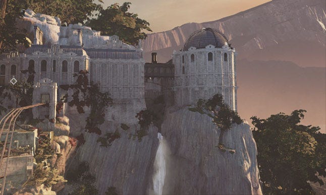
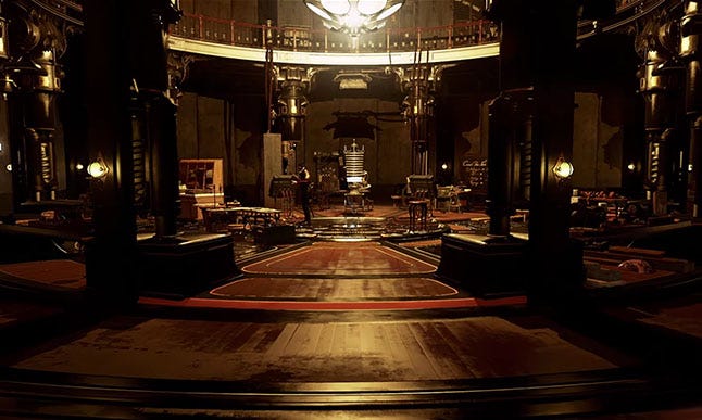
The Clockwork Mansion is a level in Dishonored 2 where players have the ability to trigger architectural and mechanical transformations of some rooms by pulling levers. David, the level architect, has said that one of his main sources of inspiration for the Clockwork Mansion was Bob Potts’ kinetic sculptures and the smart way he uses one source of movement that translate to the entire sculpture.
The number of player types and playstyles we have to think about in level design is pretty big. It includes low or high chaos, combat or stealth and shadow, non-lethal or lethal, exploration or playing without reading a single note, playing with ‘no powers’ mode or without markers, series fans or total new-comers, and any combination of them all. This is what makes the level design of the Clockwork Mansion particularly challenging because, on top of these constraints, it adds another layer of complexity.
In this level, the player is put in a situation where their orientation is changing constantly. This was a huge risk! So it was extremely important to let the player be able to construct a mental picture of the house while they're progressing. We tried to avoid long and tight passages that go in and around the walls because in our game that’s the best way to cause confusion. Players can also go backstage, a bit like in the Portal series, and see how it’s all working while trying to reach their goals.
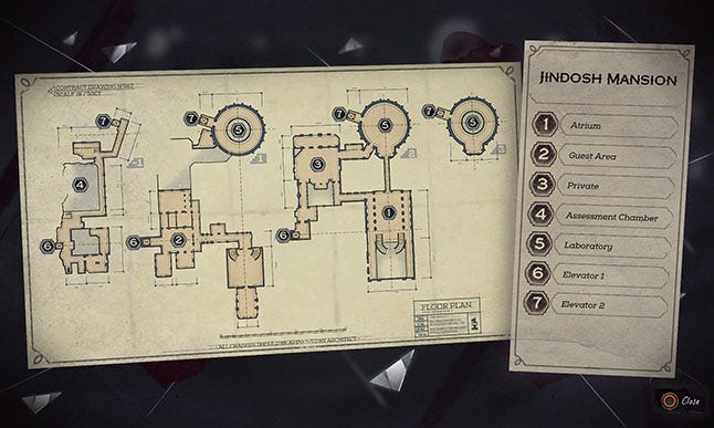
Having the walls move in such an elegant and credible way is already very difficult in itself, but making sure the player wouldn't be lost was one of the biggest challenges for us. Every backstage area had to be, as much as possible, visually connected to the big areas of the building so that the player would always be able to perceive them, consciously or unconsciously, to get a good mental picture of the mansion.
Rooms also had to have specific functions that the player could relate to from their real-world perspective so that attentive players could understand the house and even play without markers on a second playthrough. The room where two aristocrats are waiting for and talking about a Clockwork demo to be held in the assessment chamber transforms into an elevator going down to... the assessment chamber.
Also, if you pay attention to details, you’ll notice that the kitchen is below the dining room so that servants could lay out the table while the guest are drinking whisky, smoking and playing pool. The maid can then move the table up directly in the room, when required.
I like to think that level design is not only about building an environment, which is of course fundamental, but it's also, among many other things, designing the conditions in which the player will traverse it. All the conditions. Whether geometry related or psychological.
The idea for this level first began with a fantasy of mine. A lot of people of my generation were raised with pop culture of the 80s and 90s…James Bond villains who have incredible headquarters with escape pods and rocket pads that appear from behind walls, temple altars that reveal dark stairs going down into dark crypts, Hyperion's rich houses in Dan Simmons saga where each room is in a different galactic system. And back in that time, some games were using transformations to a smaller degree. Portal does that brilliantly.
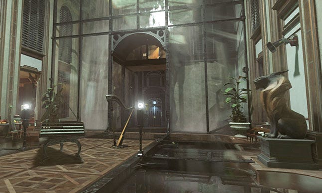
I thought that it would fit perfectly with the mind of Kirin Jindosh, the owner of the Clockwork Mansion who is a cynical and psychopathic inventor that likes to show off, impress his guests, brag and feel rightfully superior. So I proposed a "transformer" house concept for Jindosh's mission, and pitched the idea to Harvey Smith, the game’s creative director, who liked it.
We started prototyping with the Dishonored 1 engine while the animation tools for the new engine were being developed. Original prototypes ranged from super crazy abstract environments that did not resemble a house at all to very normal places with a few fancy elevators and secret doors. I remember that the team was skeptical. After all, it was a big technical challenge, a risky one in terms of level design and very demanding for almost every team.
On top of that, it would only be used once, which is heresy in AAA game production. The original idea was reduced to some walls rotations, secret doors and appearing furniture. Then the Clockwork Mansion was chosen as the map to showcase in our announcement trailer that Blur was doing. We briefed them on the general ideas and they used the craziest ones in the final trailer. When everybody saw what Blur did it was so good that we had to do it all the way.
In the end, it paid off, because everybody was on board with the idea and gave the best of their talents. And furthermore, it allowed us to create more sophisticated tools that we wouldn’t have had, if only for the complexity of this map.
One of the most challenging parts was ensuring that AI locomotion still worked not only in the two configurations, but continued to work even as the rooms were moving. AI also needed to be able to behave convincingly when they were trapped.
Obviously, animation tools also greatly benefitted. The tech we developed was used throughout the game. Any time a rail carriage moves, a secret door opens, or the player is transported through the Void on a flying platform, the tools and systems we developed for the Clockwork Mansion are used. Nearly every map in the game is touched by these features, so in the end, it made the entire game better.
There's a little bit of every one of us "Arkanites" in the Clockwork Mansion which is another very cool thing about it.
You May Also Like