Trending
Opinion: How will Project 2025 impact game developers?
The Heritage Foundation's manifesto for the possible next administration could do great harm to many, including large portions of the game development community.

Featured Blog | This community-written post highlights the best of what the game industry has to offer. Read more like it on the Game Developer Blogs or learn how to Submit Your Own Blog Post
Hallways are a necessary evil in video games and more specifically level design. However, if done correctly, hallways can go from being a bland part of your level to one of the highlights.

Hallways are a necessary evil in video games and more specifically level design. Not only are they a natural part of architecture but hallways may be necessary for technical, pacing and narrative reasons. Hallways are a great place for streaming to occur and they are a natural place to slow down the pacing of the level and let the player take a breather. However lame hallways might sound to gamers, if done correctly, they can go from being a bland part of your level to one of the highlights.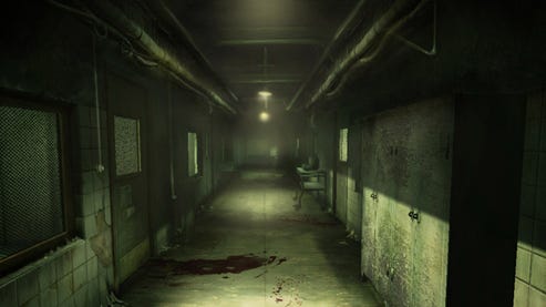
All level designers have been faced with the problem of dealing with a boring hallway section. Sometimes we have to bite the bullet and settle for a variety of reasons. However, if you have the schedule, time and resources, there are two non-gameplay ways to make a boring hallway interesting and fun, removing hallway geometry to open up vistas and adding visual storytelling.
In general, hallways are made up of walls, a floor and a ceiling. When a ceiling, wall or both get removed, a huge line of sight area opens up for the player to take in a really cool vista moment. That allows the player to feel part of the vista and in turn, the game world. Visual storytelling captures the imagination of the player for either the behavior of the inhabitants of the space or the space itself. Visual storytelling adds greater meaning to the player's adventure through the game space because it adds to their immersion in the game world.
In the following I will illustrate that there are two non-game-play adding ways to make hallways powerful parts of your level design. Although scripted moments, combat moments, etc. can be added to a boring hallway to make it more fun, when you combine gameplay moments with the two techniques discussed herein, your hallway section will turn into a truly memorable part of the level.
Geometry Removal
One of my favorite techniques for making hallways feel special is removing geometry and opening up a vista view. In Transformers War for Cybertron, I had two hallways and room leading to a tube highway structure that felt very generic. My level artist had made a cool vista of Autobot City outside the windows in the hallway. However, the player couldn't see very well out those windows and one day he added a balcony I had asked for as a test, to see if we could make something more interesting.
When I stepped out onto that balcony for the first time, I felt a part of the vista, like I was interacting with the environment instead of looking at it through some boring window. The balcony was basically a hallway section missing a roof and two walls. Realizing how much more fun it would be fight and traverse out in the vista, I then proceeded to alter the existing level path.
I turned the two hallways and room into a tiered balcony connected by a staircase. The top balcony / hallway section leads to the highway tube in the distance in the image below.
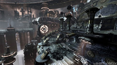
Immediately the doubts my level team mates and I had about the space went away. Along with feeling great layout wise, opening up the roof and walls of the game space allowed us to have lots of cool AI vignettes play alongside dynamic enemy entrances. Looking out from the hallways / balconies had a view like in the below image, notice the enemy jet zooming close by the player:
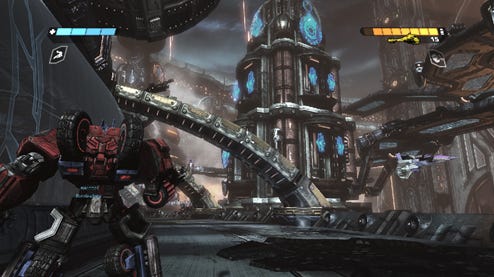
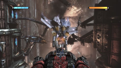
Since I had so much room to bring in enemies from the sky and surrounding buildings, I was able to add a turret fight with an AI drop ship that wouldn't have been possible in an interior hallway section:
I was recently able to use this technique in Tomb Raider. We had a hallway system leading to a shrine room in a burning Japanese Castle. The interior hallways were on fire and a high intensity moment, we needed a way to take the intensity down a notch and keep the environment interesting to traverse and fight in. We opened up a wall and let the player onto the roof of the castle structure that were simply a hallway with a single wall and a floor. Below is a three quarter view of the rooftops that serve as an exterior hallway section:
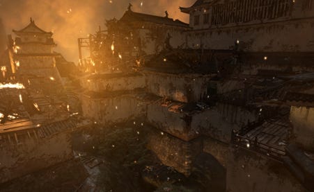
Once again, moving the player path to an exterior hallway system allowed for cool scripted events, traversal bits and combat moments. Below is an image of what the start of the exterior hallway looks like after the initial transition, during a scripted explosion moment: 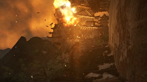
Here's a cool gameplay sequence where we managed to squeeze a scripted event and traversal moment into: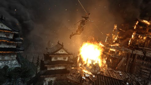
One more where I was able to use the openness combined with verticality to create an interesting shoot out amongst the flames: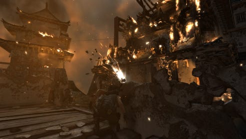
You can see from the above screen grabs that we took what could have been a repetitive, boring section and turned it into a visual and gameplay treat by tearing off some walls and roofs.
Geometry Removal through Adding Transparency
Another technique to remove geometry without actually removing any geometry is to add transparency to your hallway. Adding transparency lets players see through the geometry without having the freedom to jump over a ledge and die like in the previous examples. Bioshock's underwater hallways did a really good job of opening up underwater vistas and making the player feel immersed in their undersea world, like in the image below: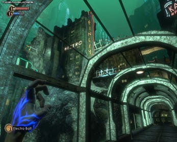
Visual Storytelling
Besides adjusted geometry, visual storytelling in a hallway is another way to make them interesting. Visual storytelling is a task whose success will mostly fall on the shoulders of artists, but art and design need to work together closely to make sure that the visual story telling is impactful. In its simplest form, visual storytelling in video games uses game assets to tell a story about the level itself, characters or both. Visual storytelling can be as simple as graffiti on the wall to bodies hung up in sacrificial poses, each telling a different message to the player.
An artist could write a whole article about technical ways to create visual storytelling, but I want to focus on how design and art should work together to make sure those visual story telling moments are most impactful. When working with your level artist to dress up a hallway with visual storytelling, do the following:
Make sure it is in the player's line of sight
Make sure it is lit in a way to bring attention to it, but does not confuse the main path
Talk to your narrative designer about what you want to do and see if he or she has any ideas to spice it up.
Number one is simple; make sure the player can see the visual story telling. If your artist is going to make something cool that imparts background knowledge of the characters or the level, it should be in a place that the player can see it. Visual story telling should not be a reward for exploring, that's what pickups are for.
Notice in the below image from Bioshock, that since the graffiti is on the back wall of the hallway immediately before the right turn up the stairs, the player must look at it the whole time they traverse down the hallway. If the graffiti was on a sidewall, the player would not notice it until they passed by, or even worse, may not even notice it at all.
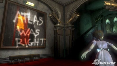
The second thing to do is make sure the artist lights the storytelling scene so that you can see it but also so that it doesn't confuse the player as to where to go. Lights draw a player's eye and tell the player where to go, like runway lights. One of the things I discuss most with artists as a level finishes is where lighting confuses players. It's real easy to let happen.
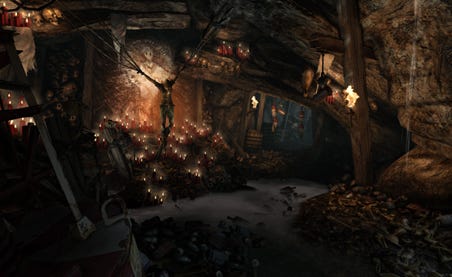
Give the visual storytelling scene light that pulls the player's eye when they walk by it, but make sure that the light at their destination is a brighter, stronger color or whatever y'all can agree to keep drawing the player along the correct player path. You do not want the player to stop and look at this cool thing in the hallway and get up and go back in the direction they came because lighting confused them. For an example of well-lit visual story, look at the below image from Tomb Raider. The player can totally absorb the crazy alter around the strung up dead body, but the torches on the right draw the player down the hallway in the direction they need to go.
The third thing to do when creating visual storytelling is talk to the narrative designer. Tell him or her the direction you want to go and see if they have any other ideas. I always advocate talking to narrative designers about stuff like this because they spend all day thinking about the story. Artists and designers have lots of different responsibilities, but since all the narrative designer does is think about story, you may be surprised by some suggestions that are outside of the box.
Conclusion
Removing geometry to open up vistas and adding visual storytelling to boring hallways are two techniques to make them more interesting. When a designer adds gameplay into a space that has undergone this treatment, more often than not a memorable gameplay moment will be created.
Read more about:
Featured BlogsYou May Also Like