Trending
Opinion: How will Project 2025 impact game developers?
The Heritage Foundation's manifesto for the possible next administration could do great harm to many, including large portions of the game development community.
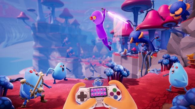
Trover Saves the Universe was created by Rick and Morty creator Justin Roiland and shows off much of his show's bizarre humor. We talk to Squanch Games to learn about world-building and judgment-free ideation.

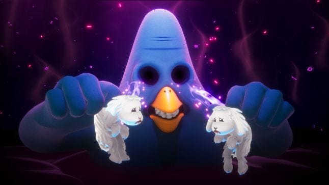
The VR game Trover Saves the Universe was created by Rick and Morty creator Justin Roiland and shows off much of the show’s trademark bizarre humor: for example, the game’s villain gains cosmic power by plugging your characters' two dogs into its empty eye sockets, a development that is best described as “only the beginning.”
Developed and published by Squanch Games, Trover Saves the Universe invents in-universe explanations to get around many of the issues with VR play: your perspective doesn’t move around smoothly, but discretely, jumping from place to place, because your character is a “Chairoipian,” naturally spending their whole lives seated, and getting around by teleporting between specific locations in the landscape.
Erich Meyr, design director at Squanch, Tanya Watson, Squanch co-founder, and Mikey Spano, art director, answered our questions about the development of this unique game.
Erich Meyr: I'm the design director at Squanch Games. I started in the games industry in 2007 at Insomniac Games and worked as a UI designer on titles in the Ratchet and Clank and Resistance franchises. I moved into a design role on Sunset Overdrive and realized how much I enjoyed making funny, irreverent games. After eight and a half years I left Insomniac with a desire to work on a game from the ground up with a small team, and serendipitously was pointed towards Squanch Games!
Tanya Watson: I have been making games since 2003, when I first got my start as a software test engineer at Microsoft. Over the five years there, I worked on sports games, then moved to the RPG group, then to shooters - which had me working closely with Epic Games on Gears of War as the on-site QA lead. I loved working there with production so much that I asked to be hired as an associate producer. Thankfully, they said yes, and I was given the opportunity to grow from an AP, to a producer, and eventually to executive producer on some incredible games: Gears of War, Unreal Tournament, Bulletstorm, and Fortnite. In 2015, I left after almost 10 years there, and formed Squanch Games with Justin Roiland, and we’ve just celebrated our three year anniversary.
Mikey Spano: I’m the Art Director here at Squanch Games. I’ve been making games for almost 20 years, and I’ve shipped over a dozen titles including the original Gears of War trilogy and Fortnite.

Watson: When starting the company, I knew working with Justin was going to be interesting because he had this completely new perspective on games, and how to tell stories within them. He could easily draw on his experiences from animation, and describe or draw how that may work out in a “game way.” He wouldn’t necessarily understand all of the steps needed to get there, but the vision and ideas conveyed were really interesting. We had tons of scope and development conversations; they were on-going throughout the development process. Probably 50 percent of the overall scope of Trover was re-cut or re-scoped in some way in order to get what we wanted done, to the quality bar that we had set out to achieve.
Meyr: Justin is a huge gamer and we quickly were able to speak the same language and dig into how we could create comedy through gameplay in Trover. Over the years we’ve developed a good push and pull about what makes good design vs. what makes a good joke. There were many times in Trover where he’d throw out a pitch and say, “what game in their right mind would do this?” and just the idea alone would make us laugh so hard we knew we were on to something. Justin is a font of ridiculously funny ideas and part of our job is working with him to fit them into the game’s design.
Meyr: We iterated a lot on our dialog process and (like most new games) it wasn’t until the end of the project that we really figured out our pipeline. We started by laying out rough level beats and then we’d go into the recording booth and improv them without a script. This was initially intended as a temporary pass, but some of it was so hilarious we kept it!
As we got further in production we kept mapping out narrative beats and began to make them more granular based on varying player interactions in a given scene. Between design, programming, and animation we built out a framework we call Squanch Theater to enable us to quickly script dynamic dialog that could branch, be interrupted and return to where it left off, dynamically pick a line based on multiple factors, and all sound as natural as possible.

We wrote jokes and some specific dialog to make sure our character arcs were tracking, but would let many of our actors improv in the booth to keep things as loose and playful as the early scratch dialog. For animating this crazy amount of dialog, we build an automated lip-syncing system but still hand authored expressions and look-ats.
The character performances were animated by creating sets of smaller animations then layering them against the dialog track to create lots of well-timed performances. The benefit of this method was that it allowed other team members to pile on and help ‘tag’ dialog with animations as we closed out the project. A lot of larger games use this same technique but I think we achieved a very high quality bar across the whole game by using UE4's sequencer tool for every line of dialog and having some amazing animators.
Watson: No, not really. We always knew that we were going to be a Mature-rated title, we just wanted to make sure that we didn’t tip the scale over into AO territory, hah. With the way that we did the recording pipeline, we really gave him free run to explore what was funny or might work for these sequences, and then the narrative team did a lot of editing in the game itself to help direct what may work for the pacing of that section, or what told the funniest story.
In all, we ended up not using almost 40 percent of the total amount of dialogue recorded! Pretty intense, but it really allowed us to be flexible and err on the side of funny, and not be too pigeonholed into a script.
There were maybe two areas where we really considered language as a factor and did some bleeping (even for the non-censored version), but in a way, it made it funnier, so we were OK with it.
Meyr: It was absolutely a challenge! Early on we tried many experiments to see how far we could push platforming difficulty and realized we couldn't make a super skill-based platformer using a fixed camera. We really did not want to induce motion sickness so having a moving camera was not an option.
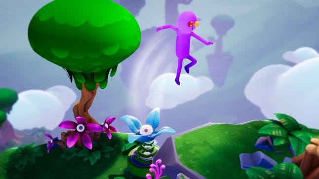
Instead, we added the ability for the player to “pop up” and get a better vantage point to combat poor depth perception. We ended up being very strict about our distance metrics and made rules like "never put a platform at a height within 2m of our three camera pop-up heights" to try and help depth perception as much as possible.
Adding a permanent 3D jump helper on the ground below Trover, instead of just a shadow on the ground, probably helped depth issues the most. Knowing difficult platforming wasn't a core pillar of the game, we toned it down for the critical path but still wanted some harder jumps and challenges for finding hidden power babies.

Meyr: Trover began as a VR game and our main goal was to create complete immersion for the player and a locomotion system that reduced motion sickness as much as possible. Those are pretty common goals for a VR game and we embraced them full on by creating fiction and jokes around them. Justin came up with the concept of the player being stuck in a chair looking for warp nodes that you have to reach with Trover in order to then move yourself to that location.
We took that initial pitch and worked out moving and rotating the player at speeds that didn't induce sickness in the majority of our playtesters. The upside of grounding our locomotion system into our narrative was when we decided to make the game also in non-VR the constraints still make sense in the narrative and the player’s immersion is still very much intact.
Spano: Justin, Erich, and I are like a little hive mind of weird ideas. We are super passionate about creating unique experiences, and we are constantly riffing off of each other’s ideas. After the initial idea is conceived, we always try to get tons of ideas flowing from everyone on the team, and we encourage the ideas to come in as raw as possible with no judgment. We really take a ‘no wrong answers’ approach to everything, and we encourage people to communicate in whatever way gets their idea across, which means we get everything from stick figure doodles, to fleshed out design documents.
Once we have all the ideas we want to try figured out on paper, the world then gets its own art direction guide, which includes reference images from cartoons, toys, movies, games, reality, etc. As the idea gets fleshed out, concept art and guidelines are added to keep everyone from level designers to artists on track. Guidelines typically include things like color schemes, silhouettes, atmospherics, lighting, etc.
Sometimes little jokes can lead to an entire world-building scenario; like how Chairorpean culture was formed around their reliance on chairs. Justin pitched the chair-obsession as a funny one-off note, and then we just kept pushing the idea forward: what about chair mailboxes? Chair Houses? Foliage shaped like cushions? We pushed until it was too far, and then we realized ‘too far’ was even funnier so we pushed it more.
A planet made of flesh was a dream for a lot of the artists on the team, so when we started designing Flesh World we had a lot of ideas flowing. The hardest question was how do we keep Flesh World ‘funny/gross’ and not ‘gore/gross’. On the art side, I pushed the team into more bulbous fun shapes and simpler color schemes to keep things feeling fleshy without feeling like you were inside someone’s guts; and on the design side, Erich and Justin kept everything themed more towards what was happening in this world, and less on the world itself. The less the characters talked about Flesh World, the less of a gimmick it was, and it really helped sell the absurdity of a prison/zoo/apartment all tangled together on a fleshy planet.
My biggest piece of advice for any team that’s trying to do unique world-building is to just stop worrying if your idea is good or not. If you have an idea, write it down, draw it, sing it, whatever works for you; then share it with people who are willing and able to riff on the idea. In the end the best idea should always win, regardless of where the idea came from. And take tons of notes! Write it all down as you go, draw doodles in meetings if they come to you, don’t be afraid to look distracted. My notes are always 50 percent words, 50 percent doodles, as a result tons of designs were figured out right in the middle of a pitch meeting.

Watson: We are an indie team, with a small game budget (and even smaller marketing budget). We thought, instead of spending the marketing money on ads and stuff, we should instead use that money on creating content. Idea being that word of mouth will drive awareness and get people to buy the game. Additionally, we knew that the game was fairly short, hence the price point - and we wanted ways to show fans that we plan to extend the experience over time.
So far, we don’t have a ton of data from this experiment because we’re still in the middle of it. Happy to report back once we release our first DLC :).
You May Also Like