Trending
Opinion: How will Project 2025 impact game developers?
The Heritage Foundation's manifesto for the possible next administration could do great harm to many, including large portions of the game development community.
Here's why the developers are making games for people who don't have time for the genre.

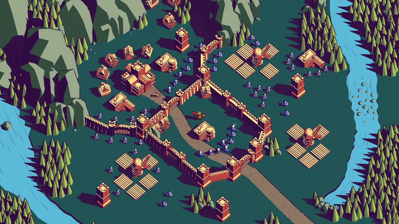
Thronefall, which comes out in Early Access on August 2, aims to simplify strategy games by offering a minimalist experience in building and defending your kingdom. Game Developer spoke with Jonas Tyroller and Paul Schnepf of Grizzly Games to discuss how their own dwindling gaming time inspired them to simplify such a complex genre, the importance of layering complexity to make things more approachable for players, and how subtracting a simple (but core) element of strategy games opened up a wealth of interesting design possibilities.
Game Developer: Thronefall aims to streamline and simplify city-building strategy (while throwing a little hack and slash in there). What appealed to you about making this complicated genre more approachable to people who find them daunting?
Schnepf: This urge for minimalism is something that has been a theme for everything we have done so far at Grizzly Games. I suppose it developed for a couple of different reasons: First of all, we just found ourselves having less and less time to actually play games. Getting older and caught in the usual swamp of work and responsibilities, we realized we don’t have the 100 hours to sink into the next super complex game anymore. We felt there was a need for wholesome and deep, but also less time-consuming, experiences.
The other great thing about making those kinds of accessible games is that they are—surprise!—very accessible. This means that something that was reserved to a more core audience before is suddenly experience-able for many more people, including those that have had no prior gaming experience. Sharing what we love with people we love, no matter their background, just feels great.
How did you distill the core elements of a strategy game into Thronefall? How did you capture the essence of a strategy game while simplifying it greatly?
Tyroller: The way we like to find our game ideas is through a rigorous prototyping process. That means we make tons of little mini-games and small game-like experiences to try out a huge variety of ideas. We do not approach this from a game mechanics perspective, but from an experience perspective. We decide on an experience we want the player to have and then work our way backwards on how to best provide that experience in a simple and appealing fashion.
In this case we started out with the “build your kingdom” experience in mind (that we came to love from other games like Stronghold), so we created a bunch of prototypes that were aiming to achieve that experience. The best experiments were then developed further through a process of feedback and iteration.
In classic strategy games, you often have to make a decision between upgrading your economy and building out your forces. Within both of those domains, there should be even more decisions to make so that great decision makers are rewarded with a more efficient economy and forces that better counter your enemies. Our goal was to provide that exact experience but make it more accessible to open the genre up to a wider audience.

Many strategy mechanics can get deep and complex. How did you preserve a sense of depth while making them easy-to-understand?
Tyroller: I think the trick lies in slowly layering complexity onto your existing systems. A lot of strategy games throw too much at you all at once, which makes them difficult to get into. In Thronefall, we’re trying to make the game grow with the players. The game starts out simple but gets more and more complex over time. This makes sure that players are never overwhelmed, but never underwhelmed either as the complexity of the game grows alongside with you.
We achieve this through our progression system where you slowly unlock additional perks, weapons and modifiers, but also through level design. In Thronefall, you can only build predefined buildings on predefined built slots, which opens up tons of level design possibilities for us. We can keep adding new buildings, new units, new upgrades, new choices, and new abilities to new levels without affecting or breaking any of the previous levels, which is a huge advantage.
Another advantage of this approach is that we, the developers, can grow with the skills and demands of players, too. We’re launching in Early Access, so for future levels and future content, we’re aiming to increase the complexity of the game in correlation to the skills and demands of our existing playerbase. As we only add complexity “at the end of the game”, the beginning of the game and the onboarding experience will stay beautifully unaffected.
Can you walk us through the creation of one of the mechanics and how you created that simplicity while maintaining complexity?
Tyroller: While a painter uses paint to create an image, a game designer assembles game mechanics to create an experience. So, every game mechanic you add always starts with a design purpose or design goal. If you want to keep it simple (which we do) you should never add a game mechanic without reason. Once you have a design goal, you just go through your options. Which mechanic from my tool box should I use to best achieve this goal? Bonus points if you manage to serve multiple design goals at once.
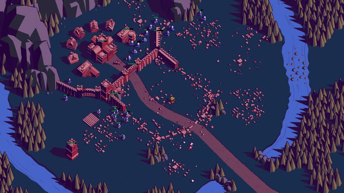
For example, here are a couple of our design goals: we want to make the game as forgiving as possible. We want to reduce frustration as much as possible. We want the player to protect their buildings. Our solution to serve all of these goals: all of your buildings respawn every morning for free, but your economic buildings don't give any gold when they have only just respawned. This way, we serve all of our design goals. Buildings being destroyed is not a big deal—it’s extremely forgiving—but players are still incentivized to protect them at all costs.
The question of how complexity can arise from simple systems is a different one. The board game Go is often a popular example for that. Complex systems can emerge from surprisingly simple rules. Conway’s game of Life would be another example. It is generally recommended to aim for that emergent complexity in games, but to be completely honest, Thronefall is not really a good example on how to do that. Thronefall creates complexity through complexity. We just layer it on very slowly and carefully so that all players can keep pace. If you’re looking for a game that creates complexity from simplicity, our game ISLANDERS would be a much better example to look at.

What drew you to the game's visual style? How did you use visuals to help convey information about how the game worked?
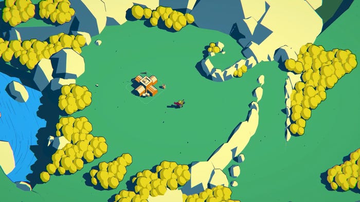
Schnepf: With Thronefall’s visual style, we tried to create a high legibility while maintaining an appealing atmosphere that also communicates the casualness of the gameplay. Neither of us is a trained artist, so it was important to us to find a way to achieve the above without ending up with a super complex art style that neither I nor Jonas could execute. We went for a very limited color palette that combined with simple 3D models. This allowed us to add content to the game quickly.
In Thronefall, the silhouette of objects is the element that communicates the most information to players. We took great care to make things as distinguishable from each other as we could, reinforcing the readability of the shapes by putting an outline around objects. I feel like this worked well in most cases, but there is arguably some room for improvement when it comes to the different units — something we plan to tackle during Thronefall’s Early Access period.
You make player actions seem more exciting and compelling with some great animations for building things. How did you create these building animations, and what ideas went into making it fun to just plop a building down?
Schnepf: Well, I guess that’s another Grizzly Games maxim. We create small things, but we want them to feel the absolute best they can. Especially in Thronefall, where the core gameplay comes down to very few simple interactions, it’s extra important to make them feel great. On the tech side, those animations are fairly simple — just a bit of scaling on the mesh, a particle system and some sounds. The focus was to make players feel like they can exercise great power with a simple button press.
What drew you to add the active combat element? What do you feel it added to the experience?
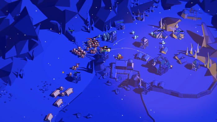
Schnepf: Thomas van den Berg’s fantastic 2D sidescroller Kingdom was obviously a great inspiration for Thronefall. I absolutely love the game, but the one thing that frustrated me a lot while playing is that you had to just idle for the whole night while your little kingdom was under attack. This was something we wanted to do differently with Thronefall. The combat also adds an easy-to-learn, hard-to-master element to the gameplay, allowing for a high amount of replayability and depth for players that like to fully dive into it.
What thoughts went into making the combat also feel complex and satisfying while keeping things simple?
Schnepf: To be honest, Thronefall surely is not the game with the most complex combat system out there. We made many decisions during the development that favored accessibility over complexity. The fact that you auto-attack enemies in range, for example, is a mechanic that makes Thronefall much easier to pick up for new players—especially those not used to combat games. However, having a couple of different weapons to choose from that all come with a unique active ability (that can be safely ignored in the beginning, but mastered later) generates a fair amount of depth. Combined with the variety of enemy types that differ in behavior, combat can get quite complex in Thronefall—but only if you want it to be.

What challenges did you face in maintaining the balance between simplicity and complexity in Thronefall? What surprise benefits came from pursuing this goal?
Tyroller: The main challenge of keeping things simple is that you have to take things away. You have to subtract things from the formula. There is no way around that. For Thronefall, that means that we took away the player’s ability to choose what to build and where and only left them with one decision: When to build it (or in what order to build things).
This made room for some other decisions, like which upgrade path you want to choose for each building, but the point remains: If you want to simplify you need to subtract, and generally people often don’t like when you take things away from them.
That means you have to be very careful with how you talk about your game and what expectations you set. If you market your game as a “strategy game” people will likely expect the ability to build whatever they want wherever they want, so simplifying a genre really makes expectation management much more challenging.
The surprise benefits of simplifying systems are always different but there are always at least a few. For Thronefall that was certainly the case as well!
Players not being able to decide what to build and where opened up absolutely incredible - and I mean unheard of—level design possibilities for us. We can force players to build buildings in risky positions, which makes for way more interesting decisions. We automatically prevent players from building three walls around the spawn point of the enemies. We can limit the amount of buildings and units of the player without needing anything like a supply count. As we can limit building and unit counts so easily, we have a lot more freedom in the balancing. We can choose where your units respawn and how far they need to walk, which has huge strategic impacts. We can choose how the finished castle should look like, which is nice because that way we can force players to build something that looks pretty. We can purposefully leave vulnerabilities the players will have to work around. We can even have a new custom tech tree for every single level we build.
And we have all of that without any effort just because of a few small simplifications we made. It’s definitely funny how “taking things away” can result in more design options. Surprise! That’s how it goes and we love it.
You May Also Like