Trending
Opinion: How will Project 2025 impact game developers?
The Heritage Foundation's manifesto for the possible next administration could do great harm to many, including large portions of the game development community.

Featured Blog | This community-written post highlights the best of what the game industry has to offer. Read more like it on the Game Developer Blogs or learn how to Submit Your Own Blog Post
In this second part of the series I’d like to share some thoughts about how to create, integrate and organize UI in Virtual Reality(VR) and more specifically the Oculus Rift.

Part 1 is available here.
In this second part of the series I’d like to share some thoughts about how to create, integrate and organize UI in Virtual Reality(VR) and more specifically the Oculus Rift.
The conclusions I reached are very similar to the ones the Valve team got in their work in porting Team Fortress 2 for the device. I’ll also mention some ideas I will try in the future but hadn’t enough time to complete.
UI in Virtual reality
In traditional applications the UI can be divided conceptually in two types – UI elements residing in the 3D world and elements that get directly composed on the screen and hence ‘live’ in the 2D plane of the display. Recently the distinction between these types of interfaces is diminishing – almost all modern game UIs have 3D or pseudo 3D elements in their HUDs and menus. In VR the difference vanishes as we’ll see later in the post.
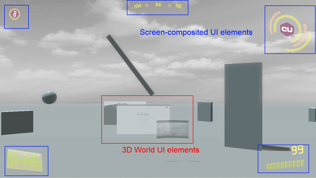
Some UI elements rendered with Coherent UI in a traditional non-vr application
3D world UI elements usually will need no change when transitioning a game to VR. They already are in the game world so no special care should be taken. The overlay UI however will need significant modifications in it’s rendering and probably also in the elements itself to cope with the specifics of the Rift.
If you leave the same 2D overlay for the UI in VR you’ll get something like this: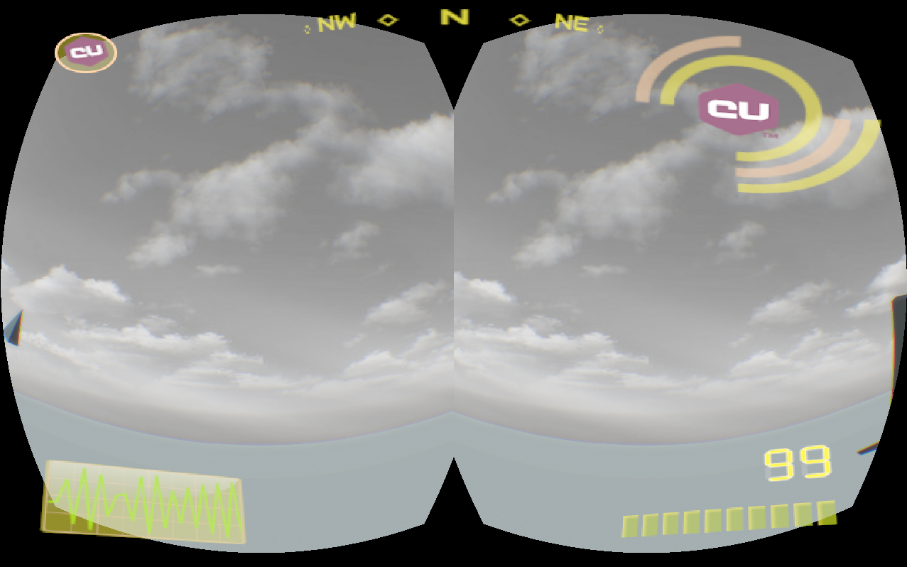
This result is obviously wrong, most of the elements won’t be visible at all because they fall outside the field of view of the player. The central region of every eye in the Rift is where the player sees more clearly, everything else is periphery – the same applies to your eyes in the ‘real’ world.
If we composite the HUD before the distortion we’ll get this: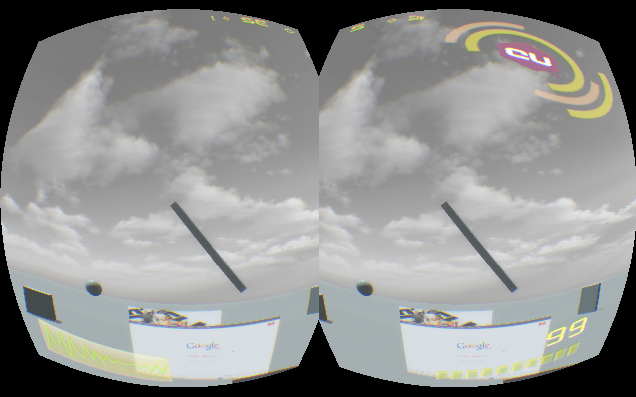
At least now everything is in the FOV of the player but the peripheral vision of the result remains. More importantly the UI is not adjusted for stereo rendering – the left and right eyes see different things and the result will surely cause at least a headache.
Stereo UI
What I did is the same as the Valve team in TF 2 – drew the UI on a plane that always stays in front of the player.
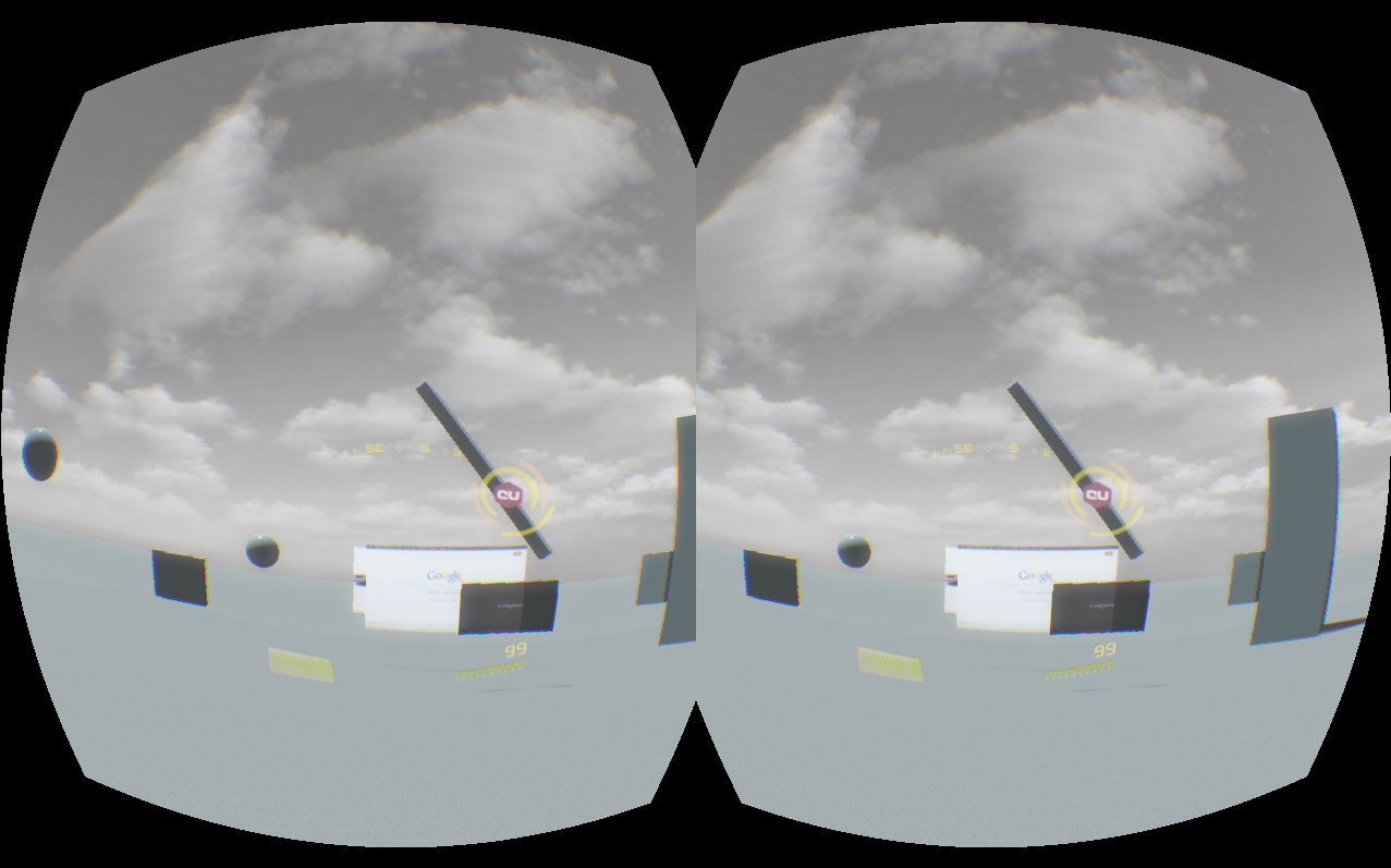
The correct result
TF 2 is a FPS game where you have a body that holds a weapon while you can freely rotate your head. Valve made a very clever decision when they noticed players were forgetting where their bodies are facing after looking around with their virtual heads. They always put the UI in front of the body, not the head. In this way the player always has a point of reference and can return facing forward in respect to her body.
In the Coherent UI demo we have a free flying camera so I locked the UI plane to always face the camera. This produced the very cool effect of feeling like a pilot of a fighter jet. The 3D effect that can be seen on some of the HUD elements becomes even more convincing in VR and adds a ‘digital helmet’ feeling.
Notice in the screenshot how small and concentrated the UI becomes – this is the position I personally felt most comfortable. It is unpleasant if you need to move your eyes inside the Oculus to look at a gauge or indicator that is too far from your focus point. The UI is semi-transparent so it doesn’t get in the way with the exception of the big element in the upper right corner with the CU logo. It is too big.
UI design considerations for VR
This brings me to point that having a UI that is correct in VR is not enough – it must be tailored for it. What looks very good and usable in non-VR will most probably be very different in VR.
First notice that the aspect of the HUD is different – in non-VR it is very wide and with the aspect of the screen. In the Rift however it needs to be replicated for every eye that by itself has a much more narrow aspect. This means that some elements that were very far apart will get closer and might even overlap.
UI elements close and in front of the player also means that they shouldn’t get in the way of gameplay. I think that transparency mostly solves this because the HUD is still in the semi-peripheral region of the player’s sight.
The resolution of the current generation of the Rift SDK is very low and makes reading text a real pain. The UI should be created with that in mind and numerical and textual information should be kept to a minimum and exchanged with more pictographic and color-coded elements.
In his TF 2 presentation Joe Ludwig argues that in VR the UI should be avoided but I think that it actually becomes even more interesting and compelling. The jet pilot helmet feeling I got after adding the HUD felt a lot more immersive to me than the 3D world alone.
I decided to also modify the sample menu scene with which the demo starts. The normal scene is just the logo of Coherent UI with some 3D animated buttons and a cool background. It is nice in 2D but looks somewhat dull in VR.

The old menu scene
I did a very simple modification – just removed the background and placed the menu in an empty 3D world with just a skybox. This allows the player to look around even in the menu scene and the game responds to head movement immediately immersing in VR. 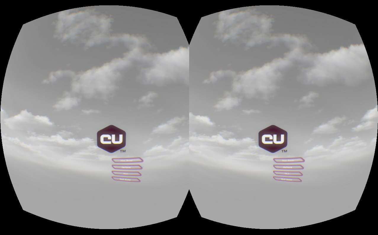
The new VR menu scene
Future
There are some ideas that I plan to try out but didn’t have the time while doing this integration.
The most interesting plan I have is to try to simulate true 3D stereo elements in the HUD. Currently the gadgets are transformed in 3D in the space of the UI itself and then the resulting image is splatted on a plane in the game world. As Coherent UI supports all CSS3 transformations, it is possible to pass all relevant matrices to the UI itself to draw the elements as if they are correctly positioned in the 3D world and then just composite the whole image on the screen.
As far as the Rift goes, the biggest challenge in the context of UI is still the resolution. It is very difficult and tiring to read text. This however makes creating VR-aware UI even more interesting as new ways of expressing content must be found and employed.
UI in VR is a very new topic with many challenges still in the way and I will continue to share our experiments and ideas in the field.
Read more about:
Featured BlogsYou May Also Like