Trending
Opinion: How will Project 2025 impact game developers?
The Heritage Foundation's manifesto for the possible next administration could do great harm to many, including large portions of the game development community.
After years in development including a period in Early Access, Dusk finally hit full release a month ago. We talked to creator, programmer, level builder and game designer David Szymanski about this successful Quake homage.

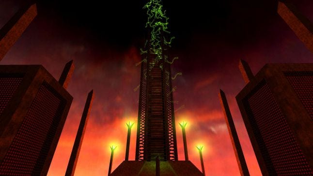
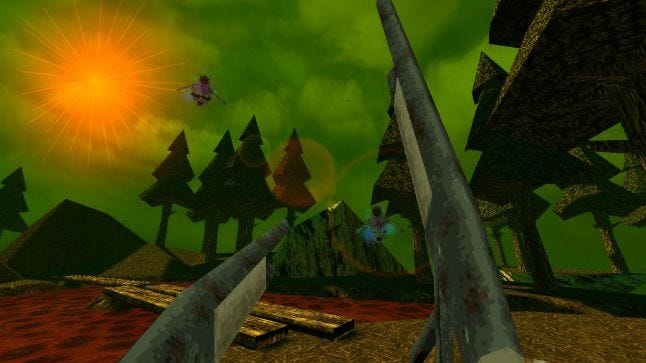
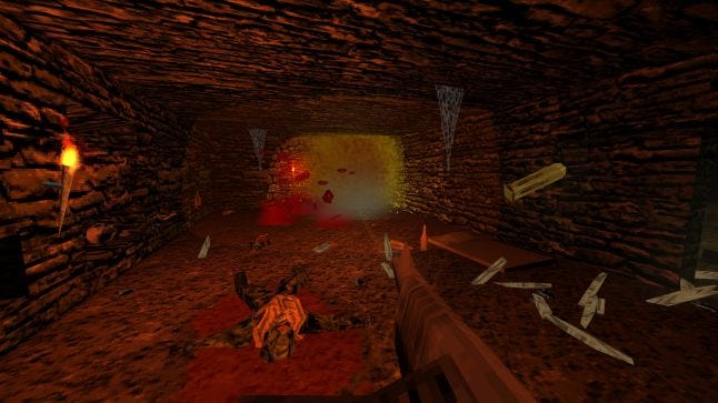
Dusk is a terrific 90s-inspired horror-action shooter that, as of this writing, is rated Overwhelmingly Positive on Steam. Published by New Blood Interactive, it achieved that popularity with a combination of evocative mood, fast-paced action, and a visual style that hit the nostalgia bullseye.
After years in development including a period in Early Access, Dusk finally hit full release a month ago. We talked to creator, programmer, level builder and game designer David Szymanski about this successful Quake homage. Szymanski explains his game in his words...
At first yeah, before we watched anyone play or got the game into players' hands. You get thrown into the deep end from moment one.
But it's sort of a fake deep end. You have plenty of health and morale (Dusk's version of armor) and room to kite enemies around, and even if you do end up dying once it's pretty obvious what you have to do the next time around. Provided they were on an appropriate difficult level and provided they have at least some basic knowledge of standard FPS controls, I don't think I've ever seen a player die there more than once or give up without getting past the first room.

It's kind of an anti-tutorial. It is giving players a chance to warm up: it gets them familiar with the basic controls, movement speed, and enemy behavior. Just in a way that encourages them to immediately engage with the game instead of spending 15 minutes responding to onscreen tool tips.
I don't think it's the sort of thing that would work for every game but for Dusk, a game about getting back to basics and trimming the fat, it felt like an appropriate start.
My go-to answer is always "pick any game from about 1993 to 2001 and it's probably inspired Dusk in some way." Obviously all the big ones: Doom, Quake, Half-Life, Duke, Blood, etc., etc., etc.
But lesser-known ones also. Like, the blood effects do the "particle arc" thing you see in older Lithtech games like Blood 2 and Shogo. Several levels take cues from Daikatana (yes really!). The climbing powerup was partially informed by the Alien in AvP/AvP2.
I basically just went nuts taking elements I liked from various 90s shooters and either referencing them or wholesale stealing them. And from other sorts of games too, from other eras. There's a lot of Deus Ex and Thief in Dusk, as well as STALKER and even some Condemned. And that's without even getting into Dave's contributions: there's an entire level layout pattered after a dungeon in Planescape: Torment, for instance.
...The reasoning [Dusk evokes classic FPS graphics] was twofold: first, I am one guy and I make my assets either from scratch or as near to scratch as I can get. Making it look like Doom 2016 was never an option. Second, I just really really love that low poly software rendered look. Even a decade ago when it was both woefully out of date and a long way from being fashionably retro, I adored how games like Quake and Chasm: The Rift looked. It's a bit more in vogue now but when I started Dusk four-ish years ago, I think the only other game really shooting for that same thing was Strafe.
There wasn't an established "this is new-school early 3D throwback art" look (or if there was I wasn't seeing it), and I couldn't find anything in the way of tutorials outlining old school modeling/texturing workflows/tech, so I basically just pored over old games staring at walls and floors and looked over Quake model UVs and tried to reach some sort of aesthetic that mooshed everything together. While, simultaneously, learning to draw textures and model things other than blocky buildings.

All that to say that Dusk's look is a product of both a purposeful aesthetic direction and my own weaknesses and inexperience. Which is why yeah, maybe some of the models ended up looking blockier than Quake, and some of the textures don't pop quite as much or tile quite as well or communicate as much detail. But at the end of the day it all looks like Dusk, which I think is just as important.
We've definitely gotten complaints about visuals not measuring up to Quake in some areas, or to newer mods like Arcane Dimensions, and of course every so often there's someone who just plain old isn't on board with an early-3D look, but none of those seem to have affected the game in any meaningful way with critics or our audience, which I am very grateful for.
The idea that you have to chase cutting edge graphical tech to attract players, or as insurance against bad reviews, seems really outdated to me. We've had years now of lower-fidelity or even downright ugly games going toe to toe with high-fidelity professional-looking efforts.
One of the highest rated first person shooters on Steam right now is Blood and Bacon, which a passing glance could also mistake for a relic from the 90s. The greatest "bedroom programmer" success story of our generation—Minecraft—released long before low-fidelity visuals were mainstream acceptable. Five Nights at Freddy's looked like it could have been a budget pre-rendered point and click adventure from the early 00s. Undertale's basic monochromatic pixel art won hearts and minds over other games with lavish spritework. Meanwhile I've seen technically impressive games with middling reviews and/or very little audience draw.
Players don't care about graphics tech as much as we think, or even probably as much as they think. Years of indie darlings have granted mainstream acceptance to lo-fi or below-par visuals, while simultaneously the rise of Unity's asset store and Unreal's Marketplace have normalized the high-poly/PBR-shiny look and eliminated players' ability to judge a game's merit based on its graphical quality.

In fact I'd say the opposite is true now. As a player, when I come across a game I've never heard of with a lot of high-quality assets in the screenshots and a standard acceptable art style (i.e something that could be of general use as an asset pack for a wide variety of different games), I generally assume that's either someone's first game and it's jankily assembled from purchased assets, or it's a straight up flip of an asset pack, unless something suggests otherwise.
Right now at least, in 2019, I believe it's more important to stand out than it is to check all the boxes for what makes "good graphics." It's basically impossible to determine whether Dusk's look contributed to its success or not (who knows, maybe if it looked less like garbage it would have been the next Undertale!). But I will say this: nobody's ever going to mistake Dusk for an asset flip. For better or for worse.
Nope no real modding experience, other than messing around with the level editor for Chasm for a few weeks as a kid, and of course the few odd Doom maps every has lying around from their childhood/teen years. Dusk is the first game I've made with like... actual 3D LEVEL levels, and it was quite a learning experience.
A lot of trial and error and you can kind of see everything I learned moving through each episode (a lot of the geometry in episode one is woefully basic compared with later levels). I used ProBuilder for everything, which was a third-party plugin when I started Dusk, but has since been integrated into Unity.
Heh well I don't know that Dusk's endless mode quite manages to do that. It was never the main focus of the game or the main draw, so it's not as polished a wave-based experience as you'd get in, say, Devil Daggers. At a certain point the difficulty flatlines and it's just down to how long you can keep going without making a dumb mistake.
It's pretty fun as a casual time waster, but a skilled player can definitely go for a long time without being overwhelmed (earlier in development one fan asked if we'd put his name in the game if he managed to get a certain score. He was able to continue playing for hours on end, and was only stopped when Dusk itself crashed, probably due to the number of corpses onscreen. He didn't quite reach the score he wanted, but we added his name in anyway. And then we gave him a job as a QA tester :D).
Biggest movie influence would probably be The Texas Chainsaw Massacre, which is my favorite horror movie (the original 1974 one, not the remake). A lot of that in episode one, with the most obvious reference being E1M1 which is named after the film's working title. Then there's also the heavy Lovecraft influence and references later on. He's one of my favorite horror authors, and it just so happens that with Quake being so Lovecraft-tinged that serves as another nod to retro FPS.
You May Also Like